


 Share
Share Tweet
Tweet Share
Share


As part of our Data for Good (D4G) initiative, we collaborated with the Institute of Dendrology of the Polish Academy of Sciences to build a Shiny application with an enhanced UI. This application – Future Forests – shows how different climate scenarios will affect European forests. It provides a sobering look into the future, where our forests and other ecosystems will face drastic changes.
In the next 50 years, some tree species might completely disappear from parts of the continent. Some species will migrate or face a significant decrease in suitable habitat, while others may increase. The alternate scenarios may invite alien species and irrevocably change the landscape.
The Shiny app lets users explore European tree responses to shifting environmental conditions caused by the climate crisis. It offers three different climate change scenarios presented in the research – optimistic, moderate, and pessimistic.
But as highlighted in a previous article, our dashboard doesn’t resemble the average Shiny app. That is because of the design choices made during development, ensuring that the research message is clearly shown to the users.
TOC:
- Iteration 1 – Shiny prototype
- Iteration 2 – Focus on the data
- Iteration 3
- Iteration 3.5
- Breaking down Shiny UI design with Future Forests
Visualizing scientific research findings with Shiny
The purpose of the Future Forests dashboard is to translate years of complex research for the general public. This research, performed by domain experts, was shared in the traditional scientific form of peer-reviewed publications. But scientific articles are often challenging to consume, even for the academically initiated.
Shiny offers researchers a chance to bridge the gap and share findings in a friendly, consumable manner. By opening the door to research and inviting the public to engage, we increase awareness and extend knowledge sharing.
Applications and dashboards are not meant to water down findings, but rather to focus and guide interpretations. With Shiny, we strive to use compelling and interactive visualizations to clearly and succinctly show what the data is telling us. When you explore the Future Forests app, what story do you discover in the data?
The path to a Shiny UI
Shiny proof of concepts and boilerplate-type builds are relatively easy to create. But pushing the design of any web app is not an easy task. What you see in Future Forests is the result of several iterations and thoughtful planning.
Shiny application layouts are changing. Are you up to date?
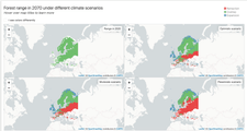
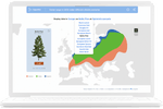
UI Iteration 1 – Shiny prototype
The base prototype showed four map tiles (one for each scenario) on the screen for a selected tree species. It had a very rudimentary UI, but it did contain a colorblind mode. This colorblind mode carried over to the final iteration.
Pros:
- A solid foundational building block for what comes next
- Accessibility; contains colorblind functionality used in later iterations
Cons:
- The amount of simultaneous maps shown makes it difficult to compare changes
- Users lose focus of the data story
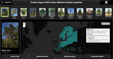
UI Iteration 2 – Focus on the data
This iteration was built on the previous version, but with a more robust UI and tree selector. It still contained multiple scenarios displayed, but the focus shifted away from the scenarios to the tree species.
Pros:
- Scenario selection; reactive map changes per scenario or tree selected
- A visually engaging way to select trees as well as information for each tree; response to scenarios, species information, etc.
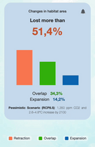
- Detailed information for outcomes; Retraction, Expansion, and Overlap
Cons:
- The tree selector consumes space on the dashboard
- Selecting via images doesn’t add a lot of value as not all tree species are easily identified by image
- The UI is too dark
- The visual accessibility feature was lost as some colors don’t work on a dark background
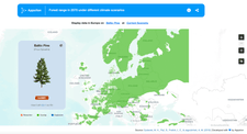
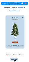
UI Iteration 3.5 – Finding success with Shiny
Iteration 3 was an early take on what would become the final design. It has a consolidated and simplified UI. Tree species are selected independently of the climate scenario and only one future scenario is visible on the screen at one time.
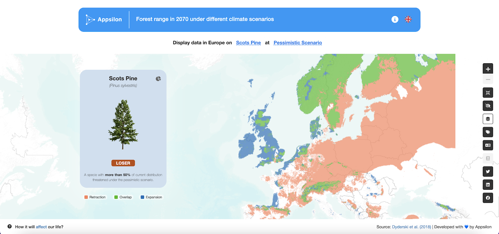
Iteration 3
It showcases the criteria selection (tree species, climate scenarios) embedded into the header, which also describes what we see on the map. We found this to be a very elegant, yet intuitive solution to save space and still maintain full control over the different parameters the users can choose from.
Iteration 3.5
Pros:
- A more inviting, less cluttered UI with a managed information hierarchy
- Flippable cards enable us to share more information without overwhelming the user
- Text selector reduces the need for having a string somewhere as the selector itself shares the context; saving space and decluttering the UI
- The above ‘pro’ makes it possible to have more controls on the map, which opens opportunities for the UX
- Visual accessibility features and translation were returned
Cons:
- Load time is an issue given a more complex functionality in the app
Features of the Future Forest Shiny app
- Accessibility: A colorblind mode for visual aid
- Localization: The app supports Polish and English languages
- Shareability: Social media share is implemented as prefilled intents (try sharing on Twitter!)
- Map Layers: Layers can be toggled (labels, borders, and a Polish forest layer)
- Modern Selection: The selectors read like a sentence, reducing the need for additional explanation
Breaking down Shiny UI design with Future Forests
Identifying the problem(s)
In previous versions of the app, what we came across was congestion. The app showed everything, all at once. And that’s stressful for the user. It doesn’t elicit the behavior we want for an engaging, learning experience.
This stress triggers two subconscious actions – run or freeze. Running is expressed in bounce rate. A user will enter the app, become frustrated, and leave. Freezing means that a user pauses with a delayed time to understand. This can be expressed in a number of ways, but most likely a combination of longer session times with aimless user behavior. Both lead to cognitive load and negative perception, and ultimately, failed adoption.
Remove visual noise and sharpen focus
To resolve this congestion, first, we trim. Instead of a tree-species carousel and split screens, add selectors in the control panel. Instead of 4 scenarios, display one.
In doing these things, we can declutter the visuals and create focal points.
Additional declutter:
- The legend moved to the card
- Switching languages and information about the application moved to the header
- All other interactive elements that were scattered on the screen are now organized into the right vertical panel on the map. Here is also the color blindness option for people with visual disabilities, as the main focus of the application is on the color ratio on the map
- “languages” and “about” moved to the top
Custom UI can be challenging. Try these open-source options for building professional Shiny UIs.
Priority of selection – text instead of image
In order to optimize user interaction, we simplified the interaction with the selector. We moved away from image-based selections to text, based on ‘hallway’ tests of the app.
Initial dashboard design received from our design team.
To support this text-based approach, we included a sentence as a contextual guide in the filter panel.
Cut back time to analyze by giving outputs
We have found that presenting information in a processed form, like a photo with a current status displayed by default and a graph on the back, is more effective than serving raw data. This approach allows users to quickly access and understand the key points, while still providing more detailed information for those who want it.
Optimizing user flow
Entry point
To engage a wider audience and bring important information to users, we created a landing page as the point of entry to the app. The landing page presents information in a simple and straightforward manner, using numbers and facts to explain why this is a problem worth paying attention to. This approach helps to capture the attention of users and draw them into the app, where they can learn more about the topic.
Exit point
To promote information dissemination and user involvement, we have included the ability to share content on social media as an exit point from the app. This allows users to easily share the information they have learned with their networks and spread awareness about the topic. By providing users with an easy way to share content and engage with others, we can help to extend the reach of the research and its impact.
Future Forests and the power of Shiny UI
Quickly building Proofs-of-Concept is one of Shiny’s best selling points. Its beginner-friendly and rich ecosystem of open-source R packages make it a great launching pad for completing and sharing research.
And as we’ve seen with the Future Forests case study, improving design elements in subsequent iterations can transform a PoC into a powerful, educational tool. A well-designed user interface can open research to a much wider audience.
The final iterations of Future Forests are strong examples of how UI design and Shiny development can help tell the story of data in an engaging and accessible way. Shiny lets you move from static pdfs of scientific reports and posters to interactive web apps.
You’ve spent countless hours monitoring, collecting, analyzing, and interpreting; so why limit the reach of your work? Try Shiny to communicate your findings. Promote your work and engage wider audiences. Let users explore, interact, and discover new insights. Don’t limit your work – design accessible research with Shiny!
Curious if R Shiny is right for you? We’ve shared 6 lessons for Shiny app development for enterprises to help others in their production journey.
Contact Us

Head of Marketing

Get Updates
Subscribe to Shiny Weekly Newsletter
Join 4000+ Shiny enthusiasts to see the latest Shiny news from the R community.
Also on accessibility
