Share
Share Tweet
Tweet Share
Share


Excel has its limitations regarding advanced statistics and calculations, quality and version control, user experience, and scalability. Switching to a more sophisticated data analysis tool or dashboard is often a great solution to these limitations. What’s more, transferring your Excel sheet to an R Shiny app can be the easiest way to create an enterprise-ready dashboard. In this post, we present 8 Shiny alternatives for the table-like data that are better than Excel.
Can’t decide between Tableau and R Shiny? Our detailed comparison might simplify the decision.
You’re probably aware of Shiny’s cool interactive plot and charts features that are well ahead of what you can do in Excel. What may still prevent you from switching from Excel to a more advanced Shiny dashboard is the fear of missing the beloved Excel functionalities to work with table-like data. Don’t worry! It is super easy to implement and extend them using Shiny. The most commonly used table widgets in Shiny are DT and rhandsontable. We’ll first take a deep dive into their features but also look at some other packages strictly dedicated to helping with popular spreadsheets tasks.
Updated: March 29, 2022.
Table of contents:
- Editable tables
- Conditional formatting
- Sorting and filtering
- Drag & drop pivot tables
- Reacting to selection
- Expandable rows
- Data visualization
- Connecting to external data sources
1. Editable tables
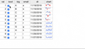
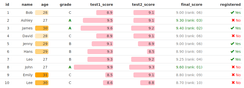
A basic reason for using a spreadsheet is the simplicity of data manipulation. Displaying data is not always enough. Content may require spell checking, fixing, and adding rows or columns. The closest solution to what can be found in spreadsheets is rhandsontable. It contains all of the cool spreadsheet features like autocomplete, selecting a value from a list, adding rows/columns, sparklines in cells, freezing, comments, input validation, read-only mode, and so on.
Image 1 – Source: rhandsontable on GitHub
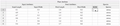
A similar solution is available in excelR. The package is worth testing as it contains many interesting solutions such as radio selection inside tables and multiple well-known Excel functions like SUM presented below. The package also allows users to easily manipulate cells with actions like resizing, merging, or switching row/column positions. Nested headers are also useful as they can organize your data. Implementing the solution in Shiny is easy and intuitive with well-known render/output dedicated functions.
There are two downsides with excelR at the moment — cloning formulas between columns, and calculation approximations, which do not work as one would expect.
Image 2 – Source: excelR on GitHub
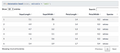
The DT package has a lot of great features and is a great option when heavy data editing is not the main goal. And as you can see in the gif below, tables implemented with DT look really nice. It has less functionality than rhandsontable though, basically just allowing the user to replace the values inside cells when double-clicked, without validating the values typed in. Some columns may be restricted to be read-only.
Image 3 – Source: DT on GitHub
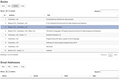
A possible workaround for DT’s limited editing functionality is a more advanced DTedit package. It comes with a pleasing interface (modal dialog) for editing single table rows as well as buttons to add, delete, or copy data. The package is currently only available on GitHub, but we will keep our fingers crossed for its expansion and increase in popularity.
Image 4 – Source: DTedit on GitHub
2. Conditional formatting
Conditional formatting is a super useful tool for getting a quick overview when dealing with tons of values. Both rhandsontable and DT allow users to format cells according to their values. If your highest priority for your application is beautiful data presentation, then the package formattable is worth checking out. The formatting interface is more user-friendly than in rhandsontable and it is based on R functions, not pure javascript code. Besides working on tables, it also contains the functionality of formatting R vectors which might be useful when presenting results of pure R analysis.
Image 5 – Source: formattable on GitHub
3. Sorting and filtering
Sorting and filtering are also crucial when examining a huge dataset. In the rhandsontable package, sorting columns can be enabled by a single parameter, however filtering is not implemented inside the feature and may require adding some extra Shiny components. On the other hand, in DT, column sorting is available by default as well as global search. Enabling column filtering is as easy as adding a single parameter (filter = top/bottom, depending on where the filters should be placed).
Image 6 – Source: DT on GitHub
4. Drag & drop pivot tables
Excel users love pivot tables. Allowing the users to create their own stories based on data is an excellent feature – sometimes the valuable info is only generated when looking at the data from the right angle. For a plug-and-play pivot table, we recommend using the rpivotTable package. As you can see in the gif, it is super easy to produce tables and manipulate the aggregation variables with drag & drop. You can also filter by specific values and/or choose which variable should be calculated based on the selected function – like presented below sum and sum as a percentage of the total. Quickly switching from table to different types of (interactive!) charts is a great bonus.
Image 7 – Source: rpivotTable on GitHub
If you would like to combine pivoting with other features, a combination of shinydnd and DT Custom Table Containers as well as data manipulation is needed. Nevertheless, the results can be amazing. Maybe we’ll get into that in a future post. Let us know in the comments if this is interesting to you.
5. Reacting to selection
The usual scenario in dashboards applications is reacting to user selection and continuing to work on a selected element. When it needs to be a key feature of the application, then the DT package is a great choice. It is easy to implement the logic for reacting to user cell/row/column selection.
The sky’s the limit! Options range from custom edit data tools to going deep into nested tables. Or as presented in the gif below, you see the graph dynamically reacts to user selection in the table.
Image 8 – Source: DT in Shiny on GitHub
6. Expandable rows
Expandable rows are a nice, extra feature that allows you to hide (in an elegant way) additional information and bring the crucial part to the top. This is another feature that does not exist in spreadsheets. Expandable rows are also useful in presenting database-like structures with one-to-many relations. It requires a little javascript magic in DT for now, but the various examples (including child rows) are easy to follow.
Image 9 – Source: Extending DT child row example
7. Data visualization
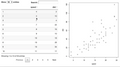
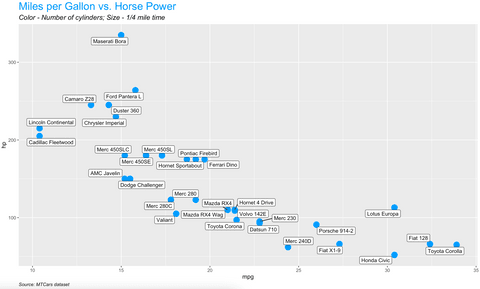
Let’s face the facts – looking at endless tables day in and day out is no fun, especially for business users. What’s easier on the eyes is the visual representation of these tables. The good news is – R offers more visualization packages than we can list. The de-facto standard package is ggplot2, and it’s used to produce publication-ready charts that are better than Excel.
The example below shows you how to use this package to visualize a scatter plot of MPG vs. HP from the Mtcars dataset, and also how to style and add captions to the plot:
Image 10 – Data visualization example
Are your data visualizations an eyesore? Our complete guide to stunning scatter plots in R can help.
8. Connecting to external data sources
You won’t always have the luxury of working with local data. More often than not, you’ll have to connect to a database of some sort, or even fetch the data from a REST API. The example below shows you how to do the latter – it connects to a dummy REST API, pulls the data by making an HTTP GET request with httr package, and converts data from JSON to data.frame – all of that in five lines of code:
Image 11 – REST API communication example
Summary of Better Than Excel – Smooth transition to R Shiny
You may have felt that if you switched from Excel to Shiny, you would be limited in the table data feature set. We hope you can see that Shiny offers a comparable feature set to Excel as well as exciting new possibilities!
- When to stick with Excel and when it’s time for a change? Take a look at Filip Stachura’s article “Excel Is Obsolete” which addresses this question from the architectural point of view.
- Curious about making the leap from Excel to R Shiny, but you don’t have any experience with R? Read How to Switch from Excel to R Shiny: First Steps.
- Are you considering using R Shiny for your enterprise solution? These 6 lessons in Shiny app development are a great way to prepare your business for digital transformation.
Contact Us
Project Manager

Get Updates
Subscribe to Shiny Weekly Newsletter
Join 4000+ Shiny enthusiasts to see the latest Shiny news from the R community.