Share
Share Tweet
Tweet Share
Share


R for Programmers – 7 Essential R Packages for Programmers

01 December 2020
Updated: October 15, 2022.
R is a programming language created by Ross Ihaka and Robert Gentleman in 1993. It was designed for analytics, statistics, and data visualizations. Nowadays, R can handle anything from basic programming to machine learning and deep learning. Today we will explore how to approach learning and practicing R for programmers.
As mentioned before, R can do almost anything. It performs the best when applied to anything data related – such as statistics, data science, and machine learning.
The language is most widely used in academia, but many large companies such as Google, Facebook, Uber, and Airbnb use it daily.
This R for programmers guide will show you how to:
- Load datasets
- Scrape Webpages
- Build REST APIs
- Analyze Data and Show Statistical Summaries
- Visualize Data
- Train a Machine Learning Model
- Develop Simple Web Applications
- Create Interactive Markdown Documents with Quarto
Load datasets
To perform any sort of analysis, you first have to load the data. With R, you can connect to any data source you can imagine. A simple Google search will yield either a premade library or an example of API calls for any data source type.
For a simple demonstration, we’ll see how to load CSV data. You can find the Iris dataset in CSV format on this link, so please download it to your machine. Here’s how to load it in R:
iris <- read.csv("iris.csv")
head(iris)
And here’s what the head function outputs – the first six rows:
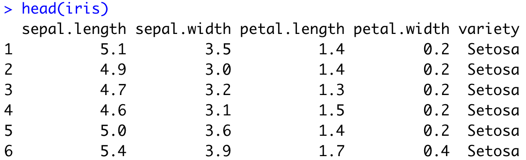
Image 1 – Iris dataset head
Did you know there’s no need to download the dataset? You can load it from the web:
iris <- read.csv("https://gist.githubusercontent.com/netj/8836201/raw/6f9306ad21398ea43cba4f7d537619d0e07d5ae3/iris.csv")
head(iris)
That’s all great, but what if you can’t find an appropriate dataset? That’s where web scraping comes into play.
Web scraping
A good dataset is difficult to find, so sometimes you have to be creative. Web scraping is considered one of the more “creative” ways of collecting data, as long as you don’t cross any legal boundaries.
In R, the rvest package is used for the task. As some websites have strict policies against scraping, we need to be extra careful. There are pages online designed for practicing web scraping, so that’s good news for us. We will scrape this page and retrieve book titles in a single category:
library(rvest)

url <- "http://books.toscrape.com/catalogue/category/books/travel_2/index.html"
titles <- read_html(url) %>%
  html_nodes("h3") %>%
  html_nodes("a") %>%
  html_text()
The titles variable contains the following elements:
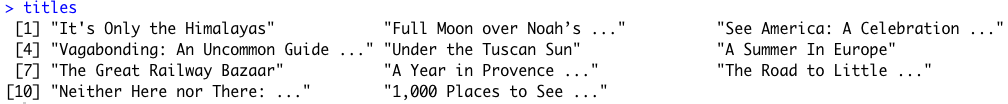
Image 2 – Web Scraping example in R
Yes – it’s that easy. Just don’t cross any boundaries. Check if a website has a public API first – if so, there’s no need for scraping. If not, check their policies.
Build REST APIs
We can’t have an R for Programmers article without discussing REST APIs. With practical machine learning comes the issue of model deployment. Currently, the best option is to wrap the predictive functionality of a model into a REST API. Showing how to do that effectively would require at least an article or two, so we will cover the basics today.
In R, the plumber package is used to build REST APIs. Here’s the one that comes in by default when you create a plumber project:
library(plumber)

#* @apiTitle Plumber Example API

#* Echo back the input
#* @param msg The message to echo
#* @get /echo
function(msg = "") {
    list(msg = paste0("The message is: '", msg, "'"))
}

#* Plot a histogram
#* @png
#* @get /plot
function() {
    rand <- rnorm(100)
    hist(rand)
}

#* Return the sum of two numbers
#* @param a The first number to add
#* @param b The second number to add
#* @post /sum
function(a, b) {
    as.numeric(a) + as.numeric(b)
}
The API has three endpoints:
/echo– returns a specified message in the response/plot– shows a histogram of 100 random normally distributed numbers/sum– sums two numbers
The plumber package comes with Swagger UI, so you can explore and test your API in the web browser. Let’s take a look:
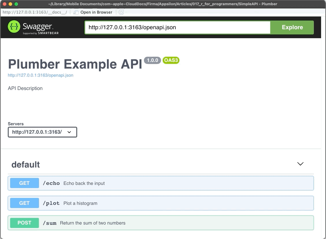
Image 3 – Plumber REST API Showcase
Statistics and Data Analysis
This is one of the biggest reasons why R is so popular. There are entire books and courses on this topic, so we will only go over the basics. We intend to cover more advanced concepts in the following articles, so stay tuned to our blog if that interests you.
Most of the data manipulation in R is done with the dplyr package. Still, we need a dataset to manipulate with – Gapminder will do the trick. It is available in R through the gapminder package. Here’s how to load both libraries and explore the first couple of rows:
library(dplyr)
library(gapminder)

head(gapminder)
You should see the following in the console:
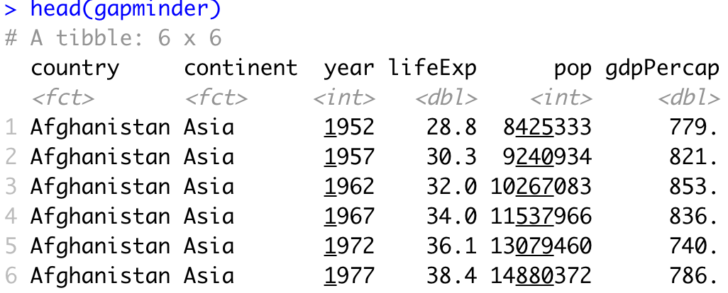
Image 4 – Head of Gapminder dataset
To perform any kind of statistical analysis, you could use R’s built-in functions such as min, max, range, mean, median, quantile, IQR, sd, and var. These are great if you need something specific, but a simple call to the summary function will provide you with enough information, most likely:
summary(gapminder)Here’s a statistical summary of the Gapminder dataset:
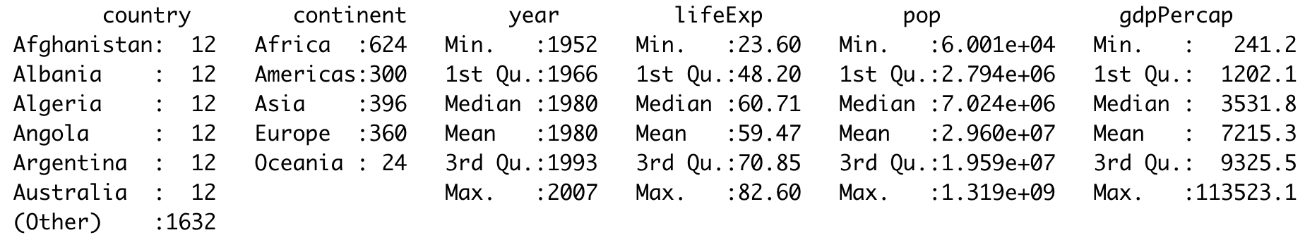
Image 5 – Statistical summary of the Gapminder dataset
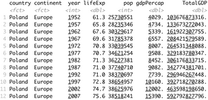
With dplyr, you can drill down and keep only the data of interest. Let’s see how to show only data for Poland and how to calculate the total GDP:
gapminder %>%
  filter(continent == "Europe", country == "Poland") %>%
  mutate(TotalGDP = pop * gdpPercap)
The corresponding results are shown in the console:
Image 6 – History data and total GDP for Poland
Data Visualization
R is known for its impeccable data visualization capabilities. The ggplot2 package is a good starting point because it’s easy to use and looks great by default. We’ll use it to make a couple of basic visualizations on the Gapminder dataset.
To start, we will create a line chart comparing the total population in Poland over time. We will need to filter out the dataset first, so it only shows data for Poland. Below you’ll find a code snippet for library imports, dataset filtering, and data visualization:
library(dplyr)
library(gapminder)
library(scales)
library(ggplot2)

poland <- gapminder %>%
  filter(continent == "Europe", country == "Poland")

ggplot(poland, aes(x = year, y = pop)) +
  geom_line(size = 2, color = "#0099f9") +
  ggtitle("Poland population over time") +
  xlab("Year") +
  ylab("Population") +
  expand_limits(y = c(10^6 * 25, NA)) +
  scale_y_continuous(
    labels = paste0(c(25, 30, 35, 40), "M"),
    breaks = 10^6 * c(25, 30, 35, 40)
  ) +
  theme_bw()
Here is the corresponding output:
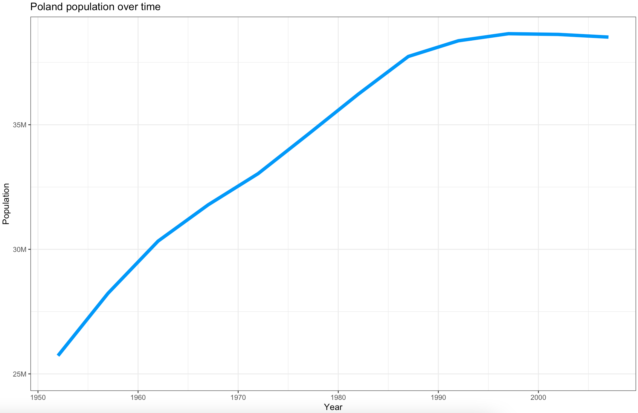
Image 7 – Poland population over time
You can get a similar visualization with the first two code lines – the others are added for styling.
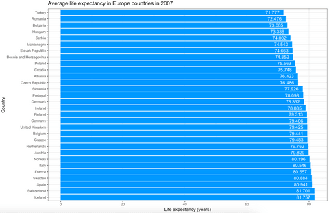
The ggplot2 package can display almost any data visualization type, so let’s explore bar charts next. We want to visualize the average life expectancy over European countries in 2007. Here is the code snippet for dataset filtering and visualization:
europe_2007 <- gapminder %>%
  filter(continent == "Europe", year == 2007)

ggplot(europe_2007, aes(x = reorder(country, -lifeExp), y = lifeExp)) +
  geom_bar(stat = "identity", fill = "#0099f9") +
  geom_text(aes(label = lifeExp), color = "white", hjust = 1.3) +
  ggtitle("Average life expectancy in Europe countries in 2007") +
  xlab("Country") +
  ylab("Life expectancy (years)") +
  coord_flip() +
  theme_bw()
Here’s how the chart looks like:
Image 8 – Average life expectancy in European countries in 2007
Once again, the first two code lines for the visualization will produce similar output. The rest are here to make it look better.
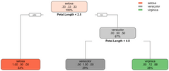
Training a Machine Learning Model
Another must-have point in any R for programmers guide is machine learning. The rpart package is great for machine learning, and we will use it to make a classifier for the well-known Iris dataset. The dataset is built into R, so you don’t have to worry about loading it manually. The caTools is used for train/test split.
Here’s how to load in the libraries, perform the train/test split, and fit and visualize the model:
library(caTools)
library(rpart)
library(rpart.plot)

set.seed(42)
sample <- sample.split(iris, SplitRatio = 0.75)
iris_train = subset(iris, sample == TRUE)
iris_test = subset(iris, sample == FALSE)

model <- rpart(Species ~., data = iris_train, method = "class")
rpart.plot(model)
The snippet shouldn’t take more than a second or two to execute. Once done, you’ll be presented with the following visualization:
Image 9 – Decision tree visualization for Iris dataset
The above figure tells you everything about the decision-making process of the algorithm. We can now evaluate the model on previously unseen data (test set). Here’s how to make predictions, print confusion matrix, and accuracy:
preds <- predict(model, iris_test, type = "class")

confusion_matrix <- table(iris_test$Species, preds)
print(confusion_matrix)

accuracy <- sum(diag(confusion_matrix)) / sum(confusion_matrix)
print(accuracy)
Image 10 – Confusion matrix and accuracy on the test subset
As you can see, we got a 95% accurate model with only a couple of lines of code.
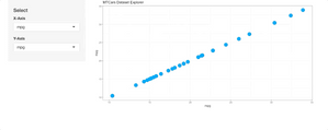
Develop Simple Web Applications
At Appsilon, we are global leaders in R Shiny, and we’ve developed some of the world’s most advanced R Shiny dashboards. It is a go-to package for developing web applications.
For the web app example in this R for programmers guide, we’ll see how to make simple interactive dashboards that display a scatter plot of the two user-specified columns. The dataset of choice is also built into R – mtcars.
Here is a script for the Shiny app:
library(shiny)
library(ggplot2)

ui <- fluidPage(
  sidebarPanel(
    width = 3,
    tags$h4("Select"),
    varSelectInput(
      inputId = "x_select",
      label = "X-Axis",
      data = mtcars
    ),
    varSelectInput(
      inputId = "y_select",
      label = "Y-Axis",
      data = mtcars
    )
  ),
  mainPanel(
    plotOutput(outputId = "scatter")
  )
)

server <- function(input, output) {
  output$scatter <- renderPlot({
    col1 <- sym(input$x_select)
    col2 <- sym(input$y_select)

    ggplot(mtcars, aes(x = !!col1, y = !!col2)) +
      geom_point(size = 6, color = "#0099f9") +
      ggtitle("MTCars Dataset Explorer") +
      theme_bw()
  })
}

shinyApp(ui = ui, server = server)
And here’s the corresponding Shiny app:
Image 11 – MTCars Shiny app
This dashboard is as simple as they come, but that doesn’t mean you can’t develop beautiful-looking apps with Shiny.
Looking for inspiration? Take a look at our Shiny App Demo Gallery.
Create Interactive Markdown Documents with Quarto
Think of R Quarto as a next-gen version of R Markdown. It allows you to create high-quality articles, reports, presentations, PDFs, books, Word documents, ePubs, websites, and even more – all straight from R.
To get started, please refer to our official R Quarto guide. In this section, we’ll only show you how to make a Markdown document, and not how to export it. The mentioned guide dives deep into that as well.
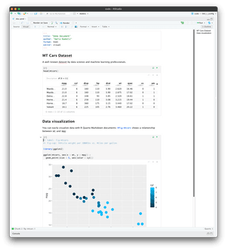
In RStudio, click on the plus button and select Quarto Document. The setup process is simple, just add the title and the author, everything else should be left as is.
The code snippet below shows you how to visualize the MT Cars dataset both as a table and as a chart with R Quarto:
---
title: "Demo Document"
author: "Dario Radečić"
format: html
editor: visual
---

## MT Cars Dataset

A well-known dataset by data science and machine learning professionals.

```{r}
head(mtcars)
```

## Data visualization

You can easily visualize data with R Quarto Markdown documents: @fig-mtcars shows a relationship between `wt` and `mpg`:

```{r}
#| label: fig-mtcars
#| fig-cap: Vehicle weight per 1000lbs vs. Miles per gallon

library(ggplot2)

ggplot(mtcars, aes(x = wt, y = mpg)) +
  geom_point(size = 5, aes(color = cyl))
```
Here’s what the document looks like in visual mode:
Image 12 – R Quarto markdown document
It doesn’t get easier than that. There are so many things you can do with Quarto and we can’t cover them here, but additional articles on Appsilon blog have you covered.
Want to learn more about R Quarto? Read our complete guide on Appsilon blog.
And that’s all for today. Let’s wrap things up next.
Summing up R for Programmers
To conclude – R can do almost anything that a general-purpose programming language can do. The question isn’t “Can R do it”, but instead “Is R the right tool for the job”. If you are working on anything data-related, then yes, R can do it and is a perfect candidate for the job.
If you don’t intend to work with data in any way, shape, or form, R might not be the optimal tool. Sure, R can do almost anything, but some tasks are much easier to do in Python or Java.
Want to learn more about R? Start here:
Contact Us
Project Manager

Get Updates
Subscribe to Shiny Weekly Newsletter
Join 4000+ Shiny enthusiasts to see the latest Shiny news from the R community.