Share
Share Tweet
Tweet Share
Share


Systematic Literature Review and R Shiny: App for Marine Conservation and Climate Change Mitigation

04 May 2023
Scientific literature plays a crucial role in advancing our understanding of marine conservation and the importance of protecting our oceans. Over the years, many studies have been conducted around hundreds of Marine Protected Areas (MPAs) and its role as an ocean-based climate solution.
However, scientific papers can be difficult to interpret and consume. Data visualization is one tool that can help to convey data storytelling effectively, bringing complex data to life and helping us unlock insights that might be difficult to uncover through traditional means. This is where R Shiny comes in handy, letting us see the data quickly, and understand it easily.
A Meta-Analysis Reveals Significant Role of MPAs in Climate Change Mitigation and Adaptation
The Research
MPAs can play a vital role as a potential solution to tackle climate change impacts, especially within ecosystems. Yet, there is a lack of clarity surrounding their actual benefits, which has led to debates on their efficacy.
In 2022, a group of scientists worked on bridging this knowledge gap by conducting an extensive review of more than twenty-two thousand publications. Their work was published in a paper on the benefits of MPAs in mitigating and adapting to climate change.
The Results
The meta-analysis revealed that MPAs have the potential to significantly enhance carbon sequestration, coastal protection, biodiversity, and reproductive capacity of marine organisms.
Additionally, MPAs can improve the catch and income of fishermen. These benefits are most evident in fully or highly protected areas, and they tend to increase with the age of the MPA.
Although MPAs cannot single-handedly solve all climate change issues, they can be a valuable tool for mitigating and adapting to its impacts on social-ecological systems.
With the efficacy of MPAs now clarified, how do we quickly and effectively share this with policy makers and stakeholders?
The Shiny Application
In our quest to make the research more accessible and actionable, we used what we know and do best – R Shiny. With R, we can work with massive datasets and handle large statistical analyses. With Shiny, we created an interactive visualization of the results.
Shiny allows us to present complex data in an easy-to-understand format, engaging readers and facilitating comprehension.
Translating Scientific Insights into an R Shiny Application
The paper covers 22,403 publications around 241 MPAs, and grades each publication based on 16 ecological and social pathways; the grades are categorized into positive, neutral or negative evidence. Our goal is to represent the collected evidence into an interactive map which lets individuals, organizations, or governments to easily explore the impact of a given MPA on each pathway and see how these impacts vary geographically.
Our Shiny App Sprint Process
In this 5-day project, we started with a working hypothesis that with Shiny and high-quality data, we can bridge the gap between research and action; We could empower individuals and organizations to create positive change.
However, we encountered some obstacles in the process. It comes when we try to connect the MPAs location to the evidence data that we had. The lack of geographical coordinates of the MPAs makes it impossible for us to visualize them in the ocean area. This somehow emphasizes the critical role of data quality which can maximize the impact of interactive scientific papers and promote informed decision-making.
Although we were not able to visualize the MPAs themselves, we were able to connect the data to the geographical position of each MPA using the MPAtlas and Protected Planet data sources. As a result, we worked on a more aggregated country-level, where each country could have more than one MPAs. We then accumulated the vote-count metric that goes from -1 to 1, which represents the positive evidence of improvements for each ecological and social pathway.
Exploring MPA Impact Using Shiny
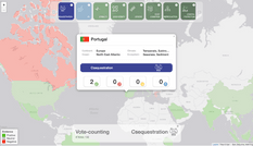
Within a week, we delivered a Shiny application which illustrates the geographical distribution of evidence, disaggregated by the ecological and social pathways. All 16 pathways are shown in the form of colored boxes and users can hover over the information icon that is provided to learn more about the pathway; what it is about and what variable is used as the indicator of the grading.
Exploring Regional Data in a Shiny Map
The color of the countries represents the evidence of its MPAs impact on the selected pathway. The green color represents positive evidence and red represents the negative. Users can also click on the country polygon to see brief summary on each country’s geographic and detailed numbers of evidence that is aggregated on the overall map:
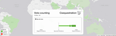
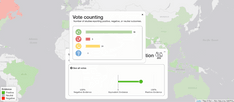
Exploring Vote Data in Shiny
We also provided the overall votes (all countries together) on the selected pathway. Users can click on the “See all votes” to see the detailed numbers of the vote counts of studies related to the pathway.
Overall, the app provides visualizations that illustrate the geographical distribution of evidence disaggregated by pathways with the sign of this evidence, either qualitative “vote counting” or quantitative meta-analysis outcomes. The benefits of marine conservation highlighted in the app include enhanced carbon sequestration, coastal protection, biodiversity, and the reproductive capacity of marine organisms, as well as fisheries catches and income.
Conclusion of R Shiny, MPAs, and Improving Systematic Literature Review
Our app provides a solution to the scientific community and service to the general public, bridging the gap between science and scientific literacy. By moving evidence closer and making it easier to consume, we hope to drive people to make more evidence-based decisions.
We believe that R Shiny is an excellent tool for creating interactive scientific papers. And it opens up the chance to cultivate wider scientific literacy, both for laymen and the experts.
Using our app, users can easily explore the impact of MPAs on various pathways and see how these impacts vary geographically. The app provides visualizations that illustrate the geographical distribution of evidence disaggregated by pathway with the sign of this evidence, either qualitative “vote counting” or quantitative meta-analysis outcomes.
The benefits of marine conservation highlighted in the app include enhanced carbon sequestration, coastal protection, biodiversity, and the reproductive capacity of marine organisms, as well as fishers’ catch and income.
Our app offers a unique way to explore marine conservation and the benefits of MPAs in mitigating and adapting to climate change. We hope that it will inspire scientists to share better and for the public to explore more evidence-based decision-making – ultimately, for the betterment of everyone and everything.
With R and Shiny, we can unlock the full potential of scientific literature and climate policy.
Explore more Data4Good projects and discover how R/Shiny and AI can power your projects!
Contact Us

Head of Marketing

Get Updates
Subscribe to Shiny Weekly Newsletter
Join 4000+ Shiny enthusiasts to see the latest Shiny news from the R community.