Share
Share Tweet
Tweet Share
Share


Top R Packages for Visualizing Table Data – Make Stunning Tables in Minutes

02 November 2021
Visualizing table data is no small task. It requires both data manipulation and data visualization skills from the technical end. It also requires knowledge about your audience. Ask yourself — For whom are you visualizing the data? Do you need interactivity? Will you include the table in a web application? The list of questions goes on and on.
Thankfully, we have a solution. This article brings you answers on the best R packages for visualizing table data. We’ll go over four of them today, and we’ll also show you how to tie them together in an interactive R Shiny application.
Table of contents:
- What is Table Data?
- Why Use R Over Excel, Python, or JavaScript?
- Best R Packages for Visualizing Table Data
- RStudio Table Contest — Sign Up Now
- Conclusion
What is Table Data?
Think of table data as something aggregated from tabular data. Tabular data is made of rows and columns, and a place where they intersect gives you specific information about a single record — for example, the number of people living in Poland in 2021.
Tabular data usually isn’t the best candidate for presenting visually with a table. The reason? It can be huge in dimension, and you’re only interested in a small subset. For example, imagine you had population data for the entire world, and you’re only interested in a single country. You could aggregate the data, so you’re left with a small, presentable subset.
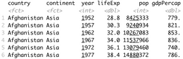
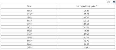
Let’s take a look at one such dataset to drive the point home. You should have the dplyr and gapminder packages installed. Let’s import them both and check how the dataset looks like:
Image 1 – The GapMinder dataset
And there’s your tabular data. It isn’t directly presentable, as it has over 1700 rows. No one wants to go over that table manually, so let’s aggregate it to something more presentable.
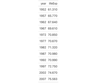
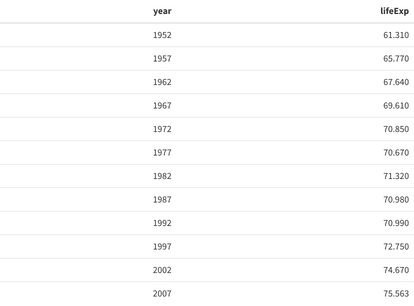
We’ll keep only the records for Poland, tracked through the year and lifeExp columns. You can do the aggregation effortlessly with dplyr:
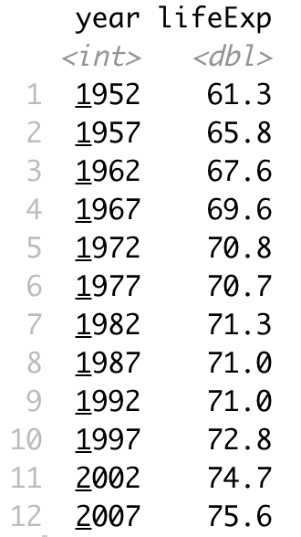
Image 2 – Life expectancy in Poland over time
Now that’s something you could present in a table format. How do you do that? There’s a lot of R packages for visualizing table data, but first, let’s discuss why you should use R in the first place.
Why Use R Over Excel, Python, or JavaScript?
Why bother with programming languages if you can style tables however you want with Excel? Well, you’re leaving a lot of customization on the table by sticking with Excel. Also, the table won’t be interactive and don’t even get me started on reproducibility.
But what about a dedicated BI tool, such as Tableau or PowerBI? Honestly, we’ve used them at Appsilon, and they generally have a lot of going for them. But like every tool, these aren’t flawless. Make sure to read our detailed comparisons to R Shiny:
- PowerBI vs. R Shiny: Two Popular Excel Alternatives Compared
- Tableau vs. R Shiny: Which Excel Alternative Is Right For You?
Want to integrate Shiny with Tableau? Check out the RStudio Connect Tableau Analytics Extensions for R and Python.
JavaScript is a different story. You can definitely use it to make stunning tables and it probably has the largest number of data visualization libraries. But here’s the thing — JavaScript is not a programming language for data professionals. Nobody uses JavaScript as a go-to language for data science and machine learning. If you’re into web application and dashboard development, it might be a viable option.
For data professionals, it almost always boils down to R or Python. Python is a general-purpose programming language with a strong background in data science and machine learning. R can also do pretty much everything but is tailored more for advanced stats and statistical modeling.
Are you new to R? Here are 6 essential things you do with R as a programmer.
You can’t go wrong with R or Python, and the choice will most likely boil down to the personal preference, or the preference of the company you work for. At Appsilon, we’ve chosen R as a programming language of choice for data science, machine learning, data visualization, and dashboard development. It’s proven to be better for what we do, but your mileage may vary.
We also have experience with Python and its data science libraries. Read our detailed Pandas vs. dplyr comparison below:
- Python’s Pandas vs. R’s dplyr — Which Is The Best Data Analysis Library
With that out of the way, let’s explore the top R packages for visualizing table data.
R Packages for Visualizing Table Data
We’ll now go over a collection of R packages for visualizing table data. If you want to follow along, please ensure you have dplyr, gapminder, gt, kableExtra, DT, plotly, and shiny installed.
We’ll use the previously aggregated life expectancy data for Poland as a table data source.
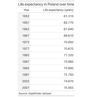
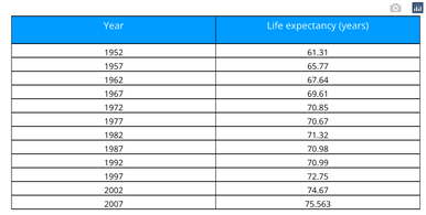
gt
The gt package is designed for making display tables, meaning it doesn’t provide any input to the user. It might be a deal-breaker if you want the ability of filtering data on the fly. Nevertheless, gt makes it so easy to get started:
Yes, that’s it! The table will look plain, but you can always add styles later:
Image 3 – Unstyled gt table
Let’s tweak it a bit — we’ll add a title, rename the columns, add a source node, and change the fill color for the first cell:
Image 4 – Styled gt table
Explore the in’s-and-outs of the gt package from RStudio. The package works well with R markdown and Quarto and can be applied across industry and academia.
The gt package is a good solution if you need minimalistic-looking tables without input controls. With some creative input,gtcan be used to build some contest-winning tables. Let’s explore one similar alternative next.
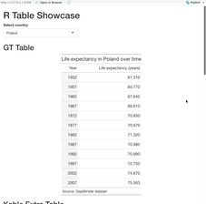
kableExtra
The kableExtra package lets you create display tables just like gt, but packs rich theme support. It’s also a bit more flexible than the previous package.
Getting started is close to effortless, once again:
Image 5 – Unstyled kableExtra table
The styling is quite minimalistic once again, but kableExtra has many ready-to-go themes you can use (source). Let’s see how the material theme looks like — we’ll also add a footnote and a stripped look that changes on hover:
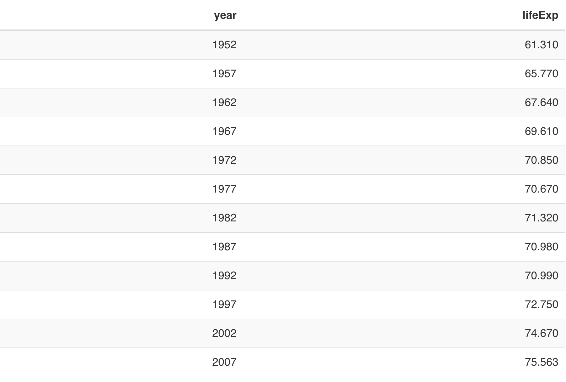
Image 6 – Styled kableExtra table
Just like gt, it’s a good option to go with if you don’t want input controls out of the box. If you do, you’re in luck — the next package has it built-in.
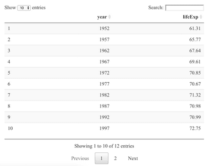
DT
The DT package in R provides an interface to the DataTables library in JavaScript. It can display matrices and data frames as tables, and provides filtering, pagination, and sorting out of the box.
It requires even less code to get started than the previous two:
Image 7 – Unstyled DT table
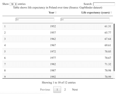
Yes, the table could definitely benefit from some styling, but offers everything the end-user might need by default. You can extend its functionality further by adding column-level filtering. Here’s the code you’ll need to do that, and also change the column names and add a caption:
Image 8 – Styled DT table
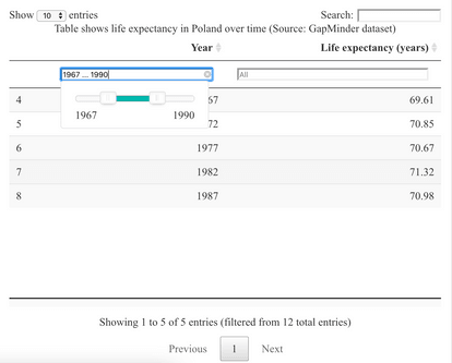
Here’s what happens if you click on the column-level filters:
Image 9 – Filtering DT tables
It’s astonishing to see so much functionality available by default. Coding that logic manually would take hours for experienced developers, which makes DT an ultimate time-saver.
The DT package might be the best solution for dashboard developers, as it won’t overflow the page if the table has many rows. Also, the search, pagination, and filtering capabilities are implemented for you, so it’s one less thing to worry about.
Plotly
Plotly is a go-to package for interactive data visualizations. It’s available for R, Python, and JavaScript, and you can use it in R Shiny dashboards without any issues. Regular charts (line, bar, scatter…) look spectacular, but how about tables?
Let’s find out. You can use the following snippet to create a basic table from our subset:
Image 10 – Unstyled Plotly table
The table doesn’t look the best by default and requires a lot more code when compared to the previous options. Styling the table, well, takes time:
Image 11 – Styled Plotly table
To summarize, Plotly tables look and feel horrible if you consider it’s one of the go-to packages for data visualization. You can make it work, sure, but is it really worth the trouble?
Tying it All Together
You can use all three of the mentioned R packages for visualizing table data when building web applications with R and R Shiny. To demonstrate, we’ll create a simple Shiny dashboard that:
- Has a dropdown menu for country selection.
- Has four separated parts to showcase tables from four different packages.
- Updates the tables automatically as you change the country.
You can implement all of that in less than 100 lines of code. You’ll understand pretty much everything from the server, as it contains the code for generating tables. The ui will contain placeholders for the charts separated with different headings and UI elements.
Here’s the entire code:
It is somewhat of a lengthy file, but it should feel readable even if you’re not an R Shiny expert.
You should see the following once you run it:
Image 12 – R Shiny dashboard for table demonstration
Not too bad, right?
If you’ve developed dashboards with Python’s Dash, then R Shiny will feel a bit different at first. We’ve written a full comparison between the two to get you started:
- Plotly Dash vs. R Shiny — Which to Choose in 2021 and Beyond
In a nutshell, both libraries work wonders, and the decision will likely boil down to the ecosystem you’re using. At Appsilon, we’ve used both but mainly stick to R Shiny for enterprise applications.
Are your dashboards slow? Consider Apache Arrow to supercharge your R Shiny dashboards.
RStudio Table Contest
Do you think you have what it takes to produce award-winning data table visualizations? You’re in luck, as RStudio is holding a 2021 Table Contest. It runs from September 30th to November 15th, 2021, so there’s still time to apply.
What are you up against? Browse the phenomenal entries from the 2020 Table Contest.
You should consider a couple of things before applying:
- Every submission must include all code and data that was used, so the visualization can be reproduced.
- You can submit an entry as an R Markdown document, a repository, or an RStudio Cloud project.
- You can use any table-making package available in R.
- You can submit an entry either as a single table example (an example of a common table popular in a specific field) or as a tutorial (teaching how to craft an excellent table).
Everything looks good? You can submit your entry for the contest by filling in an online form, just make sure to fill it before November 15th, 2021 at midnight Pacific Time.
What’s in it for you? RStudio has excellent prices for the winners:
- The Grand Prize — A randomized combination of RStudio t-shirts, books, and mugs, plus the prizes below.
- Runner-Up — Face time with people making table-making packages, and a one-year subscription to the Shinyapps.io Basic plan, plus the prize below.
- Honorable Mentions — A larger-than-large helping of hexagon-shaped stickers for RStudio packages, plus a side of hex for table-making packages.
You can find more details about the RStudio Table Contest here.
Conclusion
To summarize, we believe R is the most promising option for visualizing table data. We’ve used the mentioned packages countless times when developing enterprise R Shiny dashboards, and we never looked back. With a little ingenuity, you can add creative flair to your tables and better communicate your results.
Looking to participate in RStudio Table Contest? Check our R Shiny Dashboard gallery for inspiration.
If you’re thinking about a career as an R Shiny developer, take a look at our recent guide. It contains many tips and resources for those starting out, and those with years of experience. Plus, you’ll also find out how to get hired at Appsilon — an industry leader building the world’s most advanced R Shiny applications for Fortune 500 companies.
Contact Us
Project Manager

Get Updates
Subscribe to Shiny Weekly Newsletter
Join 4000+ Shiny enthusiasts to see the latest Shiny news from the R community.