By Dominik Krzemiński and Krzysztof Sprycha
Data can be very powerful, but it’s useless if you can’t interpret it or navigate through it. For this reason, it’s crucial to have an interactive and understandable visual representation of your data. To achieve this, we frequently use dashboards. Dashboards are the perfect tool for creating coherent visualizations of data for business and scientific applications. In this tutorial ,we’ll teach you how to build and customize a simple Shiny dashboard.
We’ll walk you through the following:
- Importing library(shiny) and library(shinydashboard)
- Creating a server function
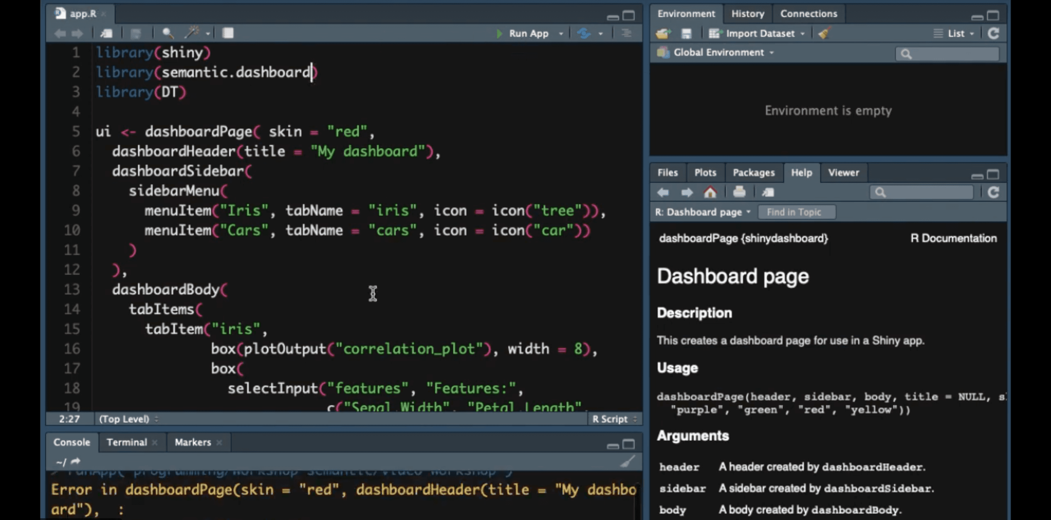
- Setting up a dashboardPage() and adding UI components
- Displaying a correlation plot
- Adding basic interactivity to the plot
- Setting up navigation with dashboardSidebar()
- Using fluidPage()
- Data tables with library(DT)
- Applying dashboard skins
- Taking advantage of semantic UI with library(semantic.dashboard)
You might also want to check out our in-depth article on our semantic.dashboard package.
Looking for more R Shiny tutorials? We’ve got you covered:
- RStudio Shortcuts and Tips
- Tutorial: A Journey From Basic Prototype to Production-Ready R Shiny Dashboard
- How I built an interactive R Shiny dashboard in 2 days without any experience in R
- Tutorial: How I Built a Video Game in R Shiny
- How to Use CSS to Style Your R Shiny Dashboards
- How to Make Your CSS Systematically Awesome with SASS
Follow Appsilon Data Science on Social Media
- Follow @Appsilon on Twitter
- Follow Appsilon on LinkedIn
- Sign up for our company newsletter
- Try out our R Shiny open source packages
- Sign up for the Data for Good newsletter.
- We’re hiring
Thanks to www.bensound.com for the music in the video.
Get Updates
Subscribe to Shiny Weekly Newsletter
Join 4000+ Shiny enthusiasts to see the latest Shiny news from the R community.


