

 Share
Share Tweet
Tweet Share
Share


Lessons Learned with shiny.benchmark: Improving the Performance of a Shiny Dashboard

13 April 2023
The attention span of every user is very valuable. When they are forced to use an application that feels sluggish, their curiosity and motivation to use the product or service disappears fast.
Getting ahead of these performance issues becomes vital, and obfuscates any improvement in the interface and functionality of the application. So how to find these bottlenecks in an R/Shiny application?
Some tools and automation are necessary to get the best results, and in this article, we highlight {shiny.benchmark} as a great package to have in your toolkit.
New to shiny.benchmark? Get started with the intro to shiny.benchmark tutorial.
Identifying the Challenge in the Visualise Shiny Dashboard🎯
The Visualise dashboard presents a risk assessment of cyclone risk for the population by province. It needs to run smoothly in order to avoid adding stress to a sensitive topic.
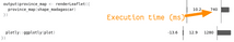
We start by running the application and finding the main issues users face. While the start page loaded quite fast, we noticed that the response was slow when accessing the mapping information and province details, taking up to 15 seconds for the latter.
Visual comparison of the time it takes to load a map. Before and after a major improvement
Our challenge was to improve how this application responds using a quantitative method that is not subjective to what a user feels is acceptable or slow.
Quantitative Approach by Benchmarking Shiny Applications📊
In order to understand the impact of the changes in the code on performance, we used the {shiny.benchmark} approach that uses end2end frontend tests to quantify the performance of the application on each change.
The approach is quite ingenious, it uses automated tests that simulate a user using the application to measure how long they take to complete. Repeating each test multiple times allows the developers to understand how the changes to the code affect the performance.
Setting Up the Shiny Benchmark🏗️
Before fixing the codebase, we needed to make sure that all of the use cases identified manually were being automated in end2end tests. We used the {cypress} framework to expand the test suite to include all the new slow workflows in the application.
The Visualise dashboard didn’t have automated tests, so we created the necessary structure for {cypress}. The tests were variations of the same workflow:
- Load the application
- Interact with it until it displays the required information
- Opening different tabs and waiting for the map to load
- Select a province in the map and wait for the details to load
describe('Performance test', () => {
  it('Load Overview tab Map', () => {
	cy.visit('/');
	cy.get('a[data-tab=overview]').click();

	const provinceSelector = getProvinceSelector(
  	'overview',
  	'#national_overview-general_map'
	);

	const result = cy
  	.get(provinceSelector, { timeout: 10000 })
  	.should('have.length', PROVINCES_LENGTH);
  });
  // … more tests
});
Once the tests were implemented we committed the changes in {git} and could now start working on improving the performance.
Our initial baseline for the worst-performing use case is 15 seconds to load details of the province information. It takes some time to load the map required to click on a given province.
Cypress vs Shinytest2? Which should you choose for your Shiny project?
So we started by profiling the maps’ use cases.
Profiling Shiny Apps In RStudio🐌
Using RStudio profiling tools we can understand the time it takes for the different components of the application to run. The granularity is so small that we can look at each line of code to understand how long it takes to run and track down all the bottlenecks.
To accomplish this, we decided to leverage the testing infrastructure that we had just set up and manually start the Shiny server with the same port as the one being used in the cypress baseUrl configuration.
Then we can start the profiler and run the tests:
After stopping the profiler we get a report that shows two big bottlenecks in the application.
- Two leaflet maps take a long time to render
- ggplotly::ggplotly call to render a mosaic plot on the details
Profiler screenshots of the two slowest lines in the code (that are covered in the tests)
We need to look deeper into the code.
Automating testing ensures reliability, but don’t forget the end user. Project Leader Maria Grycuk shares her experience on the importance of user tests.
Finding Solutions for a Performantive Shiny Application🔎
Starting with the map, we can start by looking at the parameters and data that is being used, in particular the shapes that are used to define the provinces in Madagascar. It is immediately apparent that the complexity of the geographical shapes is slowing down the execution of the application.
How fast can Shiny get?! Speed up R Shiny with this definitive guide.
To solve this, we use a package called {rmapshaper} that simplifies the geographical shapes down to simpler lines. We are not interested in the exact borders of the provinces, as we use this as a method to choose them. The simplest implementation would be a dropdown or a search box, but we believe that choosing from the map is the most intuitive solution.
library(shiny.benchmark)

# Commits to compare (tags)
type <- "cypress"
commit_list <- c("legacy", "module_server", "simplified_shapes", "ggplotly")
dir <- file.path("js", "cypress")
n_rep <- 2

# run performance check using Cypress
out <- shiny.benchmark::benchmark(
  commit_list, cypress_dir = dir, n_rep = n_rep
)

summary(out)
plot(out)
The Effect
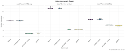
This solution immediately cuts the loading time drastically for each of the maps that are being displayed. According to {shiny.benchmark} with 10 different observations, we see a drop in 2, 4, and 8 seconds for 3 different maps.
The figure below shows how long each of the commits takes to run the e2e tests. We can observe that the commit with the tag “simplified_shapes” drastically improves the performance of the application.
Impact of the different commits on how long each e2e test takes to load the map, click on a province, and access the details
When running in the browser manually it feels that there’s no delay when rendering the map. The first figure in the article shows a real-world example.
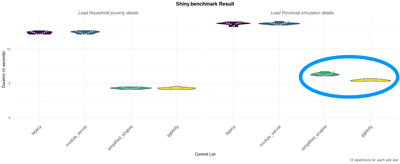
Converting the “ggplotly” call into a native {echarts4r} minimized the second bottleneck, reducing the display time for the details of the provinces by 1 or 2 seconds. The legacy “ggplotly” would create a ggplot2 object and then convert it to “plotly” and it wasn’t efficient. This fix observed with “ggplotly” commit tag is enough to be noticeable, but the impact is much smaller than the first fix.
Impact of the different commits on how long each e2e test takes to fully load the maps
Concluding shiny.benchmark for Finding Solutions to Improve App Performance🪡
{shiny.benchmark} provides an analytical tool to assess the performance impact in the development of a shiny application. When coupled with CI it becomes an essential tool that can evaluate if there was a regression in terms of performance.
Keep a look for a future article in the Appsilon blog where we integrate it in a Github action that fails if performance is much worse than the previous release.
Scaling and Infrastructure – Why is your Shiny app slow?
Contact Us

Get Updates
Subscribe to Shiny Weekly Newsletter
Join 4000+ Shiny enthusiasts to see the latest Shiny news from the R community.
