Share
Share Tweet
Tweet Share
Share
Goodbye Complicated Dropdowns: Welcome to the New Era of Human Readable Filters

09 January 2024
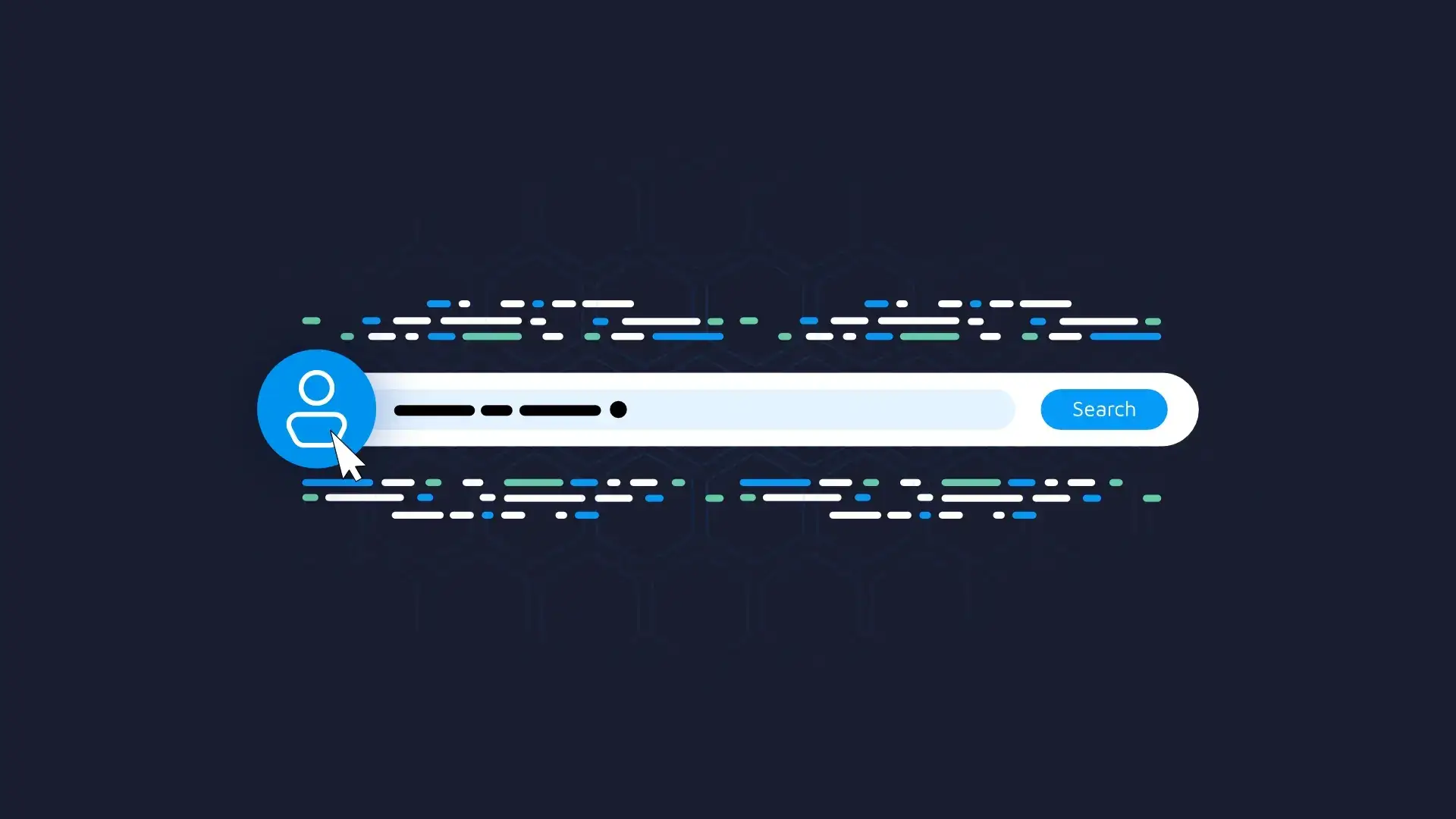
Have you ever tried to book a flight and found yourself overwhelmed by the endless dropdown menus? You’re not alone. We’ve all been there, clicking through multiple options, often unsure of what to choose. Not to mention, their placement is often inconsistent across different sites, which makes it hard to get accustomed to a single UX design choice.
Enter Human Readable Filters. Put simply, they’re here not to fully replace traditional filtering options, but to significantly simplify interaction and enhance the user experience. In other words, they allow you to replace confusing dropdowns with simple and clear sentences that you can adjust as easily as you speak.
Do people struggle to get used to your app? Here are 7 steps to design R Shiny dashboards that people will love.
Table of Contents
- What’s Wrong with Traditional Website Filters?
- Human Readable Filters – A Solution That Speaks to You in Your Language
- More Advantages of Filters in a Natural Language
- Summing up Human Readable Filters
What’s Wrong with Traditional Website Filters?
Just to reiterate once more – Human Readable Filters aren’t here to fully replace traditional filters. They are still valuable, but getting less so by the day.
The reason? We have a few:
- Complexity: The problem with traditional search filters is that they’re often intricate and have numerous options and categories to choose from. As an end-user, you might find it challenging to find the information you need, especially if it’s your first time visiting the website.
- Placement: The position of website filters depends on their quantity and variability, but you’ll mostly find them positioned either on the sides or at the top of the screen. The problem with that is they consume a significant portion of the website’s content. Designers and developers often address this by hiding filters behind buttons or in sliding panels, but this only complicates their accessibility and interaction. If you need to tweak the filters frequently, it’s an even bigger issue!
- Lack of consistency: The problem with websites is that everyone thinks their UI/UX implementation is the best. It isn’t. Traditional search filters often don’t have a consistent or standardized appearance between applications and websites. For you as an end-user, this means an extra step in understanding where to find the filter parameters and how to use them.
In short, all of these 3 issues have a common denominator: the time users invest in the search process.
Everyone knows that the best user experience can be represented as the shortest route from point A to point B, as shown in the following image:
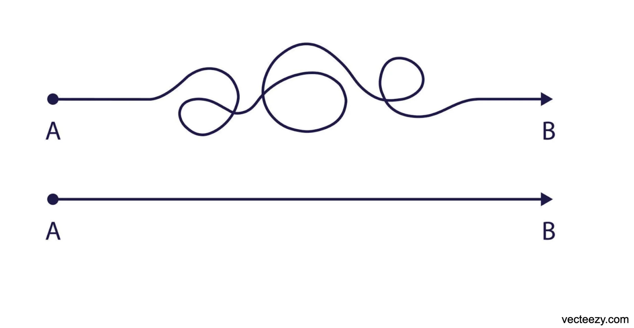
Image 1 – Suboptimal (top) and optimal (bottom) user experience
But still, most websites fail to implement this “straight line” user experience. Poorly designed filters represent a big portion of the top curvy line, so next, we’ll explore what you can do about it.
Human Readable Filters – A Solution That Speaks to You in Your Language
By now, you know the shortcomings of traditional filtering systems on websites, and this section will introduce you to Filters 2.0, or Human Readable Filters.
If you skim through Jacob Nielsen’s 10 Usability Heuristics for User Interface Design, you’ll find that the second principle tells us that the system should “speak” to the user in their language. That’s the main idea behind Human Readable Filters.
In a conversational language, a “search query” would be a single sentence with a set of specific conditionals. Typically, this is a logical sequence arranged by priority. This single sentence should be sufficient to convey the user’s position to the listener.
So, what does this mean to you? Put simply, you arrive at the idea of wrapping the query system into a single human-readable sentence, like the one below:

Image 2 – Human readable filter example
Each blue and underlined piece of text is interactive and opens up a filter dialog when clicked (or pressed) on.
Let’s dive into the anatomy to really drive the point home.
Anatomy of Human Readable Filters
Every Filter 2.0 starts with a Call to action. You can think of it as the beginning of the sentence that helps to form a query, similar to real-life conversations.
In the example below, the call to action is the free state at the beginning of the sentence:
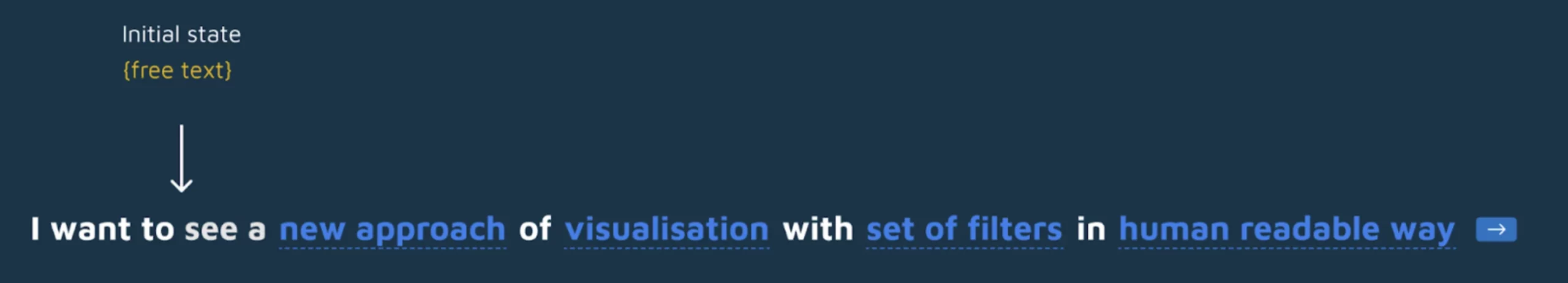
Image 3 – Call to action
Up next, we have one or more Conditions. These are 1:1 replicas of your familiar filters, just represented in a sentence. Clicking on each reveals a set of options every condition might have.
You can represent conditionals with a single select, multi-select, search bar (in a single or multi-select), date/time picker, range, counter, and so on:
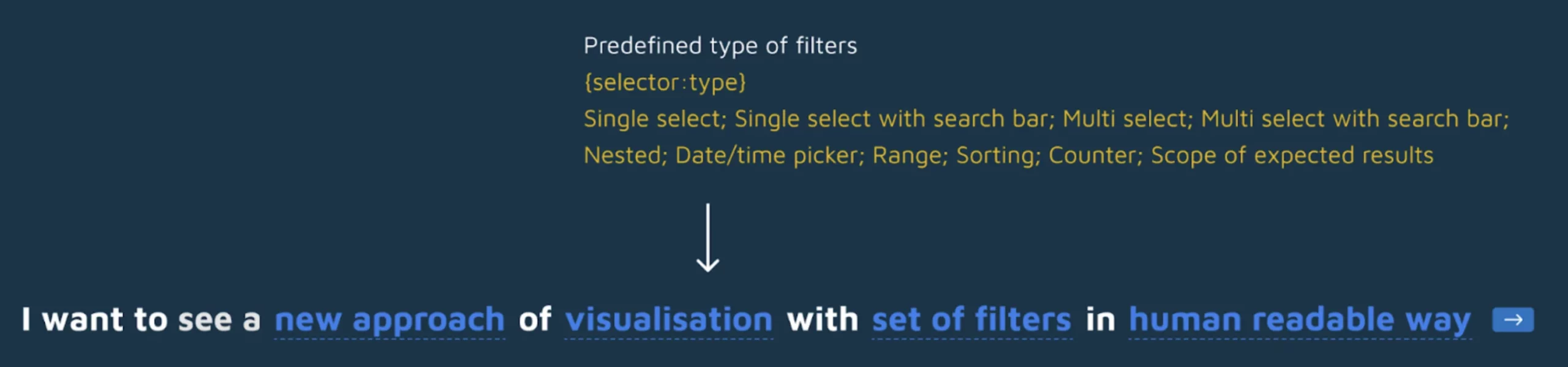
Image 4 – Condition
Then you have prepositions which aren’t dynamic at all, but are used simply to link conditions. Think of the words such as Any, Of, At, All, By, For, In, With, To, Since, Until, and similar:
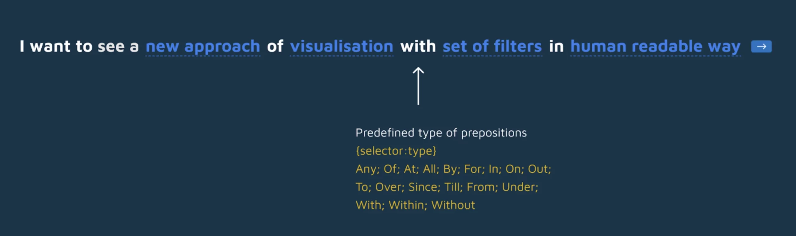
Image 5 – Preposition
These are the must-have components of Human Readable Filters. If you’re wondering how they look in a real-world example, continue reading.
Human Readable Filters Example – Flight Aggregator
Imagine your typical flight aggregator page. You typically need to enter information such as from and to destination, departure date and time, return date and time, passenger class, and the number of people for which you want to buy a ticket.
In a traditional (Filter 1.0) world, that webpage system could look like this:
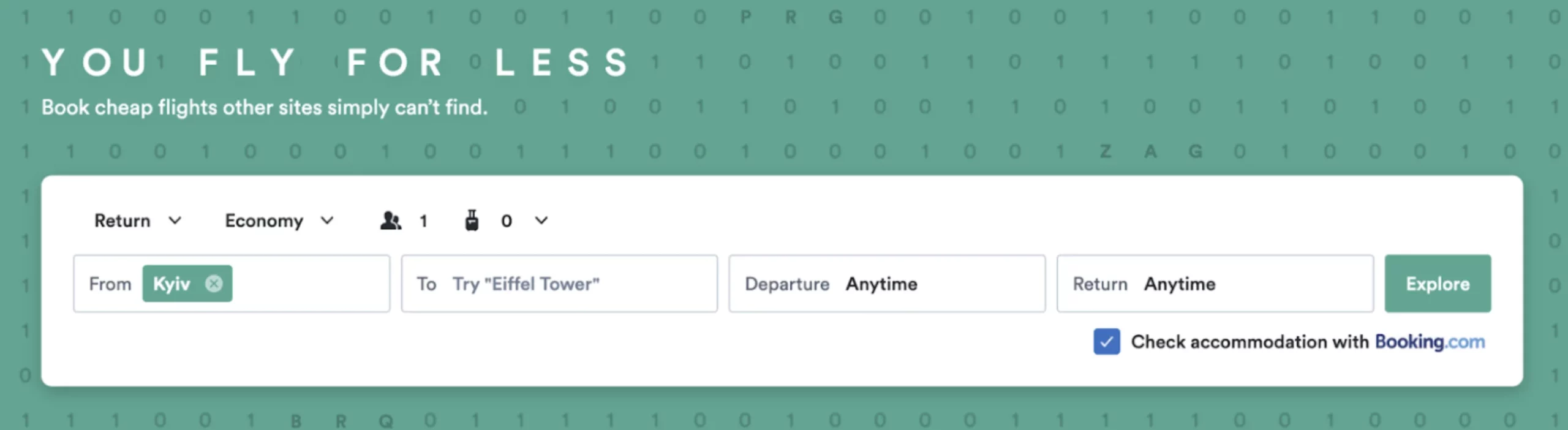
Image 6 – Flight aggregator example without human readable filters
It looks fine on a desktop version of the site, but the mobile version might hide these filters behind a button or somewhere else on the page.
Human Readable Filters (Filters 2.0) exchange all of that for a simple natural language text that can be modified:
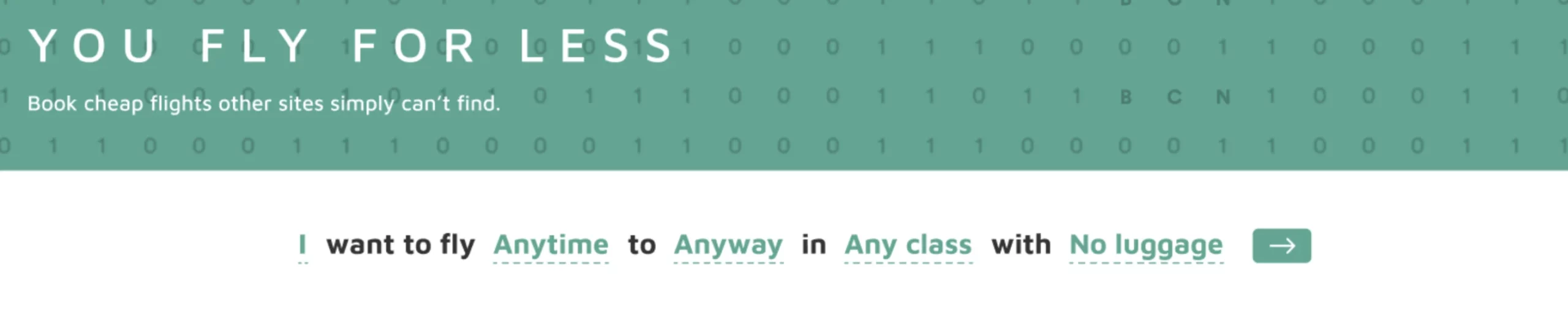
Image 7 – Flight aggregator example with human readable filters
Here, you see everything we described in the previous section – call to action, conditions, and prepositions.
The first condition requires you to specify who is flying. You can select the number of passengers based on their age group, as shown below:
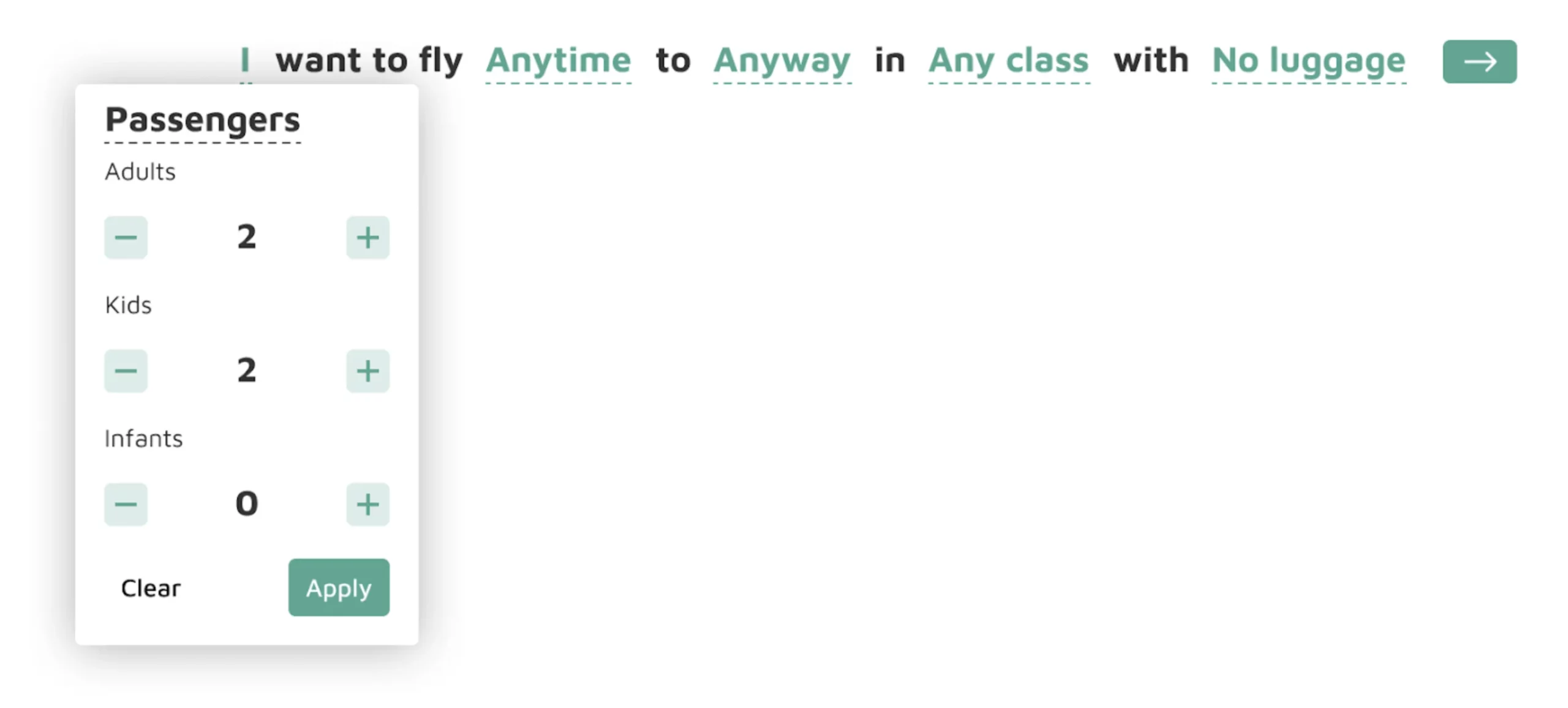
Image 8 – Single filter example (1)
Immediately after you select your option, the natural text of the condition will change to form a fluent and short sentence.
The preposition to connects us to the next filter which is a date/time picker. This one will specify when are you flying:
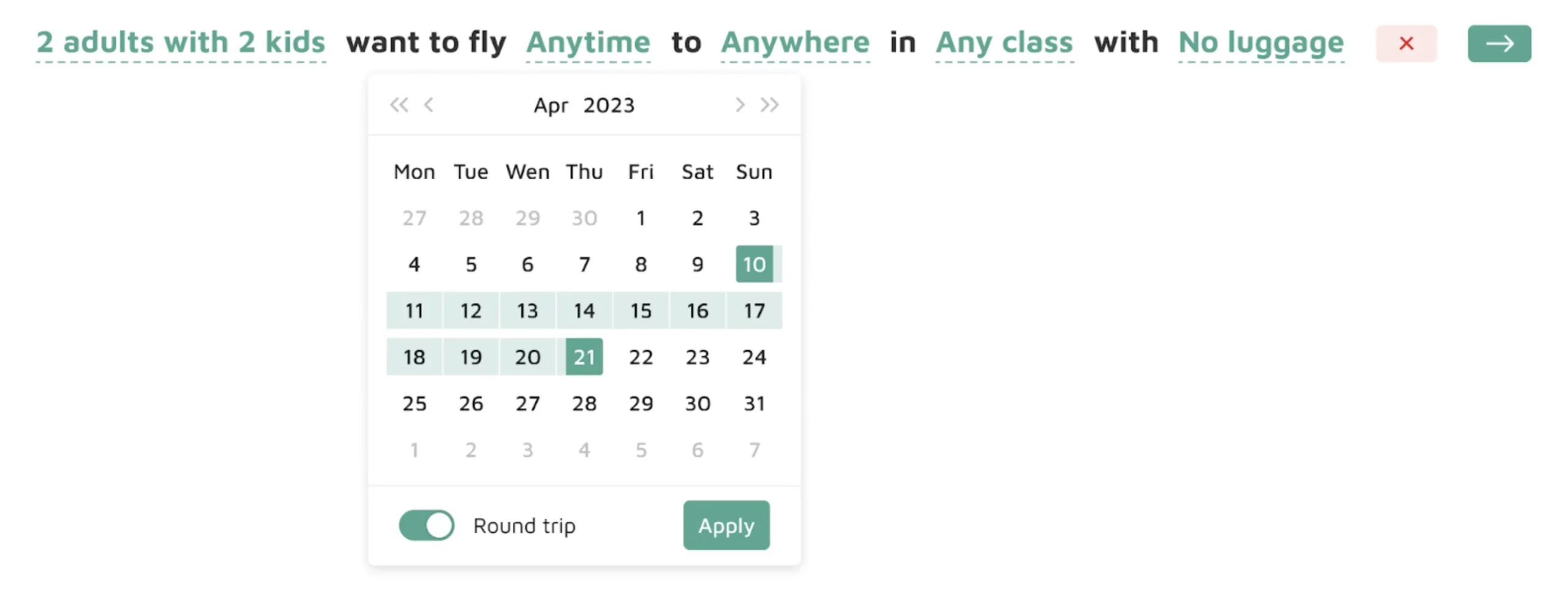
Image 9 – Single filter example (2)
After the following preposition, we arrive at the double single select with the search bar condition. This one will make you specify where you are flying in a simple and convenient way. Note that you might want to separate From and To into two filters, or you can leave them as is:
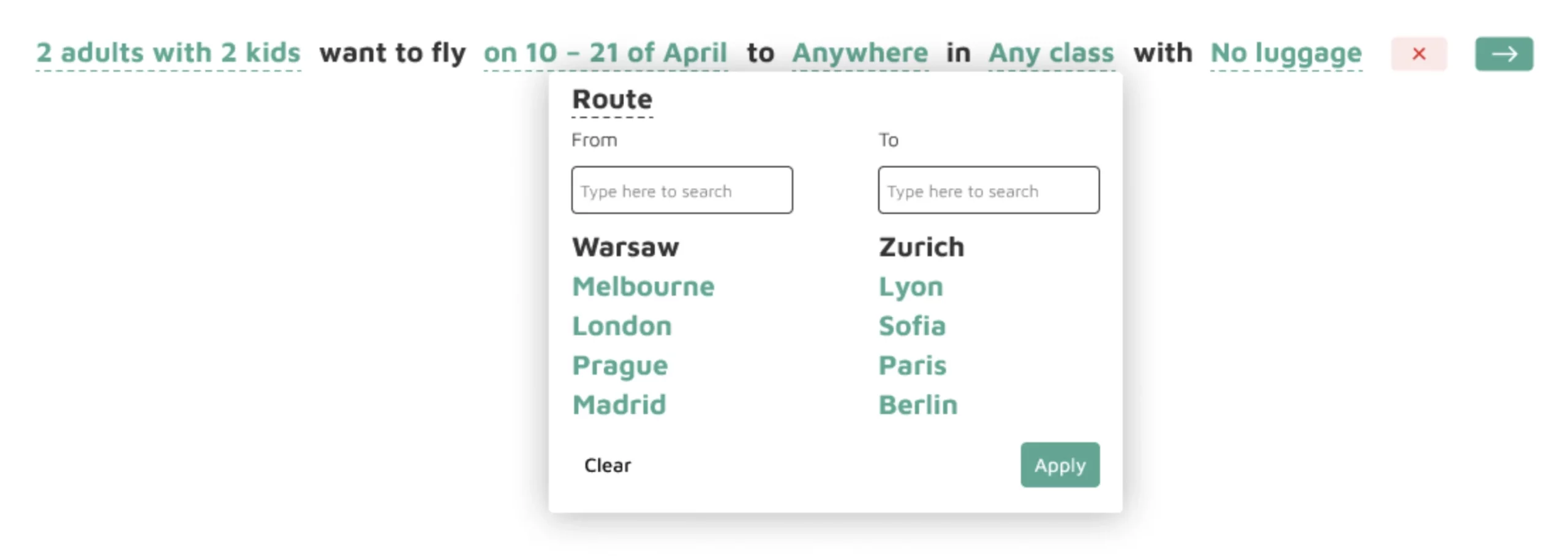
Image 10 – Single filter example (3)
Almost done! The second to last condition is the simplest one so far – you only need to choose the class for your flight:
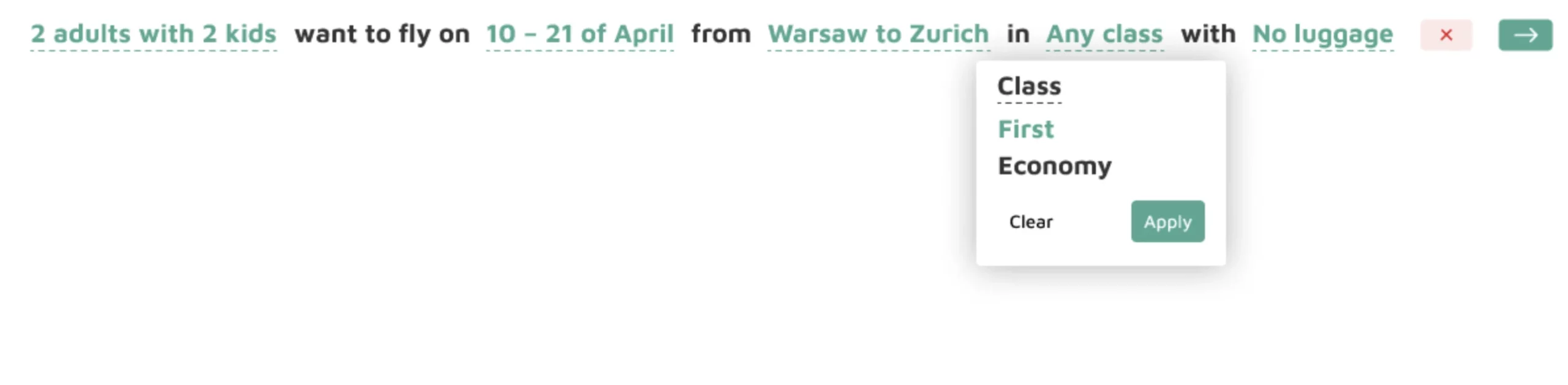
Image 11 – Single filter example (4)
The final condition lets you increase or decrease the amount of luggage you’re taking with you, which is an additional and optional filter:
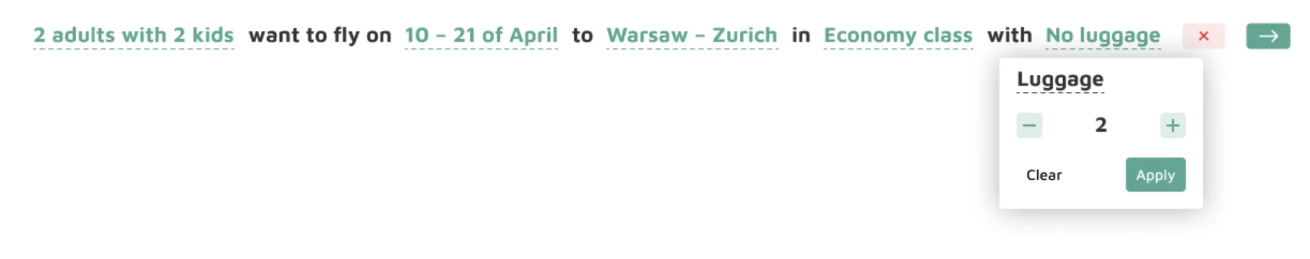
Image 12 – Single filter example (5)
From here, you can either press the green arrow button to display the available flight options, or you can click on the red circle to reset the filters, and bring the sentence to its initial state.
Let’s say you opt for the first option. The frontend will then communicate with the backend to fetch results based on your search criteria, and during this time you’re shown a nice skeleton loading screen (which has nothing to do with Human Readable Filters):
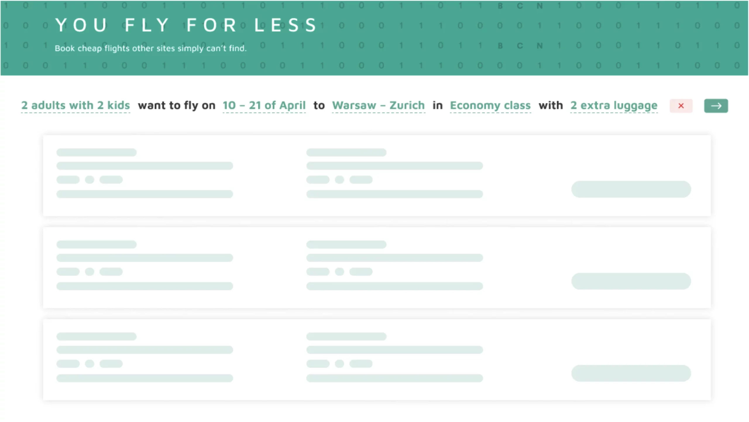
Image 13 – Final results
To conclude, Human Readable Filters allow you to implement everything the traditional approach has to offer, but with a nicer and more consistent user experience.
Remember This Before Using Human Readable Filters
If you need more practical examples, this video shows you how it’s done on a real dataset:
To finish off this section, you need to remember that you always must have your end user in mind.
You should construct a sentence as long as it makes sense, or as long as it follows a natural structure. That’s the entire purpose of this refined approach to filtering.
Also, remember that the key to successfully implementing Filters 2.0 in your webpage lies in a good understanding of your user. This will allow you to build a sentence structure that’s easy for your target user to follow.
More Advantages of Filters in a Natural Language
You’ve seen what a huge milestone Filters 2.0 is when compared to traditional filtering systems – both in theory and through hands-on examples.
This section aims to provide a couple of more reasons why natural language in search results filtering is the way to go in 2024 and beyond:
- Simplicity and Accessibility: Natural language filters reduce interaction complexity and make the search process intuitive, accessible, and even fun to all kinds of users – even those who aren’t tech-savvy.
- Efficiency and Speed: A single natural language string means the users can quickly express their preferences without the need to learn a multitude of complex filters, which in the end improves efficiency and reduces search time.
- Flexibility and Variability: The Filters 2.0 approach allows users to dynamically change the applied filters during query formulation. In return, this provides flexibility and extensive possibilities for combining conditions.
- Increased Engagement: Natural text is intuitive so it contributes to increased user engagement. It also encourages users to explore the data on their own and discover new opportunities.
- Competitive Advantage: If your organization is among the first to implement Filters 2.0, it will gain a competitive edge by being among the pioneers of simplifying and enhancing the search process.
Today’s article was crammed with information and examples, but we hope it was easy enough to follow. Let’s make a quick recap next.
Summing up Human Readable Filters
To sum things up – the entire point of Filters 2.0 isn’t only to fix the problems we had, but also to set a stage for making websites and applications better for users, supercharging efficiency, and giving us a leg up against the competition.
That’s why we’ll share two interesting resources with you:
- Human Readable Fitlers in Action – A simple Shiny application (with code) that allows you to visualize the difference between traditional filters and Filters 2.0.
- Appsilon Natural Language Queries GitHub Repo – So you can download the source code and take it for a spin.
As a final note, Filters 2.0 isn’t just about solving issues, but more generally about updating our whole vibe and making things awesome for the users, all while staying ahead in the game.
Make sure to try them out for yourself, and let us know what you think.
Did you find this helpful? Contact us today to explore how we can upgrade the user experience of your Shiny apps.
Contact Us

Head of Sales

Get Updates
Subscribe to Shiny Weekly Newsletter
Join 4000+ Shiny enthusiasts to see the latest Shiny news from the R community.