

 Share
Share Tweet
Tweet Share
Share


5 Ways R Programming and R Shiny Can Improve Your Business Workflows

24 May 2023
It doesn’t take a data scientist to use R – that’s the point we’ll prove in today’s article. If you’re an experienced Excel user, you’ve likely run into some hard limitations, or find the tool confusing and sluggish when working with large datasets. That’s not the case with programming languages, as the recommended next step from Excel is to use R programming to improve business workflows.
Today we’ll show you just what we mean by that. No advanced R knowledge is mandatory, but it would help if you have R and RStudio installed, and if you’re familiar with basic programming and statistics.
We’ll start lightly by downloading and exploring a ~ 1.5 GB dataset, manipulating it with R, doing some advanced data cleaning, training a machine learning model, generating a markdown report, and even training a machine learning model. There’s even a bonus section at the end in which we’ll use ChatGPT to generate some R code. It’s a pretty packed article, so let’s cut the introduction section short.
Already have some experience in R programming? Here’s a couple of best practices for durable R code.
Table of contents:
- Improve Business Workflows by Efficiently Manipulating Large Datasets
- Advanced Data Cleaning and Preprocessing Techniques for improving Business Workflows with R
- R Programming for Machine Learning – Build Predictive Models
- Generate High-Quality R Markdown Reports with Quarto
- Improve Data Communication Workflow with R Shiny
- Bonus: Can ChatGPT Help You Use R Programming to Improve Business Workflows?
- Summary
Improve Business Workflows by Efficiently Manipulating Large Datasets
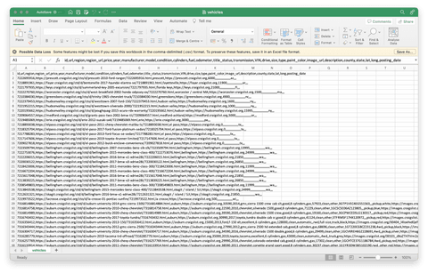
Excel has a hard limit when rendering a workbook – it’s 10 MB by default, and 2 GB maximum. In short, it’s not a platform you should use when working with big datasets. Speaking of, we’ll use the Used Cars Dataset from Kaggle throughout the article.
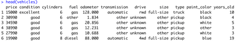
It contains every used vehicle entry within the United States on Craigslist. It’s a lot of cars, to put it mildly, as the dataset alone is close to 1.5 GB in size. Excel takes some time to read it even on modern hardware (M1 Pro MacBook Pro), but opens the file successfully:
Image 1 – Vehicles dataset opened in Excel
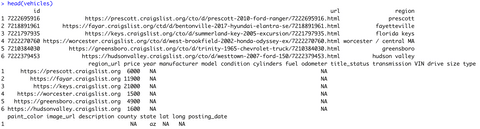
Now, working on this dataset in Excel is a whole different animal. You’re far better off with R. Here’s the code snippet you can use to read a CSV file and display the first six rows:
vehicles <- read.csv("path/to/the/dataset.csv")
head(vehicles)
Here’s the output you should see:
Image 2 – Vehicles dataset loaded in R
It’s full of things we need and doesn’t need, so let’s start by trimming the selection down a bit.
Selecting Columns
We don’t need the information on URLs, listing IDs, VIN, images, detailed descriptions, and locations for this article. We’ll only keep a handful of attributes, which will make the workflow more easier and manageable.
R’s dplyr package comes to a rescue here. You can use it to perform all sorts of data manipulations and summarizations, as you’ll see throughout the article. An additional benefit of R is the wide range of open-source packages and package ecosystems that support R development. If you’re looking for something specific, chances are there’s a package for that, so there’s no need to reinvent the wheel!
Appsilon even has its own ecosystem of packages, ‘Rhinoverse‘, to build Shiny dashboards and handle data.
The code snippet below imports the package and subsets the dataset, so only the columns of interest are kept:
#install and load the package
install.packages("dplyr")
library(dplyr)

#keep only the columns desired
keep_cols <- c(
  "price", "year", "manufacturer", "condition", "cylinders",
  "fuel", "odometer", "transmission", "drive", "size", "type",
  "paint_color", "state"
)
vehicles <- vehicles %>%
  select(all_of(keep_cols))

head(vehicles)
The dataset is now much easier to grasp:
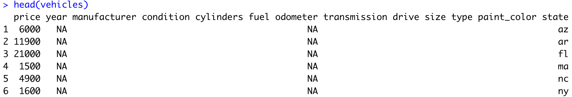
Image 3 – Excluding unnecessary attributes
It’s full of missing values, but we’ll address that a bit later. Let’s dive deeper into the exploration first.
New to R dplyr? We have a easy-to-follow guide for complete beginners.
Exploring Possible Attribute Values
Oftentimes when working with datasets, you want to know if an attribute is discrete (either A or B), or continuous (an infinite range of possible values). The n_distinct() function returns the number of unique elements of an attribute, which sounds like the perfect solution.
We don’t want to apply it manually for each attribute, so opting for the R’s sapply() function is a good way to automate this step:
sapply(vehicles, function(x) n_distinct(x))
Image 4 – Number of unique elements per attribute
The dataset spans many years (115) and consists of mostly discrete values. Price and Odometer are perfect examples of a continuous variable since there’s an infinite range of possible options.
Let’s use this knowledge to calculate some summary statistics next.
Calculating Summary Statistics
Summary statistics provide an answer to a single question, such as “How does the price vary by the car paint color” or “What’s the average car price per year”. They are used to summarize a huge dataset into a small tibble (table) anyone can understand and interpret. You’ll see a couple of examples in this section, so let’s start with the first one.
In this example, we want to find out the price statistics for each distinct car color. We’ll show the minimum, maximum, mean, and median prices, which will give us a clearer picture than one metric alone:
vehicles %>%
  group_by(paint_color) %>%
  summarise(
    min_price = min(price),
    mean_price = mean(price),
    median_price = median(price),
    max_price = max(price)
  )
Here are the results:
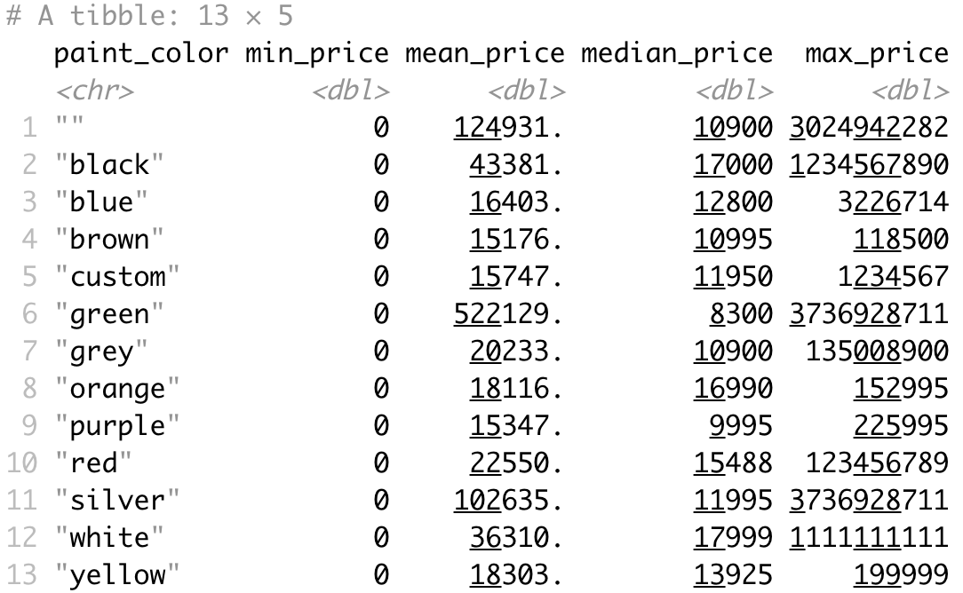
Image 5 – Car price analysis by car color
The median is by far the most representable metric here. It shows the 50th percentile, or the middle price when the price list is sorted in ascending order. It looks like white and black cars take the lead, with orange taking a strong third position. On the other hand, green and purple cars have the lowest median price. There are some missing values in this attribute, indicated by the "" value. We’ll address them later.
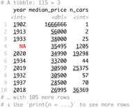
Next, let’s analyze the median price by the manufactured year; we will arrange the data by scending median price. We’ll also include the number of cars for each year, so we can know how representative the numbers are:
vehicles %>%
  group_by(year) %>%
  summarise(
    median_price = median(price), .groups = "drop",
    n_cars = n()
  ) %>%
  arrange(desc(median_price))
Image 6 – Car median price by year
Cars from 1902 are ridiculously expensive – but there’s only one car on the listing. On a dataset this large, you typically want a sample of at least a few thousand to make representative conclusions.
Finally, let’s analyze the prices by the odometer state. The odometer variable is continuous, so we’ll have to bin it into a couple of groups first, using the bin_data function from the mltools package. Here, we’ll also exclude missing values:
install.packages("mltools")
library(mltools)

vehicles %>%
  mutate(isna = is.na(odometer) | odometer == "") %>%
#You can also try 'filter(!isna)' if you prefer
  filter(isna == FALSE) %>%
  mutate(odometer_group = bin_data(odometer, bins = 10, binType = "quantile")) %>%
  select(odometer_group, price) %>%
  group_by(odometer_group) %>%
  summarise(
    median_price = median(price),
    n_cars = n()
  )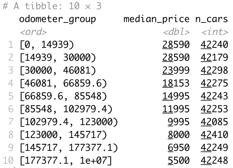
Image 7 – Car median price by the odometer state group
There’s more or less the same number of cars in each group, which is excellent. You can conclude that the median price goes down as the odometer goes up. It’s logical, after all.
Basic Data Visualization
Effective data visualization is the best approach to communicating your findings with non-tech-savvy folk. It’s also a top recommendation for improving business workflows with R programming.
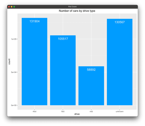
The first visualization you’ll make displays a bar chart of the number of cars by drive type. There are some missing values, so we’ll fill them with “unknown” for the time being. That’s all done in the first portion of the code snippet. The second part is all about producing a bar chart with ggplot2 R package. The visualization also includes the text of Y values inside the bars, which is a recommended practice to eliminate guesswork from your charts, especially when values are this high:
library(ggplot2)

df_vehicles_drive <- vehicles %>%
  group_by(drive) %>%
  summarise(count = n()) %>%
  mutate(drive = ifelse(is.na(drive) | drive == "", "unknown", drive))

ggplot(df_vehicles_drive, aes(x = drive, y = count)) +
  geom_col(fill = "#0099f9") +
  geom_text(aes(label = count), vjust = 2, size = 5, color = "#ffffff") +
  labs(title = "Number of cars by drive type") +
  theme(plot.title = element_text(hjust = 0.5))
Image 8 – Number of cars by drive type bar chart
The minority of cars in this dataset have rear-wheel-drive, which is understandable. Most manufacturers opt for front-wheel-drive or 4WD. There’s a significant amount of unknown values, so keep that in mind when drawing conclusions.
Horizontal, vertical, stacked, and grouped bar charts – When and how to use each one.
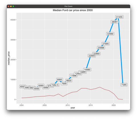
Let’s now make a more interesting visualization. We’ll keep only the records where the manufacturer is Ford and where the manufacture year is 2000 or later. The visualization will display two lines – the blue line shows the median sale price by the year, and the red line represents the total number of cars listed for the given year.
There’s some manual work if you want to include the labels on the blue line, but nothing you can’t figure out from the code snippet below:
df_vehicles_ford <- vehicles %>%
  filter(manufacturer == "ford", year >= 2000) %>%
  select(year, price) %>%
  group_by(year) %>%
  summarise(
    median_price = median(price),
    count = n()
  )

ggplot(df_vehicles_ford, aes(x = year, y = median_price)) +
  geom_line(color = "#0099f9", linewidth = 2) +
  geom_line(aes(y = count), color = "#880808", linewidth = 1, alpha = 0.5) +
  geom_point(color = "#0099f9", size = 5) +
  geom_text(check_overlap = TRUE) +
  geom_label(
    aes(label = median_price),
    nudge_x = 0.25,
    nudge_y = 0.25,
  ) +
  labs(title = "Median Ford car price since 2000") +
  theme(plot.title = element_text(hjust = 0.5))
Image 9 – Median car price for Ford since 2000 line chart
There’s been a huge drop in the last year, but that’s due to not many cars listed for sale – understandable for newer models. Cars typically tend to be more expensive the newer they are, which follows real-world logic. It’s also valuable to say there are $7000 differences between 2014 and 2015 cars, which is significant considering they’re only a year apart.
For more practice with line charts, try placing the number of cars on a separate y-axis; to learn how, explore the R Graph Gallery’s tutorial. If you’d like to level up your line chart skills with ggplot2, try our ggplot2 line chart guide.
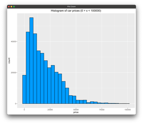
Finally, let’s plot a histogram of prices. We’ll limit the price range to go from 0 to 100000 USD, and we’ll also exclude missing values.
Wait, what exactly is a Histogram? Read our detailed guide on making stunning histograms with ggplot2.
Histogram will show a more detailed distribution representation, and is a must-know data visualization type when working with continuous data:
df_vehicles_hist <- vehicles %>%
  mutate(isna = is.na(price) | price == "") %>%
  filter(isna == FALSE) %>%
  filter(price > 0 & price < 100000) %>%
  select(price)

ggplot(df_vehicles_hist, aes(price)) +
  geom_histogram(color = "#000000", fill = "#0099F8") +
  labs(title = "Histogram of car prices (0 > x < 100000)") +
  theme(plot.title = element_text(hjust = 0.5))
Image 10 – Histogram of car prices with the price limit
The good news – the distribution is skewed, which means there are cheaper cars available than expensive ones. We’ve deliberately excluded cars priced above $100000 because there’s only a handful of them, and they would skew the distribution even further.
If you’re eager to learn more about data visualization, start with these two articles:
Advanced Data Cleaning and Preprocessing Techniques for improving Business Workflows with R
Take a moment to pause and think what’s the biggest problem we’ve seen so far. Thoughts? It’s the problem of missing values. They are everywhere in the dataset, and it’s your job as a data professional to handle them. We’ll first explore where the missing values are most common and then we’ll go over a couple of imputation methods.
This section will also show you the basics of feature engineering, so make sure to keep reading until the end.
Missing Value Exploration
Credits for charts in this and the following section go to jenslaufer.com blog.
Before imputing missing values, we have to know where they are and what’s the most likely reason they’re missing. Doing so involves some manual work in R. We want to produce a nice-looking visual representing the portion of data missing and available for every dataset column that contains missing values.
The first portion of the snippet uses dplyr to extract this information, and the second portion plots the data as a horizontal collection of “progress bars”. Here we’ll introduce tidyr – a powerful tool for data wrangling and.. tidying. Whether you need to separate variables, spread values across columns, or gather scattered data into a tidy format, tidyr provides intuitive functions to simplify the process:
install.packages("tidyr")
library(tidyr)

missing_values <- vehicles %>%
#In lieu of 'gather' you can also try 'pivot_longer'
#pivot_longer(
#names(vehicles),
#values_transform = as.character,
#names_to = "key", values_to = "val")
  gather(key = "key", value = "val") %>%
  mutate(isna = is.na(val) | val == "") %>%
  group_by(key) %>%
  mutate(total = n()) %>%
  group_by(key, total, isna) %>%
  summarise(num.isna = n()) %>%
  mutate(pct = num.isna / total * 100)

levels <- (missing_values %>% filter(isna == T) %>% arrange(desc(pct))pull(key)

percentage_plot <- missing_values %>%
  ggplot() +
  geom_bar(
    aes(
      x = reorder(key, desc(pct)),
      y = pct, fill = isna
    ),
    stat = "identity", alpha = 0.8
  ) +
  scale_x_discrete(limits = levels) +
  scale_fill_manual(
    name = "",
    values = c("steelblue", "tomato3"), labels = c("Present", "Missing")
  ) +
  coord_flip() +
  labs(
    title = "Percentage of missing values", x =
      "Variable", y = "% of missing values"
  )

percentage_plot
Here’s what it looks like:
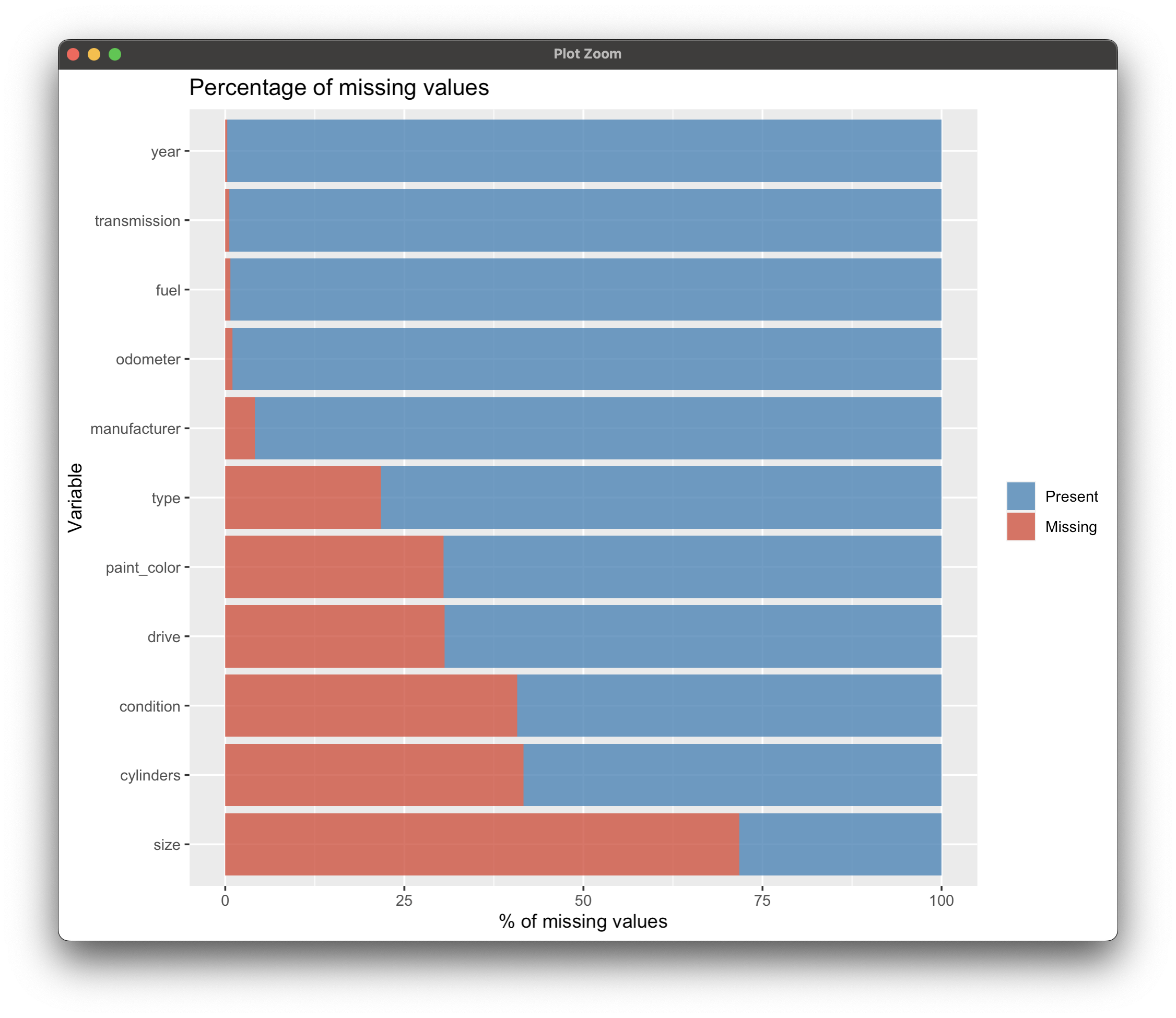
Image 11 – Percentages of missing values by attribute
Considering the size of the dataset, this is a whole lot of missing values. Some we can just drop, and some we’ll have to impute.
Missing Value Imputation
The way you impute missing values highly depends on domain knowledge. For example, in the telco industry, maybe the value is missing because the customer isn’t using the given service, hence it makes no sense to impute it with zero or an average value. It’s important to know the domain well for real business problems, especially if you want to use R programming for business workflow improvement.
At Appsilon, we aren’t experts in cars, but we’ll give it our best shot. Based on Image 11, here’s what we’re gonna do for each attribute:
condition– Replace missing with “good”cylinders– Impute with “6 cylinders”drive– Fill with “unknown”fuelandyear– Remove missing values since there aren’t many of themodometer– Impute with the median valuepaint_color,size,transmission, andtype– Fill missing values with “other”
If you prefer code over words, here’s everything you have to do:
# Replace empty strings with NA
vehicles[vehicles == ""] <- NA

# Handle categorical variables
vehicles <- vehicles %>%
  mutate(
    condition = replace_na(condition, "good"),
    cylinders = replace_na(cylinders, "6 cylinders"),
    drive = replace_na(drive, "unknown")
  ) %>%
# For the selected columns, replace the missing value of each column with other
  mutate(across(c("paint_color", "size", "transmission", "type"),
    .fns = ~replace_na(.x, "other")
  ))

# Handle continuous variable "odometer" - replacing with median
vehicles|>
# Remove other missing ("fuel" and "year")
  mutate(
    odometer = replace_na(odometer, median(vehicles$odometer, na.rm = TRUE))
  )
That’s it! Let’s now check if the imputation was successful with a similar code snippet as in the previous subsection:
missing_values_2 <- vehicles %>%
  gather(key = "key", value = "val") %>%
  mutate(is.missing = is.na(val)) %>%
  group_by(key, is.missing) %>%
  summarise(num.missing = n()) %>%
  filter(is.missing) %>%
  select(-is.missing) %>%
  arrange(desc(num.missing))

missing_values_2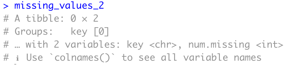
Image 12 – Missing values after imputation
As you can see, there are no more missing values, which means we can mark our job here as done. Let’s proceed with some basic feature engineering.
More on missing data imputation – Here are top 3 ways to impute missing values in R.
Feature Engineering
Now, feature engineering is closely tied to machine learning. Long story short, you want to create new features that you hope will have more predictive power than the current ones. Once again, this is closely related to domain knowledge. The more you know about some field, the more you know what’s important both for analysis and predictive performance.
We’ll make only a handful of transformations in this section. The first one boils down to subsetting the dataset (only keeping Ford cars) and deriving a new column years_old, calculated as 2023 - year. After creating this new attribute, we’ll remove the manufacturer and year info, but also the listing state since we won’t need it anymore:
vehicles <- vehicles %>%
  filter(manufacturer == "ford") %>%
  mutate(years_old = 2023 - year) %>%
  select(-c("manufacturer", "year", "state"))
The next transformation boils down to converting a string value to a numeric one. The cylinders column currently has string values, e.g., “6 cylinders” and we want to convert it to the number 6.
Some missing values might be introduced in the process, so it’s a good idea to call drop_na() after the transformation:
vehicles <- vehicles |>
  mutate(
    cylinders = as.numeric(gsub(" cylinders", "", cylinders))
  )
vehicles <- vehicles %>%
  drop_na()
Finally, we’ll divide the odometer number by 1000, just to bring the range of continuous variables closer:
vehicles <- vehicles %>%
  mutate(odometer = odometer / 1000)

head(vehicles)
All in all, here’s what the dataset looks like after feature engineering:
Image 13 – Dataset after basic feature engineering
We can now proceed to the next section in which you’ll learn how to improve business workflows with R programming by training a machine learning model.
Data cleaning always takes time – But considerably less if you know how to do it properly.
R Programming for Machine Learning – Build Predictive Models
This section will teach you how to go from a clean dataset to a machine learning model. You’ll learn the basics that go into dataset transformation for machine learning, such as creating dummy variables, data scaling, train/test split, and also how to evaluate machine learning models by examining feature importance and performance metrics.
Create Dummy Variables
Machine learning models typically require some sort of special treatment for categorical variables. For example, the drive column has four possible values, abbreviated as “FWD”, “RWD”, “4WD”, and “unknown”. You could convert these strings to numbers – 1, 2, 3, and 4, but what does that mean for the inter-variable relationship? Is 2 twice as better as 1? Well, no, at least not when comparing car drive types.
These are distinct categories, and one isn’t better than the other. For that reason, we have to encode them with dummy variables. These will create as many new columns as there are distinct categories in the variable, and a column will have a value of 1 if the type matches or 0 otherwise.
We’ll further subset the selection of attributes for machine learning, followed by the creation of dummy variables (using fastDummies) for categorical attributes:
install.packages("fastDummies")
library(fastDummies)

vehicles_ml <- vehicles %>%
  select(c("price", "condition", "fuel", "odometer", "transmission", "drive", "years_old"))

vehicles_ml <- dummy_cols(vehicles_ml, select_columns = c("condition", "fuel", "transmission", "drive")) %>%
  select(-c("condition", "fuel", "transmission", "drive"))

head(vehicles_ml)
The dataset will have much more columns now:

Image 14 – Dataset with dummy variables
Categorical features are now either 0 or 1, but continuous features are not. We’ll deal with them shortly.
Finalizing Data for Predictive Modeling
Before scaling continuous features, let’s make our lives a bit easier by building a model only for cars with a price between $1000 and $100000. This will take extremes outside the equation, and we’ll have a more stable model overall. Sure, you won’t be able to use the model to predict the prices of luxury cars, so keep that in mind:
vehicles_ml <- vehicles_ml %>%
  filter(price >= 1000 & price < 100000)
vehicles_ml <- unique(vehicles_ml)

head(vehicles_ml)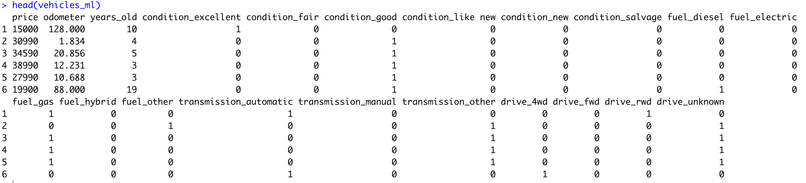
Image 15 – Dataset with prices in a range
The dataset looks identical to Image 14, but that’s only because there were no extreme data points in the first six rows.
Data Scaling
Now let’s discuss the scaling of the continuous features. The categorical ones are in the range of [0, 1], so it makes sense to stick to that range. MinMax scaler is a perfect candidate for the job.
The {caret} package is a comprehensive toolkit for building and evaluating predictive models. It simplifies the process of training, tuning, and evaluating models. With {caret}, you can easily switch between different algorithms, handle preprocessing tasks, and perform cross-validation.
MinMax scaling, also known as Min-Max normalization, is a data preprocessing technique used to rescale numerical features within a specific range. It transforms the data so that the minimum value becomes 0 and the maximum value becomes 1, while preserving the relative distances between other data points. The MinMax scaler in {caret} is a function that applies this scaling transformation to your data, ensuring that all features are on a similar scale and preventing any single feature from dominating:
install.packages("caret")
library(caret)

preproc <- preProcess(vehicles_ml[, c(2, 3)], method = c("range"))
scaled <- predict(preproc, vehicles_ml[, c(2, 3)])

vehicles_ml$odometer <- scaled$odometer
vehicles_ml$years_old <- scaled$years_old

head(vehicles_ml)
Here’s what the dataset looks like now:
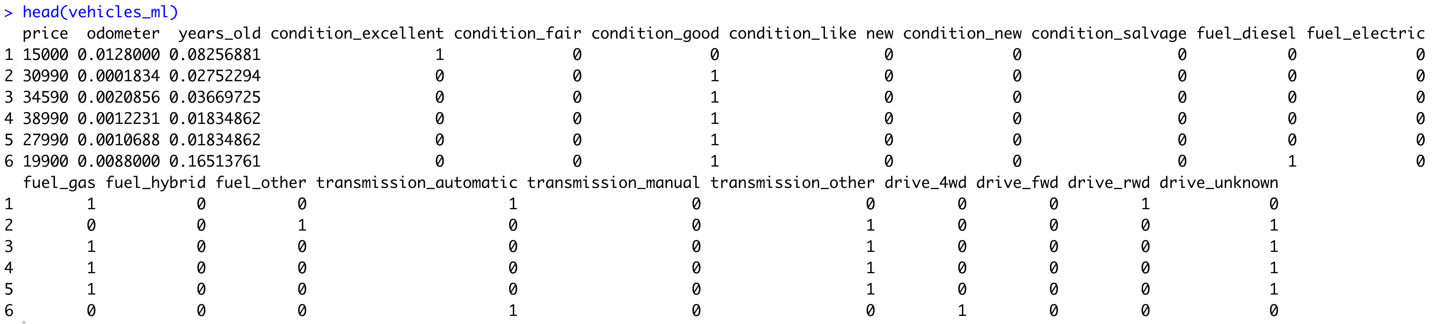
All of the features are now in a range of [0, 1]. You might be wondering – What about the price? Well, it’s not a feature, it’s a target variable, meaning we won’t use it as a feature in a machine learning model. More on that shortly.
Train/Test Split
Train/test split refers to a process of splitting the dataset into two parts. The first one will be used to train a machine learning model, and the second to evaluate it. Doing both on the same dataset is a terrible practice and can lead to misleading results.
A common approach is to use 80% of the dataset for training, and 20% for testing, but the ratio may vary depending on the dataset size. The more data you have available, the less you have to put in the testing set, percentage-wise.
The caTools R package allows you to do this split easily. It’s a good idea to set the random seed to a constant value, especially if you plan to repeat the experiment sometime later:
library(caTools)

set.seed(42)

sample <- sample.split(vehicles_ml$price, SplitRatio = 0.8)
train <- subset(vehicles_ml, sample == TRUE)
test <- subset(vehicles_ml, sample == FALSE)

print(dim(train))
print(dim(test))
Image 17 – Dimensionality of training and testing datasets
Keep in mind – this is the dimensionality of a cleaned dataset, free of missing values, and limited to Ford vehicles manufactured after 2000 and priced between $1000 and $100000. It’s a small sample, sure, but it will be suitable enough for a predictive model.
Training a Machine Learning Model
Machine learning models are a great way to leverage R programming for business workflow improvement. You’ll now build one based on a decision tree algorithm.
It boils down to a single line of code – rpart(<name_of_target_variable> ~ ., data = train, method = "anova"). The dot in the equation means you want to use all features to predict the target variable, and Anova instructs the package to build a regression model (prediction of a continuous variable).
The code snippet below trains the model on the train set and plots the decision tree:
library(rpart)
library(rpart.plot)

model_dt <- rpart(price ~ ., data = train, method = "anova")
rpart.plot(model_dt)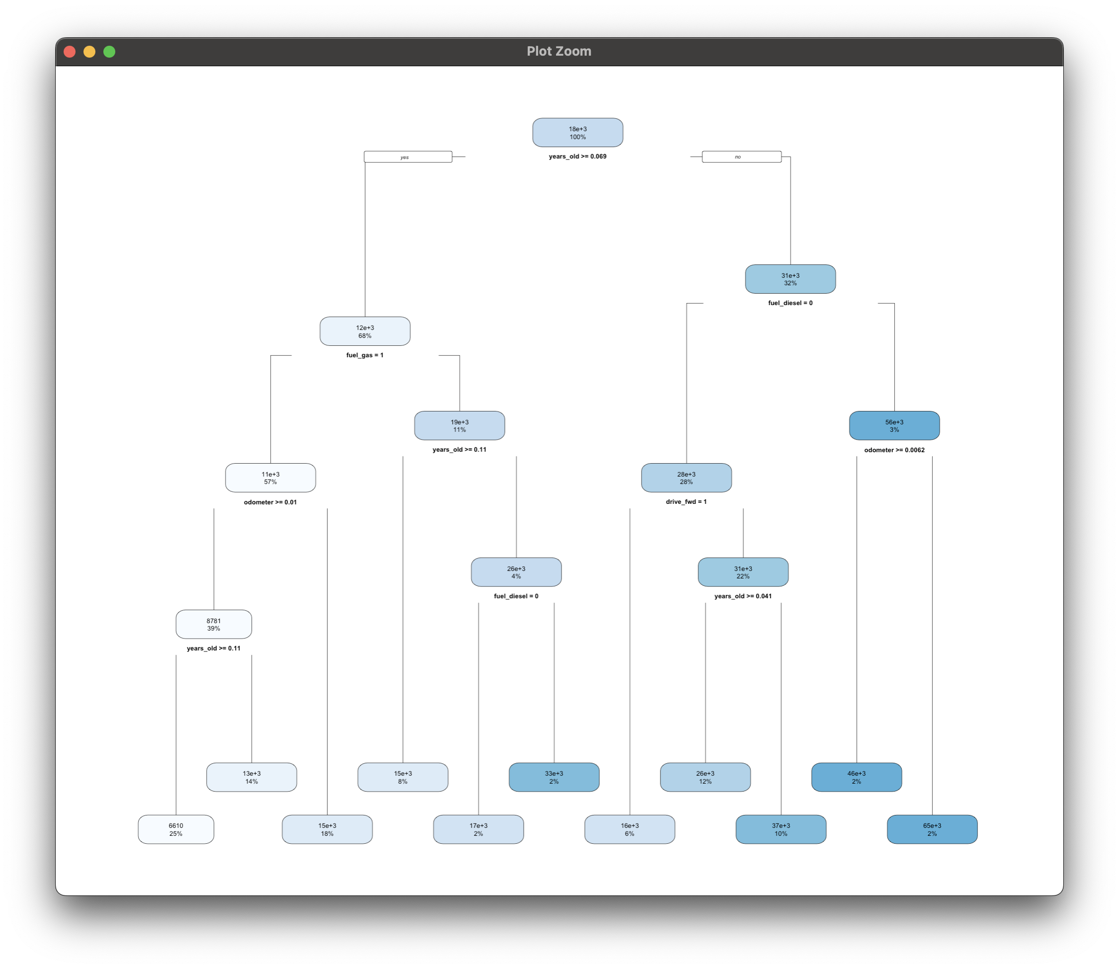
Image 18 – Decision tree model structure
Think of this as a learned set of if-else statements. You don’t have to supply the conditions, these are figured out automatically for you based on the data provided.
Up next, we’ll evaluate this model.
Do you know what goes into building a decision tree model? Our from-scratch guide will teach you the basics.
Evaluating a Machine Learning Model
There are a lot of ways to evaluate a machine learning model, but we’ll cover only two in this section – via feature importance and performance metrics.
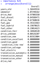
Feature importances won’t technically evaluate the model, but they’ll give you a relative representation of which features have the most impact on the model’s predictive power. Here’s how to calculate them based on a decision tree model:
#Note that varImp comes from the previously used {caret}
importances <- varImp(model_dt)
importances %>%
  arrange(desc(Overall))
Image 19 – Decision tree feature importance
As it turns out, the age of the car and its mileage have the most impact on price. It’s a reasonable assumption, the older the car is and the more it’s traveled, the less it will generally sell for. Some of the features are completely irrelevant for prediction, so you might rethink excluding them altogether.
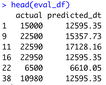
The best way to evaluate a machine learning model is by examining performance metrics on the test set. We’ll calculate predictions on the test set, and then compare them to the actual values:
predictions_dt <- predict(model_dt, test)

eval_df <- data.frame(
  actual = test$price,
  predicted_dt = predictions_dt
)
head(eval_df)
Image 20 – Actual vs. predicted values
The values are off, sure, but follow the general trend.
If you want to quantify how off the model is on average, look no further than the Root Mean Squared Error (RMSE) metric. In our case it will display how many thousands of dollars the model differs from the true value on average:
sqrt(mean((eval_df$actual - eval_df$predicted_dt)^2))Image 21 – Decision tree root mean squared error
Around $9000 – not too bad for a couple of minutes of work. This means our decision tree model is on average wrong by $8928.18 in its prediction. Including some additional features and spending more time on data preparation/feature engineering is likely to decrease RMSE and give you a better, more stable model.
Want to consider Python for machine learning? Read our beginners guide to PyTorch.
Generate High-Quality R Markdown Reports with Quarto
Reports are everywhere, and making custom ones tailored to your needs is easier said than done. That’s where R programming comes in, and it transforms your business workflow for the better.
R Quarto is a next-gen version of R Markdown and is used to create high-quality articles, reports, presentations, PDFs, books, Word documents, ePubs, and websites. This section will stick to reports exported as PDF documents.
To get started, you’ll first have to install R Quarto for your OS and restart RStudio. Once done, you can proceed to the following section.
Create a Quarto Document
Creating Quarto documents is as easy as clicking on File – New File – Quarto Document. A modal window like this one will appear:
Image 22 – Creating a new R Quarto document
Make sure to add a title and author info to the document, and change the other settings as you see fit. Once done, click on the “Create” button to create a QMD document.
Quarto R Markdown – Writing a Document
If you know Markdown, Quarto will feel right at home. If not, well, the learning curve isn’t steep, and you can easily remember the basics in a day. This Basic syntax guide contains everything you’ll ever need for markdown.
In this section, we’ll copy some of the analyses and visualizations from the previous section. If you don’t feel like typing, paste the following into the QMD file (but keep the top identification section as is):
---
title: "Quarto Document"
author: "Dario Radečić / Appsilon"
format: pdf
editor: visual
---
```{r setup, include=FALSE}
knitr::opts_chunk$set(warning = FALSE, message = FALSE)
```

## Vehicles Dataset Exploration

-   Download the dataset from [this link](https://www.kaggle.com/datasets/austinreese/craigslist-carstrucks-data)
-   A 1.45 GB CSV file containing many features on used car data (Craigslist)
-   This document demonstrates some basic exploration and visualization

## Introduction to the Dataset

Let's load the used car dataset and keep ony a couple of columns:

```{r}
library(dplyr)

vehicles <- read.csv("/Users/dradecic/Downloads/vehicles.csv")
keep_cols <- c(
  "price", "year", "manufacturer", "odometer", "type", "paint_color", "state"
)
vehicles <- vehicles %>%
  select(all_of(keep_cols))
```

And now let's see what the dataset looks like:

```{r}
sample_n(vehicles, 10)
```

## Calculations

Price analysis by paint color:

```{r}
vehicles %>%
  group_by(paint_color) %>%
  summarise(
    min_price = min(price),
    mean_price = mean(price),
    median_price = median(price),
    max_price = max(price)
  )
```

Median car price by odometer:

```{r}
library(mltools)

vehicles %>%
  mutate(isna = is.na(odometer) | odometer == "") %>%
  filter(isna == FALSE) %>%
  mutate(odometer_group = bin_data(odometer, bins = 10, binType = "quantile")) %>%
  select(odometer_group, price) %>%
  group_by(odometer_group) %>%
  summarise(
    median_price = median(price),
    n_cars = n()
  )
```

## Visualizations

Median Ford price by year since 2000:

```{r}
library(ggplot2)

df_vehicles_ford <- vehicles %>%
  filter(manufacturer == "ford", year >= 2000) %>%
  select(year, price) %>%
  group_by(year) %>%
  summarise(
    median_price = median(price),
    count = n()
  )

ggplot(df_vehicles_ford, aes(x = year, y = median_price)) +
  geom_line(color = "#0099f9", linewidth = 2) +
  geom_line(aes(y = count), color = "#880808", linewidth = 1, alpha = 0.5) +
  geom_point(color = "#0099f9", size = 5) +
  geom_text(check_overlap = TRUE) +
  geom_label( aes(label = median_price), nudge_x = 0.25, nudge_y = 0.25, ) +
  labs(title = "Median Ford car price since 2000") +
  theme(plot.title = element_text(hjust = 0.5))
```
Car price distribution for vehicles priced between 0 and 100000 USD:
```{r}
library(ggplot2)

df_vehicles_hist <- vehicles %>%
  mutate(isna = is.na(price) | price == "") %>%
  filter(isna == FALSE) %>%
  filter(price > 0 & price < 100000) %>%
  select(price)

ggplot(df_vehicles_hist, aes(price)) +
  geom_histogram(color = "#000000", fill = "#0099F8") +
  labs(title = "Histogram of car prices (0 > x < 100000)") +
  theme(plot.title = element_text(hjust = 0.5))
```
You’ll need to change the dataset path, of course, but other than that you’re good to go. The code snippet toward the top of the document probably requires some additional explanation, though:
```{r setup, include=FALSE}
knitr::opts_chunk$set(warning = FALSE, message = FALSE)
```
Put simply, it’s here to prevent Quarto from rendering R warning messages and R messages in general. Nobody wants these in their reports after all, so make sure to include it in every Quarto document.
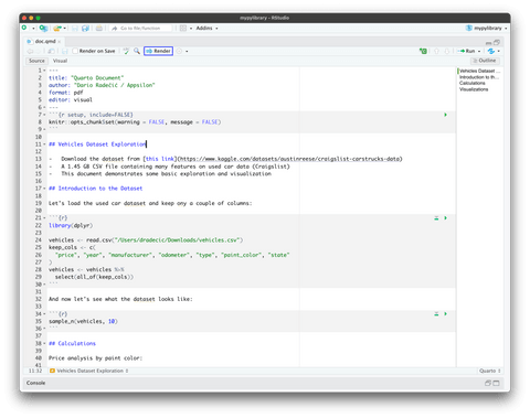
The finalized QMD file should look like this:
Image 23 – Final QMD file
With that out of the way, let’s discuss rendering.
Rendering an R Quarto Markdown Document
Our goal is to save the rendered version of a Quarto Markdown file as a PDF document. To do so, just hit the “Render” button that was highlighted in Image 23. You’ll see some console output, and the PDF document will be saved to the source file location shortly after.
Here’s what it looks like on our end:
Image 24 – Rendered R Quarto PDF document
And that’s it regarding R Quarto for improving business workflows with custom reports. Finally, let’s discuss Shiny before wrapping up this article.
Want to learn more about Quarto? Here’s an in-depth article to follow.
Improve Data Communication Workflow with R Shiny
We’re big fans of R Shiny at Appsilon, and we genuinely think it’s a go-to way to improve business workflows with R programming. After all, if a photo (chart) is worth 1000 words, then a custom dashboard is worth 1000 photos. That’s where Shiny chimes in, as a de-facto standard approach for building apps and dashboards straight from R.
Our task here is simple – we need an app that can be shared across teams/departments and shows the following car data:
- Summary statistics by manufacturer – Min, mean, median, and max price
- Sample data – A sample of 10 rows from the dataset rendered as a table
- Price distribution chart – A histogram we made earlier
- Price distribution by odometer group chart – A bar chart showing median prices by odometer group (summary statistic from before)
- Price movement over time – Line chart showing price trends
Let’s start with the UI.
Building the R Shiny App UI
Okay, so what do we need from the controls? The user will be able to select a manufacturer from a list of two (Ford and Chevrolet), and on a manufacturer change, the entire dashboard data will be refreshed. You’re free to add additional input controls, such as year and price limitation, so consider this a homework assignment.
The df object will be shared through the dashboard. It has the dataset loaded in only the manufacturer, year, price, and odometer columns kept.
The UI consists of a Sidebar Layout, with the UI controls on the sidebar on the left, and the main content (tables and charts) on the right:
library(shiny)
library(dplyr)
library(tidyr)
library(mltools)
library(ggplot2)
library(kableExtra)
options(scipen = 999)


df <- read.csv("/Users/dradecic/Downloads/vehicles.csv") %>%
  select(c("manufacturer", "year", "price", "odometer"))


ui <- fluidPage(
  sidebarLayout(
    sidebarPanel(
      tags$h3("Used Cars Dataset Exploration"),
      tags$a("Dataset source", href = "https://www.kaggle.com/datasets/austinreese/craigslist-carstrucks-data"),
      tags$hr(),
      selectInput(inputId = "manufacturer_select", label = "Manufacturer", choices = c("ford", "chevrolet"), selected = "ford")
    ),
    mainPanel(
      tags$h4("Data from the year 2000, price between 1000 and 100000 USD"),
      tags$hr(),

      # Summary statistics
      tags$div(
        uiOutput(outputId = "summary_stats")
      ),

      # Table data sample
      tags$div(
        tags$h4("Used car price data overview"),
        tableOutput(outputId = "sample_data_table"),
        class = "div-card"
      ),

      # Price distribution
      tags$div(
        tags$h4("Histogram of car prices"),
        plotOutput(outputId = "plot_prices_hist"),
        class = "div-card"
      ),

      # Price by odometer group
      tags$div(
        tags$h4("Median price by odometer group"),
        plotOutput(outputId = "plot_price_odometer"),
        class = "div-card"
      ),

      # Price over time
      tags$div(
        tags$h4("Median price by year"),
        plotOutput(outputId = "plot_price_over_time"),
        class = "div-card"
      )
    )
  )
)
Pretty much all elements are wrapped in div elements and assigned a CSS class property because we’ll add some styles later on. Feel free to remove them if you don’t want to tweak the visuals.
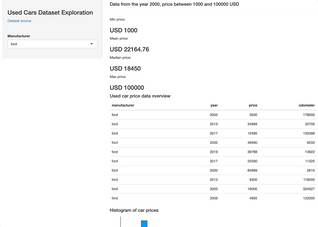
Either way here’s what the dashboard looks like now, without the server logic:
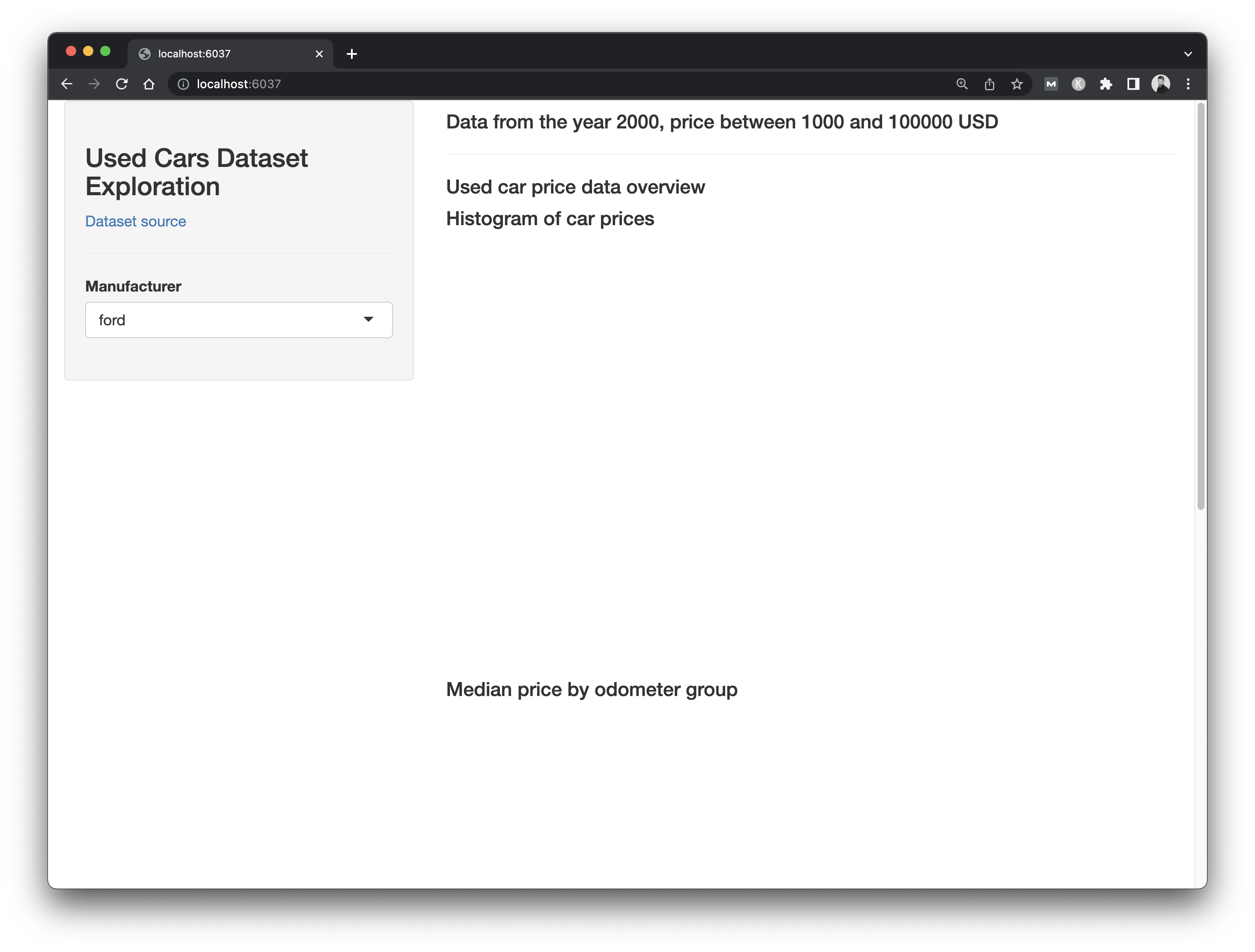
Image 25 – Shiny app UI
The basis is here, we just need to add the logic. Let’s do that next.
Don’t like how the table data looks? Here are some alternative packages you can use in R and R Shiny.
Building the R Shiny Server Logic
The server logic in Shiny will take care of rendering the correct data and making sure the correct data is shown when the user makes changes to the input fields. There are quite a bit of things we need to take care of, the most important one being the data itself.
The server data object is a reactive value filtered with the currently selected manufacturer, plus some hardcoded filter you’re familiar with from before.
Programming logic for each UI element is written in sections below the data declaration. We’re sure you’ll recognize most of it from the previous article sections:
server <- function(input, output) {
  data <- reactive({
    df %>%
      filter(manufacturer == input$manufacturer_select & year >= 2000 & price >= 1000 & price <= 100000) })

# Summary statistics
output$summary_stats <- renderUI({ price_stats <- data() %>%
      summarise(
        min_price = round(min(price), 2),
        mean_price = round(mean(price), 2),
        median_price = round(median(price), 2),
        max_price = round(max(price), 2)
      )

    tags$div(
      tags$div(p("Min price:"), h3(paste("USD", price_stats$min_price)), class = "summary-stats-card"),
      tags$div(p("Mean price:"), h3(paste("USD", price_stats$mean_price)), class = "summary-stats-card"),
      tags$div(p("Median price:"), h3(paste("USD", price_stats$median_price)), class = "summary-stats-card"),
      tags$div(p("Max price:"), h3(paste("USD", price_stats$max_price)), class = "summary-stats-card"),
      class = "summary-stats-container"
    )
  })

  # Table data sample
  output$sample_data_table <- reactive({
    sample_n(data(), 10) %>%
      kbl() %>%
      kable_material() %>%
      kable_styling(bootstrap_options = c("striped", "hover"))
  })

  # Price distribution
  output$plot_prices_hist <- renderPlot({
    ggplot(data(), aes(price)) +
      geom_histogram(color = "#000000", fill = "#0099F8") +
      theme_classic()
  })

  # Price by odometer group
  output$plot_price_odometer <- renderPlot({
    odometer_group_data <- data() %>%
      mutate(odometer_group = bin_data(odometer, bins = 10, binType = "quantile")) %>%
      select(odometer_group, price) %>%
      group_by(odometer_group) %>%
      summarise(
        median_price = median(price)
      )

    ggplot(odometer_group_data, aes(x = odometer_group, y = median_price)) +
      geom_col(fill = "#0099f9") +
      geom_text(aes(label = median_price), vjust = 2, size = 5, color = "#ffffff") +
      labs(
        x = "Odometer group",
        y = "Median price (USD)"
      ) +
      theme_classic()
  })

  # Price over time
  output$plot_price_over_time <- renderPlot({
    price_data <- data() %>%
      select(year, price) %>%
      group_by(year) %>%
      summarise(
        median_price = median(price),
        count = n()
      )

    ggplot(price_data, aes(x = year, y = median_price)) +
      geom_line(color = "#0099f9", linewidth = 2) +
      geom_line(aes(y = count), color = "#880808", linewidth = 1, alpha = 0.5) +
      geom_point(color = "#0099f9", size = 5) +
      geom_text(check_overlap = TRUE) +
      geom_label(
        aes(label = median_price),
        nudge_x = 0.25,
        nudge_y = 0.25,
      ) +
      labs(
        x = "Year",
        y = "Median price (USD)"
      ) +
      theme(plot.title = element_text(hjust = 0.5)) +
      theme_classic()
  })
}


shinyApp(ui = ui, server = server)
Let’s launch the app and see what it looks like:
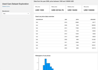
Image 26 – R Shiny application
Overall, it’s nothing fancy (yet) but perfectly demonstrates what R Shiny is capable of. Add a couple more filters (year, odometer, drive type, color) and you’re golden. It all boils down to adding a couple of UI elements and including their selected values in data reactive value filter conditions.
Did you know Shiny is also available for Python? Here are some key differences when compared to R.
Next, let’s work on CSS styles.
Styling R Shiny Applications
R Shiny allows you to easily add styles, either directly to the R file or to an external CSS file. We’ll opt for the latter option, and recommend you to go with it as well.
Create a www directory right where your Shiny app source R script is, and inside create a style.css file. Next, add the following code in UI in between fluidPage() and sidebarLayout():
tags$head(
  tags$link(rel = "stylesheet", type = "text/css", href = "style.css")
),
#If you have trouble making the styling work with 'tags$link' try 'includeCSS("www/style.css")
This makes R Shiny aware of the CSS file, so the only thing left to do is to add some styles to style.css. This should do:
body {
  background-color: #f2f2f2;
}

.summary-stats-container {
  display: flex;
  justify-content: space-between;
  gap: 1rem;
}

.summary-stats-card {
  background-color: #ffffff;
  padding: 1rem 2rem;
  border-radius: 5px;
  width: 100%;
}

.div-card {
  width: 100%;
  margin-top: 2rem;
  background-color: #ffffff;
  padding: 1rem 2rem;
  border-radius: 5px;
}
Run your app again and you’ll see the following:
Image 27 – Styled R Shiny application
Once again, it’s nothing fancy, but perfectly demonstrates how you can tweak your Shiny apps with only 20-something lines of CSS.
That wraps up the R programming business workflow portion of the article. Up next, we’ll explore if artificial intelligence can assist you if you get stuck writing R code.
Looking for Shiny app inspiration? Take a look at these 5 agriculture examples.
Bonus: Can ChatGPT Help You Use R Programming to Improve Business Workflows?
ChatGPT or Chat Generative Pre-trained Transformer is a neural-network-powered chatbot developed by OpenAI. It created a lot of hype since its launch in November 2022 and for a good reason – it can write computer programs better than some developers. It’s not limited to coding, of course, it can handle music composing, writing essays, and even passing a Bar exam.
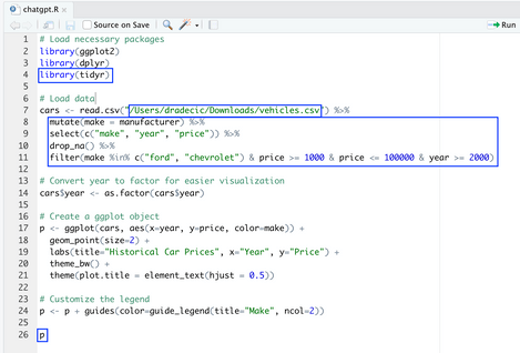
Does this mean it can help you write R code? Well, let’s see. We’ve asked ChatGPT to write an R script for visualizing historical car prices with ggplot2. Keep in mind that ChatGPT isn’t aware of our dataset nor of the attributes it contains.
Here’s what we got back:
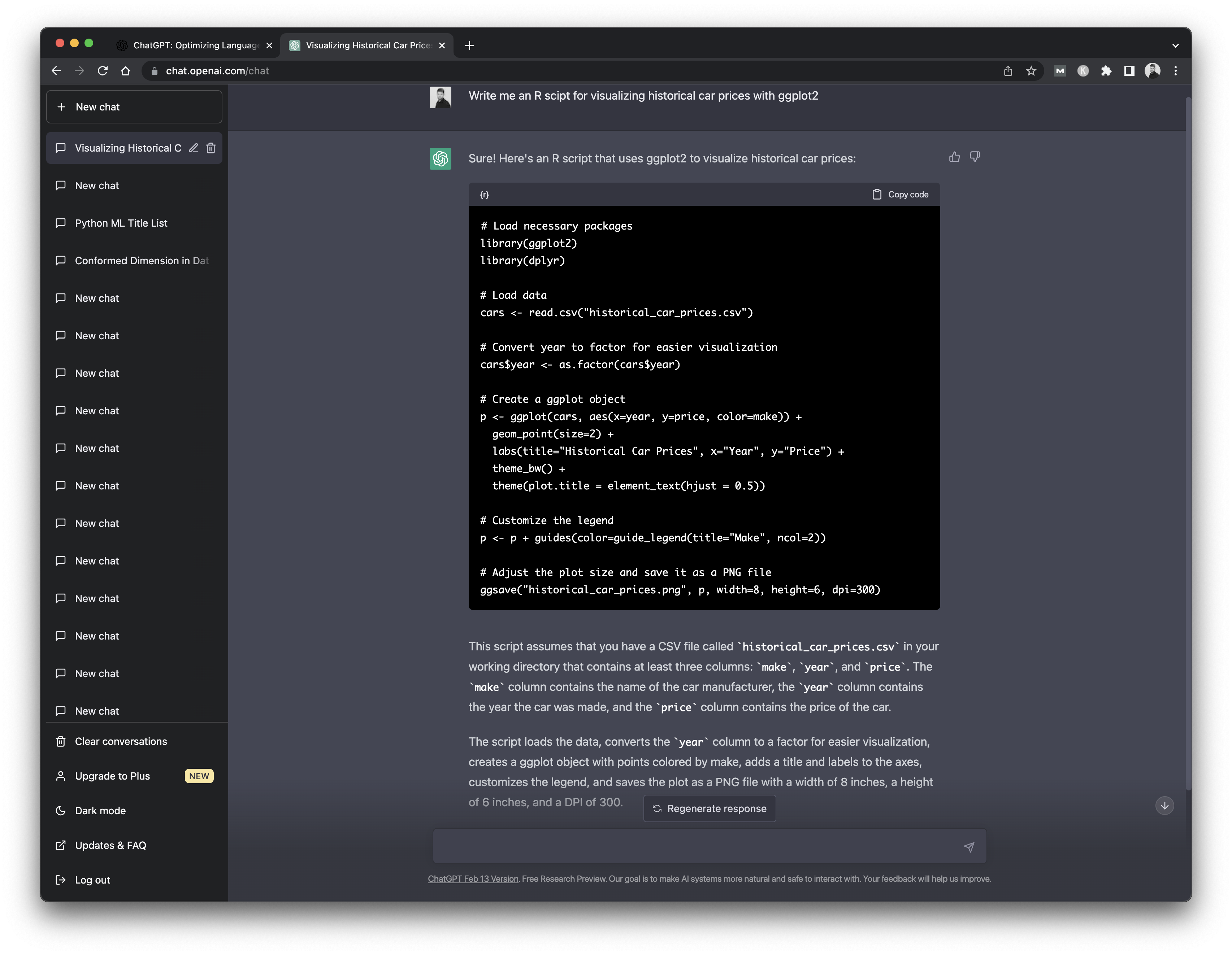
Image 28 – ChatGPT output
This is interesting. In addition to the code, ChatGPT also provides a set of instructions and assumptions. For example, here it assumed we have a CSV file called historical_car_prices.csv and that it contains make, year, and price attributes.
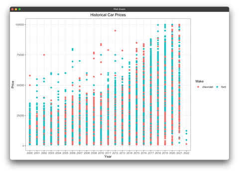
It’s not 100% identical to our dataset, so we’ll have to make minor changes. The chart code generated by ChatGPT will make a scatter plot grouped by every car brand. It’s too messy for our dataset, so we’ll filter some out. The same thing with the year attribute.
The following image highlights all the changes we’ve made to the R script:
Image 29 – Changes to the R code
There’s also no need to save the chart, as we can just display it:
Image 30 – Car price by year data visualization
Truth be told, the code changes were minimal, but assume you’re comfortable working with the car prices dataset. ChatGPT doesn’t generate the data for you, but it shows you how to load the data and make the chart – impressive for a single sentence input. ChatGPT also lists all the assumptions so you know what you’ll have to change to match your system (dataset path and column names).
Is it a fool-proof solution for those with 0 experience with R? No, but it’s far more capable and faster than a Google Search.
Summary
This was likely the longest article on the Appsilon blog so far. We hope you’ve managed to get something useful out of it, and that we haven’t lost you in the process. The overall goal was to see how you can use R programming to improve business workflows and prove it doesn’t take a data scientist to take full advantage of R.
We think that business workflow optimization is more of a cycle than a one-time project. Today you switch from Excel to R, tomorrow you work on a large dataset in order to optimize resource utilization or customer mailing strategies, and the day after you’re writing an application to present the solution to the board. With more data comes more challenges, and more need for adequate and scalable analysis. Excel oftentimes doesn’t stand a chance for big players.
What are your thoughts on our business workflow improvement ideas with R programming? Have you successfully implemented R or R Shiny in your organization? Let us know in the comment section below, or reach out to us on Twitter – @appsilon. We’d love to hear from you.
Continue learning R – Here are 7 essential R packages for programmers.
Contact Us
Project Manager

Get Updates
Subscribe to Shiny Weekly Newsletter
Join 4000+ Shiny enthusiasts to see the latest Shiny news from the R community.

