“Water water everywhere, and not a drop to drink.”
The irony of the ancient Mariner’s rime resonates more clearly these days as potable water, on which we rely so much, begins to vanish.
Freshwater resources are drying up or face alarming levels of pollution. Groundwater resources are also being drained and in some cases overexploitation is causing irreversible damage , with new discoveries few and far between. The demands of population growth, economic development, and climate change are exacerbating the issues of water scarcity and water stress, two major issues for global freshwater supplies.
Where the Water Flows – Data Discovery and Water Policy
According to the UN, water stress is when a country withdraws 25% or more of its renewable freshwater supply. An area experiences water stress when annual water supplies drop below 1,700 cubic meters per person. When supplies falls below 1,000 cubic meters per person, the situation escalates to water scarcity, and when it drops below 500 cubic meters, it reaches “absolute scarcity.”
Accessible and reliable data on freshwater supplies presents an additional challenge, particularly in countries with inadequate water monitoring systems. This lack of readily available information hampers effective water resource management, crucial for meeting the needs of communities and economic development planning.
To address these issues, an integrated approach is needed. This data discovery and validation on water resources, implementing water-saving measures, adopting green and hybrid technologies, and conducting awareness campaigns to promote sustainable water consumption in households.
Water Resources Data, Open-Source Tech, and Data4Good
Technology and data are indispensable in implementing our comprehensive strategy and advancing the attainment of the sixth Sustainable Development Goal outlined by the United Nations: Clean water and Sanitation.
With some exceptions, looking at reams of spreadsheets and endless rows of numbers is not anyone’s idea of a good time. We may have an idea of how much freshwater there is and there is a lot of data on that as well, but to most of us who are not scientists or data analysts, how do we make sense of that data?
More than just data, our projects make real-world impacts for policy and conservation. Learn more about the benefits of Data4Good with case studies like the Reef Monitoring App in Micronesia.
What if we could visualize those numbers in a clean, intuitive way, a way that makes sense, and that enables us to quickly know what is going on?
Something as simple as transforming a few columns of data into a few lines of code can make a huge difference to the reader. For example, see what can be done with {dplyr}, {gganimate}, and {themes}:
Appsilon’s Approach
At Appsilon, we believe in utilizing technology to preserve and improve life on Earth.
As part of our mission, we look to bridge the gap between science and policy, in a quest to turn data into effective conservation.
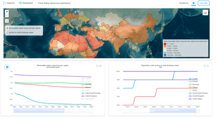
With this vision in mind, we built a Shiny Proof of Concept: The Global Fresh Water Resources Dashboard.
Global Water Resource Map Application
With The Global Fresh Water Resources Dashboard, we envision a world where data-driven conservation initiatives play a pivotal role in preserving our planet’s precious freshwater resources. By providing a centralized hub of information, we aim to catalyze collaborative efforts among stakeholders, fostering interdisciplinary cooperation between scientists, policymakers, and communities.
Curious what the future of our forests will be? Check out our Future Forests dashboard built in collaboration with leading forestry researchers.
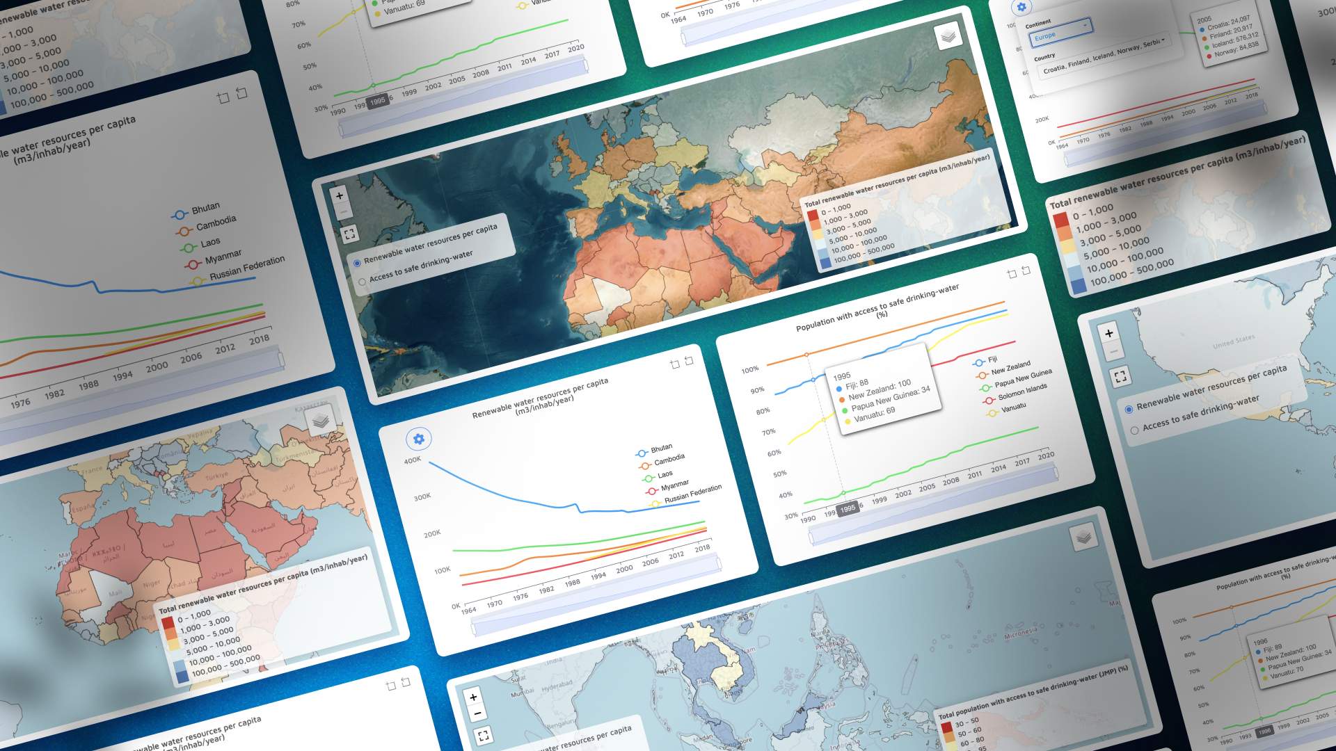
Our dashboard offers interactive visualizations of renewable water resources per capita and safe drinking water access. Utilizing data from AQUASTAT Statistics, the dashboard provides valuable insights into water resource trends using a combination of geospatial maps and trendline charts..
Water Resources Dashboard Features
- An interactive map showcasing freshwater resources per capita and the percentage of people with access to safe drinking water for each country.
- Trendline charts displaying changes in freshwater resources and percentage of people with access to safe drinking water over time.
- Easy comparison of multiple countries simultaneously.
- Focused analysis with filters like countries by region for more targeted examination of trendlines.
- Convenient interactive draggable elements to effortlessly select and switch between indicators displayed on the map.
- Make meaningful comparisons by pinning a country for reference to another country with a simple click.
Fresh Water Resources Dataset
The data comes from the AQUASTAT Statistics database, managed by FAO of the United Nations. While not comprehensive, it covers over 180 countries. Additional data could be used to augment this or be used alone.

Image credit (FAO.org)
We understand that organizations may have their own private datasets, or may have the need to connect and combine multiple datasets; this can be done with relative ease.
At Appsilon, we value collaboration and understanding the purpose of our clients’ projects, and we make data integration seamless. Regardless of the type of database or programming language used, we work closely with our clients to ensure easy connectivity, data quality and validation, and reporting, to enrich the analysis.
By leveraging our expertise or other options available in the rich open source ecosystem, we can assist and guide you with integrating your own datasets or relevant public datasets to enhance the scope and depth of the project.
Explore the Fresh Water Resources Demo
Experience the power of our Global Fresh Water Resources Dashboard firsthand. Take a deep dive into the interactive features and gain valuable insights into global water resources. Use it as inspiration or stay tuned to our blog to learn how to create your own version.
We highly value your feedback and suggestions to further enhance this project. If you come across any tips, bugs, or have general feedback, we would greatly appreciate hearing from you. Your input helps us improve the dashboard and ensures that it meets the specific needs of users like yourself.
Together, let’s work towards effective water resource management and conservation. Have a project that needs support?! Check out the links below.
Interested in Collaborating with Data4Good?
If you are interested in using technology for a positive impact, sign up for the Data4Good Newsletter and get more information on your LinkedIn feed.
Be sure to visit our Data4Good page as well, where you’ll find more examples of our D4G projects going from Science to Impact like using interactive dashboards and data science to visualize diversity and drive policy.
If you have an impactful project that can make a difference, we’re here to help! Contact us to see if we can apply our domain expertise to your project.


