COVID-19 Risk Heat Maps with Location Data, Apache Arrow, Markov Chain Modeling, and R Shiny
This is the second of two articles about our recent participation in the Pandemic Response Hackathon. Our project (CoronaRank) was one of only 5 projects out of 230 submissions chosen as Spotlight Winners to present at the closing ceremony. Read on for the technical aspects of our solution, for a more general overview of the hackathon and our product see our first article.
tl;dr
The current COVID-19 pandemic is attracting response from tech communities around the world. The recent Pandemic Response Hackathon received over 200 submissions. Participants contributed their data science skills to build software solutions that could assist in containing the spread of the virus and mitigating its effects. Appsilon‘s solution (CoronaRank) is inspired by Google’s PageRank and utilizes geolocation data in the Apache Parquet format from Veraset for effective exposure risk assessment using Markov Chain modeling. We used R to analyze a large geolocation database and build the algorithm. CoronaRank was then implemented as a responsive Shiny web application.
Background: Balancing Privacy with Urgency During a Pandemic
While the use of smartphone user location data might spark anxiety and even resistance, most users have allowed access to their location history voluntarily, even if they do not remember opting in to this feature when they first initialized their device. The tech companies claim that this data ultimately remains in the hands of the users and legislation such as GDPR in Europe and HIPAA in the United States serve to enforce this. Regardless, our geolocation data is out there – it’s a fact of the world that we live in. The question is: How can we use this available data for good?
At Appsilon we came up with a way to put these data to good use in the current pandemic crisis. Earlier this month, we came out as one of the spotlight winners of Datavant’s Pandemic Response Hackathon with CoronaRank – an algorithm inspired by Google’s PageRank, which allows for assessing the personal risk of exposure to COVID-19 given the level of interaction between individuals. CoronaRank also provides valuable information about potential pandemic hotspots given the level of human activity in the area.
We developed our Proof of Concept solution when we realized that the existing forms of conveying data about the spread of the pandemic may not be best suited to inform people on how to make daily decisions to minimize their risk and the risk to others. The descriptive analyses of pandemic data in different regions of the world have certainly been useful, but many people cannot relate to these abstractions – an exponential curve certainly evokes fear, but does not help much when someone still needs to commute to work or decide where to buy groceries. We address this problem (and others) with CoronaRank.
Our Solution: CoronaRank
We set out to answer the question of where confirmed COVID-19 patients (or asymptomatic carriers) have been in the past two weeks, and what locations could thus be compromised. This provides a corresponding personal exposure risk level which can recommend stronger isolation or potential early intervention. It can also show users which areas to avoid if they must go out – for instance, to buy groceries.
Our intuition was to use Markov Chain modeling to model and communicate the riskiness of specific locations (and the people that move through these locations). We implemented a Markov Chain based model within a functional Proof of Concept in the form of a dashboard that is capable of visualizing the riskiness of a given region (e.g. neighborhoods in New York) or a given individual. We kept the individual component private, so that all personal geolocation data or related epidemiological data remains in the hands of the user.
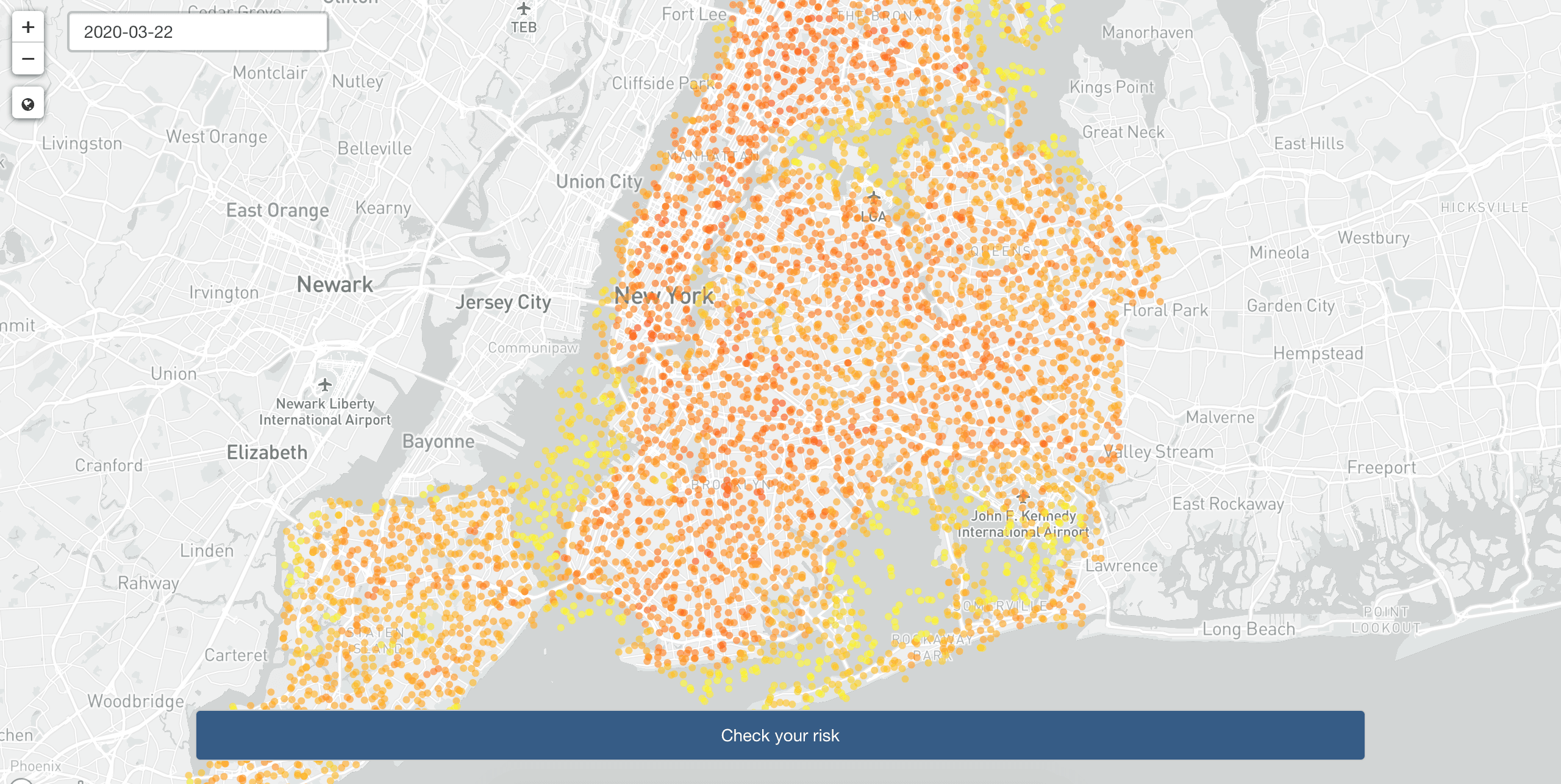
Heat map of New York generated with CoronaRank. Darker (red) circles indicate locations with higher risk.
A high risk individual (CoronaRank of 0.9) visited a number of high risk areas in Manhattan recently.
The CoronaRank algorithm
We took our inspiration for CoronaRank from the PageRank algorithm that stands behind Google search. PageRank assigns a weight to each website to provide a measure of its relative importance on the Internet. Each webpage is considered a node and a hyperlink an edge. The rank of a particular website is then defined recursively and depends on the rank of other pages linking to it and the number of these links. Thus, a page that is linked to by many websites with a high PageRank receives a high rank itself.
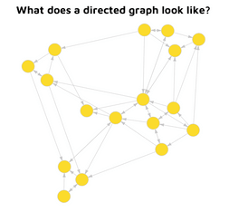
A Directed Graph
A directed graph can be used to visualize complex networks of relationships.
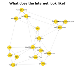
A WebGraph of the Internet
The Internet is one such network and the resulting graphical representation is called the Webgraph, which describes the links between pages of the World Wide Web.
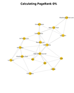
Google PageRank
PageRank utilizes the Webgraph to provide a relative importance score for all connected websites.
In the same way that PageRank is constructed by assessing how pages give other pages “respect” as they pass it through hyperlinks, CoronaRank provides an individual risk score, as people can give others “viruses” when they pass them through contact.
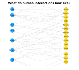
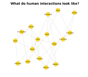
A Graph of Human Interactions
A WebGraph of Human Interactions
Individuals, similar to webpages on the Internet, interact with one another to form a complex network. Each person is affected by their history of interactions with others, including the number of virus carriers.
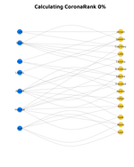
CoronaRank in Action
CoronaRank takes advantage of these network effects and provides a relative risk score for all individuals.
To simplify our model we treat both individuals and locations as nodes (non-directed bipartite graph). The edge is the point of contact between a person and the location. The more visits to a given location, the more risky this location becomes, and the higher the personal risk to individuals visiting it.
Also in line with PageRank, CoronaRank can be customized by setting weights for edges. Currently, the weights are set to reflect the number of diagnosed people visiting a given location, but that can be easily adjusted further. For instance, to take account of the amount of time spent at the location.
Manipulating a large geolocation dataset with R
The hackathon spanned 2 days. We not only had to develop our model under time pressure but also in a difficult remote work environment with many distractions given the current pandemic situation. However, in our commercial work we discovered that R with its excellent time to value ratio is perfectly suited for such scenarios and we went ahead and used it for the CoronaRank project.
Throughout the hackathon we used location data provided by Veraset, but the model itself is data agnostic. Veraset shared the data with us in Apache Parquet format, compressed using Snappy. We used Apache Arrow to load data to R, which was very straightforward:
read_full_data <- function(dataDir = "veraset-03-22") {
 print(glue("Reading {dataDir}..."))
 purrr::keep(dir(dataDir), ~ grepl(".*snappy.parquet$", .)) %>%
   purrr::map(~ arrow::read_parquet(paste0(dataDir, "/", .), as_tibble = TRUE)) %>%
   dplyr::bind_rows()
}
While loading the data was not much of a challenge, the sheer size of the dataset made working on it more difficult. The uncompressed RAW data for a single day for New York (the focus of our Proof of Concept – the “network” for our webgraph) takes over 3GB of RAM. Manipulating data of this size for multiple dates is not trivial with R. Especially when we need to preprocess data, create graphs, calculate weights for graph edges, etc.
Apache Arrow allows us to reduce size of consumed RAM by using:
data <- read_parquet("data.parquet",
  as_data_frame = FALSE,
  col_select = dplyr::all_vars()
)
This way we load only metadata information about the dataset. Unfortunately, we only learned about this after the hackathon during one of Appsilon’s internal Tech Talks. The Parquet format did allow us to efficiently process files in a dplyr pipeline without the need to load the whole dataset into working memory.
Computing and Visualizing CoronaRank
Once we loaded the data we moved on to computing CoronaRank. The initial data had just 3 columns: timestamp, cid and geohash. Geohash is in essence the latitude and longitude wrapped into a single value. To generate the dataframe with graph description, nodes and edges, or get from logs to the graph we followed these steps:
- Create a node for each cid.
- Create a node for each location (we split the locations into a grid – in practice we simply rounded latitude and longitude to a certain digit).
- Create an edge between nodes if a person (cid) was in a given location.
At this stage the difference between PageRank and CoronaRank becomes apparent. In PageRank edges are directed (one page is linking to the other). In CoronaRank the graph is undirected (person is visiting location ≡ location is visited by person).
To further account for the fact that the pandemic situation is changing rapidly and the graph itself is massive, we introduced weights to the graph edges. The weight designates whether a particular edge is risky. The higher the weight the more contagious the edge. Conversely, a lower weight indicates that the edge is less contagious.
We utilized data from The New York Times on the number of cases per county for our initial weights. Edges with locations with a higher number of cases (per county) were set up with higher weights.
The pseudocode for our solution:
coronaRank <- function(data) {
  edges <- dplyr::select(data, geohash, id) %>%
     distinct()
  # calculating weights for edges:
  risk_profile <- build_ny_counties_risk_profile()
  weights_edges <- risk_for_locations(risk_profile, edges$geohash)


  graph <- graph_from_edgelist(as.matrix(edges), directed = FALSE)

  coronarank <- igraph::page_rank(graph, algo = "prpack", directed = FALSE,
               damping = 0.99, weights = weights_edges)

  tibble(
node = names(coronarank$vector),
score = coronarank$vector
  )
}
Please note that we set damping (“teleport probability”) to a relatively high number, because we are assuming that GSM data tracking is quite accurate.
The complete solution is available here: https://github.com/Appsilon/covid-hackathon (the Hackathon conditions and time pressure did result in a functional but lower quality code)
Google and Apple contact tracing solution and CoronaRank
Our implementation of CoronaRank is only a Proof of Concept. Since submitting our solution we were excited to see that Google and Apple have announced their collaboration to use contact tracing technology for fighting the pandemic as well.
Their project will facilitate the exchange about potentially risky interactions between individuals using Bluetooth on their mobile devices. The process will be based on a secure protocol with no access to geolocation data, thus it will be entirely anonymous and secure. The smartphones will only share the information whether the owner has been in proximity of someone who had marked themselves as having contracted the virus. No other information about the encounter will be shared.
One of the downsides to that solution is that not all iOS or Android smartphone users will subscribe to the service and some might provide inaccurate information.
While our solution does necessitate the use of geolocation data to overcome this issue, it provides the user with additional information about the extent of the risk that they contracted the virus given their past interactions. Combining this approach with that of Google and Apple would make it possible to inform even those users who don’t have the app or don’t know they might have been exposed. As in our app, this would require making data privacy and security measures a priority.
Conclusion
The Pandemic Response Hackathon was a great experience. It was inspiring to see over 230 submissions from around the world, which speaks volumes about how the tech community is taking seriously the responsibility to use their skills for the common good. We believe that it was also a good opportunity to showcase the power of R to quickly develop a functioning product and would like to recognize all the companies and organizations that provided resources, data, and support throughout the hackathon.
We are hoping to obtain funding or a partnership with an established public service institution to get our solution to citizens. Read more about our plans for the future in our previous blog post.
Finally, I want to recognize my amazing teammates (including the epidemiologist Ewa Knitter) and our loved ones including my wife – we would not have been able to participate and win without your support. We also want to recognize the Open Source community, which has built tools that allow for the rapid development of advanced software. Special thanks to the people working on Apache::Arrow, igraph, Leaflet, Shiny and the sf R package.
Follow Us for More
- Follow @Appsilon on Twitter
- Follow Appsilon on LinkedIn
- Try out our R Shiny open source packages
- Sign up for the AI for Good newsletter


