Data visualization is important. It’s so important that how you present your data can affect the success of an app or project. For applications that make heavy use of data, data visualization best practices can significantly increase the level of adoption. On the other hand, if the data is represented in a convoluted, complex way – your application will fall short.
Data visualization is a broad topic and in this post, I’ll focus on bar plots. I will be using ggplot2 in the examples. I’ll present the theory behind the problems and practice examples of working code. And a final remark – there is no one universal design that you should use for all plots. That’s why it’s important to know the theory, so you can choose the proper design for your data.
Table of contents:
- Data visualization
- Best practices
- Remove unnecessary elements
- Choose the proper order of data categories
- Conclusion
Data visualization
Drawing conclusions
Good data visualization helps users quickly understand the data. It should be clear what’s being presented on the graph and what the data is telling us. With good data visuals, proper conclusions can be drawn at a first glance. Bad data visualizations can also lead the user to draw conclusions very quickly, but more often than not, these are the wrong conclusions. For example, if you don’t start the bar plot at 0, the differences in values will seem much bigger, but this is misleading!
Proper data visualization will draw attention to what is important. When presenting data you might need to show additional information for context. With good data visualization, your audience will have no doubt about what’s important.
Learn how to make stunning bar charts in R with the ggplot2 bar chart tutorial.
Knowing your audience
Lastly, good data visualization makes it possible for laymen to understand the data. As an R/Shiny developer, you probably work with data a lot. But remember, not everyone is used to looking at complicated charts. If your app will be available to a wide audience – make sure to present data in a way that’s accessible and appropriate to them!
Data visualization best practices
Step 1: Remove unnecessary elements
In order to make the important elements on the graph stand out, you need to remove the extraneous bits. This will help to convey the message behind your data.
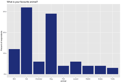
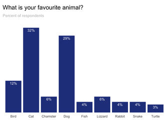
Below is an example of default ggplot2 settings and an improved version of the same graph. The goal of the graph is to present the survey results so that the categories can be easily compared. The data I’m using in the examples are completely random data, but I’m providing the goal for context. Generally speaking, you should have a goal in mind when you start visualizing your data.
Background
You can remove the background if it’s not required to bridge the styling of the entire application. The background doesn’t add any information to your data. Generally speaking, it’s an extraneous design element.
Practice makes perfect. Follow Appsilon’s best practices to build durable R code.
Gridlines
Default ggplot2 settings have both vertical and horizontal grid lines. For bar plots, vertical grid lines make no sense and are absolutely useless. You’re not comparing anything in that direction, so they should be removed. Horizontal gridlines on the other hand can be used for bar plots. These are helpful when you have a lot of bars and the exact values aren’t that important. In my example, I decided to use data labels directly on the graph, as they make it easier to read the exact value of the data point.
Axes and tick marks
I decided to remove both axes together with their tick marks. The Y-axis isn’t needed when we have data labels, but remember that you should start the bar plot at 0. The X-axis also isn’t needed. So for a cleaner look, I prefer to remove it. However, you could keep both axes, for example, to match the styling with other types of graphs that you have in the app. If this were the case, I’d recommend using light gray instead of black. Lighter coloring makes the lines less visible and minimizes visual distractions from the data and descriptions.
Axes description
The X-axis isn’t necessary to understand the data. The graph title states that we are presenting animal choices. For the Y-axis, try to avoid vertical text orientation. You can put the axis label under the graph title. Just be sure to make it more subtle (using font size or color).
Step 2: Choose the proper order of the data categories
In order to make the data categories easy to compare – use the proper order! General rules for ordering the data are as follows:
- Natural order (e.g. time) – Always use natural order if it exists in your data.
- Meaningful order (e.g. from biggest to smallest brand) – if there is no natural order, look for some meaningful order in your data
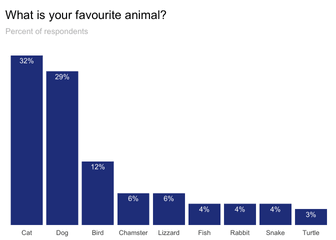
- Order of value – If there is no natural or meaningful order in your data, sort them by value, so that the highest / smallest categories can be found easily. (Caveat: with frequently updated data, such sorting may be misleading and result in the audience spending more time searching for info. This is because the ordering of the data will also be updated together with the values.)
- Alphabetical order – With numerous categories, sorting by name can make it easier for your audience to find a specific title.
Below is an improved ordering of the graph from the previous example.
Turn graphs, not heads
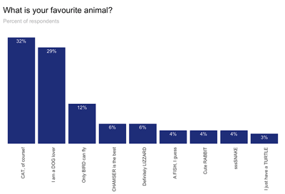
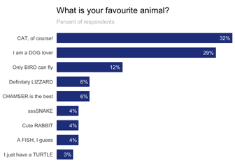
When category labels are long and don’t fit nicely under the bar it can distract viewers. If you try to put the text vertically, the readability goes out the window. Luckily there’s a simple solution for that: flip the graph from vertical bars to horizontal. This way you can get a lot of space for category labels, without decreasing the readability. But remember also to change the position of the data labels as they’ll now be flipped in the wrong orientation.
Looking for a Shiny app template to kickstart your project? Download Appsilon’s free use Shiny templates.
Below is an example of a bar plot with long labels and how it can be improved.
Conclusions on data visualization best practices
Introducing good data visualization practices to your Shiny apps will increase their usability and encourage adoption. Some visualization tricks are fairly easy to use and implement. Others require a good understanding of the data and the purpose of the visualization. But with practice, you’ll be able to intuitively know what works best and quickly improve the graphs in your Shiny applications.
Comment below and let me know what other graph types I should cover next! 🙂
