

 Share
Share Tweet
Tweet Share
Share


IIASA Collaboration: An Interactive Map for COVID-19 Public Policy Decisions

10 June 2020
Introduction
Public institutions rely on external data sources and analysis to guide policy making and intervention. Through our AI for Good initiative, Appsilon supports organizations that provide such inputs with our technical expertise. We were recently approached by IIASA, an international research institute, to create a dashboard to visualize COVID-19 data. This builds on our previous collaboration with IIASA, which had us deliver a decision-making tool for natural disaster risk planning in Madagascar. In this article we provide an example of how to help policymakers navigate the ocean of available data with dashboards that turn these data into actionable information. We implemented our dashboard solution with Python and Svelte. The application is available to explore here.
Data is useful information when it creates value…or saves lives
The current pandemic emergency has put an unprecedented strain on both public health services and policy making bodies around the world. Government action has been constrained in many cases by limited access to equipment and personnel. Adequate policymaking can help to coordinate the emergency relief effort effectively, make better use of scarce resources, and prevent such shortages in the future. This, however, requires access to secure, timely, and accurate information.
Governments commission various public bodies and research institutes to provide such data both for planning and coordinating the response. For instance, in the UK, the government commissioned the National Health Service (NHS) to build a data platform to consolidate a number of data providers into one single source. However, for the data to be useful it must be presented in a way that is consistent with the demands of an emergency situation. Therefore, the NHS partnered with a number of tech companies to visualize the data in dashboards and to provide deeper insights. Raw data, regardless of its quality, is not useful information until it is understood in a way that creates value – or in this case informs action that could save lives.
The International Institute for Applied Systems Analysis (IIASA) approached us to support them in making their COVID-19 data and indicators more useful to policymakers. IIASA is an independent research institute which conducts research into pressing global issues such as climate change, energy security, population aging, and sustainable development. The institute’s research is used by policymakers around the world to make critical decisions. We appreciated the opportunity to use our skills to support their efforts by creating an interactive data visualization tool.
IIASA COVID-19 Report and Mapbook
Research indicates that while all segments of the population are vulnerable to the virus, not all countries are equally vulnerable at the same time. Therefore, there is a need for accurate socioeconomic and demographic data to inform the allocation of scarce resources between countries and even within countries.
IIASA responded to this need with a regularly updated website and data report: “COVID-19: Visualizing regional socioeconomic indicators for Europe”. The reader is introduced to a range of demographic, socioeconomic and health-related indicators for European Union member countries and sub-regions in five categories:
- Current COVID-19 trends – information about the number of cases and effectiveness of policy response measures
- Demographic indicators – age, population density, migration
- Economic indicators – GDP, income, share of workers who work from home
- Health-related indicators – information about healthcare system capacity
- Tourism – number of visitors, including foreign
The indicators and data were chosen for their value in assisting epidemiological analysis and balanced policy formulation. Policymakers often face the challenge of prioritizing pandemic mitigation efforts over long-term impacts like unemployment, production losses and supply-chain disruptions. IIASA’s series of maps and graphs facilitates the understanding of these impacts while maintaining the focus on containing the spread of the virus.
Our Collaboration with IIASA – A Svelte Dashboard for Policymakers
Having taken the first step to disseminate the data as information in the form of a mapbook,
Asjad Naqvi decided to make these data even more accessible by turning the maps into an interactive and visually appealing tool.
IIASA has previously approached Appsilon Data Science with a data visualization project, which had us improve the features and design of Visualise, a decision support tool for policymakers in natural disaster risk management. Building on this experience we set out to assist Dr Naqvi with creating a dashboard to deliver the data to end-users even faster.
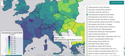
The application allows for browsing through a list of 32 indicators and visualizing them on an interactive map. The list is not final with indicators being regularly reviewed, added and retired on a weekly basis.
The citizens of some regions in Italy have a very high life expectancy at the age of 65. A healthy population, especially in the most vulnerable segments is better prepared to overcome the pandemic.
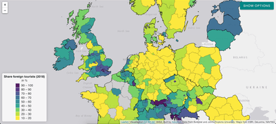
Germany, as compared to the United Kingdom, does not attract as many foreign tourists and would probably not benefit as much from restrictions on cross-border movement.
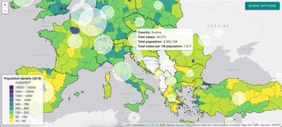
The application provides descriptions and source for each indicator, the time the COVID-19 case data was last refreshed and the option to overlay case data on the map:
White circles indicate the number of cases per 1 million citizens.
The application will continue to provide the latest and most relevant information to track regional performance in Europe also in the post-pandemic phase:
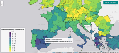
The pandemic has a disproportionate impact on women’s employment and revealed some of the systemic inequalities. Social distancing measures have a large impact on sectors with high female employment rates. The closure of schools and daycare facilities particularly affects working mothers. Indicators such as female unemployment rate can inform appropriate remedial action in the post-COVID world and highlight regions of special concern like Castilla-La-Mancha in Spain.
The application is available to explore here.
Given the urgency of the pandemic emergency, we managed to develop and deploy this application within five days. We believe such partnerships between data science consultancies and research institutes can transform the way policymakers utilise data. We are looking forward to future collaborations with IIASA and other partners to help transform data into accessible and useful information.
This project was conducted as part of our Artificial Intelligence for Good initiative.
Follow Us for More
- Follow @Appsilon on Twitter
- Follow Appsilon on LinkedIn
- Try out our R Shiny open source packages
- Sign up for the AI for Good newsletter
Contact Us
Project Manager

Get Updates
Subscribe to Shiny Weekly Newsletter
Join 4000+ Shiny enthusiasts to see the latest Shiny news from the R community.


