


 Share
Share Tweet
Tweet Share
Share


Data Science has (unnecessarily) divided the world into two halves – R users and Python users. Irrelevant of the group you belong to, there’s one thing you have to admit – each language individually has libraries far superior to anything available in the alternative. For example, R Shiny is much easier for beginners than anything Python offers. But what about basic data visualization? That’s where this Matplotlib vs. ggplot article comes in.
Today we’ll see how R and Python compare in basic data visualization. We’ll compare their standard plotting libraries – Matplotlib and ggplot to see which one is easier to use and which looks better at the end. We’ll also show you how to include Matplotlib charts in R Shiny dashboards, as that’s been a common pain point for Python users. What’s even better, the chart will react to user input.
Want to use R and Python together? Here are 2 packages you get you started.
Table of contents:
- Matplotlib vs. ggplot – Which is Better for Basic Plots?
- Matplotlib vs. ggplot – Which is easier to customize?
- How to Include ggplot Charts in R Shiny
- How to Use Matplotlib Charts in R Shiny
- Summary of Matplotlib vs. ggplot
Matplotlib vs. ggplot – Which is Better for Basic Plots?
There’s no denying that both Matplotlib and ggplot don’t look the best by default. There’s a lot you can change, of course, but we’ll get to that later. The aim of this section is to compare Matplotlib and ggplot in the realm of unstyled visualizations.
To keep things simple, we’ll only make a scatter plot of the well-known mtcars dataset, in which X-axis shows miles per gallon and Y-axis shows the corresponding horsepower.
Are you new to scatter plots? Here’s our complete guide to get you started.
There’s not a lot you have to do to produce this visualization in R ggplot:
library(ggplot2)

ggplot(data = mtcars, aes(x = mpg, y = hp)) +
  geom_point()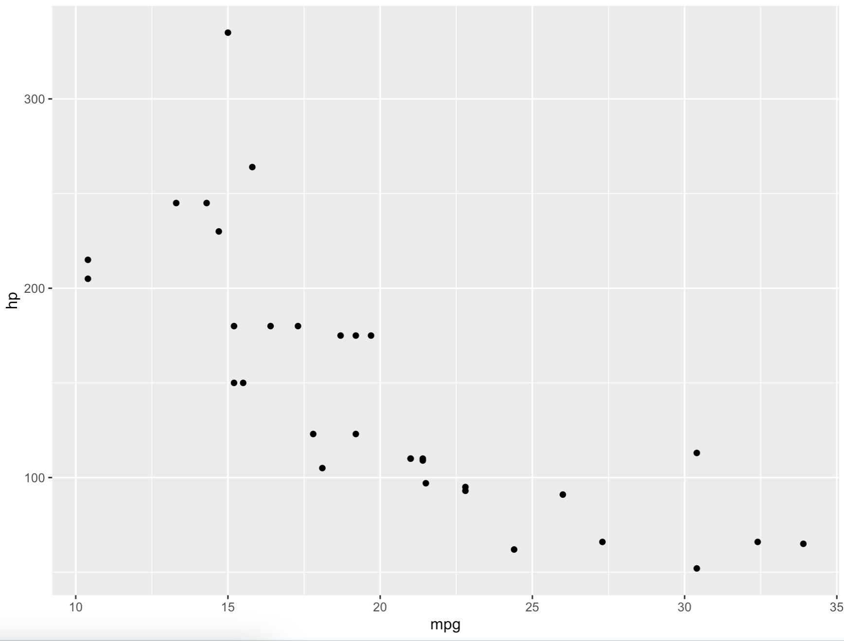
Image 1 – Basic ggplot scatter plot
It’s a bit dull by default, but is Matplotlib better?
The mtcars dataset isn’t included in Python, so we have to download and parse the dataset from GitHub. After doing so, a simple call to ax.scatter() puts both variables on their respective axes:
import pandas as pd
import matplotlib.pyplot as plt


mtcars = pd.read_csv("https://gist.githubusercontent.com/ZeccaLehn/4e06d2575eb9589dbe8c365d61cb056c/raw/898a40b035f7c951579041aecbfb2149331fa9f6/mtcars.csv", index_col=[0])

fig, ax = plt.subplots(figsize=(13, 8))
ax.scatter(x=mtcars["mpg"], y=mtcars["hp"])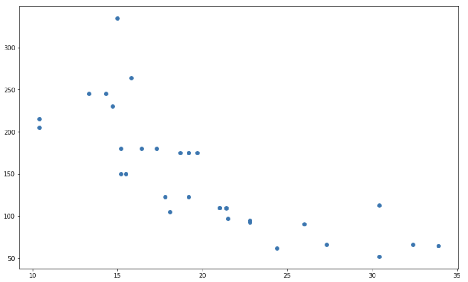
Image 2 – Basic matplotlib scatter plot
It would be unfair to call ggplot superior to Matplotlib, for the pure fact that the dataset comes included with R. Python requires an extra step.
From the visual point of view, things are highly subjective. Matplotlib figures have a lower resolution by default, so the whole thing looks blurry. Other than that, declaring a winner is near impossible.
Do you prefer Matplotlib or ggplot2 default stylings? Let us know in the comment section below.
Let’s add some styles to see which one is easier to customize.
Matplotlib vs. ggplot – Which is easier to customize?
To keep things simple, we’ll modify only a couple of things:
- Change the point sizing by the
qsecvariable - Change the point color by the
cylvariable - Add a custom color palette for three distinct color factors
- Change the theme
- Remove the legend
- Add title
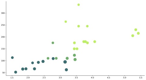
In R ggplot, that boils down to adding a couple of lines of code:
ggplot(data = mtcars, aes(x = mpg, y = hp)) +
  geom_point(aes(size = qsec, color = factor(cyl))) +
  scale_color_manual(values = c("#3C6E71", "#70AE6E", "#BEEE62")) +
  theme_classic() +
  theme(legend.position = "none") +
  labs(title = "Miles per Gallon vs. Horse Power")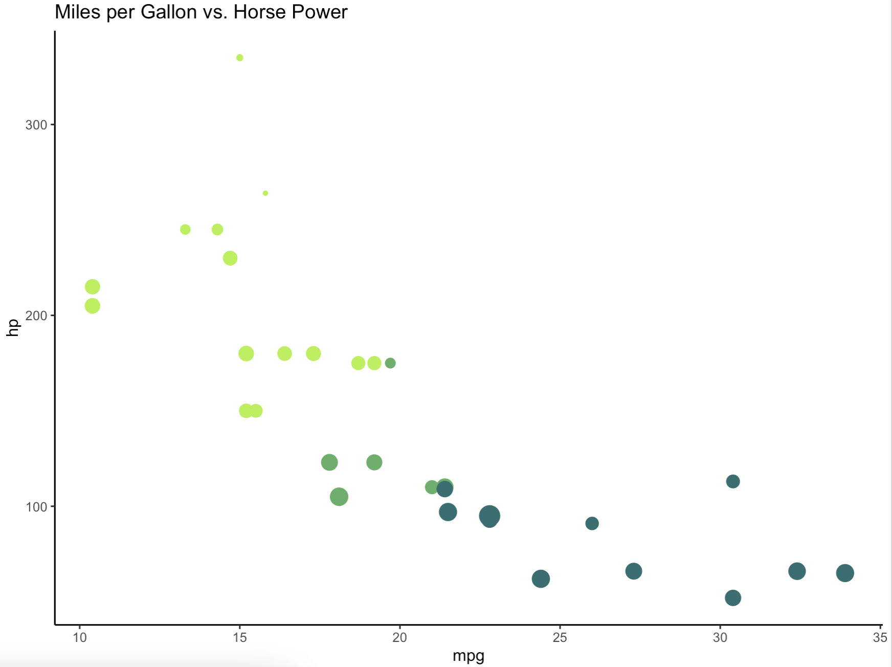
Image 3 – Customized ggplot scatter plot
The chart now actually looks usable, both for reporting and dashboarding purposes.
But how difficult it is to produce the same chart in Python? Let’s take a look. For starters, we’ll increase the DPI to get rid of the blurriness, and also remove the top and right lines around the figure.
Changing point size and color is a bit trickier to do in Matplotlib, but it’s just a matter of experience and preference. Also, Matplotlib doesn’t place labels on axes by default – consider this as a pro or a con. We’ll add them manually:
plt.rcParams["figure.dpi"] = 300
plt.rcParams["axes.spines.top"] = False
plt.rcParams["axes.spines.right"] = False


fig, ax = plt.subplots(figsize=(13, 8))
ax.scatter(
    x=mtcars["mpg"],
    y=mtcars["hp"],
    s=[s**1.8 for s in mtcars["qsec"].to_numpy()],
    c=["#3C6E71" if cyl == 4 else "#70AE6E" if cyl == 6 else "#BEEE62" for cyl in mtcars["cyl"].to_numpy()]
)
ax.set_title("Miles per Gallon vs. Horse Power", size=18, loc="left")
ax.set_xlabel("mpg", size=14)
ax.set_ylabel("hp", size=14)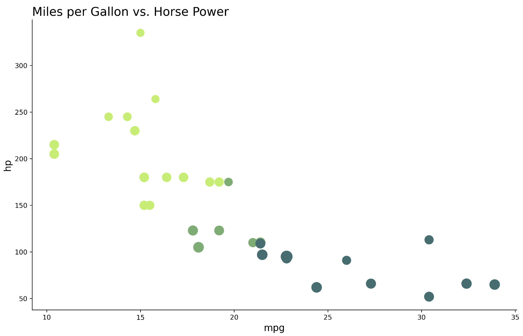
Image 4 – Customized matplotlib scatter plot
The figures look almost identical, so what’s the verdict? Is it better to use Python’s Matplotlib or R’s ggplot2?
Objectively speaking, Python’s Matplotlib requires more code to do the same thing when compared to R’s ggplot2. Further, Python’s code is harder to read, due to bracket notation for variable access and inline conditional statements.
So, does ggplot2 take the win here? Well, no. If you’re a Python user it will take you less time to create a chart in Matplotlib than it would to learn a whole new language/library. The same goes the other way.
Up next, we’ll see how easy it is to include this chart in an interactive dashboard.
How to Include ggplot Charts in R Shiny
Shiny is an R package for creating dashboards around your data. It’s built for R programming language, and hence integrates nicely with most of the other R packages – ggplot2 included.
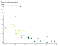
We’ll now create a simple R Shiny dashboard that allows you to select columns for the X and Y axis and then updates the figure automatically. If you have more than 30 minutes of R Shiny experience, the code snippet below shouldn’t be difficult to read:
library(shiny)
library(ggplot2)

ui <- fluidPage(
  tags$h3("Scatter plot generator"),
  selectInput(inputId = "x", label = "X Axis", choices = names(mtcars), selected = "mpg"),
  selectInput(inputId = "y", label = "Y Axis", choices = names(mtcars), selected = "hp"),
  plotOutput(outputId = "scatterPlot")
)

server <- function(input, output, session) {
  data <- reactive({mtcars})

  output$scatterPlot <- renderPlot({
    ggplot(data = data(), aes_string(x = input$x, y = input$y)) +
      geom_point(aes(size = qsec, color = factor(cyl))) +
      scale_color_manual(values = c("#3C6E71", "#70AE6E", "#BEEE62")) +
      theme_classic() +
      theme(legend.position = "none")
  })
}

shinyApp(ui = ui, server = server)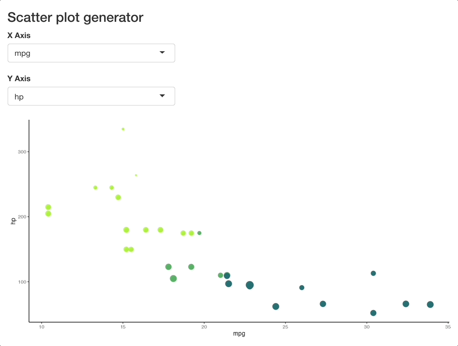
Image 5 – Shiny dashboard rendering a ggplot chart
Put simply, we’re rerendering the chart every time one of the inputs changes. All computations are done in R, and the update is almost instant. Makes sense, since mtcars is a tiny dataset.
But how about rendering a Matplotlib chart in R Shiny? Let’s see if it’s even possible.
How to Use Matplotlib Charts in R Shiny
There are several ways to combine R and Python – reticulate being one of them. However, we won’t use that kind of bridging library today.
Instead, we’ll opt for a simpler solution – calling a Python script from R. The mentioned Python script will be responsible for saving a Matplotlib figure in JPG form. In Shiny, the image will be rendered with the renderImage() reactive function.
Let’s write the script – generate_scatter_plot.py. It leverages the argparse module to accept arguments when executed from the command line. As you would expect, the script accepts column names for the X and Y axis as command line arguments. The rest of the script should feel familiar, as we explored it in the previous section:
import argparse
import pandas as pd
import matplotlib.pyplot as plt


# Tweak matplotlib defaults
plt.rcParams["figure.dpi"] = 300
plt.rcParams["axes.spines.top"] = False
plt.rcParams["axes.spines.right"] = False

# Get and parse the arguments from the command line
parser = argparse.ArgumentParser()
parser.add_argument("--x", help="X-axis column name", type=str, required=True)
parser.add_argument("--y", help="Y-axis column name", type=str, required=True)
args = parser.parse_args()

# Fetch the dataset
mtcars = pd.read_csv("https://gist.githubusercontent.com/ZeccaLehn/4e06d2575eb9589dbe8c365d61cb056c/raw/898a40b035f7c951579041aecbfb2149331fa9f6/mtcars.csv", index_col=[0])

# Create the plot
fig, ax = plt.subplots(figsize=(13, 7))
ax.scatter(
    x=mtcars[args.x],
    y=mtcars[args.y],
    s=[s**1.8 for s in mtcars["qsec"].to_numpy()],
    c=["#3C6E71" if cyl == 4 else "#70AE6E" if cyl == 6 else "#BEEE62" for cyl in mtcars["cyl"].to_numpy()]
)

# Save the figure
fig.savefig("scatterplot.jpg", bbox_inches="tight")
You can run the script from the command line for verification:
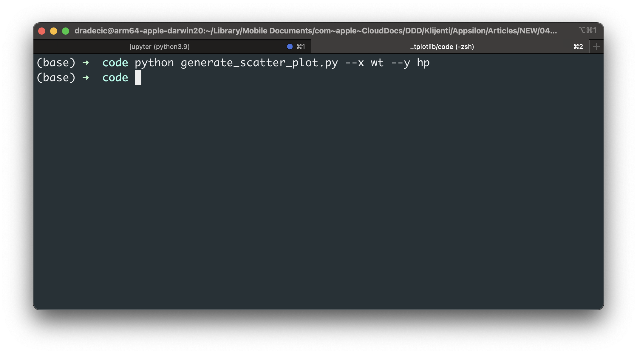
Image 6 – Running a Python script for chart generation
If all went well, it should have saved a scatterplot.jpg to disk:
Image 7 – Scatter plot generated by Python and matplotlib
Everything looks as it should, but what’s the procedure in R Shiny? Here’s a list of things we have to do:
- Replace
plotOutput()withimageOutput()– we’re rendering an image afterall - Construct a shell command as a reactive expression – it will run the
generate_scatter_plot.pyfile and pass in the command line arguments gathered from the currently selected dropdown values - Use
renderImage()reactive function to execute the shell command and load in the image
It sounds like a lot, but it doesn’t require much more code than the previous R example. Just remember to specify a full path to the Python executable when constructing a shell command.
Here’s the entire code snippet:
library(shiny)

ui <- fluidPage(
  tags$head(
    tags$style(HTML("
      #scatterPlot > img {
        max-width: 800px;
      }
    "))
  ),
  tags$h3("Scatter plot generator"),
  selectInput(inputId = "x", label = "X Axis", choices = names(mtcars), selected = "mpg"),
  selectInput(inputId = "y", label = "Y Axis", choices = names(mtcars), selected = "hp"),
  imageOutput(outputId = "scatterPlot")
)

server <- function(input, output, session) {
  # Construct a shell command to run Python script from the user input
  shell_command <- reactive({
    paste0("/Users/dradecic/miniforge3/bin/python generate_scatter_plot.py --x ", input$x, " --y ", input$y)
  })

  # Render the matplotlib plot as an image
  output$scatterPlot <- renderImage({
    # Run the shell command to generate image - saved as "scatterplot.jpg"
    system(shell_command())
    # Show the image
    list(src = "scatterplot.jpg")
  })
}
Image 8 – Shiny dashboard rendering a matplotlib chart
The dashboard takes some extra time to rerender the chart, which is expected. After all, R needs to call a Python script which then constructs and saves the chart to the disk. It’s an extra step, so the refresh isn’t as instant as with ggplot2.
Summary of Matplotlib vs. ggplot
To conclude, you can definitely use Python’s Matplotlib library in R Shiny dashboards. There are a couple of extra steps involved, but nothing you can’t manage. If you’re a heavy Python user and want to try R Shiny, this could be the fastest way to get started.
What do you think of Matplotlib in R Shiny? What do you generally prefer – Matplotlib or ggplot2? Please let us know in the comment section below. Also, don’t hesitate to reach out on Twitter if you use another approach to render Matplotlib charts in Shiny – @appsilon. We’d love to hear your comments.
R Shiny and Tableau? Learn to create custom Tableau extensions from R Shiny.
Contact Us
Project Manager

Get Updates
Subscribe to Shiny Weekly Newsletter
Join 4000+ Shiny enthusiasts to see the latest Shiny news from the R community.


