R Esquisse: How to Explore Data in R Through a Tableau-like Drag-and-Drop Interface
R Esquisse is an R package that provides an intuitive GUI for creating data visualizations using ggplot2. This package is particularly valuable for stakeholders seeking quick interactive analysis and insights gathering from data sources, whether they are new to R or prefer a more visual approach to creating plots. With R Esquisse, you can easily select variables from your data and drag and drop them onto a plot canvas, customize plot features such as titles, axis labels, colors, and generate ggplot2 charts with just a couple of clicks.
The interface of R Esquisse is similar to Tableau – a popular data visualization software, making it easy for users who are familiar with Tableau to transition to R Esquisse. The package also offers advanced features such as multi-language support and an in-browser application, which further enhance the user experience. In this article, we will discuss how to install and import data into R Esquisse, explore its basic and advanced features, and provide examples of how it can be used to create stunning data visualizations in R. So, without further delay, let’s dive in!
Is Tableau better than R Shiny? Read this article to find out which Excel alternative is right for you.
Table of contents:
- What is R Esquisse and How to Install It
- How to Import Data to R Esquisse
- How to Visualize Data in R Esquisse – Generate ggplot2 Charts
- Additional Features – Multi-Language Support and In-Browser Application
- Summing up R Esquisse
What is R Esquisse and How to Install It
As mentioned in the introduction section, Esquisse is an R package that provides a user-friendly graphical user interface (GUI) for creating data visualizations using the ggplot2 package. There really isn’t much to say about it, except that it requires no knowledge of ggplot2 and that it offers superb R Shiny support. More on Shiny use case in a separate article, since it’s too broad of a topic to cover today.
To install R Esquisse, you can use the install.packages() function in R, followed by the name of the package in quotation marks. Here’s the command you have to run from the R console:
install.packages("esquisse")This command will install R Esquisse and all of its dependencies.
Once installed, you can load the package and click on the Addins dropdown menu in RStudio. Scroll down a bit, and you’ll see an Esquisse section:

Image 1 – R Esquisse addin in RStudio
Clicking on the first item in the section will launch the Esquisse GUI. Alternatively, you can the esquisse:esquisser() command from the R console. Whatever the approach you choose, this is the window you’ll see:
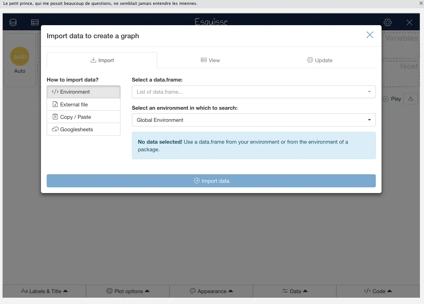
Image 2 – R Esquisse welcome window
You’re ready to go! In the next section, you’ll learn how to import your data in CSV format to Esquisse.
How to Import Data to R Esquisse
There are multiple ways to import data to R Esquisse. As you’ve seen from the previous image, you can load a data.frame straight from your R environment. For this example, we’ll use an ‘External file’. You can also copy/paste your data or import it from a Google sheet.
For simplicity’s sake, we’ll use the Iris dataset for this guide. Download it to your machine, click on the Externa file section, and search for the file:
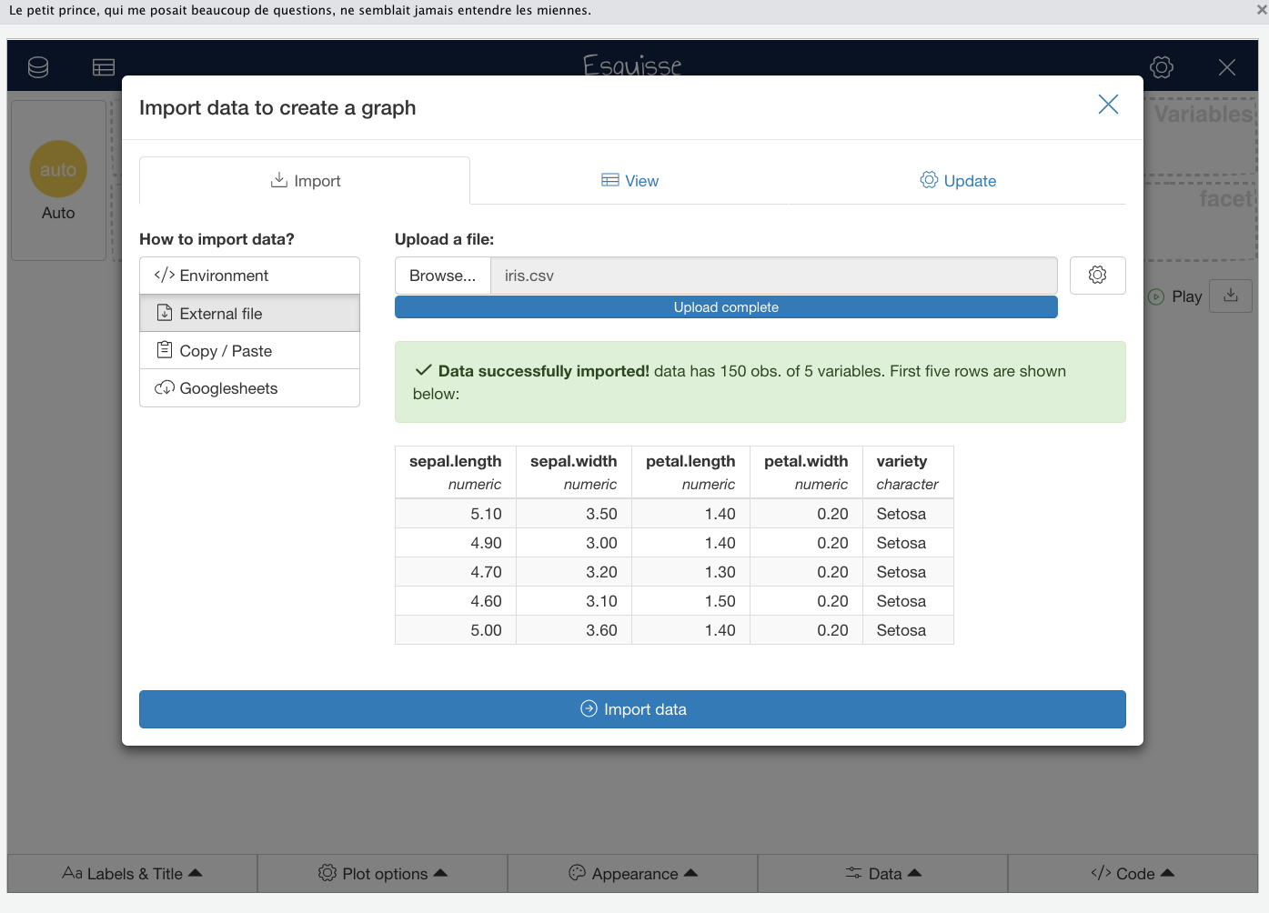
Image 3 – Importing a CSV file with Esquisse
Esquisse will instantly upload your dataset and display the initial rows. If you’re content with the display, you’ll have the option to either view the complete file or make updates to specific rows or columns by clicking on the Import data button.
This will bring you to a blank Esquisse canvas, just like the one you can see below:
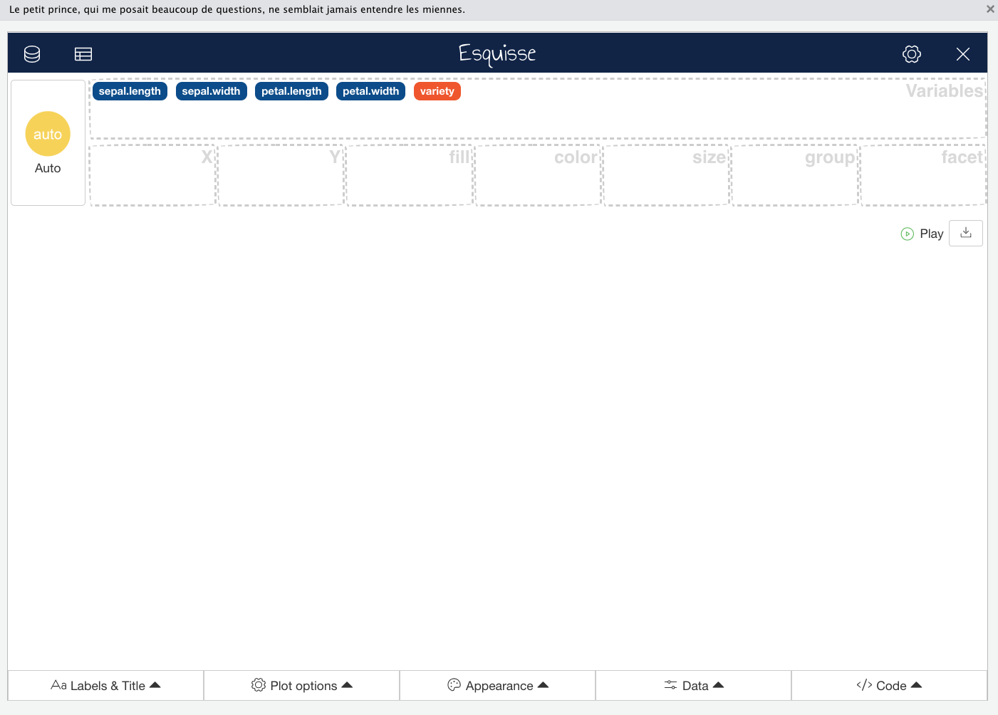
Image 4 – Blank Esquisse canvas
You can see the features from the Iris dataset in the Variables container, which means the data is ready to be visualized. That’s exactly what we’ll do in the following section.
How to Visualize Data in R Esquisse – Generate ggplot2 Charts
This section will show you how to make one and two-variable data visualizations, how to tweak title and axis labels, and also how to tweak the general appearance of your charts with only a couple of mouse clicks. You’ll also see how to export the R code needed to generate the chart.
Visualize One Variable with Esquisse
One-variable charts are primarily used to show the variable distribution through a histogram, density plot, box plot, or violin plot. These are four different chart types that essentially show the same thing.
Start by dragging the sepal.length variable to the X container. You’ll immediately see a histogram in your canvas:
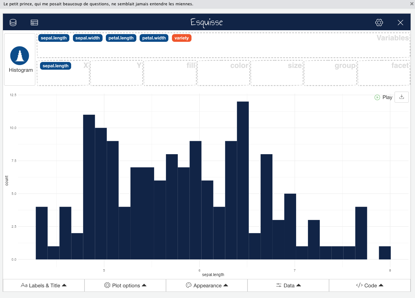
Image 5 – Sepal length histogram
If you want to show a density plot instead, click on the Histogram button. This will open a selection tool in which you can change the chart type. The types you can’t currently use are grayed out, which makes sense. You can’t make a bar chart with a single variable:
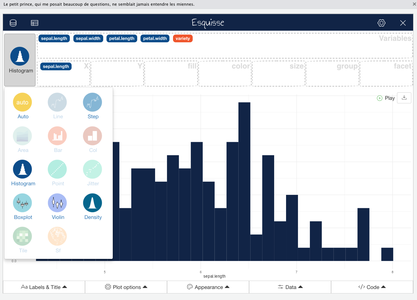
Image 6 – Possible chart types for one variable data visualizations
Click on Density, and your chart type on canvas will immediately change:
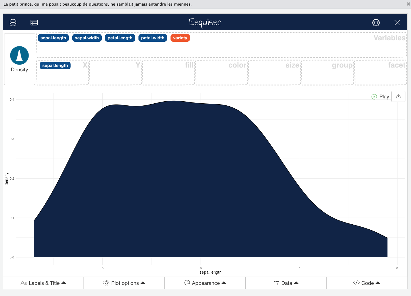
Image 7 – Sepal length density plot
And that’s univariate charts in a nutshell. You can tweak them, of course, but that’s something we’ll explore later with multivariate charts.
Looking to dive deeper into Histograms with ggplot2? Our detailed guide to stunning histograms has you covered.
Visualize Multiple Variables with Esquisse
Multi-variable charts display a relationship between the variables, e.g., sepal length vs. petal length. You can also add color and size properties to these charts to further clarify the distinction.
In this section, we’ll visualize the sepal length and petal length relationship through a scatter chart. To follow along, drag petal.length variable to the Y container, variety to the Color container, and sepal.length to the Size container. These last two are optional but will make the chart more informative and interesting to look at.
Here’s what you should see:
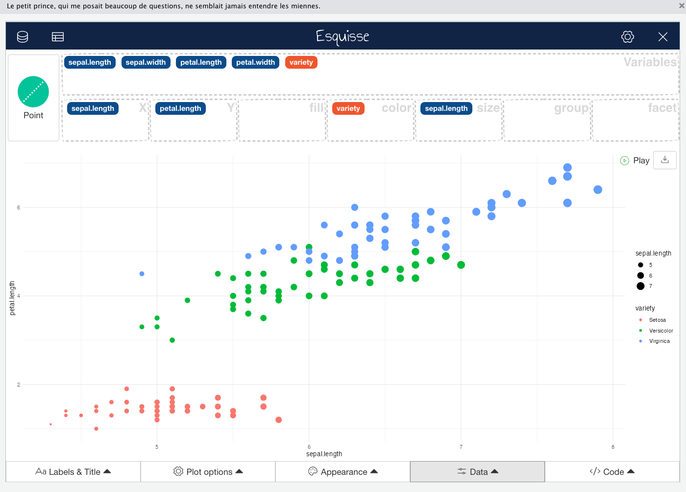
Image 8 – Scatter plot of sepal length and petal length
And that’s how you can make multi-variable charts with R Esquisse. The chart is a bit plain currently and has no title or proper axis labels. That’s what we’ll tweak next.
Configure Title and Axis Labels
The Labels & Title section allows you to tweak everything there is about chart titles, subtitles, captions, axis labels, and even legend titles. Click on the Labels & Title section to expand it, and then specify your values:
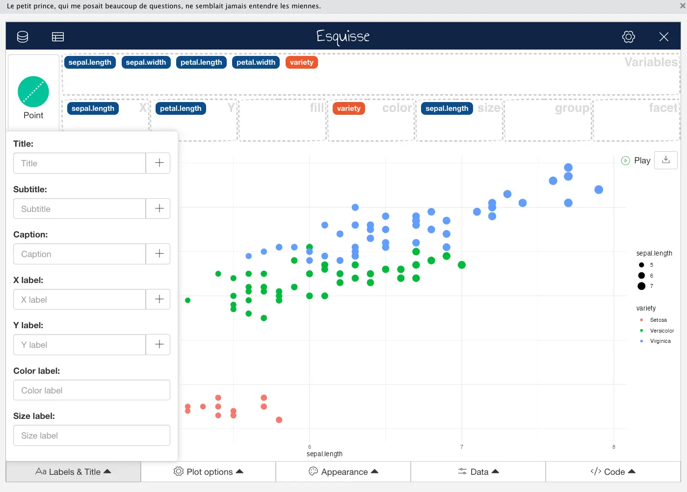
Image 9 – Title and label tweaking
Here’s what our chart looks like after configuring titles and axis labels:
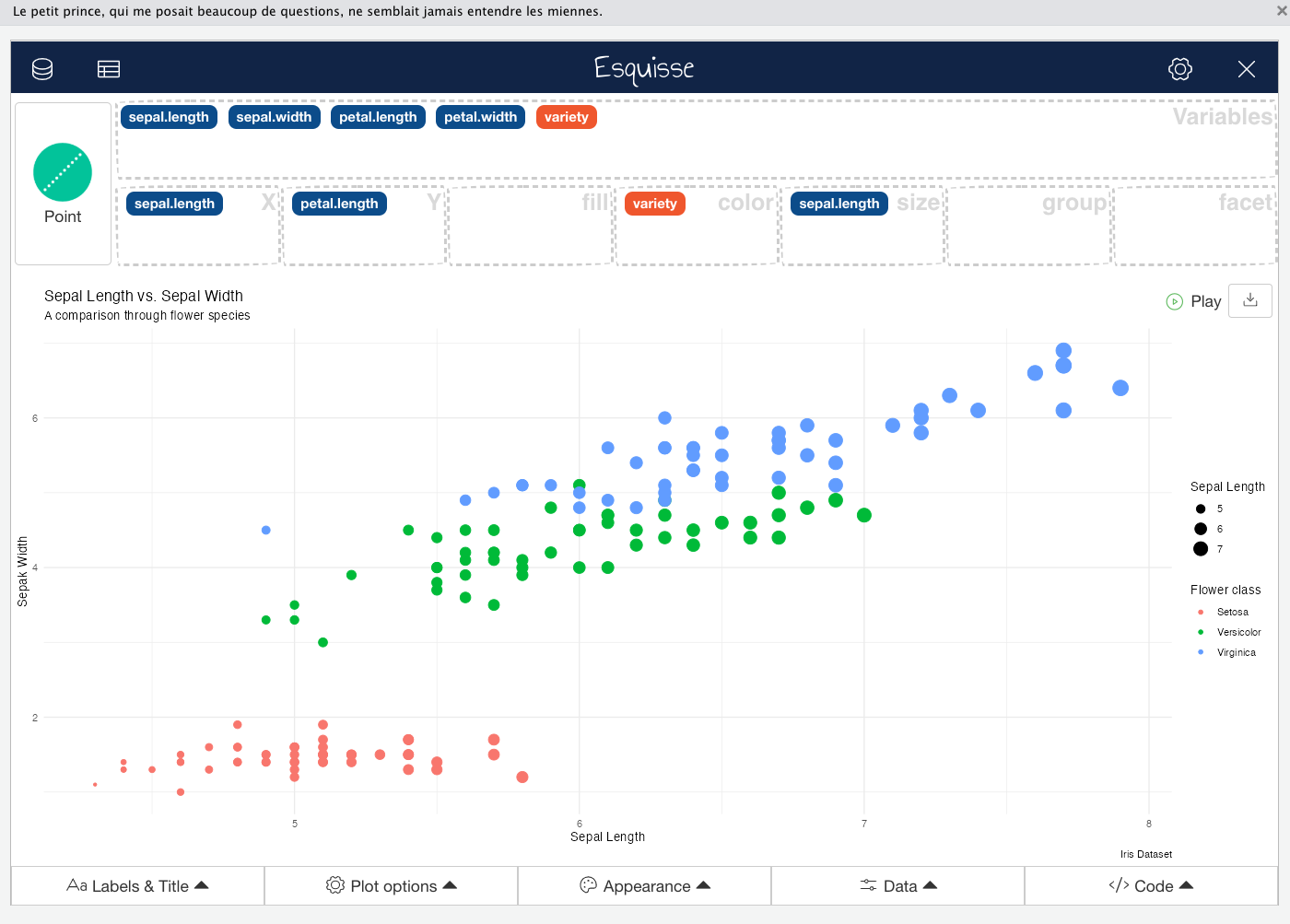
Image 10 – Updated charts with title and axis labels
On the risk of sounding like a salesman, allow us to say one thing – wait, there’s more. You can click on the plus button on the right of each property in the Labels & Title section to further tweak the visuals. For example, you can change the font face, font size, and element alignment:
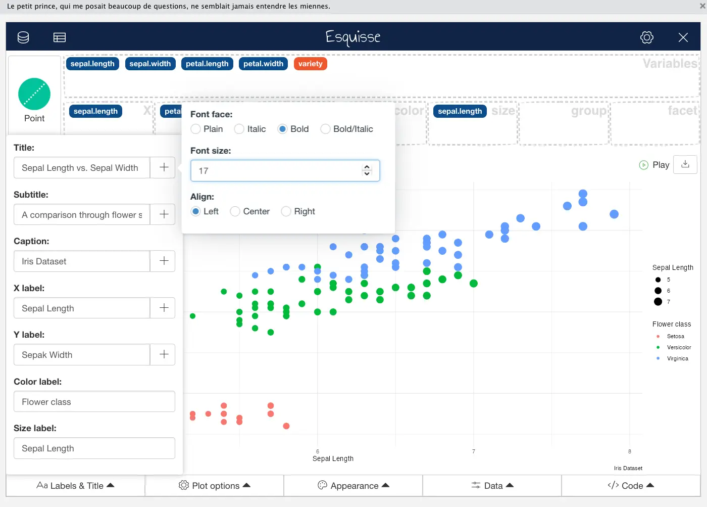
Image 11 – Styling the title and subtitle
Here’s what the updated chart looks like:
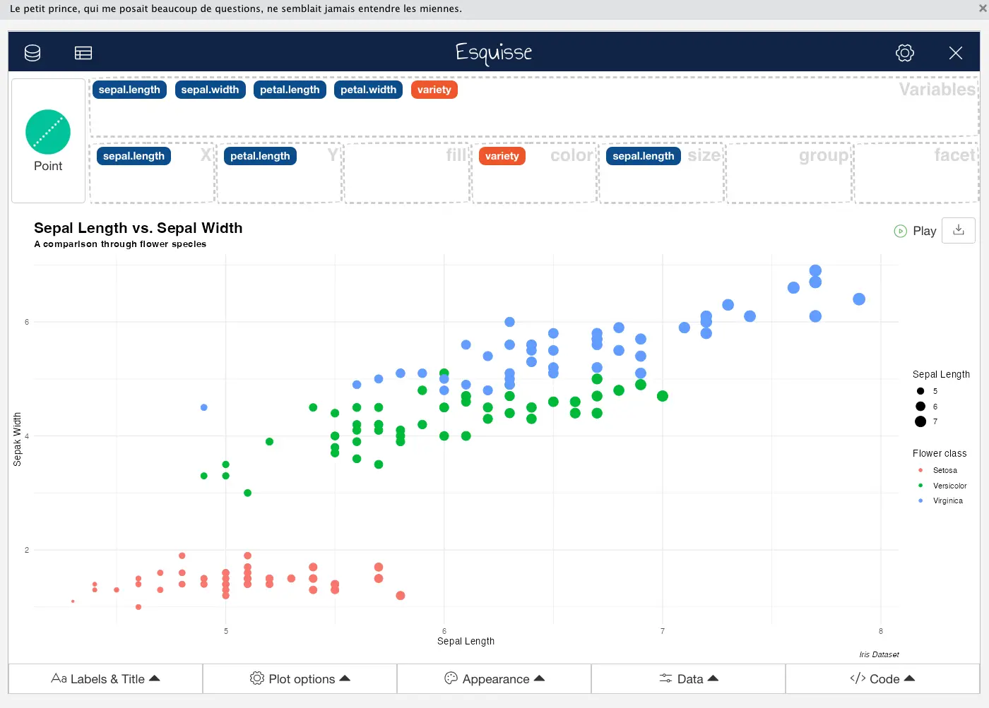
Image 12 – Updated chart
Long story short, Esquisse allows you to change these things quickly without referencing the ggplot2 documentation every time. Let’s be honest, you probably can’t remember the right function name from the top of your head. And that’s fine.
Scatter plots can be confusing for beginners – Our detailed article on ggplot2 will teach you everything you need to know.
We now have a rich set of titles and axis labels on our chart, but the visualization still looks a bit dull. Let’s address the visuals next.
Tweak the Visualization Appearance
The Appearance section in R Esquisse does just what the name suggests – it allows you to tweak the visuals of your chart. You can change the color scheme, marker symbol, theme, and legend position – at least for scatter plots. Other chart types will come with their specific set of tweaking options.
For now, click on the Appearance section to see what your options are:
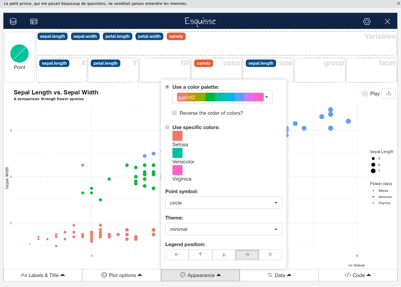
Image 13 – Appearance tweaking
We’ll change the color palette and theme to get a more minimalistic chart. We’ll also change the position of Legend to the top to give more space to the chart. It’s strange to say this since the previous theme was named minimal, but we find this one to be more minimal-istic:
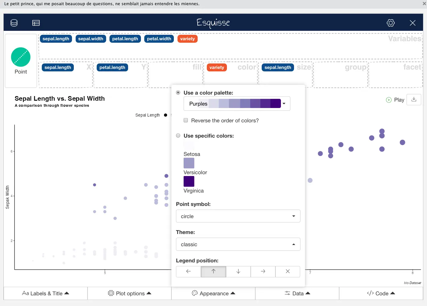
Image 14 – Changing color palette and theme
Here’s what the updated chart looks like:
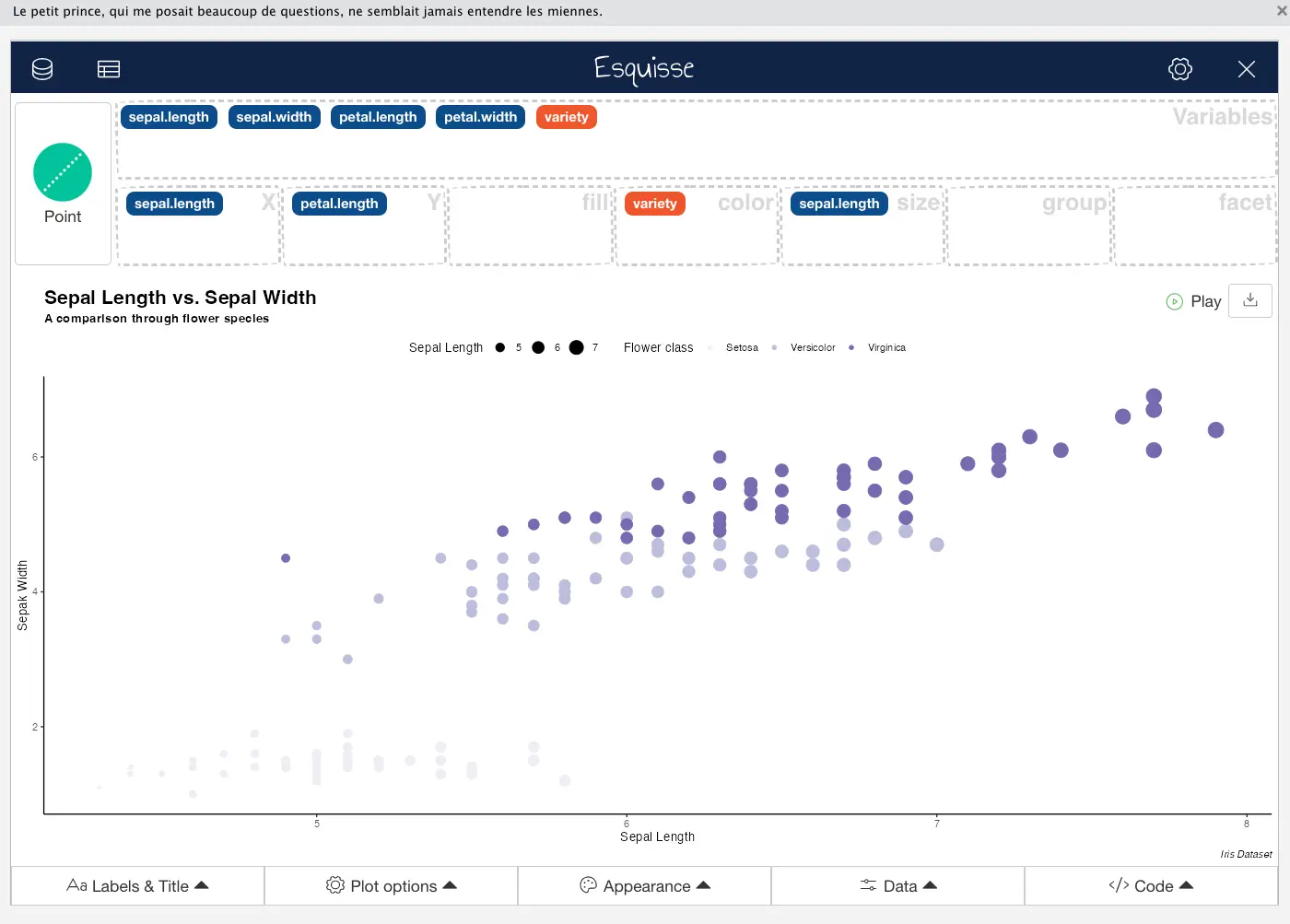
Image 15 – Updated chart
If you don’t like the built-in color palettes, you can always bring your own. Esquisse will provide you with as many options are there are distinct categories in the variable selected in the Color container.
Our chart is pretty much done, so next, let’s see how to get the R code needed to create it.
Export the ggplot2 Visualization Code
The code export tool in R Esquisse is likely the most useful feature of the entire package, since it allows people with no experience in R or ggplot2 to create stunning visuals with just drag-and-drop and learn both technologies at the same time.
To get started, click on the Code section to get the R code for creating your chart:
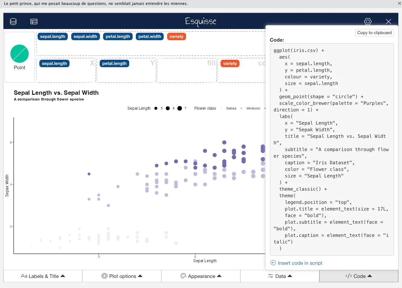
Image 16 – ggplot2 code for the chart
It won’t quite get you there, since it doesn’t seem to import the required R packages, and it also doesn’t provide a mechanism for loading your data. The Iris dataset is in CSV file format, so you’ll have to use the read.csv() function to import it.
Here’s the entire snippet – modified and fully working:
library(ggplot2)

ggplot(read.csv("/Users/dradecic/Desktop/iris.csv")) +
  aes(
    x = sepal.length,
    y = petal.length,
    colour = variety,
    size = sepal.length
  ) +
  geom_point(shape = "circle") +
  scale_color_brewer(palette = "Purples", direction = 1) +
  labs(
    x = "Sepal Length",
    y = "Sepak Width",
    title = "Sepal Length vs. Sepal Width",
    subtitle = "A comparison through flower species",
    caption = "Iris Dataset",
    color = "Flower class",
    size = "Sepal Length"
  ) +
  theme_classic() +
  theme(
    legend.position = "top",
    plot.title = element_text(
      size = 17L,
      face = "bold"
    ),
    plot.subtitle = element_text(face = "bold"),
    plot.caption = element_text(face = "italic")
  )
You’ll see a familiar-looking chart if you run the code:
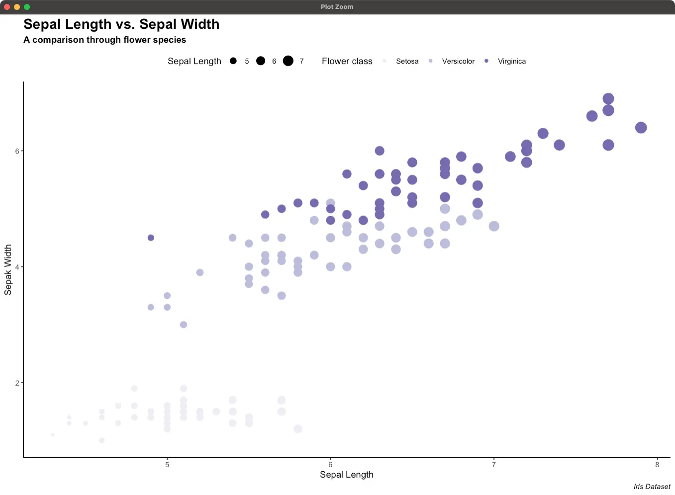
Image 17 – Rendered chart
Just remember to import ggplot2 and load the data properly – R Esquisse will do the rest.
Up next, let’s go over some additional features this package provides.
Additional Features – Multi-Language Support and In-Browser Application
This section will walk you through two additional features present in R Esquisse.
Esquisse Browser Viewer
Maybe you don’t like that Esquisse launches in a separate window, and you’d prefer to start it in your favorite browser instead. The developers behind this package have thought of that use case, and have provided you with an additional parameter you need to specify when starting it.
Simply add viewer = "browser" and Esquisse will launch in your default web browser:
library(esquisse)
esquisser(viewer = "browser")
Here’s what it looks like on our end:
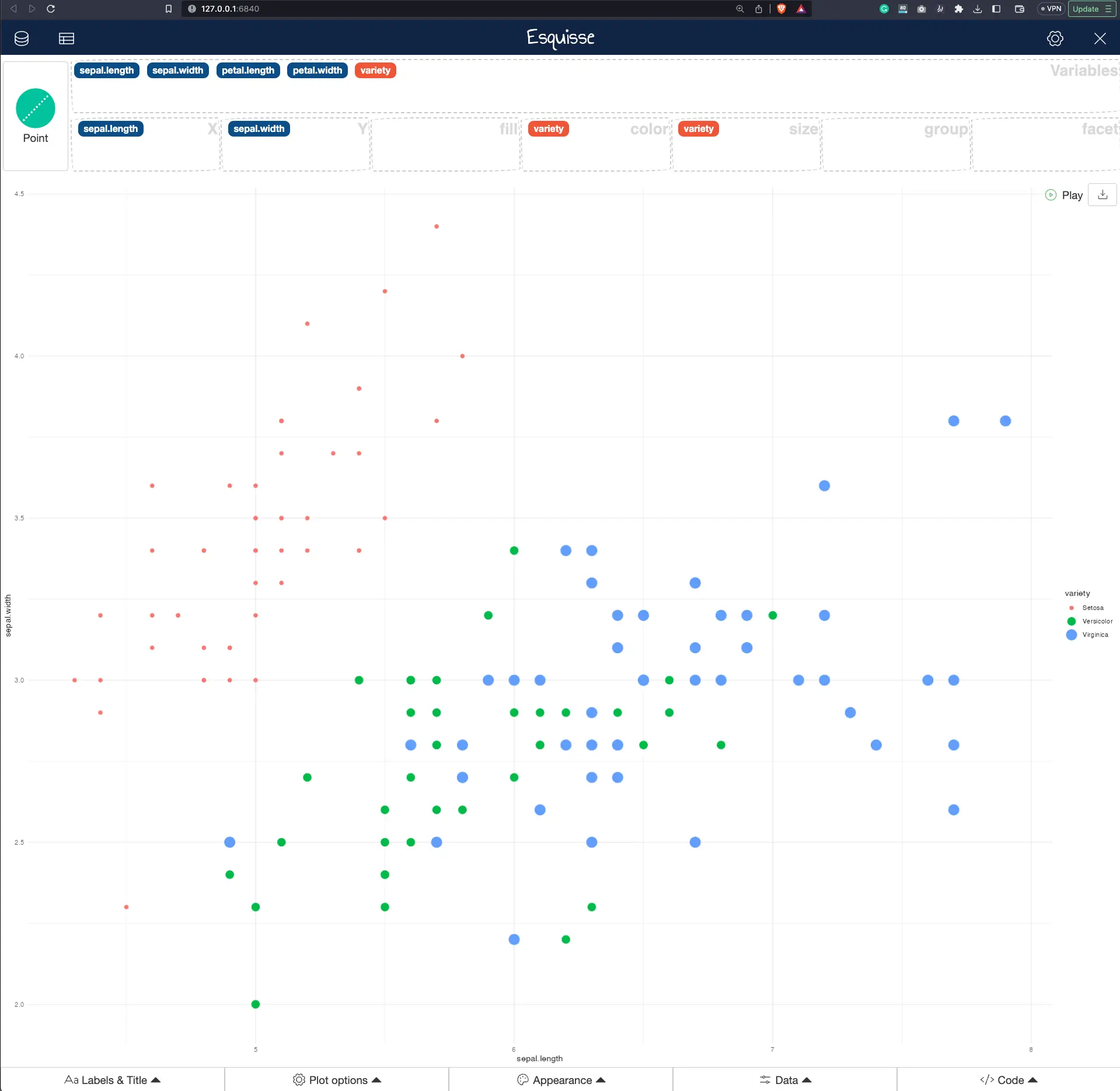
Image 18 – Esquisse in browser
There’s one other neat functionality you must know about.
Internationalization with i18n
If you work in a global setting, chances are you might need to add multiple languages. Or maybe you’d prefer to learn ggplot2 in your native language. Well, if you live in France (fr), Macedonia (mk), or Albania (sq), you’re in luck. It’s a short list of languages, but it might just be enough for you.
Looking to add internationalization to your Shiny app? shiny.i18n makes it easier than ever.
Use the set_i18n("language_code") function to translate Esquisse. Here’s an example of how to translate it into Macedonian:
library(esquisse)
set_i18n("mk")
esquisser(viewer = "browser")
The translation takes place even on the start screen:
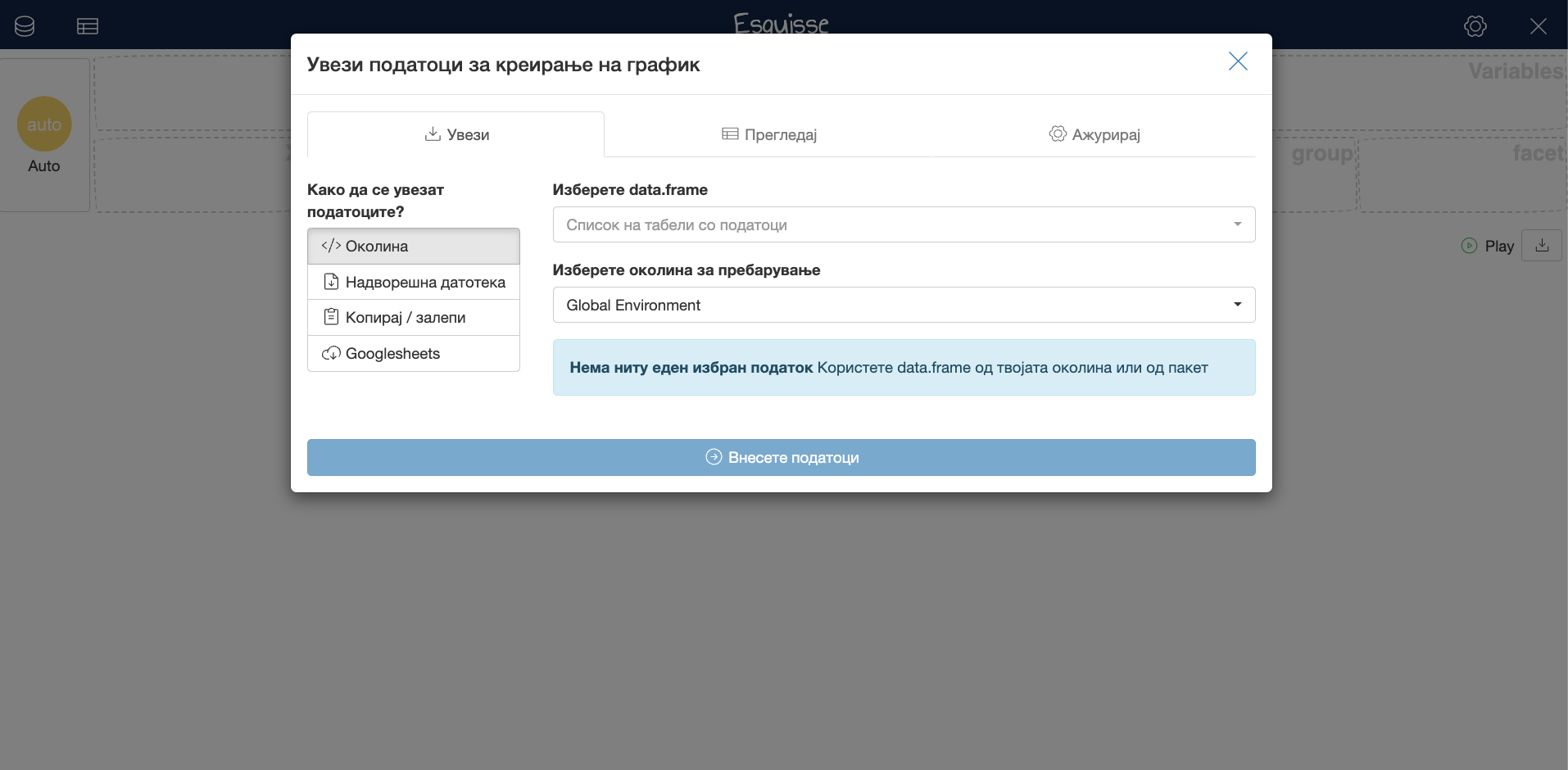
Image 19 – Internationalization in Esquisse, Macedonian example
And that’s the basics of Esquisse. What are the next steps? Read the summary section to find out.
Get Started with R Esquisse
In today’s article, we covered the basics of R Esquisse, including how to install the package, how to import data, and how to create visualizations using the drag-and-drop interface. We also discussed some of the advanced features of the package, such as multi-language support and in-browser application. It’s enough to get you started, to say at least.
The next step in R Esquisse is to learn how to use it in R Shiny, a web application framework for building interactive web apps with R. In our upcoming article, we will cover how to integrate R Esquisse into an R Shiny app to create a user-friendly interface for exploring and visualizing data. Stay tuned to the blog for that article.
What are your thoughts on Esquisse? Does it deliver a Tableau-like user interface? Does your team need more solutions like this? Let us know in the comment section below, or reach out on Twitter – @appsilon– We’d love to hear from you.
Looking for a more serious Business Intelligence (BI) tool? Read our comparison between Tableau, PowerBI, and Sisense.


