

 Share
Share Tweet
Tweet Share
Share


Power BI vs R Shiny: Two Popular Excel Alternatives Compared

29 October 2020
tl;dr Power BI vs R Shiny
Choosing the appropriate dashboarding/reporting/BI tool has never been harder. There are plenty of genuinely great options such as R Shiny, Power BI, and Tableau. Today we’ll compare two widely used tools at Fortune 500 companies; Power BI vs R Shiny.
- Power BI – a collection of software services, apps, and connectors that work together to turn unrelated sources into coherent, visually immersive, and interactive insights (source: Microsoft)
- R Shiny – a web framework written in R, widely used to make dashboards and interactive web applications
More of a Tableau fan? Learn how Tableau compares to R Shiny?
One thing to keep in mind: R Shiny is not a reporting/dashboarding tool. It’s actually a full web framework.
As most people use it to make dashboards, and many of our customers compare R Shiny with Power BI when they invest in analytical solutions, we can consider this comparison fair.
We’ll start with a basic overview of Power BI and then compare both tools in various areas, such as:
- Connectivity
- Chart Types
- Ease of Use: Simple Charts
- Ease of Use: Simple Dashboards
- User Input and Interactivity
- Visual styling
- Conclusion
At Appsilon, we are global leaders in R Shiny, and we’ve developed some of the world’s most advanced R Shiny dashboards, so we have a natural bias toward using Shiny. However, many members of our team have plenty of experience using Power BI in professional settings. We will do our best to be impartial in this article to help you decide whether Power BI or R shiny is genuinely best for your particular needs.
Power BI Overview
As mentioned previously, Power BI is used to represent interactive insights from various data sources visually. It is a perfect tool for reporting, which is a read-only operation and is relatively easy to build and maintain. Power BI is also one of the easiest tools to get started with, as only a couple of crash courses should get you up to speed in no time. We’re not saying R is difficult to learn, but the drag and drop GUI interface is considered to be easier to learn than R, at least for business folks.
Power BI Pros
But here’s one of the most important selling points – Power BI just looks good out of the box. You don’t have to be an expert to produce great-looking visualizations with Power BI. Shiny requires much more manual labor to produce great-looking dashboards. Manual work isn’t necessarily bad, as there’s no limit to what you can do if you’re willing to put the effort in, but simple drag and drop tools are more than enough most of the time.
Searching for good-looking Shiny dashboard examples? Check out Appsilon’s Shiny Demo Gallery.
Power BI Cons
For every pro, there’s a con, and PowerBI is no exception. One of the most significant disadvantages of Power BI is that it is read-only.
As a user, you cannot use charts/tables to make decisions and save them in a database directly. Also, Power BI doesn’t have an accessible source code. You can only edit fields in WYSIWYG mode, which makes Power BI easy to start but difficult to maintain. Having no source code makes it nearly impossible to have proper version control, automatically test logic, or collaborate on large projects.
Power BI Options
Power BI comes in a few different flavors, listed below:
- Power BI Desktop – an application you can download and install on your computer. Available only for Windows. It has powerful data analysis capabilities and can connect to many data sources. It is used to perform analysis, create visualizations, and create reports.
- Power BI Service (Pro) – web application. It is used to create visualizations and reports. The biggest selling point is dashboards -and they are easy to make. Also, it’s easier to share results thanks to the collaboration mode.
- Power BI Mobile – mobile application for both Android and iOS. It is used only to access your data from anywhere, not to perform analysis.
Most of our attention today will focus on the Power BI Desktop variant.
Connectivity in Power BI vs R Shiny
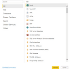
Power BI comes with many built-in connection types categorized into Files, Databases, Power Platform, Azure, and Online services, and is, without any doubt, more versatile than our last contestant – Tableau. As of late 2020, you find these connection options:
Put simply, Power BI doesn’t come short when it comes to connectivity. On the other side of the equation, R Shiny uses R as the programming language of choice, so Shiny can connect to any source that R can.
A simple Google search will yield either a premade library or an example of API calls for any data source type. R Shiny can sometimes have an edge for domain-specific sources. Still, we’ve found multiple examples of Power BI handling domain-specific data sources, such as CAD files.
Winner (Connectivity): Tie
Chart Types in Power BI vs R Shiny
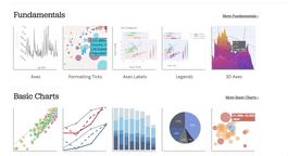
Power BI Charts
Power BI provides basic visualization options – bar, line, area, scatter, and pie charts, with a couple of fancier types such as maps, treemaps, funnels, and ribbon charts. Refer to the image below for a full list:
Still, it might be more than enough for most use cases, as more sophisticated statistical plots don’t appear too often in production dashboards. Also, you might have noticed these “R” and “Py” icons. This means you can use R and Python charts in Power BI, with just one caveat – the source code of these charts is not under version control.
Curious about R Shiny dashboards? Get started with an introduction to dashboards in R Shiny.
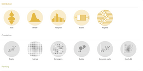
R Shiny Charts
In R Shiny, you can use any visualization library that’s available in R, such as ggplot2 and plotly. Here’s an overview of the types of visualizations you can do with both:
GGplot2 options; Source: https://www.r-graph-gallery.com
Plotly options; Source: https://plotly.com/r/
Declaring a winner in this department is a no-brainer.
Sure, Shiny can do a lot, but Power BI can do all of that and much more. Power BI can handle its own charts and Python-generated ones.
Winner (Chart Types): Power BI
Ease of Use: Simple Charts in Power BI vs R Shiny
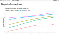
We’ll now get our hands dirty with recreating the same visualization in both Power BI and Shiny. For demonstration purposes, we’ll use the Gapminder dataset, so make sure to download it if you’re following along. The goal is to create a simple line chart, comparing average life expectancy over time per continent.
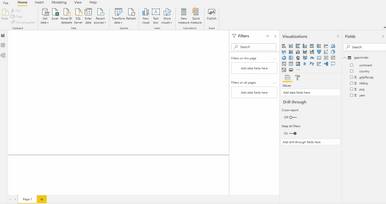
Simple Chart with Power BI
Let’s start with Power BI. We’ve imported the dataset and created the visualization with the following steps:
Power BI was designed to be easy to use for people from all backgrounds, making this simple chart a no-brainer to implement.
Simple Chart with R Shiny
Replicating the same in R Shiny is quite a different story, as we need to write actual code. The dataset is available in R through the gapminder package, so there’s no need to download and import the provided CSV. Shinyintroduces some boilerplate code – an apparent downside for this simple chart but negligible for larger, real-world projects.
Here’s the code:
library(gapminder)
library(ggplot2)
library(dplyr)
library(shiny)

ui <- fluidPage(
  titlePanel("Gapminder explorer", windowTitle = NULL),
  plotOutput("line")
)

server <- function(input, output) {
  output$line <- renderPlot({
    data <- gapminder %>%
      group_by(year, continent) %>%
      summarise(avgLifeExp = mean(lifeExp))

    ggplot(data, aes(x = year, y = avgLifeExp, color = continent)) +
      geom_line(size = 1.5) +
      ggtitle("Average life expectrancy per continent through time") +
      labs(x = "Year", y = "Average life expectancy") +
      theme_light() +
      theme(
        plot.margin = unit(c(2, 1, 1, 1), "cm"),
        plot.title = element_text(vjust = 13),
        legend.position = c(0.25, 1.07), legend.direction = "horizontal"
      )
  })
}

shinyApp(ui = ui, server = server)
And here are the results:
As was the case with Tableau, there’s no point in using R Shiny to produce single-chart and non-interactive dashboards.
This is one of the areas where Power BI dominates, as it’s easy and intuitive to use. Also, charts in R require a bit of customization to look decent and interpretable, which comes out of the box with Power BI. But then again, you could just as well use Excel or Google Sheets for free!
Winner (Simple Charts): Power BI
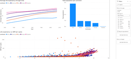
Ease of Use: Simple Dashboards in Power BI vs Shiny
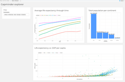
Making a simple dashboard in Power BI was easy – a couple of clicks here and there, a couple of filters, and we’re ready to go. The goal was to display three charts:
- Average life expectancy through time – as a line chart
- Total population per continent – only in the most recent year (2007), represented as a bar chart
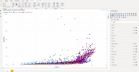
- Life expectancy vs. GDP per capita – simple scatter plot, colored by continent
The entire dashboard can then be filtered by continent – by selecting a single one or multiple. Here’s what we’ve managed to create in Power BI:
To implement roughly the same dashboard in R Shiny, we need to write some R code. Once again, R is a relatively easy language to learn, so we don’t see it as a problem for more tech-savvy users.
The following code recreates the dashboard we had in Power BI:
library(shiny)
library(gapminder)
library(dplyr)
library(ggplot2)

ui <- fluidPage(
  titlePanel("Gapminder explorer", windowTitle = NULL),
  sidebarPanel(
    width = 3,
    tags$h4("Filter"),
    selectInput(
      inputId = "continentSelect",
      label = "Continents",
      choices = c("Africa", "Americas", "Asia", "Europe", "Oceania"),
      selected = c("Africa", "Americas", "Asia", "Europe", "Oceania"),
      multiple = TRUE
    )
  ),
  mainPanel(
    width = 9,
    fluidRow(
      column(7, tags$div(
        tags$h3("Average life expectancy through time"),
        plotOutput("line")
      )),
      column(5, tags$div(
        tags$h3("Total population per continent"),
        plotOutput("bar")
      ))
    ),
    fluidRow(
      column(12, tags$div(
        tags$h3("Life expectancy vs. GDP per capita"),
        plotOutput("scatter")
      ))
    )
  )
)

server <- function(input, output) {
  output$line <- renderPlot({
    dataLifeExp <- gapminder %>%
      filter(continent %in% input$continentSelect) %>%
      group_by(year, continent) %>%
      summarise(avgLifeExp = mean(lifeExp))

    ggplot(dataLifeExp, aes(x = year, y = avgLifeExp, color = continent)) +
      geom_line(size = 1.5) +
      labs(x = "Year", y = "Average life expectancy") +
      theme(
        plot.margin = unit(c(2, 0, 0, 0), "cm"),
        legend.position = c(0.25, 1.05),
        legend.direction = "horizontal"
      )
  })

  output$bar <- renderPlot({
    popPerContinent <- gapminder %>%
      filter(continent %in% input$continentSelect) %>%
      mutate(maxYear = max(year)) %>%
      filter(year == maxYear) %>%
      select(continent, pop) %>%
      group_by(continent) %>%
      summarise(total = sum(pop))

    ggplot(popPerContinent, aes(x = reorder(continent, -total), y = total)) +
      geom_bar(stat = "identity", fill = "#519bff") +
      labs(x = "Continent", y = "Total population") +
      geom_text(aes(label = formattable::comma(total, digits = 0)), vjust = -0.3, size = 5) +
      theme(
        axis.text.y = element_blank(),
        axis.ticks.y = element_blank()
      )
  })

  output$scatter <- renderPlot({
    lifeExpWithGdp <- gapminder %>%
      filter(continent %in% input$continentSelect) %>%
      select(continent, gdpPercap, lifeExp)

    ggplot(lifeExpWithGdp, aes(x = lifeExp, y = gdpPercap, color = continent)) +
      geom_point(alpha = 0.7) +
      labs(x = "Life expectancy", y = "GDP per capita") +
      theme(
        plot.margin = unit(c(2, 0, 0, 0), "cm"),
        legend.position = c(0.15, 1.05),
        legend.direction = "horizontal"
      )
  })
}

shinyApp(ui = ui, server = server)
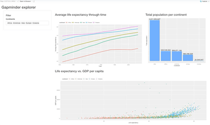
And here’s what the dashboard looks like:
We’ll work on visual appearance later, so don’t worry too much about that. It’s hard to announce a clear winner here, but R Shiny’s dashboard feels more solid to work in. As we saw, you can make a simple dashboard much faster with Power BI. For this reason, we’ll declare Power BI the winner for simple dashboards, but only for ease of use. R Shiny is more versatile if you require a sophisticated dashboard.
Winner (Simple Dashboards): Power BI by a nose
User Input and Interactivity
As mentioned in the overview section, Power BI is read-only. Sure, you can click on the various filters to include/exclude some data from the chart, but that’s pretty much all you can do. We think inputs are essential in creating interactive dashboards, so a full web framework like Shiny annihilates its opponent in this department.
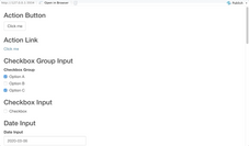
Shiny has a wide array of inputs – from text fields and buttons to dropdowns and modals. Here’s everything Shiny provides:
With all of these options, if arranged right, there’s no task too difficult for Shiny to solve. If you still aren’t sold on the importance of interactivity, here are a couple of points that will make you reconsider:
- The file input component allows us to upload a custom dataset and perform exploration in the browser
- The text input and password input fields allow us to build complete web forms – think authentication
- The var select input allows us to quickly select column(s) of interest from a dataset
Winner (User Input and Interactivity): R Shiny
Visual Styling
Tweaking the looks and feels of visuals in drag and drop tools like Power BI or even Tableau was never their strong point. These tools are designed to look good by default. Still, not everyone agrees on what classifies as good, so it’s nice to have options.
We’ve found that you can tweak a decent amount of things in Power BI. Here’s a rough overview:
The story is quite different with R Shiny. You can embed custom CSS styles by creating awww folder right where your Shiny app is. The CSS files are then stored inside the mentioned folder.
Learn More: How to Use CSS to Style Your R Shiny Dashboards
To connect the two, you have to put theme = main.css inside the fluidPage in the Shiny app. That’s all. In just a couple of minutes with CSS, we’ve managed to transform our dashboard quite a bit:
The winner of this battle is obvious, once again. PowerBI looks good out of the box, sure, but there’s not much you can do to make it look perfect. R Shiny is extremely versatile when it comes to visual styling (in the hands of the right developer).
Winner (Visual Styling): R Shiny
Conclusion: Powerful Business Intelligence Tools
Power BI vs R Shiny Score
The final results are in:
- PowerBI – 3 points
- R Shiny – 2 points
- Tie – 1 point
By our count, PowerBI took the lead by a single point for most general use cases. Of course, choosing the appropriate business intelligence tool isn’t as simple as counting to 5. Further clarifications are required like specifics for your team or project.
Recap: Comparing Business Intelligence Tools
Power BI is great when you need something relatively simple and aren’t worried too much about the looks and overall feel of the dashboard. For anything more complex, R Shiny overthrows PowerBI. PowerBI just can’t compare with the customizability that Shiny offers, especially if you need to create an enterprise application.
Learn More: Why You Should Use R Shiny for Enterprise Application Development
Better Business Analytics Tools
If you need to create powerful, customizable, and interactive dashboards that look great and respond to user input, Shiny is a clear winner. It requires a bit of coding knowledge even for simple dashboards, but R isn’t a very complicated language. You can quickly get up to speed in a couple of weeks or even a couple of days, depending on your prior knowledge of programming.
Discover the power of R Shiny for quick proof of concepts. You can develop a Shiny dashboard in 10 minutes or less.
If you want to make scalable enterprise Shiny dashboards, then reach out to Appsilon. We continually push the limits of what’s possible with Shiny. We build open-source R packages for Shiny users.
As Shiny experts, we’d be happy to equip you and your company with better business intelligence solutions.
Learn More
- Tableau vs. R Shiny: Which Excel Alternative Is Right For You?
- How to Switch from Excel to R Shiny: First Steps
- Make R Shiny Dashboards Faster with updateInput, CSS, and JavaScript
 Appsilon is hiring! See our Careers page for new openings.
Contact Us

Project Leader

Get Updates
Subscribe to Shiny Weekly Newsletter
Join 4000+ Shiny enthusiasts to see the latest Shiny news from the R community.


