


 Share
Share Tweet
Tweet Share
Share


Shiny Application Layouts Are Changing

17 October 2022
Join the Shiny Community every month at Shiny Gatherings
Shiny as a web framework is known for its combination of power, simplicity, and flexibility. It’s a convenient tool for app development at all levels, from proof of concept to production-grade Shiny apps. With additional packages like {imola} and {shiny.fluent}, anyone can create professional Shiny app UIs with custom layout options.
These characteristics make Shiny an easy-to-pick-up technology, helping teams and R users – without web development experience – to create applications and automate tasks fast. But soon we realize that this simplicity comes with a cost: boilerplate applications that look basic and monotonous.
No time to waste? Download a free Shiny template from Appsilon.
To overcome this problem we can start adding custom styles and layouts to our apps with CSS. Alternatively, we can incorporate packages developed by the R community to introduce new styles to Shiny apps without adding too much complexity to the process. Among the many packages are: {shiny.dashborard}, {shinythemes}, {bslib}, {shiny.semantic}, {shiny.fluent}, and {imola}. There is a vibrant and healthy ecosystem of R packages out there to satisfy your needs.
On the fence about Shiny for your business? See why you should be using R Shiny for enterprise application development.
In this post, we’re going to cover {shiny.fluent} and {imola}. And we’ll show you how to create Shiny apps that will impress your team.
{shiny.fluent} is a package developed by Appsilon to integrate Microsoft’s open-source Fluent UI components into Shiny applications. With this package, Shiny users are able to build applications with the look and feel of Microsoft’s user-friendly and elegant UI.
Using {shiny.fluent} in your project is quite simple. The basic input arguments are similar to those in base Shiny and all components are well documented. In the shiny.fluent demonstration, you can explore a preview of almost every available widget – like a catalog or peoplepicker. You can explore and select the ones that better suit your needs, grab the code presented, and use it in your app.
{imola} is an R package developed by Pedro Silva, and is a great solution to incorporate CSS grid and flexbox into Shiny applications. And it does so in a straightforward way. This package comes with built-in templates for the most common layouts in app development, and with flexibility for users to incorporate custom templates.
The goal of the {imola} package is to turn any container into a grid or flexbox container with minimal refactoring of the original code; It’s recommended for applications that need mobile support.
To get familiar with {imola} there are a few recommended resources:
It’s a good idea to go through them, especially the vignette and the minimal reproducible examples. There you’ll discover how to change the default configuration of the templates and how to add styles.
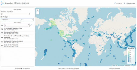
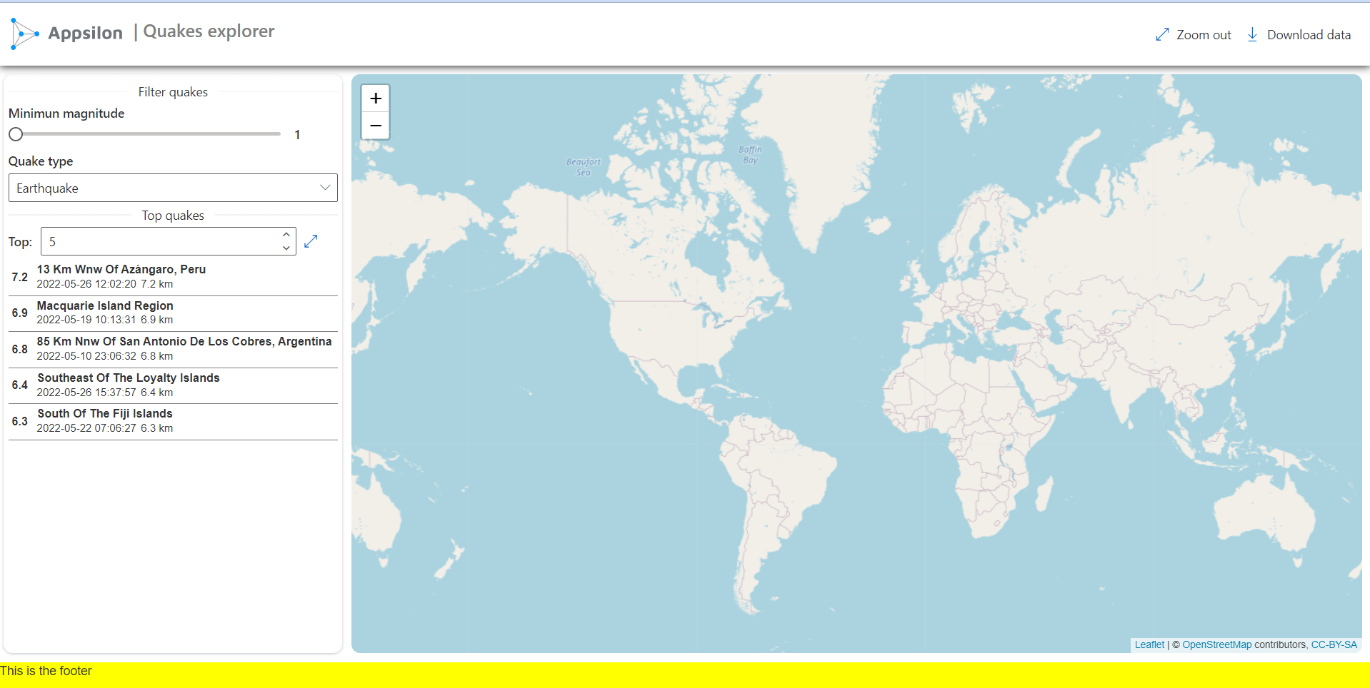
To showcase the integration between {shiny.fluent} and {imola}, let’s create an application to explore recent earthquakes. The data comes from the U.S. Geological Survey (USGS) and covers all earthquakes registered from April 28 to May 28, 2022.
The dataset contains details for each earthquake like longitude, latitude, magnitude, depth, registration date, source, and estimates error for each metric. You can use this data in complex applications like the USGS interactive map which served as inspiration for this post.
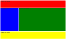
In our case, we can try {imola}’s “grail-left-sidebar” grid template for this app. This layout has 4 areas in a 3-row by 2-column grid. The areas are header, sidebar, content, and footer.
For this example, let’s start with placeholders for each area. This allows us to see the grid structure beforehand, later we can replace each one, step by step.
library(shiny)
library(shiny.fluent)
library(imola)
library(stringr)
library(dplyr)
library(readr)
library(leaflet)
library(glue)
library(purrr)

quakes_data <- read_csv("data/quakes_may_2022.csv")

ui <- gridPage(
  tags$head(tags$link(rel="stylesheet", href = "quakes_style.css")),
  template = "grail-left-sidebar",
  gap = "10px",
  rows = list(default = "70px 1fr 30px"),

  header = div("This is the header", style = "background-color: red;"),
  sidebar = div("This is the sidebar", style = "background-color: blue;"),
  content = div("This is the content", style = "background-color: green;"),
  footer = div("This is the footer", style = "background-color: yellow;")
)

server <- function(input, output, session) {}
shinyApp(ui, server)
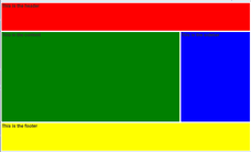
Just by changing the template argument to "grail-right_sidebar" we can get another layout. Like in the example below:
Feel free to explore all available templates that come with {imola}, or add your own.
We used the file quakes_styles.css to add minor style configurations to some elements, shadows, borders, height and width. You can create it. Place it in your www folder. And add it to the app. This is its content:
#sidebar {
  box-sizing: border-box;
  box-shadow: rgba(149, 157, 165, 0.6) 0px 1px 3px;
  padding: 5px;
  margin-left: 5px;
  border-radius: 10px;
}
#top_quakes_inputs {
  height: auto;
  margin-bottom: 5px;
}
#top_quakes {
  max-height: 50vh;
  overflow: auto;
}
.quake-container:hover {
    background-color: gainsboro;
    cursor: pointer;
}
#map, #content {
  border-radius: 10px;
  margin-right: 10px;
}
#footer{
  padding-left: 5px;
  text-align: center;
}
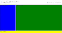
For the header, let’s go with a flexPanel with three elements: logo, title, and a command bar with two buttons. These buttons will be used to download the data and zoom out on a map.
A flexPanel is an `{imola} function to generate HTML and automatically add CSS flexbox style to it, depending on the given arguments.
header_commandbar_list <- list(
  list(
    key = 'zoom_out',
    text = "Zoom out",
    iconProps = list(iconName = "FullScreen")
  ),
  list(
    key = 'download',
    text = "Download data",
    iconProps = list(iconName = "Download")
  )
)

app_header <- flexPanel(
  id = "header",
  align_items = "center",
  flex = c(0, 1, 0),
  img(src = "appsilon-logo.png", style = "width: 150px"),
  div(
    Text(variant = "xLarge", "| Quakes explorer", style="color: gray;"),
    style = "margin-bottom: 10px;"),
  CommandBar(items = header_commandbar_list),
  style = "box-shadow: 0 0 10px #000;"
)

# Updating ui content
ui <- gridPage(
  tags$head(tags$link(rel="stylesheet", href = "quakes_style.css")),
  template = "grail-left-sidebar",
  gap = "10px",
  rows = list(
    default = "70px 1fr 30px"
  ),

  header = app_header,
  sidebar = div("This is the sidebar", style = "background-color: blue;"),
  content = div("This is the content", style = "background-color: green;"),
  footer = div("This is the footer", style = "background-color: yellow;")
)
The sidebar will contain {shiny.fluent} inputs to filter the earthquakes of interest. The type of quake and the magnitude are good filter variables for this example. So, for the type of quake, let’s use a dropdown menu and for magnitude, a slider input.
Another component of the sidebar will be a table with the top quakes by the selected criteria. To showcase another {shiny.fluent} input, let’s add a numeric input to control the number of observations to display in the table.
For the table, we’re going with a custom design instead of using a classic table output. The disply_quake() function takes as arguments the place, magnitude, time, depth, and id of a given quake and renders an HTML structure with that information.
Pay special attention to the onclick argument, here we’re passing a JavaScript function that sends the id of the clicked quake as an input to the server. Part of the logic of the app will depend on this.
display_quake <- function(mag, place, time, depth, id) {
  container_style <- "
    display: flex;
    padding: 4px;
    align-items: center;
    gap: 10px;
    margin-bottom: 0px;
    border-bottom: solid gray 1px;
  "
  h3_style <- "
    margin: 0;
    font-size: 13px;
    font-weight: 700;
  "
  p_style <- "
    margin: 0;
    font-size: 12px;
    font-weight: 300;
  "
  meta_style <- "
    display: flex;
    wrap: nowrap;
    gap: 5px;
  "

  div(
    style = "display: flex;",
    class = "quake-container",
    id = id,
    onclick = "sentQuakeId(this.id)",
    h3(mag, style = h3_style),
    div(
      h3(str_to_title(place), style = h3_style),
      div(
        class = "quake-metadata",
        p(time, style = p_style),
        p(paste(mag, "km"),p = p_style)
      )
    ),
    style = container_style
  )
}
Here is the function defined to send the id of the clicked quake to the server as a Shiny input. JS code is one of the ways we can communicate the front end of our applications with the Shiny server without Shiny input widgets. Note that we pass this object as a script in the sidebar.
For more details read this post from RStudio (Posit) on how to communicate with Shiny via JS.
# JS function to send clicked quakes's id to the server as an input
sendQuakeId <- "function sentQuakeId(element_id){Shiny.setInputValue('quake_id', element_id)}"
# key value pair table with distincs quakes
quake_types <- quakes_data |>
  distinct(type) |>
  mutate(text = str_to_title(type)) |>
  rename(key = type)

app_sidebar <- div(
  id = "sidebar",
  Separator("Filter quakes"),
  Slider.shinyInput(
    "mag", value = 1, min = 1, max = 6, label = 'Minimun magnitude'),
  Dropdown.shinyInput(
    "type", value = "earthquake",
    options = quake_types, label = "Quake type"
  ),
  Separator("Top quakes"),
  flexPanel(
    id = "top_quakes_inputs",
    basis = c("85%", "10%"),
    wrap = "nowrap",
    align_content = "space-between",
    SpinButton.shinyInput(
      inputId = 'n_quakes', label = "Top:", value = 5, min = 1, max = 15),
    IconButton.shinyInput(
      'zoom_out', iconProps = list("iconName" = "FullScreen"))
  ),
  uiOutput('top_quakes'),
  tags$script(sendQuakeId)
)
With this we have all the dependencies for the sidebar front end. Now, let’s include the content and some logic in the server. The content will be a simple leaflet map that can be included directly in the ui object.
ui <- gridPage(
  tags$head(tags$link(rel="stylesheet", href = "quakes_style.css")),
  template = "grail-left-sidebar",
  gap = "10px",
  rows = list(
    default = "70px 1fr 30px"
  ),

  header = app_header,
  sidebar = app_sidebar,
  content = div(id="content", leafletOutput('map', height = "100%")),
  footer = div("This is the footer", style = "background-color: yellow;")
)
For the server, to keep it didactic, let’s break the logic into numbered steps with details for each one.
In step one, we add a reactive value (quakes_filtered) with the subset of quakes to explore.
In step two, we render the table with the top quakes. For this, we select the top ‘n’ observations and iterate with them over display_quake function using purrr::pmap.
In step three, let’s render an empty leaflet output. This is a good idea because this way we can add other elements later using the leafletProxy() function. In general, this is a good recommendation to avoid your base map from blinking every time an input changes.
server <- function(input, output, session) {
  #1- Select quakes based on magnitude and type
  quakes_filtered <- reactive({ req(input$type) req(input$mag) quakes_data |>
      filter(type == input$type, mag >= input$mag)
  })

  #2- Render sidebar table with top quakes
  output$top_quakes <- renderUI({ req(quakes_filtered) quakes_filtered() |>
      arrange(desc(mag)) |>
      head( input$n_quakes ) |>
      select(mag, place, time, depth, id) |>
      pmap(display_quake)
  })

  #3- Output an empty leaflet map
  output$map <- renderLeaflet({ leaflet() |>
      addTiles() |>
      setView(-27.210814, 30.161823, zoom = 2)
  })
}
There are three more functionalities to implement in the server: adding points colored by corresponding magnitude, popups with useful information, and a zoom-in/-out based on the top quakes clicked in the table.
Are you thinking about UX? Discover the power of motivational UX for app development.
For this, in the next chunk we create two helper functions: make_popups, which returns an HTML tag with information to display as a popup; and map_points_palette to set the color scale for the points.
# function to create popup content
make_popup <- function(place, time, mag, depth){
  glue::glue(
    "

<style>
      .t-title {{margin: 0; color: blue; font-size: 13px}}
      .popup-content p {{margin: 0;}}
    </style>
<div class="popup-content">
<h3 class="t-title">{ str_to_title(place) }
<b>Time: { time } <b>Magnitude: { mag } <b>Depth: { depth } Km </div> "
)
}
# Color palette for leaflet map map_points_palette <- colorNumeric( palette = "YlGnBu", domain = quakes_data$mag )
# Adding popup column quakes_data <- mutate(quakes_data, popup = make_popup(place, time, mag, depth))
It’s time to add the new logic to the server. In step four, we add an observer to render the points. Here we use the leafletProxy function to target the “map” output created in previous steps.
In step five, we add the logic to zoom in on the clicked quakes from the table. This is interesting because we use the input$quake_id, which is the input we created via JS. selected_quake is a list with the longitude and latitude for the clicked quake.
server <- function(input, output, session) { # 4- Adds points and legend to the map observe({ req(quakes_filtered) leafletProxy("map", data = quakes_filtered()) |>
      clearControls() |>
      clearMarkers() |>
      addCircleMarkers(
        radius = input$map_zoom * 2,
        popup = ~popup,
        color = ~map_points_palette(mag),
        lat = ~latitude,
        lng = ~longitude
        stroke = TRUE,
      ) %>%
      addLegend(
        "bottomright",
        title = "Magnitude",
        pal = map_points_palette,
        values = c(1, 3, 5, 7)
      )
  })

  #5- Adds zoom behavior based on clicked quake on the table
  selected_quake <- eventReactive(input$quake_id, {
    quake_index <- which(quakes_filtered()[['id']] == input$quake_id) list( lat = quakes_filtered()[['latitude']][quake_index], lng = quakes_filtered()[['longitude']][quake_index] ) }) observe({ leafletProxy('map') |>
      flyTo(
        lng = selected_quake()[['lng']],
        lat = selected_quake()[['lat']],
        zoom = 6
      )
  })

  #6- Zoom out when needed
  observeEvent(input$zoom_out, {
    leafletProxy('map') |>
      flyTo(-27.210814, 30.161823, zoom = 2)
  })
}
The last step is to add the footer of the app; This is another static element. Let’s use flexPanel with useful information.
app_footer <- flexPanel(
  id = "footer",
  justify_content = 'space-between',
  gap = "20px",
  Text(variant = "medium", "Built with ❤ by Appsilon", block=TRUE),
  Text(variant = "medium", nowrap = FALSE, "Data source: U.S. Geological Survey"),
  Text(variant = "medium", nowrap = FALSE, "All rights reserved.")
)

ui <- gridPage(
  tags$head(tags$link(rel="stylesheet", href = "quakes_style.css")),
  template = "grail-left-sidebar",
  gap = "10px",

  header = header,
  sidebar = sidebar,
  content = div(id="content", leafletOutput('map', height = "100%")),
  footer = app_footer
)
The app is ready! You now know how {imola} and {shiny.fluent} packages can enhance your applications. And you have a sample to practice with. You can access the source code for this project as well as the deployed version in our Shiny demos.
Ready to build your enterprise Shiny app? Follow these 7 steps to design dashboards people will love.
Feel free to reach out to us with questions or comments. The journey doesn’t end here, there are other components and features to explore. With {imola} it is worth the time to take a deep dive into the responsive design capabilities and how to set proper breakpoints for multi-device applications. And for {shiny.fluent} there are numerous innovative widgets available that we didn’t cover here. If you find some you really like, be sure to let us know in the comments or tag us on Twitter with your {imola}/{shiny.fluent} app!
