


 Share
Share Tweet
Tweet Share
Share


How to Make Your Shiny App Beautiful

01 February 2024
Join the Shiny Community every month at Shiny Gatherings
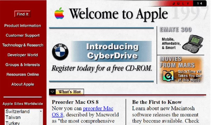
Shiny application layouts are changing. If you’ve been around web development since the 90s, you might remember how different building web page layouts used to look.
As the web evolved, so did the layout (and styling) options available, maturing and changing to make what used to be convoluted solutions and workarounds into simpler, cleaner approaches.
With Shiny for R reaching its 10-year anniversary, its column() and fluidRow() system is starting to show its age and limitations, especially when compared to newer solutions and techniques. But how does it measure against other layout solutions? What other options are even out there? And how can you leverage state-of-the-art web solutions to create truly impressive Shiny dashboard layouts?
Shiny app development has come a long way. Discover how to create Shiny apps like a full-stack software engineer using Rhino.
Join me for a tour of how web layouts got to where we are now; what kind of solutions you can use with Shiny; package recommendations to spice up your next Shiny dashboard, and a peek into what you might not even know you’re missing out on.
Table of Contents:
Web layouts are an integral part of web development. You can think of them as the website structure or the arrangement of all visual elements on a webpage. While common layout patterns are a thing, each website ends up being a bit different. And a good layout that fits your specific needs will often help you balance aesthetics with practicality.
Layouts are usually defined and iterated upon during the early stages of the design process of an application. They can take many forms, from a simple draft picture to a full-blown wireframe. But their purpose is clear: To guide developers during the implementation stage of the project and to give some shape and consistency to the different views of your application.
At its core, Shiny is a web application framework. Like any other web page, it heavily relies on HTML, CSS, and JavaScript for its structure, looks, and functionality.
Users often experience Shiny applications via a browser. So it should come as no surprise that, like any other web page, users have certain expectations when it comes to the application’s speed, look, and experience.
Making our users’ experience as comfortable, familiar, and fulfilling as other pages can be extremely important. When it comes to user adoption, a well-organized layout can sometimes be the difference between a happy and a frustrated user.
If you ever used base Shiny to build the UI of your application, you might have used functions such as fluidPage(), splitLayout(), or fixedPage(). These are some of the built-in layout templates that come with base Shiny.
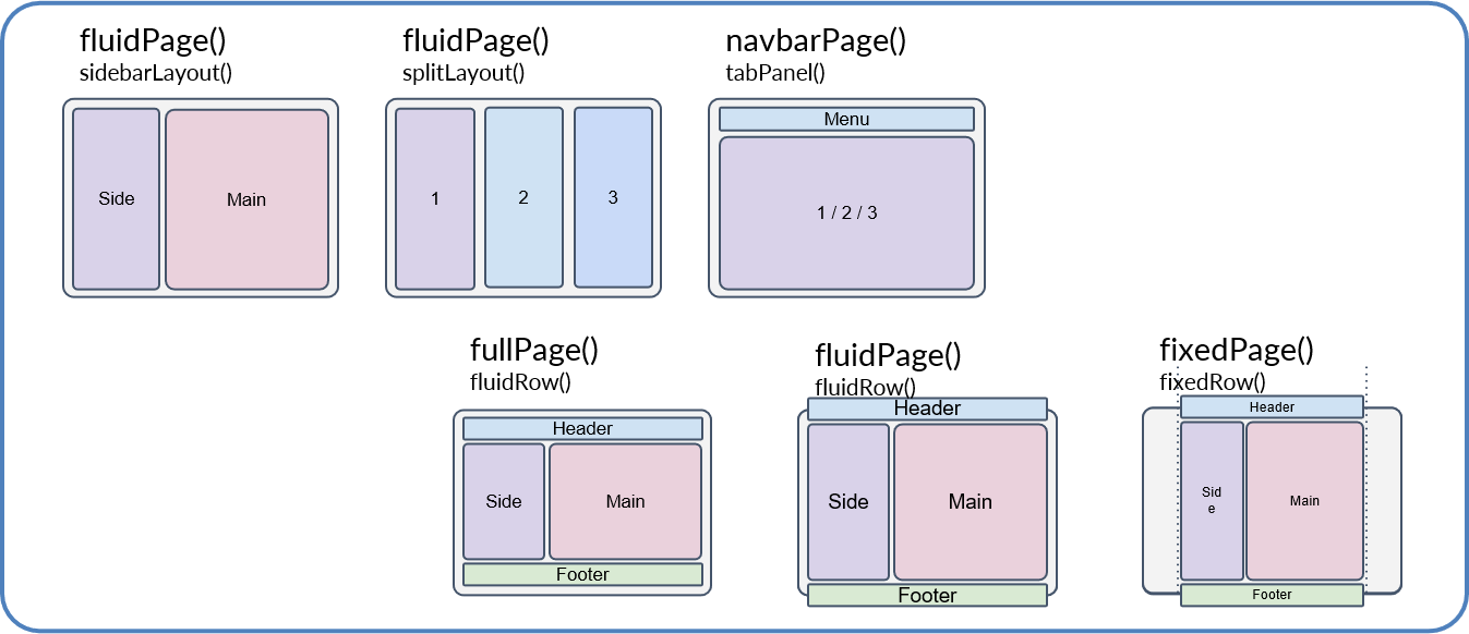
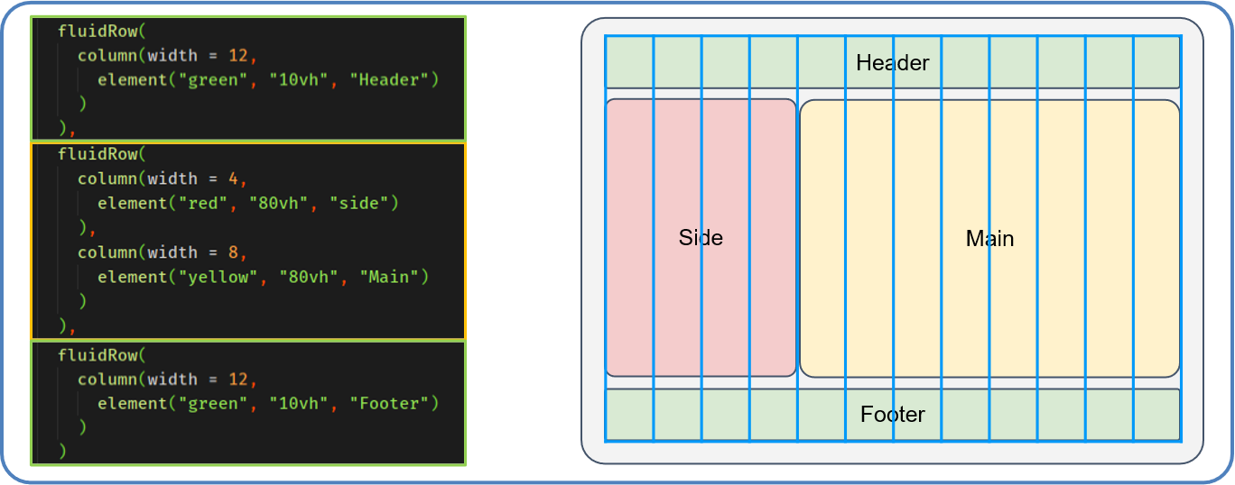
While these are a great way to get started, they offer little flexibility in creating something more unique. At this point, you might have experimented with fluidRow() or column(). Maybe even with the “12 column system” in Shiny that allows you to create different size elements based on a size from 1 to 12.
It should come with no surprise, but this is actually a layout system borrowed from web development.
In the case of Shiny, Shiny specifically leverages Bootstrap 3 for both widget styles and the layout system.
There is nothing wrong with Bootstrap 3, it (mostly) gets the job done… Except it came out in 2013. If fact, Bootstrap itself is already on version 5! That’s 2 major versions, and 10 years of technical improvements that base Shiny does not make use of.
That being said, using Bootstrap 5 with Shiny is possible. Simply using bslib in your Shiny project will bump bootstrap to a higher version, even if you’re still stuck with the 12-column system.
But what if you want to go more custom? What about layouts not based on the 12-column system? Sometimes you need a very specific size for an element, or your ideal layout doesn’t fit into the row/column model. Maybe you are looking to add completely different layouts depending on the size of the screen.
This is where things get a bit more tricky.
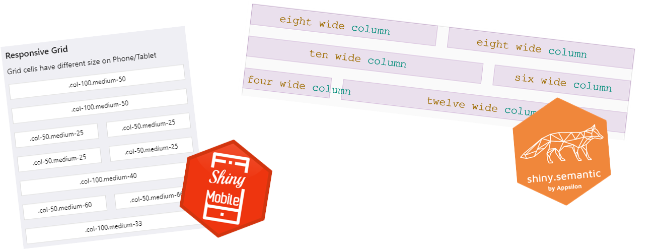
Now, it’s worth mentioning that Bootstrap is not the only layout system available for Shiny. In fact, many packages made for Shiny over the years offer different layout systems that replace the 12-column system. Different CSS frameworks offer different approaches to building layouts. And I recommended trying them out if you are looking for something unique.
In fact, most offer not only layouts but also different looking-widgets. If you’re looking to spice up your dashboards, these can be a quick way to get started. Some of these include:
So what is the state of the art when it comes to web layouts? To understand this, and where Shiny fits regarding available techniques and technologies, let’s take a quick look at the story of web layouts. From the 80s until present day, a few techniques have been developed and taken center stage at different points in time:
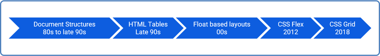
The original proposals for HTML, the standard for structuring web pages, started all the way back in 1989, lasting until early 1997. The practical realization of HTML was all about on-screen presentation. This included published recommendations, browsers & development tools, and actual websites.
At this point, web developers were mostly focused on document sharing. Leading focus toward document requirements such as headers, fonts, and paragraphs. After proposing the idea of controlling layouts via style sheets in 1993, it would still take some time for it to become mainstream.
Around this time (as well as during the reign of tables for layouts) the HTML document structure dictated the page layout. And the thought that you would need more than sequential content, was barely even considered.
Early HTML specs actually state that “The elements within the BODY element are in the order in which they should be presented to the reader.”
In 1991 ViolaWWW grew into the most sophisticated of the early Web browsers. It is claimed to have been the first browser with support for style sheets, tables, and nest-able HTML elements. Following in 1993 a proposal was made for “columns” in a presentation language for the web. This proposal did not directly turn into CSS. “The styles defined, specify the recommended behavior of HTML objects in terms of: …. page layout … column ….”.
These were the initial works of tables in HTML, and finally, in 1997, HTML 3.2 released as a W3C Recommendation. It stated that tables “can be used to markup tabular material or for layout purposes”… And oh boy did people take it literally. Tables became the base for most web pages and were considered the go-to when structuring content. It was a wild time of invisible gifs used for spacing, convoluted markup, and many more terrifying things.
A new CSS property made its way to the top, float. The idea of float was simple: you have an element and need text to wrap around it, float that element and you get exactly that! Simple right? Well…
If you couple this with fixed sizing for floated elements, a large dose of space-clearing techniques, and the CSS position property one could achieve A LOT. This was the conclusion that some clever developers reached in the early 2000s, allowing multi-column layouts and becoming the go-to for these times.
Eventually, frameworks using these techniques started gaining popularity that would hide these hacks behind CSS classes and HTML structures, making life even easier.
Bootstrap 3, the base for Shiny, is a great example of one such framework that, even now, can be found in millions of websites. Even though its newest iteration, bootstrap 5, no longer uses this approach and instead relies on flexbox for its layout system.
float;float and position to give us the first layout frameworks.The introduction of the display: flex; CSS property around 2012 was a real game changer, solving many existing layout problems, and being widely praised by both web developers and designers.
This was the first true CSS property to be 100% created for layouts, making its way into modern web development extremely fast.
It is especially powerful for page layouts that can define primarily in terms of either columns or rows. For instance, if we want to align a few elements in a single row, display: flex; provide us with a modern and easy way to do so. No tricks, clear spacing, or hacky solutions – just one line of CSS.
Not only that, flex came with built-in control of other CSS properties such as alignment and visual ordering of elements. All without having to change the HTML structure directly.
As HTML became more and more semantic-based, especially now with the release of HTML 5, this is even more important. Because we now have a way to fully decouple the presentation layer from the content itself.
As the world moved forward, web developers found themselves facing a new challenge – responsive design. Up until recently, screen sizes or different devices were not something in anyone’s mind. In fact, while it was possible to write CSS for different screen sizes, this would often require building multiple pages multiple times, or creating one main layout and tweak it to different screens.
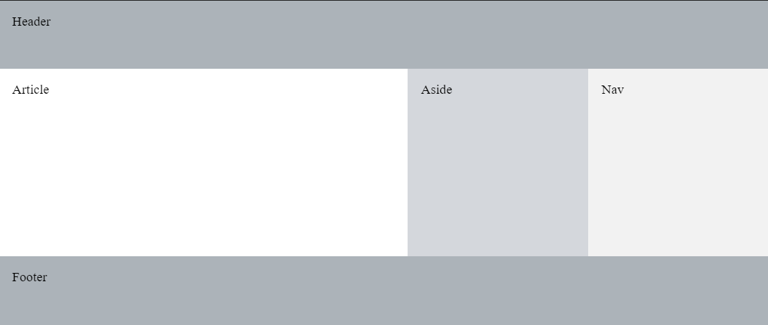
At the time of this article, display: grid; is the only CSS property designed and intended for building flexible responsive layouts. This sort of challenge requires a layout area that can be manipulated in two dimensions – both horizontally and vertically – and that is exactly what CSS Grid does.
While Flex gave us full control over either columns or rows, Grid goes one step forward and can handle both rows and columns at the same time. Meaning, that it will align items to both the horizontal and vertical tracks you have defined. Grid is also ‘mostly’ defined on the parent container, not the elements themselves as is the case with flexbox.
So CSS Grid wins! Well… No.
Flex and Grid serve different purposes and are both incredibly useful. Very often when creating a layout, mixing Flex and Grid will give you the most flexibility. And knowing what to use when can supercharge your development speed. I personally prefer to leverage both at the same time:
Flex when:
Grid when:
A common rule of thumb is to use Grid for full-page layouts and Flex for smaller elements. Or consider whether the layout you plan to build is one-dimensional (Flex) or two-dimensional (Grid).
Well, if you are a Shiny developer I’m sorry, but you ARE a web developer!
In most cases, anything you can do on the web can be used with Shiny. In the worst cases, using HTML and CSS directly in Shiny is always an option. Meaning, that you can always leverage web technologies to get things done.
Fortunately, the R community is amazing at making R developers avoid using HTML and CSS directly, and, just like with packages that wrap other CSS frameworks than Bootstrap, CSS Grid and Flex R package solutions are becoming more popular!
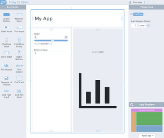
If you took part in rstudio::conf(2022), you might have even heard of RStudio’s new visual builder for Shiny UI, shinyuieditor.
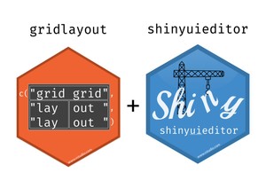
Under the hood, shinyuieditor actually uses CSS Grid, via a package, that you can also use without the visual editor, the gridlayout package.
But that’s not all. There are other options out there!
bslib for example, allows you to upgrade to the newest versions of Bootstrap with minimal effort, and while you are still using the 12-column system, your application will actually be using CSS Flex.
shiny.semantic on the other hand comes with a built-in CSS Grid function in the form of shiny.semantic::grid().
For pure usage of CSS Grid and Flex, there is also imola that aims at giving you the full functionality of CSS Grid and Flex containers from R, without the need to write CSS directly.
It also comes with templates and breakpoint systems built-in, making it a great tool for large projects that want to build and reuse their own responsive layout systems.
Add custom styling and layouts with {imola} and {shiny.fluent}.
In general, it really depends on what you are looking for, and how deep you want to get into the technologies. I do recommend trying out Grid and Flex in some form. Its browser support is outstanding, and it’s one of those things that once you start using, it’s hard to go back. 😀
Consider bslib, of a different framework layout system if you:
Check out gridlayout if you:
Try out imola if you:
Shiny is an amazing piece of technology that allows us to quickly build and create applications directly from R. Its limitations are nearly endless, and, as developers, keeping up to speed with web standards can be a great way of making your Shiny apps feel more modern and interesting.
Right now, for layouts, Grid and Flex are the state of the art. But who knows what will come next? I believe Grid and Flex will be around for a long time, so what better time to try out something new than right now? 🙂
Do you have a preferred layout or R package for your Shiny projects? Share your project by tagging us on Twitter or LinkedIn. And be sure to sign-up for Shiny Weekly to stay up to date on all things Shiny – from user tests and UI/UX to community events and tutorials.


