Shiny apps are very often used for quick prototyping and proof of concept.
However, if you want to use a Shiny app in production and make it attractive to the users, you need to make sure that the app is not only functional but also visually appealing and efficient.
When users find the UI attractive, they are more likely to use the app and forgive minor usability issues. This aesthetic-usability effect is related to people’s tendency to perceive attractive products as more usable. They usually believe that things that look better will work better, which may not reflect reality.
On one side, this effect can distort the process of finding real issues in UI during usability testing, but on the other side, it could be taken to our advantage to some extent. The aesthetic-usability effect is the main reason why a good user experience shouldn’t only be a functional UI – it should also be a beautiful UI.
In this blog post, I will show you how to improve the design of your Shiny app and how to make the code more efficient for some use cases.
TL;DR:
- This article offers a comprehensive guide on enhancing the visual appeal and efficiency of Shiny apps for production, emphasizing the importance of reducing cognitive load, establishing a clear visual hierarchy, ensuring consistency, minimizing interaction cost, and boosting app performance.
- It provides practical tips on UI design, including color scheme selection, typography, and managing screen real estate, alongside Sass/CSS code optimization techniques for developers.
- Whether you’re looking to captivate your users with stunning visuals or refine your app’s backend for smoother operation, this guide has you covered with actionable insights to elevate your Shiny app from functional to fantastic.
Table of Contents
- Design Improvements
- Minimize the Cognitive Load
- Visual Hierarchy
- Consistency
- Minimize Interaction Cost
- Efficiency / Performance
- Other
- Sass Code Refactoring
- Conclusion
Design Improvements
Even without a design mockup, you can make your Shiny app look good by following some logical rules. Of course, artistic talent helps, but a lot of things that make the UI intuitive and beautiful can be learned.
Keep in mind that you shouldn’t follow all these rules blindly because, in some cases, there may be some exceptions. Rather than treating them as strict rules, think of them as helpful guidelines that work well in most cases.
In this blog post, I will focus on user interface improvements (visual and interaction aspects) and code refactoring. I will not cover the topic of user experience (UX) design, which is a much broader topic. However, I will mention some UX design aspects that are related to UI design.
1. Minimize the Cognitive Load
Cognitive load is the user’s brain effort required to use an interface. Minimize cognitive load to make your UI user-friendly and easy to use. Your users will appreciate it. There are many ways to reduce cognitive load; some of them are:
- Show only the most important information/elements, and hide additional information in collapsible sections, tabs, tooltips, etc. Decide which elements are not relevant for the users. Hide blocks of text that contain secondary information behind an information icon in a tooltip or popup. Don’t overload them with information. Users should explore information in the dashboard gradually.
- Create a clear visual hierarchy, dictating the importance of specific information (described in the next section).
- Break up information into smaller groups/boxes to clearly show relationships.
2. Visual Hierarchy
Visual Hierarchy is a visual design principle that helps to organize UI elements in a way that users can easily perceive the importance of each element. It helps to draw attention to the most important elements and to make the UI more intuitive.
Without a clear visual hierarchy, too many elements seem to be important, and in this case, none is. When you follow visual hierarchy rules, you can influence users’ perception and guide them to perform desired actions. It can be achieved by using different visual properties, such as size, color, contrast, alignment, repetition, proximity, whitespace, texture and style. I’ll describe some of them in more detail.
Color
Color is one of the most powerful tools in UI design. It can be used to draw attention to the most important elements, to group elements, to create a mood, to make it more accessible, and so on.
- Create a color palette for your project before starting development and assign it to CSS variables or Sass variables, to limit a choice and avoid wondering about the perfect color shade during development. The color types that you should usually define are:
- primary color (most frequently used color)
- secondary color (optional)
- accent color (used for call to action buttons, links, titles, etc.)
- grays (for text, borders, backgrounds, etc.)
- warning color (for destructive actions: delete, remove, or warnings)
- positive color (confirming actions, success status, etc.)
- When creating a color scheme, you can use the client’s company / product color scheme or try a tool like Coolors to create your own.
- Use color to draw attention to the most important components, like the title, call to action button, main data visualization, etc. Bright colors typically attract more attention than desaturated ones.
- Don’t overuse colors. When you use color, make sure that it has a clear purpose and that it’s used consistently. It’s easy to make an element important on a page using strong colors. But when all elements are important, none is, and the user doesn’t know where to look first. The 60-30-10 rule can help you to keep a good color proportion. It means that most of the time, using 60% of the primary color, 30% of the secondary color, and 10% of the accent color in the app, will do the job.
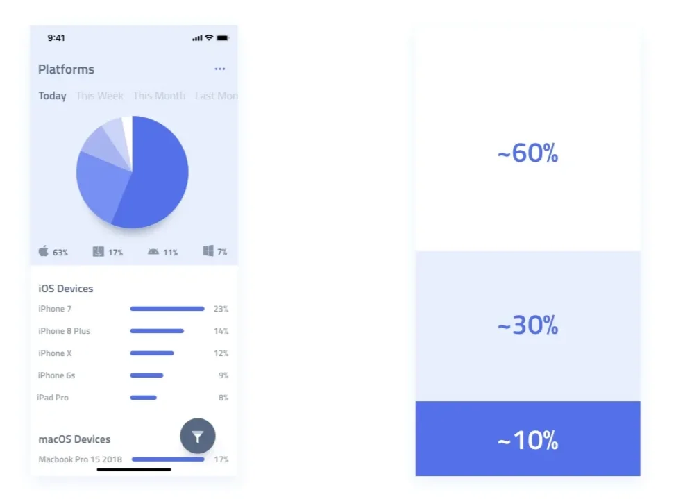
uxmisfit.com
- Instead of emphasizing primary actions, you can also de-emphasize secondary ones (use secondary buttons), e.g. in the navbar element:
View 1 View 2 About Contact
- Grays don’t have to be gray – you can use for example cold gray or warm gray. It’s good to use a color that is related to the primary color, e.g. if the primary color is blue, you can use blueish gray. Same rule applies to black color – instead of pure black (#000), try to lower darkness a little bit and add some color shade. It seems to be a little detail, but when you apply such colors to bigger areas, it will make the impression of being more consistent.
- You can simulate light sources or add depth to your app using gradients and shadows. Use tools like CSS Generator to generate gradients, shadows and much more.
- Remember about accessibility (WCAG):. There are more color-blind people than you think, so make sure that your app is accessible to them. You can use a tool like Colorblind Web Page Filter to check how your app looks like for people with different types of color blindness.
Contrast
- The bigger the contrast, the more attention it attracts. Usually, accent colors should be contrasting to draw attention, e.g. call-to-action buttons, titles, important elements. However, it’s easy to overuse them and make the UI too colorful and distracting, which can be overwhelming for the users.
- Less important, secondary information should be less contrasting, but remember about accessibility guidelines (WCAG) regarding the minimum contrast, so it’s readable. You should be able to check if the contrast is sufficient by inspecting the element in the browser in DevTools or using one of many tools on the web.
- Don’t exaggerate the contrast between different backgrounds. For example, to make the boxes with the white backgrounds visible, you just need to set the background color of their container element to be a little bit darker than white, e.g. #edf0f0 is perfect enough. If you want to increase the contrast a bit, you could add a subtle shadow, e.g.
box-shadow: 0px 3px 16px 0px rgba(0, 0, 0, 0.15); to the boxes. Box shadows usually look better than borders more subtle, but of course, it depends on the overall design. - If you use a background image, make sure that the text on it is readable. When necessary, lighten or darken the image or blur it a bit. You can use Sass’
lighten()anddarken()functions orfilter: blur(5px);CSS property.
Size
Elements size and weight matter. The bigger and bolder the element, the more attention it attracts. Use bigger font size and font weight for primary information and smaller for secondary one.
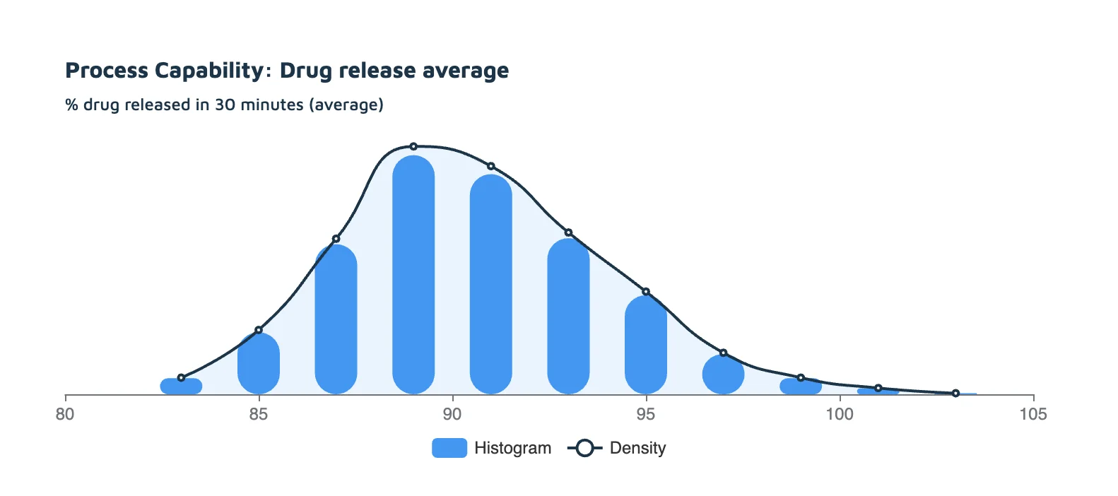
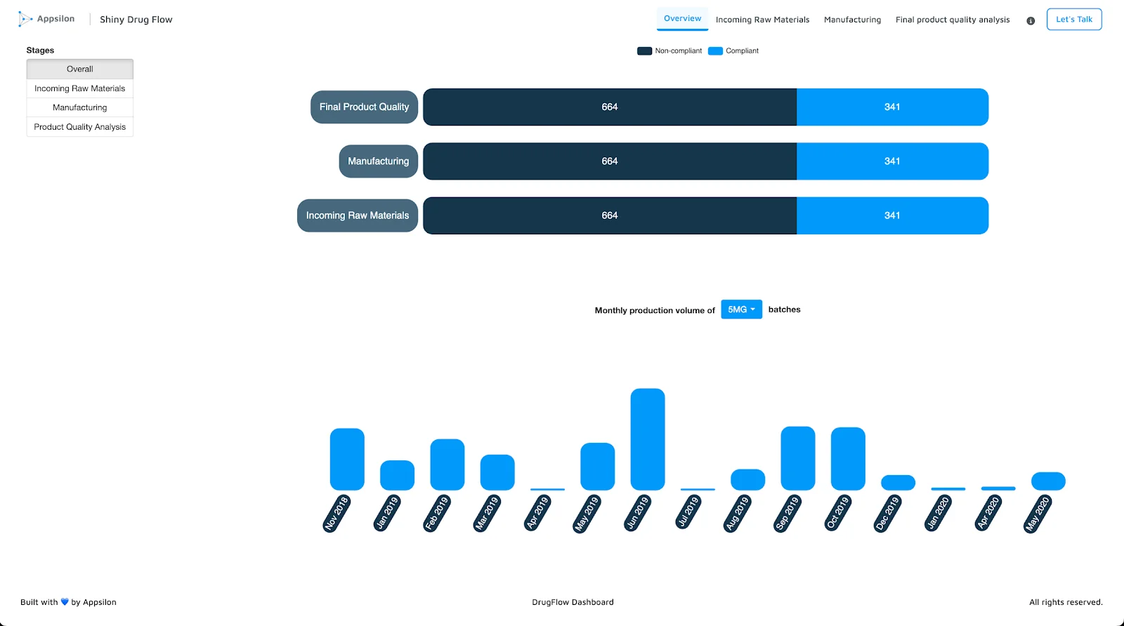
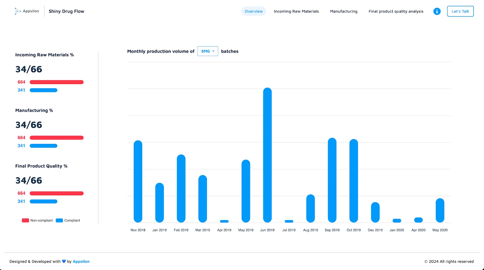
- The rule regarding size and weight also applies to other elements in the UI. In the Drug Flow example app below, the primary data visualization is bigger and takes more real estate, attracting more attention. Also, notice that the chart’s bars got slimmer to make the chart look less heavy in general. Additionally, rounded corners of the bars and buttons can make an association with drug pills, which refers to the app’s topic.
![]()
Typography & Iconography
- If possible, use the client company’s font in your application. If not, try to find a similar one. It’s good to use a font that is related to the client’s brand. In other cases, pick the one that fits the style of your app. The rounded font seems to be more playful, while the sharp font seems to be more formal.
- Remember to use the selected font consistently everywhere. In some cases, a secondary font family could also be used, for example, for text in paragraphs. The uniformity and consistency here sound like a minor detail, but it makes a difference.
- Use icons to indicate the meaning of the information upfront:
- Their meaning should be clear for the users (clarity rule). Also, don’t use the same icon for two different meanings.
- Their design should be simple and consistent in the UI. If you decide to use linear-style icons, it’s usually better not to mix them with solid-style icons.
Managing Screen Real Estate, Positioning, Spacing
- Progressive disclosure – Don’t try to fit too much information on one screen. Use progressive disclosure techniques to prevent overloading the user with too much information.
- Effectively use the real estate on the screen – but don’t make the UI too dense. Add some white space by increasing paddings, margins or gaps to make the UI lighter and less cluttered. The white space promotes balance and visual order; don’t underestimate its superpower in attractive interfaces.
- Make data visualization elements adjust to the screen size whenever possible. Check if it works correctly on smaller or bigger screens by zooming in/out in the browser.
- Whitespace – The more whitespace around a component, the more attention it attracts. Use space to emphasize the most important elements.
- According to F and Z reading patterns, the top left part of the app should display the most important information (culturally influenced).
- Grouping – Group related elements together to make the UI more intuitive (e.g. filters, metrics, data visualizations). Use the same spacing for elements in a group to make it clear they are related. It’s a good idea to use multiple box/card components for grouping.
3. Consistency
Consistency is the key to creating a visually attractive interface with a sense of order and professionalism. The important step to achieve it is to use a design system containing predefined styles, modular components, usage guidelines, etc.
- Uniformity – use the same styles for the components which are related.
- Standardization – use standardized components, like buttons, forms, and icons, creating a design language that is familiar to the users.
- Use a consistent color palette, typography and iconography based on the design system.
- Details like border-radius or box shadows should also be consistent across the app and included in the design system.
4. Minimize interaction cost
It’s the sum of mental, physical and time efforts a user invests to interact with UI. It includes actions like looking, thinking, searching, scrolling, reading, clicking, waiting, typing, etc.
- Optimize the amount of clicks and scrolling to perform some action.
- Keep related actions close – according to Fitts’s Law, the closer and larger a target, the faster it is to click on that target.
- Reduce distractions – optimize the amount of information on the screen, and keep it simple and clean.
- Minimize choice to speed up user’s decisions – e.g. hide some filters or secondary settings in the popover element.
Explore reactable.extras 0.2.0: Elevate your Shiny apps with enhanced interactivity and efficiency. Dive into the new features now.
5. Efficiency / Performance
Application loading speed is one of the most important factors influencing user experience (UX).
- Optimize loading speed – there are many ways to improve the performance of your Shiny app, including:
- Async rendering of data visualizations using external APIs, like plumber API.
- Server-side rendering of {reactable} tables, using {reactable.extras} package, that drastically improves the loading speed of tables with a lot of data.
- Caching.
- Delegate heavy computation tasks to a separate process such that it does not freeze your Shiny app. You can use {shiny.worker} package for this purpose.
- Add animated loaders – aside from the overall performance optimisations, you can positively affect a user’s perception of the app’s speed by using some visual techniques, like animated loaders. You can use packages like shinycssloaders, waiter, shinybusy or custom CSS + JS solutions. There are benefits of using loader in your app:
- Make waiting more tolerable.
- Inform users the application is working.
- Give users something to look at. The loader can be a nice visual element, e.g. animated company logo, that can be used to promote the brand.
- Sometimes, they display additional information what is going on in the background.
Learn how ‘shiny.worker’ can offload heavy calculations, speeding up your app’s performance. Click here to discover more.
6. Other
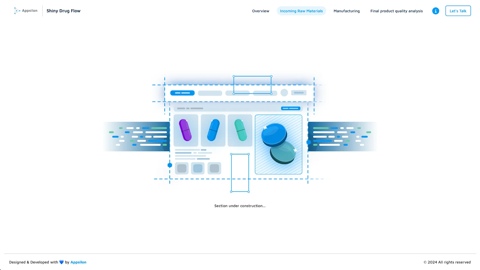
- Remember about handling empty states – Don’t forget about empty states in your app. If there’s no data to display, you can display some nice graphics (e.g. from Undraw) or check out Appsilon’s shiny.emptystate package.
- Pay attention to the quality of your graphical assets, like images, logos, icons, etc.
- Avoid using blurry, compressed images, especially when filling large areas on the screen.
- For elements like logos, icons, etc., use vector graphics (SVG) whenever possible instead of raster graphics (PNG, JPG, etc.). Vector graphics are smaller in size, load faster, and look crisp on any screen size.
- Supercharge the look of default elements like checkboxes, dropdowns, etc. Adjust their colors and styling to your color palette and design system.
- Animated data visualizations can give the users a nice experience when interacting with the charts. In the echarts4r library, simple animations are applied by default.
- Transitions – avoid too slow transitions in your application. Usually 0.15 – 0.3s transition-duration is perfect enough. Experiment with transition-timing-function (ease-in-out, ease-out, ease-in, cubic-bezier) to fine-tune the animation.
Sass Code Refactoring
This part is related to the Sass/CSS and HTML code refactoring. I listed some suggestions regarding the code quality, best practices, and developers’ frequent mistakes.
- Review your code – check the CSS rules and declarations one by one to see if there are some unnecessary ones that don’t change anything and just make your code longer and more complicated. It’s very easy to make CSS/Sass code not efficient and too long, so it’s very hard to maintain later. Refactor the code, especially after copying it from one project to another. The quality of your code for styling will most probably be reflected in the UI after all.
- Don’t add too many color variations – stick to the color scheme and store all the colours as CSS or Sass variables.
- Stop overusing
divtags – wrapping some elements with div without any CSS class or style is usually pointless. It decreases readability, making the code longer and more complicated; it’s harder to manage the page’s layout in CSS later. Also, whenever possible, use HTML semantic tags likeh1,h2,p,span, etc. instead ofdiv‘s. - Use CSS
classesas selectors for styling, notidattributes. You can assign classes to any Shiny elements using thetagAppendAttributes()function.Idattribute is a better choice for selecting elements in JavaScript. - Stick to one casing convention to name CSS classes and id’s. Most of the time,
kebab-caseis a popular convention for CSS classes (of course, there are exceptions, like CSS modules using camelCase or BEM methodology). For id’s, usuallysnake_caseorcamelCaseis the preferred option. In Javascript,camelCaseis the most popular convention.
The most important thing is to be consistent and use the same convention for specific cases. top_navBar-dark is definitely not a good choice for a class name.
- Use nesting in Sass – a very helpful feature that makes the code much more readable. Of course, writing CSS code in Sass will work, but does it make sense to install this dependency and not use its superpowers? You can read more about Sass nesting.
- In addition to nesting, using ampersand (& – the parent selector) followed by whitespace is totally redundant.
This code:
.parent-element {
& .child-element {
...
}
}
Is equivalent to this code:
.parent-element {
.child-element {
...
}
}
- It’s more readable to order CSS rules in order of appearance on the screen, although sometimes it may not be possible because of the linting rules.
- Avoid using !important flag. Limit it to the cases when you need to override some library’s styles, where !important flag was used (which is not a good practice, obviously), or it would take too much effort to override it, increasing [[specificity]]. But don’t give up too early, usually to override some styling; it’s only a matter of adding, for example
.btnclass to CSS selector to increase specificity and make it work. - Notice a difference between
aandbuttontags.ais created for links to internal or external resources, and there ishrefattribute to specify the link.buttonserves for triggering events and itsonclickattribute shouldn’t be used for navigating to specific links. - When you specify gaps between two elements, don’t mix
padding,marginandgapproperties together. Instead of this:
.parent {
display: flex;
gap: 10px;

.child-1 {
padding-bottom: 10px;
}

.child-2 {
margin-top: 10px;
}
}
you could just use gap property:
.parent {
display: flex;
gap: 30px;
}
- Usually, the best place for specifying the
font-familyproperty is inside the declaration block forbodytag. Then it should be inherited everywhere in the app. You don’t need to repeat the same declaration in multiple places. - In Sass, the use of
@importis not recommended anymore. Use@useinstead. - When you add transitions, using
allastransition-propertyis not the best practice due to performance reasons. It’s better to specify only the properties that you want to animate specifically.
Instead of:
transition: all 0.2s;
use
transition: background-color 0.2s, color 0.2s, border-color 0.2s;
Conclusion
You can significantly improve the user experience and visual appeal of your Shiny app by having a clear visual hierarchy, minimizing cognitive load and interaction cost, implementing a design system consistently and improving your app’s performance. At the same time, don’t forget about keeping your Sass/CSS code clean and optimized.
Last but not least, it’s very important to watch the examples of dashboard apps with a good design and analyze what works well and what could be improved. You will not only learn a lot from it but also gain some inspiration and a good eye for design.
Here is a list of websites where you can find a lot of examples of good-quality dashboards and other app designs:
You’ve just explored a wealth of strategies on design, efficiency, and code optimization. Ready to take your Shiny app to the next level? Contact us, and let’s get started on optimizing your app’s performance and aesthetics together!
