Share
Share Tweet
Tweet Share
Share
R Shiny is a no-brainer dashboarding choice for companies and individuals. There are thousands of Shiny dashboards in production today in every sector you can imagine – agriculture being no exception. Today we bring you 5 dashboard examples of R Shiny in agriculture. We’ll show you what’s possible using Shiny and how you can start today!
Shiny is approachable with a lot of documentation, which makes it easy for developers and researchers to produce impressive results, even without coding backgrounds. It’s easy to build a Proof of Concept app and begin sharing your insights with colleagues and customers.
The dashboards you see today span from simple statistical analysis tools to full-scale soil profile analysis, and everything in between. Continue below to see examples of how interactive Shiny dashboards can be used in your field.
Agriculture not your cup of tea? Here are 7 R Shiny dashboards in life sciences.
Here’s a list of the top 5 dashboards made with R Shiny in agriculture:
- Soilprofile by Gabriel Holz
- Pasture Potential tool by DairyNZ
- Agricultural Productivity in Tanzania by EPAR
- Viscover by RStudio
- GrapesAgri1 by Kerala Agricultural University
Shiny Dashboard Examples in Agriculture
Soilprofile by Gabriel Holz
The Soilprofile dashboard is based around the soilprofile2 R package. It provides a graphical representation of soil horizons, like the image below representing the master horizons and transitional horizon by color.

Image 1 – Soilprofile R Shiny dashboard
The main focus of graphically representing soil horizons is to gain insights from properties such as horizon transitions, texture, structure, root density, and rock content. It allows users to quickly identify and interpret the soil profile through visualizations.
The dashboard allows you to use default data or upload your own. All the charts are updated accordingly. The home page of the dashboard even contains a section with the source code which you can download and modify per your liking.
Learn more:
- View the Soilprofile dashboard
- Source code (under Codes)
Pasture Potential tool by DairyNZ
The Pasture Potential Tool shows dairy farmers the amount of pasture eaten on comparable farms in their district, and also provides them with a target to improve their profitability and environmental footprint.
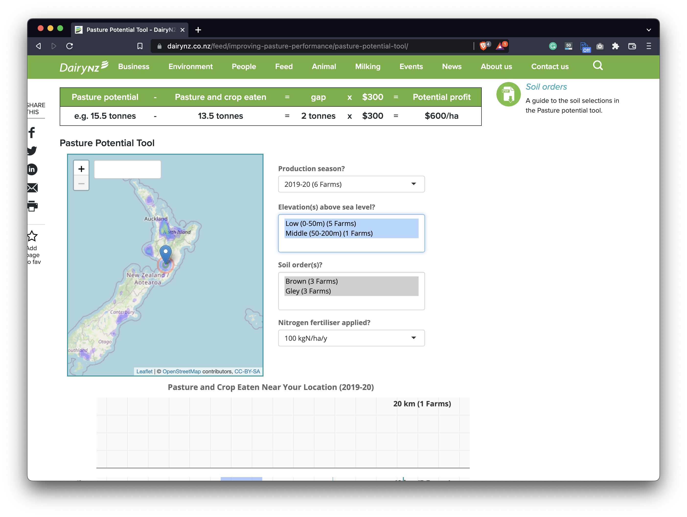
Image 2 – Posture Potential Tool R Shiny dashboard
To start, you have to enter your address or zoom in and drop a pin on the map. The colored areas on the map show where more data is available. Then, you have to choose the season and select the characteristics of your farm from the dropdown menu. Finally, you’ll be presented with the map and graphs to find the potential, the pasture, and crop eaten that the top 10% of farmers have exceeded in the selected areas.
The “pasture eaten” graphs use DairyBase data. Not all farms are enrolled in this database, so data in some areas may be limited.
Learn more:
Agricultural Productivity in Tanzania by EPAR
The EPAR (Evans School Policy Analysis & Research Group) research aims to answer the question of how is maize yield related to farm management decisions and household characteristics in Tanzania.
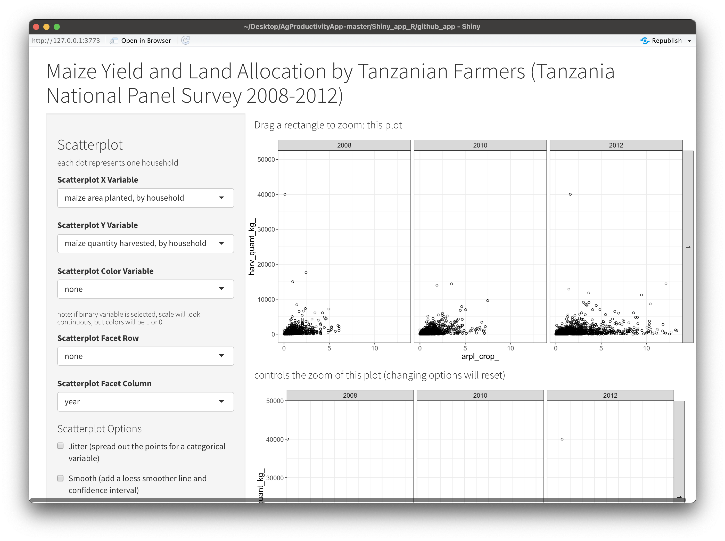
Image 3 – Agricultural productivity in Tanzania dashboard
The group aims to answer this question by investigating how a farmer who experiences an increase in maize yield from one year to the next is expected to respond in terms of on-farm and off-farm livelihood practices. There are two options: the farmer could either specialize increasingly in maize cultivation or hold the production volume constant and shift time and labor resources into other activities.
The R Shiny dashboard is based on the World Bank’s Living Standards Measurement Study – Integrated Surveys on Agriculture dataset for seven countries in Sub-Saharan Africa. The app displays cleaned data from three panels of the Tanzania National Panel Survey.
Learn more:
Viscover by RStudio
The Viscover dashboard is designed for interacting with Cropland Data Layer (CDL) and Soil Data Layer (SDL).
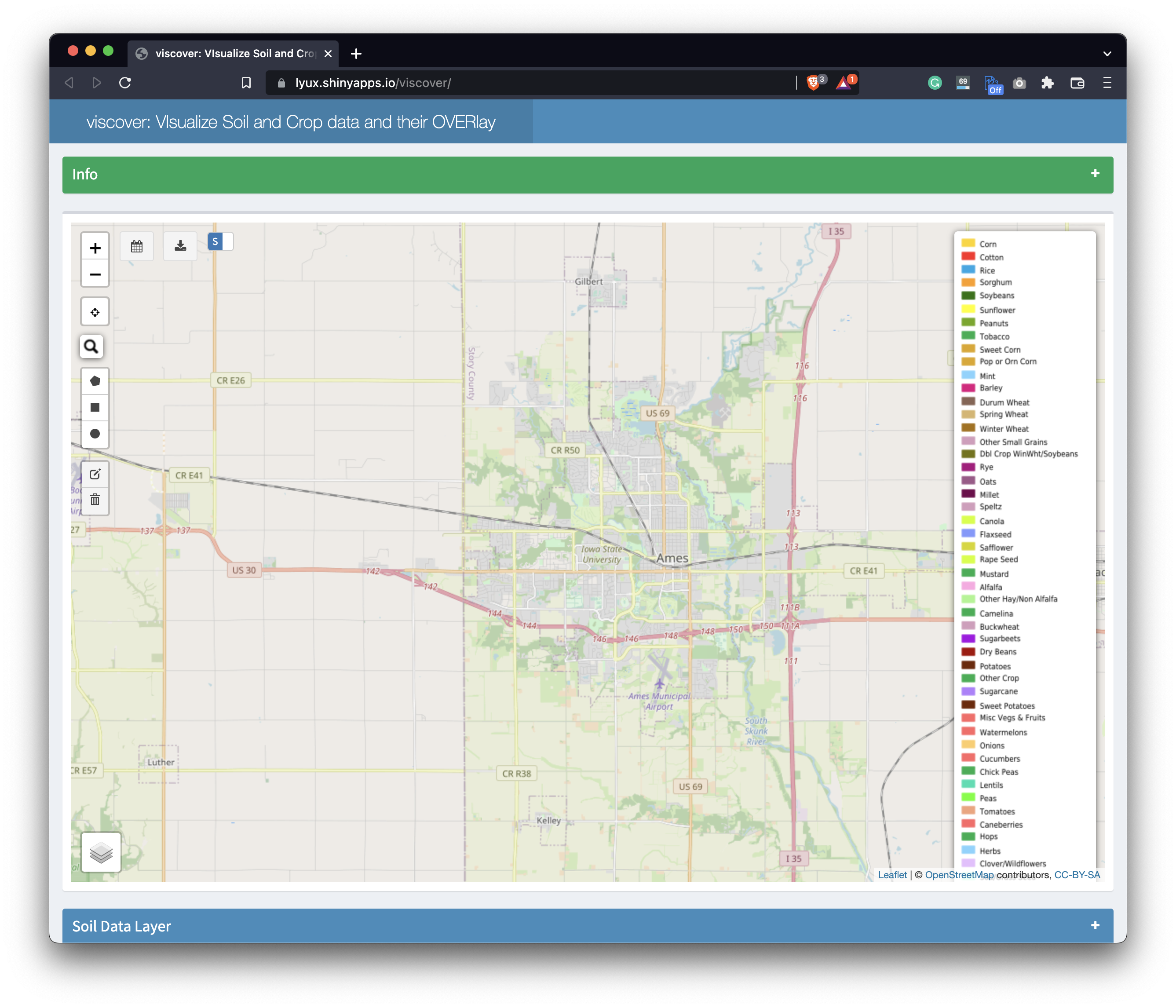
Image 4 – Viscover R Shiny dashboard
If you’re not familiar with the terms, here’s a crash course: CDL is a geo-referenced crop-specific land cover data, created annually for the contiguous United States since 2008. SDL contains tabular and spatial soil information available for the United States and the Territories.
This Shiny dashboard provides a user-friendly interface to interact with publicly available, Federal data from different sources and allows users to make cross-references through the overlay operation.
Learn more:
GrapesAgri1 by Kerala Agricultural University
The last dashboard on the list isn’t technically a dashboard. Instead, it’s an R package that’s a collection of 6 Shiny apps for agricultural research data analysis.
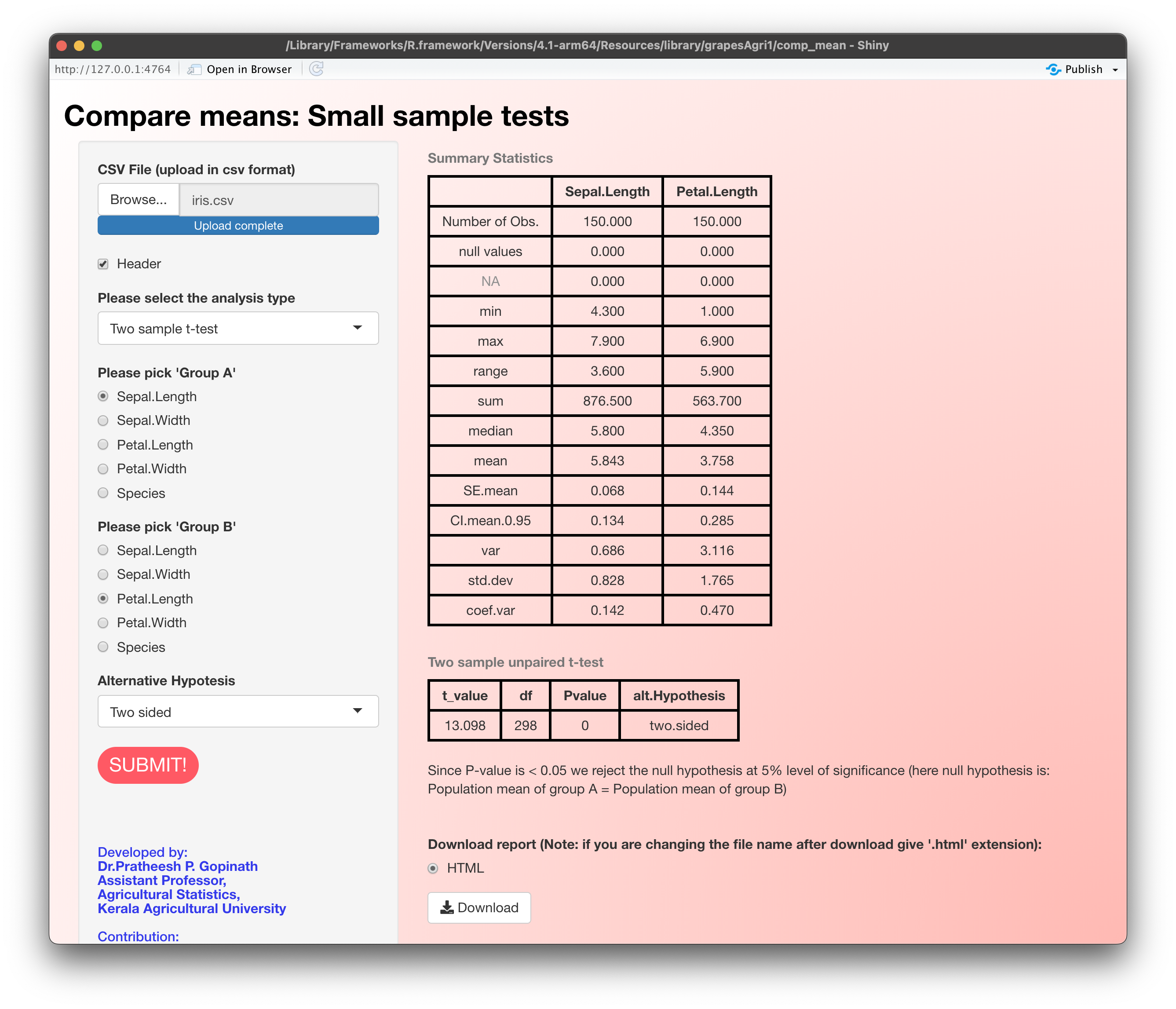
Image 5 – GrapesAgri1 ttApp (compare means) dashboard
The grapesAgri1, or General R-shiny-based Analysis Platform Empowered by Statistics for data analysis in Agriculture-part1, is a collection of R Shiny apps for some basic statistical analysis used in agricultural research. Like most non-technical users, ag specialists prefer graphical user interfaces to command-line tools. In this case, Shiny was a great tool for Kerala Agricultural University to bridge the gap between user preferences and data handling.
From the R console, you can use the following command to install the package:
install.packages('grapesAgri1', dependencies=TRUE)
Once installed, you’ll have access to six dashboards, ranging in complexity from descriptive statistics to randomized block design. Here are the commands you can use to start each dashboard:
grapesAgri1::descApp() # descriptive Statistics and Visualization
grapesAgri1::corrApp() # Correlation Analysis
grapesAgri1::ttApp() # Compare Means
grapesAgri1::crdApp() # Completely Randomized Design
grapesAgri1::layoutApp() # Field layout of experiments
grapesAgri1::rbdApp() # Randomized Block Design
Each dashboard has extensive documentation behind it, so make sure to read it if you find some part of the app confusing.
Learn more:
Summary of R Shiny in Agriculture
Today you’ve seen five examples of dashboards built with R Shiny in agriculture, and that’s only the tip of the iceberg. Most dashboards in this field are owned by corporations and research institutions, which makes them accessible only to a handful of people.
Unsure about adopting R Shiny in your business? Here’s what we’ve learned by helping Fortune 500s develop enterprise Shiny apps.
If your field can benefit from data analysis and data science, it can benefit from interactive dashboards. R Shiny has everything needed for businesses and individuals to either automate or simplify their day job. ODAPES is a perfect example of Shiny being used to open source ‘Digital Agronomy.’ With Shiny, ODAPES is able to create a centralized platform for farmers, cutting out costly digital services, and simplifying data access for users. Ultimately, putting precision agriculture into the hands of the farmers.
Do you work in a public sector? Here’s our curated list of 7 R Shiny dashboards in Government.
How to begin building your Shiny dashboard
If you’re looking to build your first R Shiny dashboard, you can use Appsilon Shiny Dashboard Templates to simplify the process. The bundle contains a ton of beautiful and easy-to-use templates. The best part – is it’s entirely free.
In case you need something more advanced, we’re also here to help. Appsilon is an RStudio Full Service Certified Partner. We develop advanced R Shiny applications for Fortune 500 companies across the globe. We’d be happy to help you choose the right options for your use case. Let’s talk and see how Shiny can help you grow.
Contact Us

Project Leader

Get Updates
Subscribe to Shiny Weekly Newsletter
Join 4000+ Shiny enthusiasts to see the latest Shiny news from the R community.