Share
Share Tweet
Tweet Share
Share


Explore 7 exciting examples of R Shiny dashboards in the life sciences! R Shiny is one of the easiest ways for developers to make production-ready dashboards when speed and functionality are crucial.
Shiny is approachable with a lot of documentation available, and because of this, a lot of developers/researchers with non-coding backgrounds are able to produce some impressive results. The whole ecosystem is easy to get your head around and pretty much limitless with regard to what you can do.
2023 Shiny in Life Sciences Update:
Since 2022, a lot has happened in the world of Shiny and the Life Sciences. Things move fast, and adoption of R Shiny (and now Python for Shiny) is ramping up. With this in mind, we’ve added a few more Shiny examples from our Life Sciences collection. However, many new apps and dashboards are constantly emerging, and we strive to publish the most unique and exciting ones in the Shiny Weekly Newsletter – so be sure to subscribe!
We’ve kept the original 7 apps shown below, but added a few more at the top of the list:
- RConsortium’s FDA Pilot 2 – Rewritten in Rhino
- Shiny Gosling – Genomics Data Visualizations
- Drug Interactions Exploration Tool
- DrawCell – Cell Illustrations Simplified
The dashboards you’ll see span from analyzing insect ecology to interpreting MRI images and everything in between. Continue below to see examples of how interactive Shiny dashboards can be used in your field.
Stuck in a Python vs R analysis paralysis? Read our take on Python Dash vs R Shiny.
Here’s a list of the top 7 dashboards made with R Shiny in life sciences:
- RStudio: Covid-19 Tracker
- RStudio: Genome Browser
- RStudio: ShinyMRI
- Appsilon: Bee Colonies
- FielDHub: Designing Experiments in R Shiny
- CSBB: Computational Suite for Bioinformaticians and Biologists
- GraphBio: Visualization Analysis for Omics Data
2023 Shiny Apps and Dashboard Examples in the Life Sciences
RConsortium’s FDA Pilot 2 – Rewritten in Rhino
The FDA Pilot 2 Rhino rewrite features the RConsortium Submissions Working Group’s Pilot 2 app, which was successfully submited in 2023! The Shiny app, built with teal modules, demonstrates clinical trial data analysis and visualization and originally used Golem.
For the rebuild, we chose Rhino, an enterprise-level framework, supports clear code, comprehensive testing, and automation, making it well-suited for highly regulated environments and drug development processes.
A lot has progressed with Rhino over the past year. Rhino 1.4.0 was recently updated on CRAN, with streamlined dependency management, React support, improved Box modules, and more! There’s also a growing list of helpful Rhino guides and tutorials. You can now lead your team into production grade app development – without needing to be a Full Stack Developer!
Shiny Gosling – Genomics Data Visualizations
Shiny Gosling demonstrates the features of Gosling.js made available in R Shiny by the shiny.gosling package. Users can now access scalable and interactive genomics data visualizations in their Shiny apps and dashboards!
From compositive visualizations like gene and transcript annotations to interactive visualizations like multi-track apps and circular encoding of genes.
Looking for more R Shiny packages in the realm of drug discovery? We’ve recently released the shiny.molstar package, an R Shiny wrapper for Mol* (/’molstar/) – A visualization toolkit of large-scale molecular data. See how you can start with our introduction to molecular visualization and analysis with shiny.molstar.
Drug Interactions Exploration Tool
The Drug Interactions Exploration Tool in Shiny is a valuable web application that utilizes an extensive online database to identify potential adverse effects related to drug combinations. This Shiny app serves as a valuable resource for healthcare professionals, researchers, and patients seeking to understand the risks associated with different drug interactions.
Developed using the Rhino package, the app offers modular code, SASS support, automation, testing, and a clean interface, streamlining the process of connecting with external drug databases for comprehensive drug interaction information.
DrawCell – Cell Illustrations Simplified
The DrawCell Shiny Application, powered by the drawCell package, offers a user-friendly and engaging solution for life sciences educators, students, and researchers. Whether you need interactive cell diagrams for teaching or to streamline data visualization, DrawCell has you covered. Created by lead developer Álvaro Sánchez, this versatile tool has the potential to make a significant impact in biology education, enabling accessible research and knowledge sharing.
Learn more about DrawCell with Álvaro Sánchez, the co-creator of the drawCell package and Shiny application in his recent interview.
2022 Shiny Dashboard Examples in Life Sciences
RStudio: Covid-19 Tracker
It’s near impossible to list the best dashboards made with R Shiny in life sciences without mentioning Covid-19. The dashboard made by RStudio shows daily updates on the number of cases and deaths among 199 countries.
Image 1 – Covid-19 Tracker dashboard by RStudio
The dashboard allows its end-users (citizens, researchers, government officials) to keep track of the pandemic stats from the very beginning (Jan 22, 2022). It has a section including an interactive world map, region plots (cases in regions of interest), and much more.
There are thousands or even tens of thousands of Covid-19 dashboards out there, so what makes this one unique? Well, it’s built with R Shiny, it’s free to access, and has the source code available on GitHub.
Learn more:
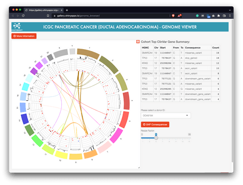
RStudio: Genome Browser
This dashboard shows a visualization based on Circos, which is a way of visualizing whole genomes. It uses pancreatic adenocarcinoma tumor samples data from various donors, provided by ICGN.
Image 2 – Genome Browser dashboard by RStudio
If you’re not familiar with the Circos-style plot, here’s a crash course. It shows several layers, starting from the outer one representing color and size distinguished chromosomes, moving clockwise from chromosome 1 to 22, then X and Y. Inside the ring, you can see a line representation of copy number mutations.
The dashboard serves researchers in the area of genomics and bioinformatics to make sense of complex data. It’s not the most useful dashboard for people without advanced domain knowledge.
Learn more:
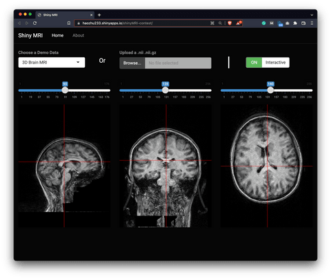
RStudio: ShinyMRI
The ShinyMRI dashboard visualizes 3D MRI images and is made entirely with R Shiny. It was also recognized as an honorable mention in the 2019 Shiny Contest.
Image 3 – ShinyMRI dashboard by RStudio
What makes this dashboard unique is the ability to upload your own files, either in .nii or .nii.gz format. That functionality makes the dashboard extremely useful for medical professionals. Sure, it’s in a PoC state now, but a little tweaking and added functionality could take it a long way.
Learn more:
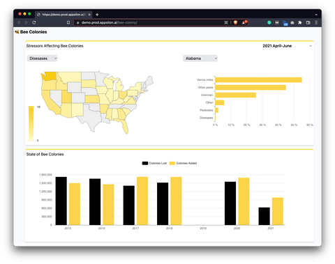
Appsilon: Bee Colonies
The Bee Colonies dashboard was made by R/Shiny Developer, Ryszard Szymański, in one day. You’re reading that right – you can build Shiny dashboards that fast.
Image 4 – Appsilon’s Bee Colonies dashboard
The dashboard shows stressors affecting bee colonies (diseases, pesticides, and others) in different US states for a given period. It also shows you how many bee colonies were lost and added in a given year, ranging from 2015 to 2021.
It helps decision-makers to early detect potential problems of adding bee colonies to one location instead of the other.
Learn more:
FielDHub: Designing Experiments in R Shiny
The FielDHub dashboard by North Dakota State University helps in the creation of traditional, un-replicated, augmented, and partially-replicated designs applied to agriculture, plant breeding, forestry, animal, and biological sciences.
Image 5 – FielDHub dashboard
If you want to test the dashboard, you’ll have to install it first. It’s assumed you have R and RStudio configured – from there, there’s only one package to install:
To actually view the dashboard, you’ll have to import the library and run the app – it will open just as any other R Shiny application:
The dashboard allows end-users to evaluate research, teach, and train others. It also has the functionality to run simulations. You can simulate response variables along with the randomization. The info can be used directly to assess the correlation of data plots in spatial designs and for teaching statistical concepts.
Learn more:
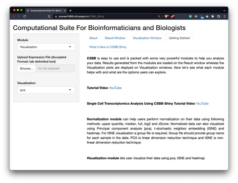
CSBB: Computational Suite for Bioinformaticians and Biologists
The CSBB is an R Shiny dashboard developed with an intention to empower researchers from wet and dry labs to perform downstream Bioinformatics analysis.
Image 6 – The CSBB R Shiny dashboard
Once again, you can run the dashboard from your machine. Use the runGitHub() function from R Shiny, and it will take care of the dependency installation for you.
The dashboard comes with 8 modules (visualization, normalization, basics statistics, differential expression, correlation profiles, function enrichment, ChiP-ATAC seq, and single-cell RNA-seq analysis) that are designed in order to help researchers design a hypothesis or answer research questions with little or no expertise in bioinformatics.
Learn more:
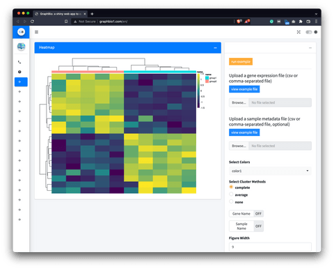
GraphBio: Visualization Analysis for Omics Data
The GraphBio dashboard provides 15 popular visualization analysis methods (heatmap, volcano plot, MA plot, network plot, PCA, ROC analysis, and others).
Image 7 – The GraphBio dashboard
If you’re unfamiliar with the term, Omics stands for different disciplines in biology whose names end in “omics”, such as genomics, proteomics, metabolomics, and so on.
The dashboard enables experimental biologists without programming skills to easily perform popular visualization analysis and get publication-ready charts.
Learn more:
Conclusion
Today you’ve seen seven examples of dashboards built with R Shiny in life sciences, and we’ve only scratched the surface. There are many other closed dashboards that aren’t accessible to the public. Shiny is used across many subfields of Life Sciences with applications in biodiversity monitoring to biotechnology research and patient care.
Unsure about adopting R Shiny in your business? Here’s what we’ve learned by helping Fortune 500s develop enterprise Shiny apps.
The take-home point we want you to remember is the following: If your field of study can benefit from data science, it can also benefit from interactive dashboards. Look no further than R shiny, as it comes with everything you need to either automate or simplify your day job.
Looking to start a career as an R Shiny Developer? Our complete beginner guide has you covered.
If you’re looking to build your first R Shiny dashboard, you can use Appsilon Shiny Dashboard Templates to simplify the process. The bundle contains a ton of beautiful and easy-to-use templates. The best part – is it’s entirely free.
In case you need something more advanced, we’re also here to help. Appsilon is an RStudio Full Service Certified Partner. We develop advanced R Shiny applications for Fortune 500 companies across the globe. We’d be happy to help you choose the right options for your use case. Let’s talk and see how Shiny can help you grow.
Contact Us
Project Manager

Get Updates
Subscribe to Shiny Weekly Newsletter
Join 4000+ Shiny enthusiasts to see the latest Shiny news from the R community.