Share
Share Tweet
Tweet Share
Share


R shinyHeatmap: How to Monitor User Sessions in R Shiny for Free

04 August 2022
User session monitoring through heatmaps is huge. It allows you to see what works and what doesn’t for your R Shiny app, and generally how users interact with it. Also, it helps you and your organization build a user adoption strategy with user behavior analytics. So, how can you get started for free? The answer is simple – with the R shinyHeatmap package.
We’ve previously explored the R Shiny Hotjar option for monitoring user behavior. But this option leaves empty heatmaps for some. Why? Bugs that are notoriously difficult to track and resolve. Also, Hotjar is a freemium service, which means you’ll have to pay as soon as you exceed 35 sessions per day (July 2022). R shinyHeatmap is different – it’s easier to get started with and is completely free of charge.
Can your R Shiny apps be used by all users? It might be time to think about accessability.
Table of contents:
- What is shinyHeatmap?
- shinyHeatmap or Hotjar – How to Choose?
- How to Get Started with shinyHeatmap in R Shiny Apps
- Heatmap Output – Walkthrough and Customization
- Summary of shinyHeatmap
What is R shinyHeatmap?
The shinyHeatmap R package aims to provide a free and local alternative to more advanced user session monitoring platforms, such as Hotjar. It provides just enough features to let you know how users use your Shiny dashboards.
As of writing this post, shinyHeatmap isn’t available on CRAN. To install it, you’ll first have to install the devtools package through the R console:
install.packages("devtools")Once installed, pull and install the shinyHeatmap package through GitHub:
devtools::install_github("RinteRface/shinyHeatmap")That’s actually all you need to get started. We’ll cover the hands-on part in a minute, but first, let’s discuss when shinyHeatmap should be the tool of your choice, and when should you consider more advanced alternatives.
R shinyHeatmap or Hotjar – How to Choose?
Hotjar drawbacks for Shiny
If you want a tool that looks good on paper and don’t care about cost – look no further than Hotjar. However, Hotjar can be more difficult to set up. You must have your R Shiny app deployed, which isn’t handy if you’re just starting out.
New to R Shiny app deployment? Here are top 3 methods you must know.
Further, you have to register an account and embed a tracking code in your app. After doing so, you have to redeploy the app. All in all, it’s not too complicated, but there are some bugs.
Missing heatmaps
Hotjar sessions take some time to appear in your dashboard – if they appear at all. We at Appsilon and many others have found Hotjar to be buggy depending on the framework you’re using. Many users have reported that sessions aren’t displayed in the dashboards, and that’s a deal-breaking issue. For example, if you’re exploring options for Shiny for Python – some web frameworks are altogether not compatible with Hotjar like Electron.
Cost
Also, we have to discuss pricing. If you’re an indie developer, paying $31 a month when billed annually is just too expensive. It’s a negligible cost for a full-scale organization, but still, that’s the most basic premium plan allowing you to record 100 sessions per day.
Moral of the story: Hotjar is amazing if you can make it work and if you can afford it – if being the crucial part.
shinyHeatmap – heatmaps made for R Shiny apps
The R shinyHeatmap package is different. It only requires a www folder for saving logs, and what it collects is barebones. The logs are collected in JSON format where each interaction is a JSON object containing X and Y coordinates of an event. Because of this, you can rest assured that there won’t be any data privacy concerns. No actual user data is collected, only the coordinates of their clicks with the purpose of aggregation and visual interpretation.
This package is free and open-source. There are no fancy features such as events and identify APIs that come with a premium Hotjar plan, but that’s okay for most users.
If you’re only interested in heatmaps, shinyHeatmap is the way to go.
Long story short:
- Use
shinyHeatmapif you want barebones logs and to ensure you receive good heatmap visualizations, free of charge
Next, let’s see how you can get started configuring the shinyHeatmap package.
How to Get Started with shinyHeatmap in R Shiny Apps
You already have shinyHeatmap installed, so now let’s begin with the fun part. For the Shiny dashboard of choice, we’ll reuse the clustering app from our Tools for Monitoring User Adoption article.
Here’s the source code:
library(shiny)
ui <- fluidPage(
headerPanel("Iris k-means clustering"),
sidebarLayout(
sidebarPanel(
selectInput(
inputId = "xcol",
label = "X Variable",
choices = names(iris)
),
selectInput(
inputId = "ycol",
label = "Y Variable",
choices = names(iris),
selected = names(iris)[[2]]
),
numericInput(
inputId = "clusters",
label = "Cluster count",
value = 3,
min = 1,
max = 9
)
),
mainPanel(
plotOutput("plot1")
)
)
)
server <- function(input, output, session) {
selectedData <- reactive({
iris[, c(input$xcol, input$ycol)]
})
clusters <- reactive({
kmeans(selectedData(), input$clusters)
})
output$plot1 <- renderPlot({
palette(c(
"#E41A1C", "#377EB8", "#4DAF4A", "#984EA3",
"#FF7F00", "#FFFF33", "#A65628", "#F781BF", "#999999"
))
par(mar = c(5.1, 4.1, 0, 1))
plot(selectedData(),
col = clusters()$cluster,
pch = 20, cex = 3
)
points(clusters()$centers, pch = 4, cex = 4, lwd = 4)
})
}
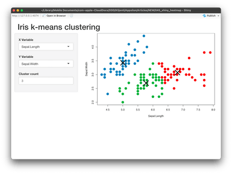
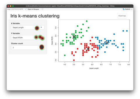
shinyApp(ui = ui, server = server)And here’s what the app looks like:
Image 1 – Clustering R Shiny application
Including shinyHeatmap is a two-step process:
ui()– wrapfluidPage()with a call towith_heatmap()server()– add a call torecord_heatmap()to the top.
If you want to copy and paste, here’s the code:
library(shiny)
library(shinyHeatmap)

ui <- with_heatmap(
  fluidPage(
    headerPanel("Iris k-means clustering"),
    sidebarLayout(
      sidebarPanel(
        selectInput(
          inputId = "xcol",
          label = "X Variable",
          choices = names(iris)
        ),
        selectInput(
          inputId = "ycol",
          label = "Y Variable",
          choices = names(iris),
          selected = names(iris)[[2]]
        ),
        numericInput(
          inputId = "clusters",
          label = "Cluster count",
          value = 3,
          min = 1,
          max = 9
        )
      ),
      mainPanel(
        plotOutput("plot1")
      )
    )
  )
)

server <- function(input, output, session) {
  record_heatmap()

  selectedData <- reactive({
    iris[, c(input$xcol, input$ycol)]
  })
  clusters <- reactive({
    kmeans(selectedData(), input$clusters)
  })
  output$plot1 <- renderPlot({
    palette(c(
      "#E41A1C", "#377EB8", "#4DAF4A", "#984EA3",
      "#FF7F00", "#FFFF33", "#A65628", "#F781BF", "#999999"
    ))

    par(mar = c(5.1, 4.1, 0, 1))
    plot(selectedData(),
      col = clusters()$cluster,
      pch = 20, cex = 3
    )
    points(clusters()$centers, pch = 4, cex = 4, lwd = 4)
  })
}

shinyApp(ui = ui, server = server)
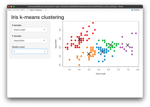
Once launched, the Shiny dashboard doesn’t look any different from before. We’ve played around with the inputs to make the image somewhat different:
Image 2 – Clustering dashboard after adding shinyHeatmap calls
Click around the dashboard a couple of times. Display different variables on X and Y axes, and tweak the number of clusters. Everything you do will get saved to the www folder. To be more precise, the events are split by minute, with each minute represented by a single JSON file:
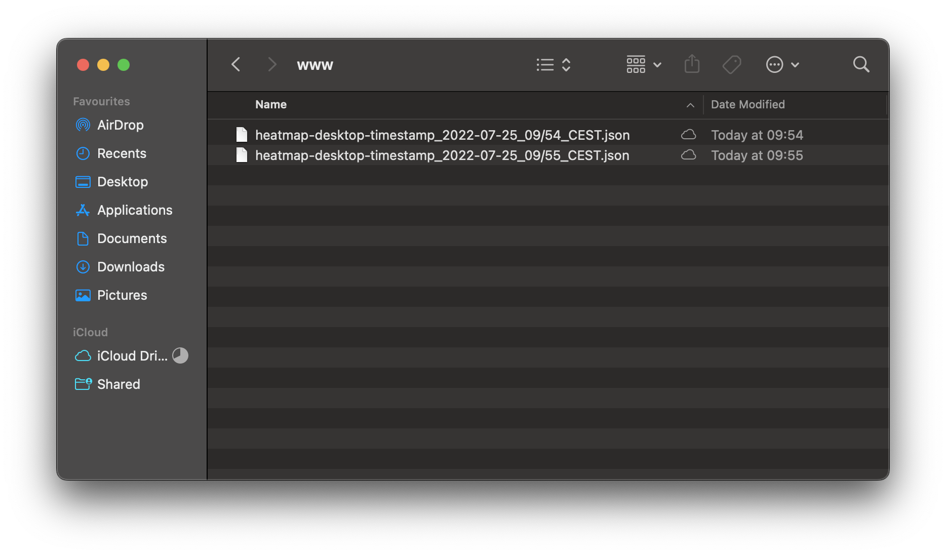
Image 3 – Contents of the www directory
Once opened, a single JSON file looks like this:
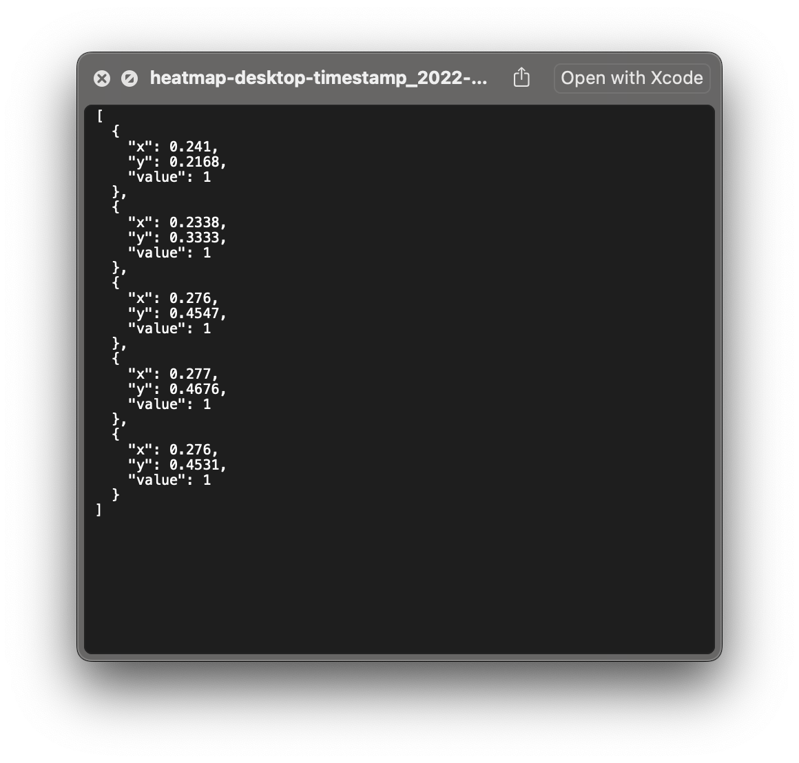
Image 4 – Contents of a single JSON log file
But how can you use these logs to visualize the usage heatmap? That’s what we’ll discuss in the following section.
Heatmap Output – Walkthrough and Customization
To render a heatmap over the dashboard, you’ll have to replace record_heatmap() with download_heatmap() in a call to server(). We can tweak the output by changing the parameters, but more on that later.
Keep in mind: Because you’ve removed a call to record_heatmap(), new events aren’t recorded.
Anyhow, here’s the code for the updated server() function:
server <- function(input, output, session) {
download_heatmap()
selectedData <- reactive({
iris[, c(input$xcol, input$ycol)]
})
clusters <- reactive({
kmeans(selectedData(), input$clusters)
})
output$plot1 <- renderPlot({
palette(c(
"#E41A1C", "#377EB8", "#4DAF4A", "#984EA3",
"#FF7F00", "#FFFF33", "#A65628", "#F781BF", "#999999"
))
par(mar = c(5.1, 4.1, 0, 1))
plot(selectedData(),
col = clusters()$cluster,
pch = 20, cex = 3
)
points(clusters()$centers, pch = 4, cex = 4, lwd = 4)
})
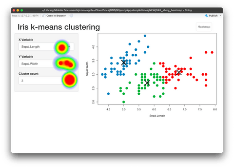
}Image 5 – Heatmap overlaying the R Shiny app
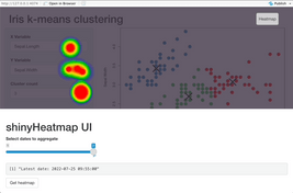
Neat, isn’t it? You can also click on the Heatmap button to show events in selected time intervals. By default, all logs are aggregated and shown, but you can show a heatmap for a time range only:
Image 6 – Playing around with the Heatmap UI
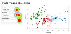
In case you don’t want the Heatmap button, you can set show_ui = FALSE in a call to download_heatmap(). By doing so, the heatmap image will be downloaded:
download_heatmap(show_ui = FALSE)Image 7 – Downloading the heatmap as an image
The image includes events from all logs, and here’s what it looks like on our end:
Image 8 – Downloaded heatmap image
Is that it? Well, no. You can also modify how the heatmap looks by changing a couple of function parameters.
How to customize the looks of shinyHeatmap
The download_heatmap() function accepts an options parameter. It is a list in which you can tweak the size, opacity, blur, and color of your heatmaps.
Here’s an example – we’ll slightly increase the size and change the color gradient altogether:
download_heatmap(
  options = list(
    radius = 20,
    maxOpacity = 0.8,
    minOpacity = 0,
    blur = 0.75,
    gradient = list(
        ".5" = "green",
        ".8" = "red",
        ".95" = "black"
    )
  )
)
Here’s what the heatmap looks like:
Image 9 – Heatmap with updated visuals
And that’s how you can install, configure, use, and customize R shinyHeatmap package in R Shiny. Let’s make a short recap next before you get started with shinyHeatmap for your user testing.
Summary of R shinyHeatmap
Monitoring user behavior used to be hard but nowadays it boils down to adding a couple of lines of code. There’s no excuse to not inspect how people use your R Shiny dashboards, especially since shinyHeatmap is completely free!
Looking to conduct effective user tests? See how Appsilon conducts user tests for Shiny dashboards.
Are you an avid user of R shinyHeatmap package? Or do you prefer some other alternative? Please let us know in the comment section below. Also, don’t hesitate to hit us on Twitter – @appsilon – we like discussing R and anything data science related.
Considering a carreer as an R Shiny developer? Take a look at our guide for complete beginners.
Contact Us
Project Manager

Get Updates
Subscribe to Shiny Weekly Newsletter
Join 4000+ Shiny enthusiasts to see the latest Shiny news from the R community.