

 Share
Share Tweet
Tweet Share
Share


Shiny.gosling Examples and How to Run Them: Genomics Visualizations in R Shiny

14 February 2023
Genomics visualizations can be tricky to set up. With shiny.gosling, we make it easier for you to access the grammar of Gosling.js in R/Shiny.
We also have a hidden feature for you to play around with and explore the package to get a taste of what it can do. If you followed our previous tutorial on shiny.gosling, you already have it set up. If not, we recommend going through it and getting the package installed and ready.
Once things are in motion, all you have to do is use the shiny.gosling::run_example() function!
Examples of shiny.gosling Genomics Visualizations
At the time of writing, the following examples are available:
- circularLinearWithBrush
- circularVisualEncoding
- multiTrackApp
- sarsCov2
- staticCircularBar
- structuralVariant
- textAnnotation
In this article, we will go through each example one at a time, adding context along the way. If an example your looking for isn’t present, reach out and let us know.
circularLinearWithBrush
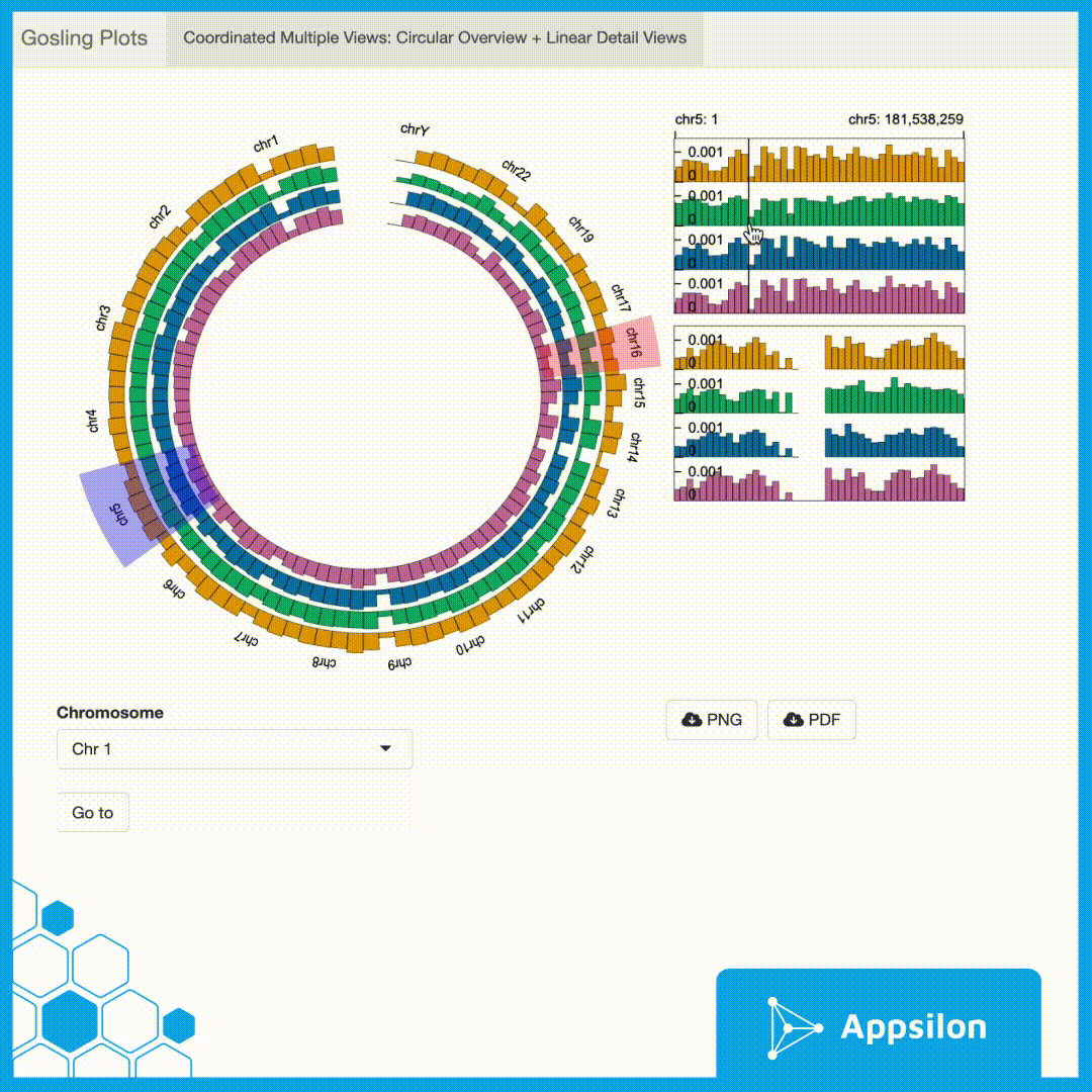
shiny.gosling::run_example(“circularLinearWithBrush”)
In this example, we have a circular overview of different chromosomes, which can be selected from the dropdown or selected via the brush. It has two draggable brushes, that choose and determine the areas to expand in the detailed view so that they can be compared with each other. It also lets us download the view in pdf or png.
circularVisualEncoding
shiny.gosling::run_example(“circularVisualEncoding”)
This is a simple example of visualizing a circular encoding of genes. Hovering over the specific areas shows you the Start Position, End Position, and Value. We can also zoom in and out of certain parts of the plot with the scroll of a mouse. From the perspective of gosling, this is a simple single-track genomics visualization. You can also easily export the plot to pdf.
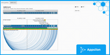
multiTrackApp
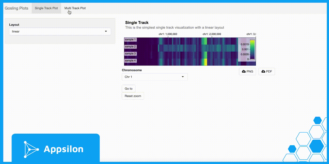
shiny.gosling::run_example(“multiTrackApp”)
Here, we have a multi-track application that shows you how you can use a tabbed UI to switch between different genomics visualizations. In the multi-track tab, we can see the standard Gosling.js example of a Breast Cancer Variant (Staaf et al. 2019); the example is based on genome sequencing from data on 254 triple-negative breast cancers (TNBCs) collected through the Sweden Cancerome Analysis Network–Breast (SCAN-B) project.
Apart from being able to download in pdf and png, we can choose a chromosome from the drop-down to quickly view it. We can also zoom out to the entire sequence by clicking on the “Reset Zoom” button.
sarsCov2
shiny.gosling::run_example(“sarsCov2”)
This example replicates the SARS-CoV-2 visualization from the Gosling gallery. This is based on the WashU Virus Genome Browser, NCBI, GISAID. The idea for these examples is to help you show how easy it is to build an equivalent genomics visualization in R/Shiny using shiny.gosling. While the run_example() function shows you the visualization itself, you can go into the package code and check the process of building the viz itself.
In this plot, all the segments are in sync with each other. We can use the brush to zoom into a certain portion and all the segments will also zoom in as well. If we zoom in on all, it’s possible to see the exact sequence of the gene. If the brush is moved, other segment views will move in tandem.
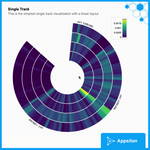
staticCircularBar
shiny.gosling::run_example(“staticCircularBar”)
This example shows the simplest visualization you can make with Gosling.js and shiny.gosling. Here, we have a static bar plot in the circular layout. It is non-interactive. This is the best format to create visualizations that you can embed into .rmd or Quarto reports.
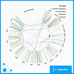
structureVariant
shiny.gosling::run_example(“structuralVariant”)
This is an example of a simple Circos plot that lets you zoom in and interact with it as you’d expect. There is also a legend for each class that you can refer to and understand the mapping between the chromosomes. This shows how to build simple layers and visualizations without too much complexity.
textAnnotation
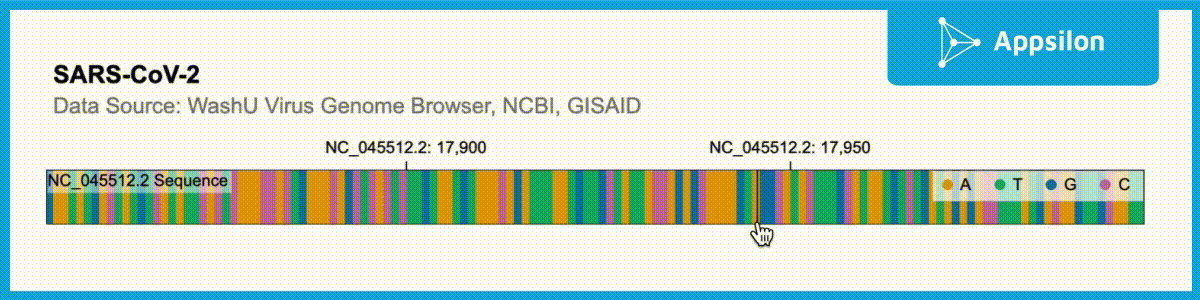
shiny.gosling::run_example(“textAnnotation”)
The example above shows a text-annotated visualization of the WashU Virus Genome Browser. If you zoom into the plot, you can actually see that each of the ACGT is labeled. Gosling.js has all of these functionalities built-in but shiny.gosling makes them much easier to tap into to augment your genomics visualizations.
How to Get Started with Genomics in R Shiny with shiny.gosling
With shiny.gosling, we are trying to bring the grammar of Gosling.js straight into R/Shiny. Hopefully, the examples above have proved to be a valid demonstration of how easy it is to use and how diverse shiny.gosling is; furthermore we hope to showcase how it is evolving! We are actively working on making it better, and adding support for more of Gosling.js grammar. Shiny.gosling as the eventual go-to package for Gosling.js and genomics visualizations in R/Shiny.
If you’d like to get started be sure to explore our shiny.gosling intro tutorial or read more about the theory and a practical example of shiny.gosling for a genomics data dashboard.
Contact Us

R/Shiny Developer

Get Updates
Subscribe to Shiny Weekly Newsletter
Join 4000+ Shiny enthusiasts to see the latest Shiny news from the R community.
Also on genomics
