Share
Share Tweet
Tweet Share
Share


Visualizing genomics data is not as straightforward as you would think. The whole industry is extremely complex and suffers from a major problem – specialization creep. There are so many niches in genomics, meaning one library or service can’t cover the entire spectrum of genomics data visualization needs.
That is, until now. Because today you’ll learn how Gosling works, what is it exactly, and how to leverage the Gosling R Shiny package to include a genomics chart in your favorite web development package.
Want to visualize spatial data in R? Read our in-depth introduction to R ggmap.
Table of contents:
- Why Gosling for Genomics Data Visualization
- Testing the Waters: Your First shiny.gosling Data Visualization
- Going Deeper with Gosling and R Shiny
- Gosling and R Shiny Summary
Why Gosling for Genomics Data Visualization
So, what is Gosling exactly? It’s an acronym that stands for Grammar Of Scalable Linked Interactive Nucleotide Graphics. It’s quite a mouthful, so we won’t give you a hard time for not remembering it.
Image 1 – Gosling homepage
The whole thing is still relatively new, so we recommend visiting the homepage through our link since a Google search turns out a bunch of results for Ryan Gosling. Both are cool, but couldn’t be more different.
In fact, Gosling was named after Raymond Gosling (not Ryan), who was the first to come up with the double helix structure of the DNA that we have come to know. His magnum opus was Photo 51 which he developed with Rosalind Franklin. It also serves as the namesake for Gosling.js.
Gosling visualization package is a grammar for interactive and scalable genomics data visualization. It balances the expressiveness of multi-scale genomics data visualizations with accessibility for domain scientists. It’s powered by Gosling.js, which is a JavaScript toolkit that provides scalable and interactive rendering.
Learn more about Gosling on the official website.
Testing the Waters: Creating A shiny.gosling Data Visualization in R
Gosling breaks data visualizations into several components and Appsilon’s shiny.gosling package reflects that. These are:
- Tracks: Atomic units that define the data, layout, height, width, aesthetics, and other items.
- Views: A combination of tracks.
- Plots: A combination of views.
In R, shiny.gosling depends on another Appsilon’s package – shiny.react. You’ll have to install both from GitHub if you want to use Gosling in R Shiny:
remotes::install_github("Appsilon/shiny.react")
remotes::install_github("Appsilon/shiny.gosling")
For the first example, we’ll grab a portion of the official example. The following snippet renders an 800×180 bar chart based on the data listed on the URL:
library(shiny)
library(shiny.react)
library(shiny.gosling)
spec1 = '{
"title": "Basic Marks: bar",
"subtitle": "Tutorial Examples",
"tracks": [
{
"layout": "linear",
"width": 800,
"height": 180,
"data": {
"url": "https://resgen.io/api/v1/tileset_info/?d=UvVPeLHuRDiYA3qwFlm7xQ",
"type": "multivec",
"row": "sample",
"column": "position",
"value": "peak",
"categories": ["sample 1"],
"binSize": 5
},
"mark": "bar",
"x": {"field": "start", "type": "genomic", "axis": "bottom"},
"xe": {"field": "end", "type": "genomic"},
"y": {"field": "peak", "type": "quantitative", "axis": "right"},
"size": {"value": 5}
}
]
}'
shinyApp(
ui = tagList(
GoslingComponent(spec = JS(spec1))
),
server = function(input, output) {}
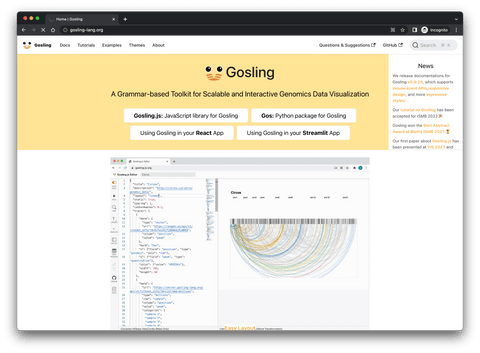
)As you can see, you need to create tracks and combine them into views and plots (wrapped in JSON), and then use GoslingComponent() function to output it in the app.
Here’s what the app looks like:
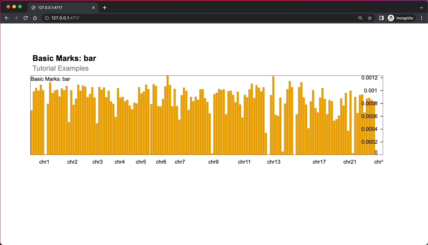
Image 2 – Shiny gosling app rendering a single chart
You can take the dashboard a step further by examining the second plot from the official example. It outputs an additional chart below the first one that is controlled by brushes:
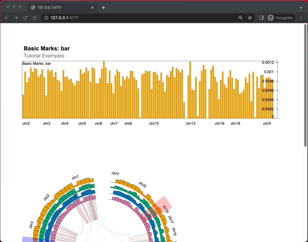
Image 3 – R Shiny app showing 2 sets of Gosling charts
If you want to get an entire example gallery, simply clone the entire Appsilon shiny.gosling repo and run the Shiny app under inst/examples/dashboard/app.R.
You’ll need an additional dependency – shiny.fluent, so install it with the following command:
remotes::install_github("Appsilon/shiny.fluent")Once up and running, you’ll have access to many other charts and examples:
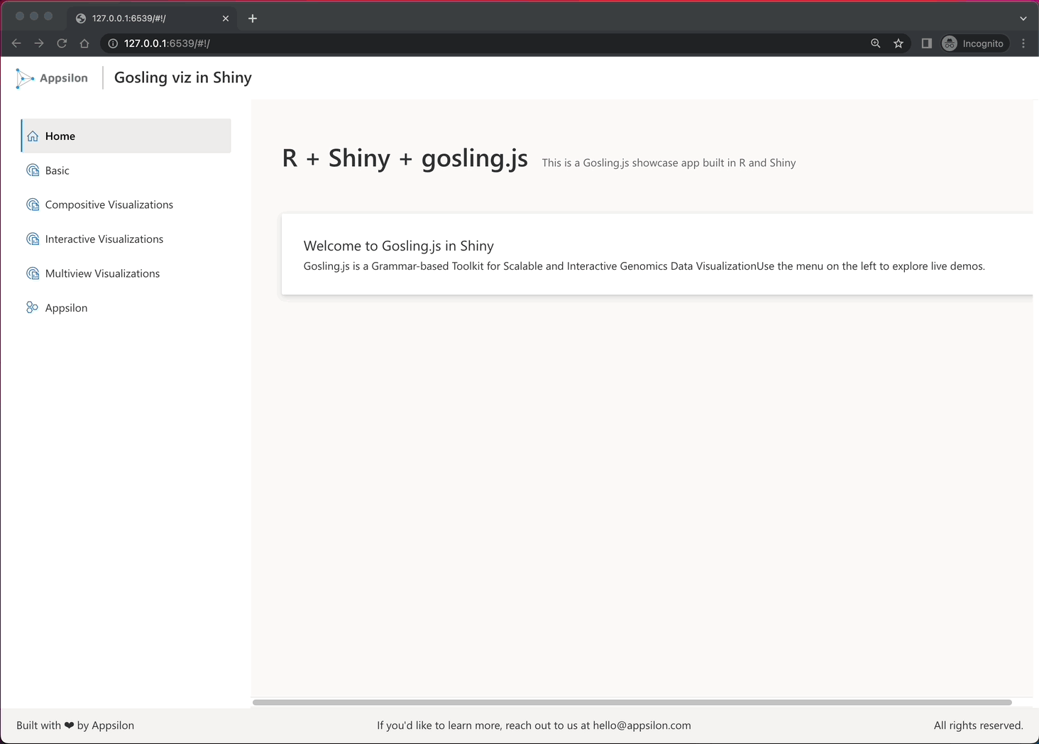
Image 4 – Shiny dashboard showcasing Gosling use cases and examples
Let’s dive a bit deeper into Gosling R Shiny by checking the most current features which haven’t been released yet.
Going Deeper with Gosling and R Shiny for Genomics Data Dashboards
Gosling in R Shiny looks good so far but offers no customization. As it turns out, you can control each level by using a list of functions shiny.gosling offers. For this part, we’ll actually install the package from the dev branch:
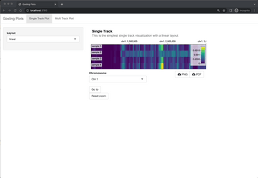
remotes::install_github("https://github.com/Appsilon/shiny.gosling/", ref = "dev")Once installed, you can clone the contents of the dev branch to get access to more examples and additional functionality. Let’s take a look at the example under inst/examples/multiTrackApp with R Shiny reactivity and options to download the plots or reset their zoom:
Image 5 – Multi-Track Gosling Shiny app
Overall, there are 7 complete dashboard examples you can take a peek at.
From a developer’s perspective, things are much more interesting here. You can now use helper functions and completely avoid the use of quote-wrapped JSON. Here are some you must know:
add_single_track()– Constructs a single track from the inputs. The inputs can be id, data, mark, and so on.add_multiple_track()– Used to combine multiple single tracks.export_png() / export_pdf()– Exports your data visualization as PNG/PDF.build_json()– Builds a Gosling spec from an R list. Useful when you want to take things outside of R.
You don’t need to explore these functions on your own. Here’s an example screenshot from an R file showcasing how much the current development version of shiny.gosling makes the workflow cleaner and developer-friendly:
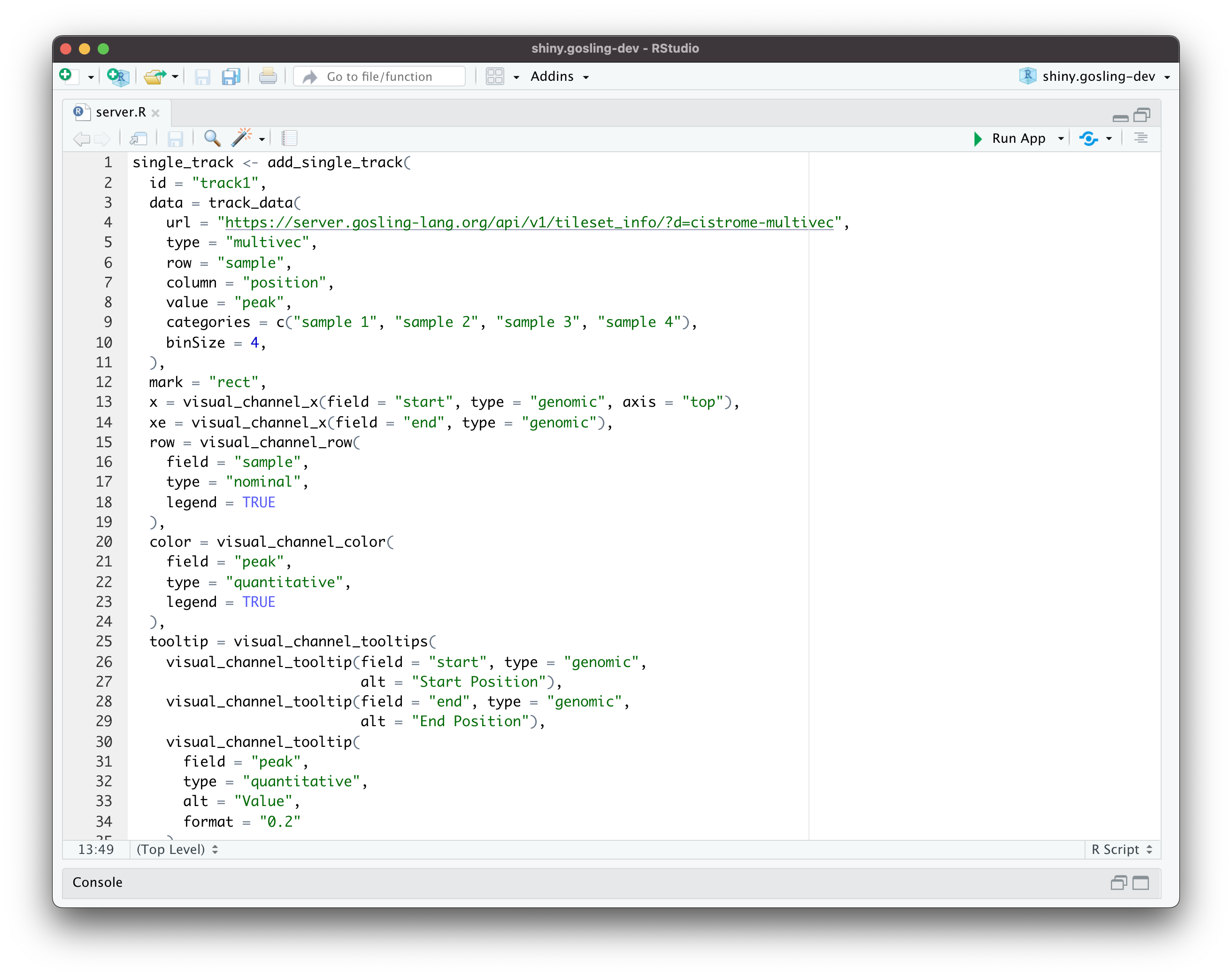
Image 6 – A new way of coding Gosling visualizations
From the previous example, you can see the add_single_track() function in action. It translates messy and hard-to-debug string-wrapped JSON into a first-class R function with a whole lot of properties you can change and tweak.
Want to design better dashboards? Follow Anna’s 7 steps to design dashboards people will love.
That’s all we’ll explore today, so let’s make a short recap next.
Summarizing Gosling and R Shiny for Genomics Charts and Visualizations
Interactive data visualization in genomics has a promising future thanks to the Gosling JavaScript toolkit. R Shiny takes it a step further by offering a complete package to work with Gosling from R – shiny.gosling. The R package is still in active development, and you can expect improvements and additional functionality soon.
Stay tuned to the Appsilon blog for any updates regarding Gosling R Shiny, as well as for the other articles and tech tutorials.
What are your thoughts on Gosling for genomic data visualization? Have you tried our R Shiny wrapper for Gosling? Make sure to let us know about your favorite features in the comment section below. Also, don’t hesitate to reach out to us on Twitter – @appsilon. We’d love to hear from you.
Looking for a dashboard inspiration? Take a look at our top 7 curated R Shiny apps in Life Sciences.
This article was co-authored by Appsilon Data Storyteller, Dario Radečić.
Contact Us

R/Shiny Developer

Get Updates
Subscribe to Shiny Weekly Newsletter
Join 4000+ Shiny enthusiasts to see the latest Shiny news from the R community.