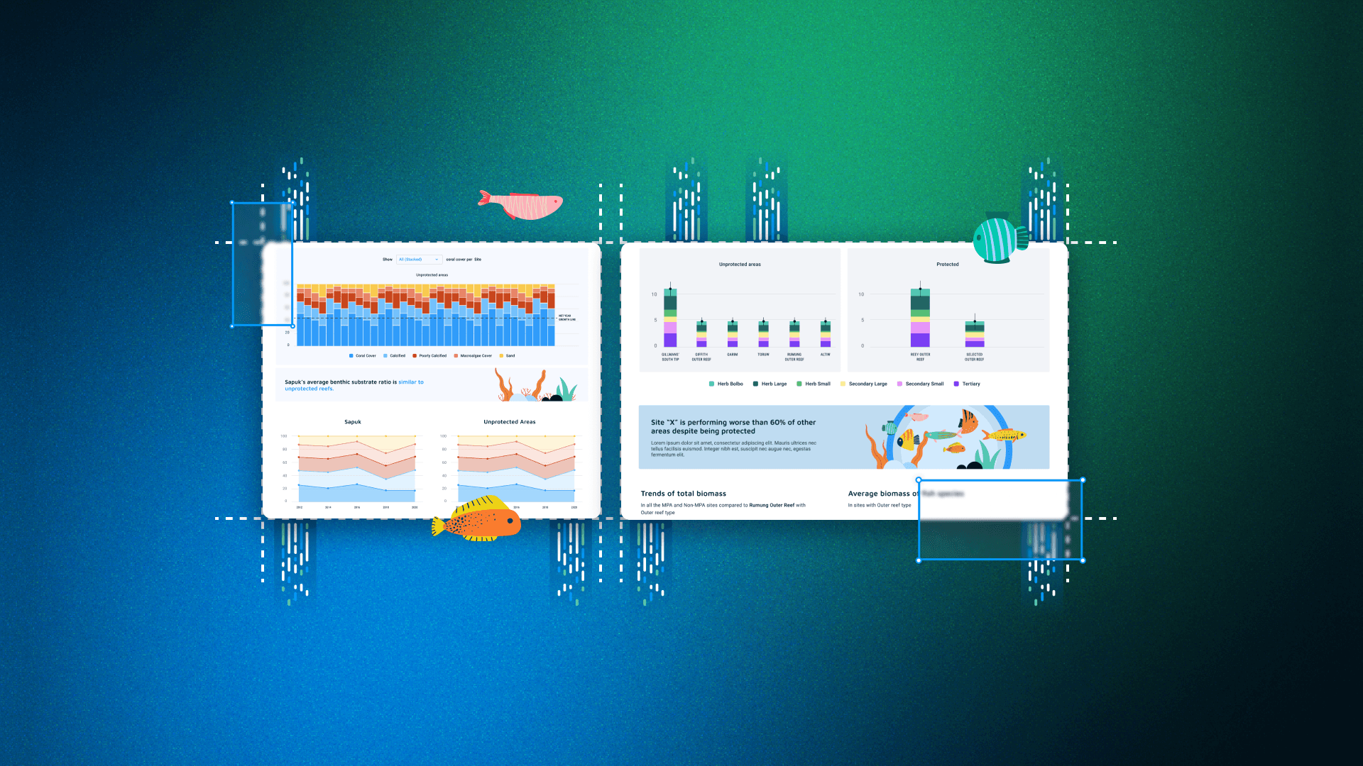
Micronesia’s Shiny App: Enhancing Data Insights for Marine Ecologists
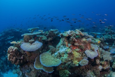
Explore the profound connection between humanity and the sea, exemplified by the beliefs of Pohnpei islanders in the Micronesia region. They perceive the mist born from crashing waves on outer reefs as the source of life-giving morning dew for their bountiful harvest. However, these exquisite underwater patterns face an uncertain fate unless proactive measures are taken to monitor and safeguard them.
As a proud participant in the Data For Good initiative, Appsilon was excited at the opportunity to collaborate with Dr. Peter Houk from the University of Guam, who spearheads the Micronesia Reef Monitoring Project. Together, we harnessed the power of data to enhance insights, ensuring that the fruits of their labor resonate more closely with the people of Micronesia. Join us on this journey of environmental preservation and technological innovation.
Image courtesy of the Micronesia Reef Monitoring (https://micronesiareefmonitoring.com/)
TOC:
- Sharing Insights and Overcoming Challenges in Data Collection
- RStudio’s Visual Markdown Editor
- Coral Reefs: Vital Elements of Marine Ecology
- Postgres, Python, Angular, and R
- Sailing through an Ocean of Data
- Completing the Project in Record Time: A 2-Month Journey
- Shipping Containers and Docker: Logistics of the Micronesia Project
- Charting a Course with a Perfect Blend of R Packages
- Dive into the Sea of Possibilities: Exploring Opportunities for Marine Ecologists
Sharing Insights and Overcoming Challenges in Data Collection for Micronesia Reef Monitoring
Collecting data is a daunting task in any data-driven endeavor, but sharing insights poses its own set of challenges. In the realm of data-wrangling operations, developers turn to R for its simplicity, intuitive coding style, stats capabilities, strong community support, and extensive ecosystem of packages. Leveraging the power of R’s Shiny package, Appsilon excels in creating web applications that facilitate the seamless sharing of valuable insights with diverse audiences.
While Appsilon is known for its work with commercial clients, we are equally passionate about leveraging technology for the betterment of our planet. This commitment is the driving force behind our Data For Good initiative. In this article, we’ll take a look into the remarkable story of how R Shiny became the conduit for showcasing the comprehensive data collected during the Micronesia Reef Monitoring Project. From funding local community initiatives to identifying near-real time illegal fishing and sales, this tool empowers stakeholders with data-driven decision-making capabilities, ultimately contributing to the preservation and enhancement of life in Micronesia’s precious marine ecosystems.
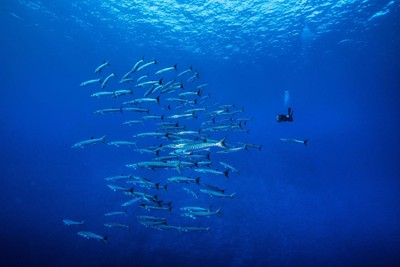
Image courtesy of the Micronesia Reef Monitoring (https://micronesiareefmonitoring.com/)
Coral Reefs: Vital Elements of Marine Ecology
Coral reefs play a pivotal role in the health and sustainability of our oceans and their surrounding ecosystems. The increasing threats to their existence demand immediate action to safeguard their future and ours. Recognizing this urgency, numerous initiatives have been undertaken to monitor and ensure the responsible utilization of marine resources.
Among the prominent coral reef habitats in the Pacific Ocean, the Micronesian region stands out. Comprising over 2000 islands in the Northwestern Pacific Ocean, Micronesia boasts a rich tapestry of coral and fish species.
In 2006, the leaders of the Micronesia region set up the Micronesia Challenge, aiming to preserve the marine ecosystems of this region. Its ambitious goal is to conserve a minimum of 30% of near-shore marine resources, including coral reefs, and 20% of land-based resources by the year 2030. By closely monitoring these vital ecosystems, the project strives to protect and sustain the delicate balance of life in Micronesia’s remarkable marine resources.
Image courtesy of the Micronesia Reef Monitoring (https://micronesiareefmonitoring.com/)
Postgres, Python, Angular, and R: Tech Conduits to Access Insights in Micronesia
The initial hurdle faced in the Micronesia Reef Monitoring project was the collection and observation of data on the growth of sea and coral species. Thanks to the unwavering dedication of Dr. Peter Houk and his team from the University of Guam, years of hard work culminated in the successful acquisition of this valuable data. The next challenge awaited us: transforming this data into actionable insights that could drive conservation efforts across the Micronesia region.
To tackle this challenge, Dr. Houk leveraged the power of the tidyverse ecosystem to generate a captivating collection of static visuals. While these visuals provided valuable information, we recognized the need for a more dynamic and user-friendly platform to present these insights to conservationists and local government leaders.
Our initial approach involved storing the collected data in a Postgres Database and creating a Python API to generate the necessary visuals using R. An Angular front-end was employed to display these visuals to end users.
While this method yielded results, its performance was hampered by the frequent data exchanges between different languages. Additionally, the static nature of the visuals limited users’ ability to interact and delve into specific components of the insights.
Sailing Through an Ocean of Data By Accelerating Data Processing
Through our Data for Good initiative, we embarked on a collaborative journey with the Micronesia Reef Monitoring challenge, aiming to enhance their existing application. Our goal was to develop an R Shiny solution that would effectively showcase the impact of conservation efforts across the various islands in the Micronesia region.
Latency Issue
At the outset, the existing solution exhibited a latency of 10 seconds, which posed limitations on user experience and engagement. Over the course of approximately two months working alongside Appsilon, we achieved remarkable progress. Dr. Houk, with our support, successfully reduced the latency to a mere 2 seconds, representing an impressive 80% decrease. This optimization allowed users to access and explore the application’s wealth of data and visualizations swiftly and seamlessly.
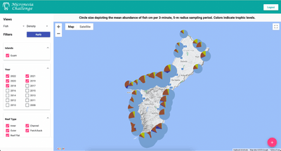
Moreover, we expanded the range of data visualizations and insights within the application. While the initial version presented users with a map of the islands accompanied by pie charts showcasing marine species abundance, the revamped application offered a captivating narrative that depicted the evolution of species abundance over time. Users were taken on a comprehensive journey, gaining deeper insights into the dynamics of the ecosystem and the impacts of conservation efforts.
Our collaborative efforts led to an application that not only provided a more responsive user experience but also delivered a richer and more informative exploration of the Micronesia region’s marine ecology.
R Marks the Spot
The secret lies in the ecosystem and structure of the application. Our final solution was an R Shiny application that utilized data from the Python API to generate interactive visuals as needed. There were two key reasons for choosing this approach.
Communicating in R and Python
Firstly, it eliminated the need for back-and-forth communication between languages. This streamlined the integration of the client’s R-based data processing scripts into the application, saving significant time.
Prototyping
Secondly, leveraging the power of R and Shiny allowed us to rapidly prototype and create production-ready applications. The simplicity of the R language facilitated smooth collaboration between end users and Appsilon, enabling easy sharing of feedback on the application structure.
In the initial version, users logged in with their credentials and accessed a view showing the available islands and relevant data filters. Upon selecting an island and filters, the data was downloaded, presenting users with a close-up view of the island. Each data collection site featured a pie chart displaying the species composition. While this user flow effectively communicated a basic set of insights, it only scratched the surface of the potential for telling a captivating story.
Appsilon’s Solution
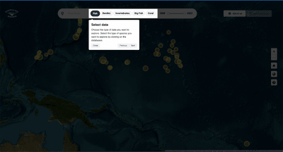
In our solution, users are initially greeted with a welcome message introducing them to the vision and efforts of the Micronesia Reef Monitoring challenge, as well as providing a brief overview of how the application works. Once the welcome message is closed, a guided tour of the application appears, highlighting each control and providing explanations on how to use them.
Mapping It Out
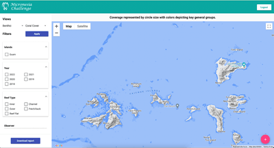
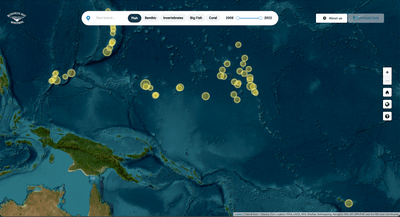
Finally, users are presented with a map of the Micronesia region, where each dot represents the total number of monitoring sites on that island. Users can zoom and pan across the map, remaining within the range of the Micronesia region. When they decide to explore further, clicking on an island seamlessly transitions the user from the overall region view to a detailed view of that specific island.
Observing Monitored Sites and Data
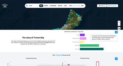
In this section, users have the opportunity to explore the monitoring sites on the selected island. Each dot on the map represents the size of the total biomass at that site. While pie charts are commonly used for data representation, they can sometimes be misleading in displaying the true composition of values. To address this, we made a significant improvement by relocating the pie chart from the map view to a more suitable place—a bar chart in the lower panel. This comprehensive bar chart presents the complete story of the dataset, allowing users to scroll up and effortlessly navigate through the entire monitoring site narrative on their screen.
Completing the Project in Record Time: A 2-Month Journey
To complete the application conversion within two months, we established a meticulous process. Utilizing an agile workflow based on sprints, we started from scratch using the {rhino} package. {rhino} serves as our opinionated framework for building robust R/Shiny apps. It simplifies the process of constructing and managing modules, implementing complex styling and interactions with SASS and Javascript.
With {rhino}, we experienced enhanced speed and strength, thanks to its seamless integration of unit tests and end-to-end tests. These tests provided the necessary safeguards to ensure the app’s reliability and consistency. Furthermore, {rhino} facilitated the integration of unit tests into the Gitlab CI pipeline with minimal configuration. By removing the limitations of the underlying framework, we were able to focus on developing impactful features without hindrance.
Rapid Iteration and User Feedback with Rhino and R/Shiny
With the support of {rhino} and R/Shiny, we promptly received and addressed user feedback. We conducted user testing sessions as soon as the app’s features were established, allowing us to receive a stream of feedback that we addressed within days.
During these sessions, users encountered difficulty remembering to click the Apply button (which may not be visible in the demo above, more on that later) after selecting species and years of data. Traditional applications often rely on action buttons to trigger specific actions. However, modern web applications aim to provide results with minimal user input and effort. Based on user feedback, it became evident that the Apply button was a remnant of conventional dashboards and impeded a smooth user experience.
To resolve this, we decided to remove the Apply button altogether and enable the application to instantly download data and respond to user feedback. Within a day, we established the necessary connections to seamlessly access data, thanks to the well-structured nature of {rhino} and the simplicity of R/Shiny. Additionally, we ensured that the data required to tell the story of the selected site would be updated instantaneously.
Shipping Containers and Docker: Logistics of the Micronesia Project
Although the app functioned smoothly on our machines, it wasn’t feasible to distribute our machines to every user interested in exploring Micronesia. So, we quickly containerized the Shiny application into a single Docker container. With the help of the project workspace in Gitlab, we had a designated location to tag and store our containers using the Gitlab Container Registry. By leveraging docker-compose, we hosted the Shiny application on a Digital Ocean droplet, making it accessible to anyone who wished to use the application.
Charting a Course with a Perfect Blend of R Packages
The {rhino} framework played a crucial role in developing our efficient and reliable production-ready application. However, it’s important to highlight the other R packages that were integrated into the mix. We utilized a variety of R packages to construct the application, incorporating modern UI/UX components. Looking back, the extensive ecosystem of R packages empowers Shiny users to seamlessly integrate and utilize well-supported libraries, almost like a plug-and-play experience for Shiny developers.
Enhancing User Experience with {shiny.semantic}
User adoption is greatly influenced by the quality of their experience. To ensure a seamless and contemporary user interface, we utilized the shiny.semantic and semantic.dashboard packages. These packages, including shiny.semantic developed by Appsilon, leverage the power of the Fomantic UI (formerly Semantic UI) design library. Through the Toast and Modals components of Fomantic UI, we incorporated messages, popups, and tooltips to provide additional information to the users.
Creating responsive web applications that adapt to different device screen sizes can be a challenge for web designers. However, we were able to address this concern without leaving the R environment. Thanks to the imola package, we integrated a grid system into our Shiny application, eliminating the need for external CSS techniques such as flexbox and grid systems commonly used for responsive designs.
Harnessing Data Visualization with {echarts4R}
To elevate the static visuals, we revamped them into dynamic and interactive graphs using the echarts4R package. This allowed users to actively explore the relationships and patterns within the data. Additionally, we leveraged the capabilities of R Shiny to develop intuitive controls that enabled users to navigate and delve deeper into the application’s content.
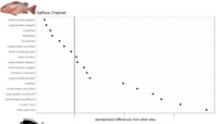
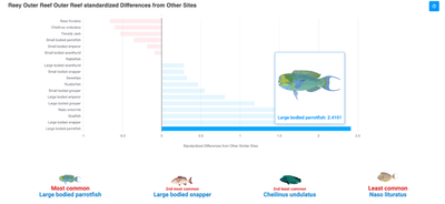
With the flexibility afforded by our creative freedom, we were able to experiment with various visualization techniques to effectively convey the story we wanted to tell. For instance, one notable plot we implemented depicted the standardized differences in species abundances among sites with the same reef type, offering valuable insights into the ecological dynamics of the region.
Building upon this initial concept, we transformed the plot into an interactive version that resonated with users. It provided them with a comprehensive understanding of the fish species present in their monitoring site, highlighting both common and rare species. This enabled users to gain awareness of which fish species required conservation efforts.
To further enrich the user experience, we incorporated captivating fish images that appear when hovering over each bar. This delightful feature allowed users to visually connect with the vibrant and diverse marine life that inhabits the deep blue sea.
Mapping Insights with {leaflet}
When it came to displaying geospatial data, we chose leaflet as the ideal tool to create the central map in our application. Leveraging the power of {rhino}, we were able to seamlessly communicate with the underlying JavaScript of the leaflet.js library. This integration provided us with a convenient platform to write JavaScript code that seamlessly integrated with our application.
Utilizing this capability, we effectively managed the two states of the map: the overall view of the Micronesia region and the individual site view. By leveraging JavaScript function calls, we could dynamically adjust zoom levels and focus areas, allowing users to navigate effortlessly between different views.
Additionally, we utilized the addEasyButton function from the leaflet package, which simplified the process of adding new functionalities to the map. With just a button click, users could relaunch the tutorial or change the map style, enhancing their interactive experience within the application.
Introducing {cicerone} for Seamless Navigation
We recognized that bombarding users with numerous controls could leave them feeling overwhelmed. To address this, we integrated a user-friendly tutorial into the application using the cicerone package. This tutorial provides step-by-step guidance to help users understand the application’s functionality.
Even if users missed the tutorial the first time, we included a convenient button to restart it. This way, there’s no need to memorize complex interfaces as a guide is standing by for users.
Dive into the Sea of Possibilities: Exploring Opportunities for Marine Ecologists
This application has already provided real value to local government leaders and conservationists in the Micronesia region. However, the journey doesn’t stop here. At Appsilon, we are committed to making a positive impact on marine ecosystems and the global environment. If you have intriguing ideas and valuable data but lack the necessary engineering expertise, we are here to support your initiative. Together, we can work towards improving the quality of life on our planet.
Take a moment to explore our Data For Good initiative project showcase and see how we can contribute to bringing your ideas to life. Let’s collaborate for a brighter future.

