Share
Share Tweet
Tweet Share
Share

R Shiny allows developers to write production-ready dashboards in no time, and for any use case. It’s not rare to find a vast number of dashboards in business-related domains, such as sales and marketing, but the possibilities don’t end there. Today we bring you seven curated examples of R Shiny in government. These dashboards are used for anything from analyzing living costs to using AI for disaster recovery.
Government agencies and municipalities don’t always have the most well-funded tech departments. Further, they can’t afford to spend countless hours going over hundreds of report pages. Dashboards provide a win-win solution – the users can pinpoint the area of interest easily, and the developers don’t have to custom-tailor the reports.
Join the biggest R Shiny event of the year – 2022 Appsilon Shiny Conference.
Here’s a list of our top seven dashboards made with R Shiny in government:
- RStudio: Crime Watch
- RStudio: Voters Profile
- New Zealand Sectors Dashboard
- New Zealand Living Cost Explorer
- Appsilon: AI for Disaster Recovery
- Appsilon: Polluter Alert
- Scotland National Electrofishing Program
Want to learn about more Shiny dashboard use cases? Check out our recent post on R Shiny Dashboards in Life Sciences. You can also view our curated Shiny demo gallery. See what’s possible with R and Shiny – from Port Analytics to Shiny video games.
Shiny Dashboard Examples in Government
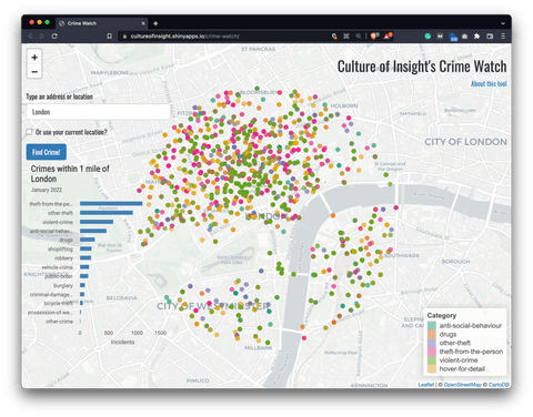
RStudio: Crime Watch Dashboard
The dashboard uses geocoding and GPS to allow users to retrieve and map data from the UK Police database at the location of their interest. Currently, users can only choose locations within England, Wales, and Northern Ireland.
Image 1 – RStudio’s Crime Watch dashboard
The dashboard shows the data only for the most recent month (available in the database), and only for a 1-mile radius around the chosen location. In addition, you can also see a summary bar plot of all incidents grouped by a category.
So, why is this dashboard useful? Well, government officials can use it, provided it’s connected to real data, to discover locations that could benefit from increasing the number of police officials. The type of crime in one area could also be a deciding factor for certain actions, for example.
Learn more:
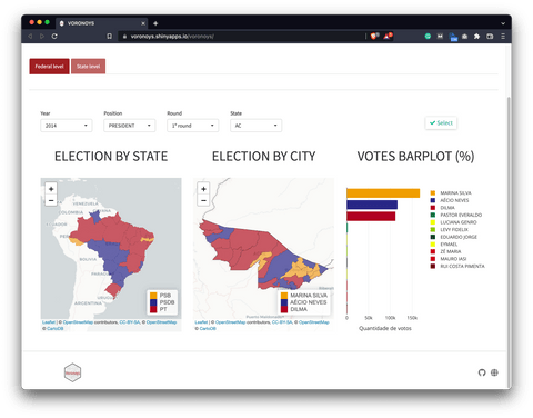
RStudio: Voters Profile
The Voters Profile dashboard is a textbook example of R Shiny in government. It provides access to charts, maps, and an innovative way to investigate voters’ profiles in the Brazilian 2014 elections. It was recognized as an honorable mention in the 2019 Shiny contest.
Image 2 – RStudio’s Voters Profile dashboard
This dashboard allows government officials and others to easily analyze the 2014 elections in Brazil. You can view both the first and second-round results by state and by city. There’s also a bar chart showing how many votes each candidate got.
The first tab – Federal level – shows the presidential election votes, while the second tab – State level – displays votes for governors and senators.
Learn more:
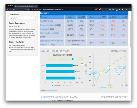
New Zealand Sectors Dashboard
The sectors dashboard aims to be a one-stop shop for all information about New Zealand’s economy by sector. It brings together a range of economic datasets produced by MBIE and Statistics New Zealand into one easy-to-use tool.
Image 3 – New Zealand Sectors dashboard
The dashboard allows both government officials and individuals to track sector situation and performance, view financial performance, and compare performance between sectors.
You can use the dashboard to get the most recent insights into GDP, employment, firm count, fixed capital formation, labor productivity growth, surplus per firm/employee, debt ratio, and many other metrics.
Learn more:
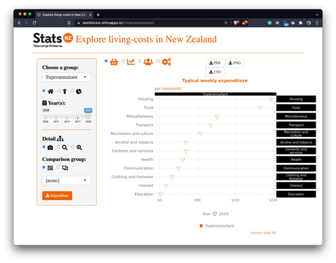
New Zealand Living Cost Explorer Dashboard
Another dashboard by New Zeland. Makes you wonder if other countries could develop similar dashboards that demonstrate the capabilities of R Shiny in government. This one presents data from Household Living-costs Price Indexes. It shows how price changes vary depending upon the average basket of goods of different types of people, such as beneficiaries, Māori, and Superannuitants.
Image 4 – New Zealand Living Cost Explorer dashboard
The dashboard serves both government officials and citizens by summarizing expenditure patterns, inflation, and other facts over time.
You can use the dashboard to explore average weekly expenditures per category, such as housing, food, transport, health, education, and others – and even compare living costs over time. There’s also an option to export the reports either as PDF, PNG, or CSV.
Learn more:
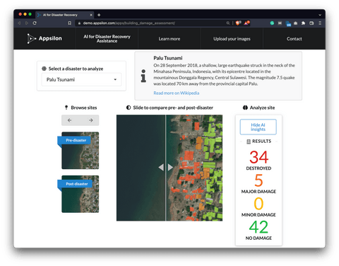
Appsilon: AI for Disaster Recovery Dashboard
The dashboard enables governments to quickly access the scale of damage to provide humanitarian aid as fast as possible. Currently, you can analyze data from the following disasters: Hurricane Florence, Midwest Flooding, Palu Tsunami, and Santa Rosa Wildfire. It’s based on a model which Appsilon’s AI team has built for the xView2 competition
Image 5 – Appsilon’s AI for Disaster Recovery dashboard
The dashboard lets you inspect multiple images for each disaster and use a slider to compare the before and after situations. You can also overlay the model’s output over the image to see which areas suffer the most damage.
The model analyzes a pair of images, one before and one after the disaster, and then locates buildings and accesses the damage they sustained.
Learn more:
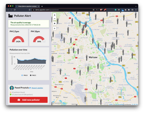
Appsilon: Polluter Alert Dashboard
This dashboard has been built in 3 days for Appsilon’s shiny.semantic hackathon. Its purpose is to monitor pollution since many people in Poland are worried about the air quality. The main reason for air pollution is “low emission” caused by heating stoves and boilers, especially when illegal materials are used as fuel, such as waste.
Image 6 – Appsilon’s Polluter Alert dashboard
This Shiny dashboard allows reporting air pollution sources. It uses real-time Airly API for air quality statistics, and other functionalities are mocked. It can be used both by citizens and local government to locate and monitor major polluters in the area.
The dashboard shows different statistics, such as current pollution, and pollution over time, measured in PM 2.5μm and PM 10μm. In plain English, “PM” stands for “Particulate matter”, or microscopic matter suspended in air or water. PM 2.5μm represents particles that are less than 2.5μm in diameter.
Learn more:
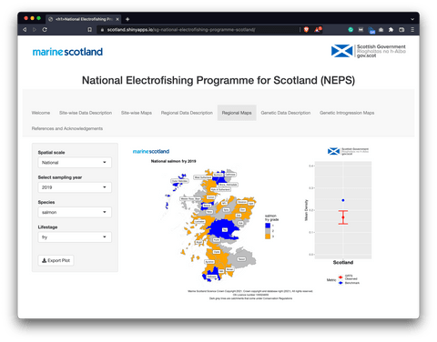
Scotland National Electrofishing Program
The last dashboard of this R Shiny in government list was developed to visualize and export data collected, analyzed, and reported under the National Electrofishing Programme for Scotland (NEPS). At the time of writing, only salmon data was available.
Image 7 – Scotland National Electrofishing Program dashboard
Unlike the other dashboards explored in this R Shiny in government article, this dashboard was created by government bodies for end-users. It allows you to view data at the site or regional levels, at the scale of individual “GRTS regions” or the whole of Scotland.
The particularly interesting charts are visible in the regional sections. In there, you can view estimates of mean observed densities of salmon in 2018 and 2019. You can also compare them with regional benchmark densities and gradings.
Learn more:
Conclusion – R Shiny in Government
To summarize – if your field of work can benefit from data analytics and data science, it can also benefit from R Shiny dashboards. Today you’ve seen seven dashboards that perfectly demonstrate the capabilities of R Shiny in government, and we’ve only scratched the surface. There are many other government-specific dashboards that aren’t open to the public.
If you’re looking to build your first R Shiny dashboard, you can use Appsilon Shiny Dashboard Templates to simplify the process. The bundle contains a ton of beautiful and easy-to-use templates. The best part – is it’s entirely free.
In case you need something more advanced, we’re also here to help. Appsilon is an RStudio Full Service Certified Partner. We develop advanced R Shiny applications for Fortune 500 companies across the globe. We’d be happy to help you choose the right options for your use case.
Contact Us
Project Manager

Get Updates
Subscribe to Shiny Weekly Newsletter
Join 4000+ Shiny enthusiasts to see the latest Shiny news from the R community.