Share
Share Tweet
Tweet Share
Share


Updated: August 22, 2022.
R XGBoost and Gradient Boosting
Gradient boosting is one of the most effective techniques for building machine learning models. It is based on the idea of improving the weak learners (learners with insufficient predictive power). Today you’ll learn how to work with XGBoost in R and many other things – from data preparation and visualization, to feature importance of predictive models.
Do you want to learn more about machine learning with R? Check our complete guide to decision trees.
Table of contents:
- Introduction to Gradient Boosting
- Introduction to R XGBoost
- Dataset Loading and Preparation
- Predictive Modeling with R XGBoost
- Predictions and Evaluations
- Summary of R XGBoost
Introduction to Gradient Boosting
The general idea behind gradient boosting is to combine weak learners to produce a more accurate model. These “weak learners” are essentially decision trees, and gradient boosting aims to combine multiple decision trees to lower the model error somehow.
The term “boosting” was introduced for the first time successfully in AdaBoost (Adaptive Boosting). This algorithm combines multiple single split decision trees. AdaBoost puts more emphasis on observations that are more difficult to classify by adding new weak learners where needed.
In a nutshell, gradient boosting is comprised of only three elements:
- Weak Learners – simple decision trees that are constructed based on purity scores (e.g., Gini).
- Loss Function – a differentiable function you want to minimize. In regression, this could be a mean squared error, and in classification, it could be log loss.
- Additive Models – additional trees are added where needed, and a functional gradient descent procedure is used to minimize the loss when adding trees.
You now know the basics of gradient boosting. The following section will introduce the most popular gradient boosting algorithm – XGBoost.
Introduction to R XGBoost
XGBoost stands for eXtreme Gradient Boosting and represents the algorithm that wins most of the Kaggle competitions. It is an algorithm specifically designed to implement state-of-the-art results fast.
XGBoost is used both in regression and classification as a go-to algorithm. As the name suggests, it utilizes the gradient boosting technique to accomplish enviable results – by adding more and more weak learners until no further improvement can be made.
Today you’ll learn how to use the XGBoost algorithm with R by modeling one of the most trivial datasets – the Iris dataset – starting from the next section.
Dataset Loading and Preparation
As mentioned earlier, the Iris dataset will be used to demonstrate how the XGBoost algorithm works. Let’s start simple with a necessary first step – library and dataset imports. You’ll need only a few, and the dataset is built into R:
library(xgboost)
library(caTools)
library(dplyr)
library(cvms)
library(caret)

head(iris)
Here’s what the first couple of rows looks like:
Image 1 – The first six rows of the Iris dataset
There’s no point in further exploration of the dataset, as anyone in the world of data already knows everything about it.
The next step is dataset splitting into training and testing subsets. The following code snippet splits the dataset in a 70:30 ratio and then further splits the dataset in features (X) and target (y) for both subsets. This step is necessary for the training process:
set.seed(42)
sample_split <- sample.split(Y = iris$Species, SplitRatio = 0.7)
train_set <- subset(x = iris, sample_split == TRUE)
test_set <- subset(x = iris, sample_split == FALSE)

y_train <- as.integer(train_set$Species) - 1
y_test <- as.integer(test_set$Species) - 1
X_train <- train_set %>% select(-Species)
X_test <- test_set %>% select(-Species)
You now have everything needed to start with the training process. Let’s do that in the next section.
Predictive Modeling with R XGBoost
XGBoost uses something known as a DMatrix to store data. DMatrix is nothing but a specific data structure used to store data in a way optimized for both memory efficiency and training speed.
Besides the DMatrix, you’ll also have to specify the parameters for the XGBoost model. You can learn more about all the available parameters here, but we’ll stick to a subset of the most basic ones.
The following snippet shows you how to construct DMatrix data structures for both training and testing subsets and how to build a list of parameters:
xgb_train <- xgb.DMatrix(data = as.matrix(X_train), label = y_train)
xgb_test <- xgb.DMatrix(data = as.matrix(X_test), label = y_test)
xgb_params <- list(
  booster = "gbtree",
  eta = 0.01,
  max_depth = 8,
  gamma = 4,
  subsample = 0.75,
  colsample_bytree = 1,
  objective = "multi:softprob",
  eval_metric = "mlogloss",
  num_class = length(levels(iris$Species))
)
Now you have everything needed to build a model. Here’s how:
xgb_model <- xgb.train(
  params = xgb_params,
  data = xgb_train,
  nrounds = 5000,
  verbose = 1
)
xgb_model
The results of calling xgb_model are displayed below:
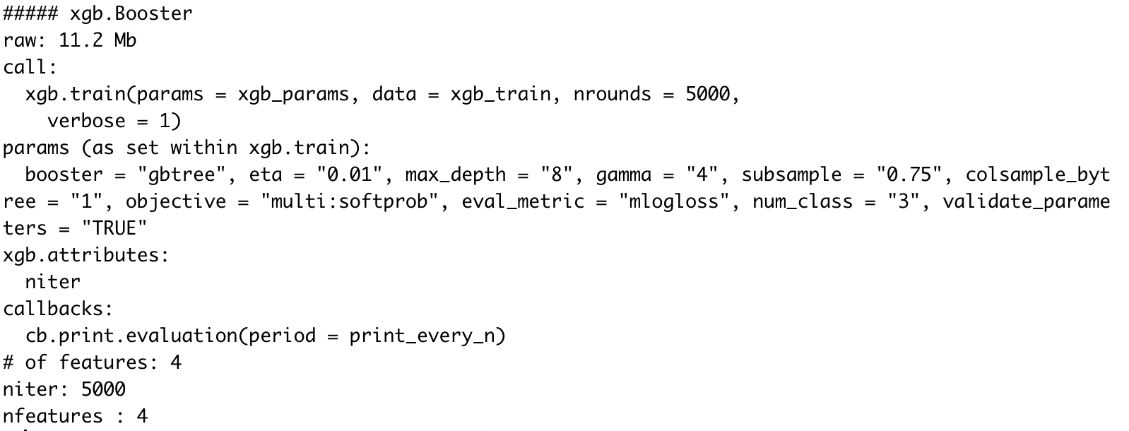
Image 2 – XGBoost model after training
XGBoost Feature Importance
You now have the model, but what’s the underlying logic behind it? What will the model think when making predictions? We can find that out by exploring feature importance. Luckily, XGBoost comes with this functionality built-in, so we don’t have to use any external libraries.
The first step is to construct an importance matrix. This is done with the xgb.importance() function which accepts two parameters – column names and the XGBoost model itself. Here’s the code snippet:
importance_matrix <- xgb.importance(
  feature_names = colnames(xgb_train),
  model = xgb_model
)
importance_matrix
Let’s inspect what it contains:
Image 3 – XGBoost Feature Importances
There’s a lot of information present in the table, so how can we simplify it? Easily, with the power of data visualization. The xgb.plot.importance() function allows you to use the importance matrix to produce a line chart:
xgb.plot.importance(importance_matrix)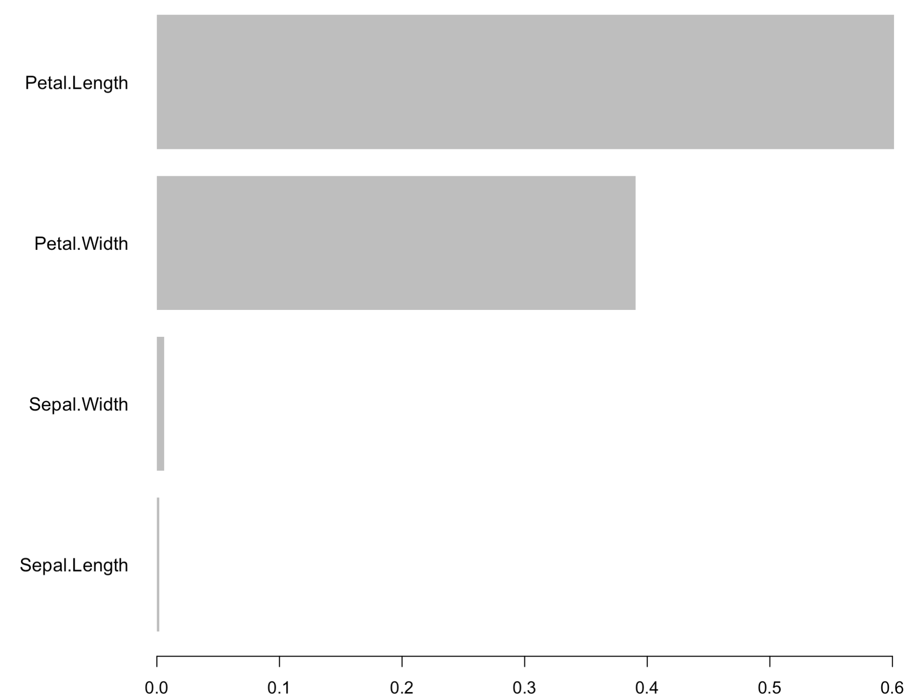
Image 4 – XGBoost Feature Importances Chart
As you can see, the Petal Length feature is the most important for making forecasts. With that out of the way, let’s actually make some predictions.
Predictions and Evaluations
You can use the predict() function to make predictions with the XGBoost model, just as with any other model. The next step is to convert the predictions to a data frame and assign column names, as the predictions are returned in the form of probabilities:
xgb_preds <- predict(xgb_model, as.matrix(X_test), reshape = TRUE)
xgb_preds <- as.data.frame(xgb_preds)
colnames(xgb_preds) <- levels(iris$Species)
xgb_preds
Here’s what the above code snippet produces:
Image 3 – Prediction probabilities for every flower species
As you would imagine, these probabilities add up to 1 for a single row. The column with the highest probability is the flower species predicted by the model.
Still, it would be nice to have two additional columns. The first one represents the predicted class (max of predicted probabilities). The other represents the actual class, so we can estimate how well the model performs on unseen data.
The following snippet does just that:
xgb_preds$PredictedClass <- apply(xgb_preds, 1, function(y) colnames(xgb_preds)[which.max(y)])
xgb_preds$ActualClass <- levels(iris$Species)[y_test + 1]
xgb_preds
The results are displayed in the following figure:
Image 4 – Predicted class vs. actual class on the test set
Things look promising, to say at least, but that’s no reason to jump to conclusions. Next, we can calculate the overall accuracy score as a sum of instances where predicted and actual classes match divided by the total number of rows:
accuracy <- sum(xgb_preds$PredictedClass == xgb_preds$ActualClass) / nrow(xgb_preds)
accuracy
Executing the above code prints out 0.9333 to the console, indicating we have a 93% accurate model on previously unseen data.
While we’re here, we can also print the confusion matrix to see what exactly did the model misclassify:
confusionMatrix(factor(xgb_preds$ActualClass), factor(xgb_preds$PredictedClass))The results are shown below:
Image 5 – Confusion matrix for XGBoost model on the test set
So, what’s actually important here? The confusion matrix itself is shown at the top of the output, but it would be much easier to look at it visually. The plot_confusion_matrix() function from cvms package does just that. It requires the matrix formatted as a tibble, so keep that in mind. The rest of the code snippet is self-explanatory:
cm <- confusionMatrix(factor(xgb_preds$ActualClass), factor(xgb_preds$PredictedClass))
cfm <- as_tibble(cm$table)
plot_confusion_matrix(cfm, target_col = "Reference", prediction_col = "Prediction", counts_col = "n")
Image 8 – Confusion matrix plot
As you can see, only three virginica species were classified as versicolor. There were no misclassifications in the setosa species.
And that’s how you can train and evaluate XGBoost models with R. Let’s wrap things up in the next section.
Summary of R XGBoost
XGBoost is a complex state-of-the-art algorithm for both classification and regression – thankfully, with a simple R API. Entire books are written on this single algorithm alone, so cramming everything in a single article isn’t possible.
You’ve still learned a lot – from the basic theory and intuition to implementation and evaluation in R. If you want to learn more, please stay tuned to the Appsilon blog. More guides on the topic are expected in the following weeks.
If you want to implement machine learning in your organization, you can always reach out to Appsilon for help.
Learn More
- Machine Learning with R: A Complete Guide to Linear Regression
- Machine Learning with R: A Complete Guide to Logistic Regression
- Machine Learning with R: A Complete Guide to Decision Trees
- How to Build a Handwritten Digit Classifier with R and Random Forests
- YOLO Algorithm and YOLO Object Detection: An Introduction
Contact Us
Project Manager

Get Updates
Subscribe to Shiny Weekly Newsletter
Join 4000+ Shiny enthusiasts to see the latest Shiny news from the R community.