Share
Share Tweet
Tweet Share
Share


Machine Learning with R: A Complete Guide to Linear Regression

24 December 2020
Linear Regression with R
Updated: July 12, 2022.
Chances are you had some prior exposure to machine learning and statistics. Basically, that’s all R linear regression is – a simple statistics problem.
Need help with Machine Learning solutions? Reach out to Appsilon.
Today you’ll learn the different types of R linear regression and how to implement all of them in R. You’ll also get a glimpse into feature importance – a concept used everywhere in machine learning to determine which features have the most predictive power.
Table of contents:
- Introduction to R Linear Regression
- Simple Linear Regression from Scratch
- Multiple Linear Regression with R
- R Linear Regression Feature Importance
- Summary of R Linear Regression
Introduction to Linear Regression
Linear regression is a simple algorithm developed in the field of statistics. As the name suggests, linear regression assumes a linear relationship between the input variable(s) and a single output variable. Needless to say, the output variable (what you’re predicting) has to be continuous. The output variable can be calculated as a linear combination of the input variables.
There are two types of linear regression:
- Simple linear regression – only one input variable
- Multiple linear regression – multiple input variables
You’ll implement both today – simple linear regression from scratch and multiple linear regression with built-in R functions.
You can use a linear regression model to learn which features are important by examining coefficients. If a coefficient is close to zero, the corresponding feature is considered to be less important than if the coefficient was a large positive or negative value.
That’s how the linear regression model generates the output. Coefficients are multiplied with corresponding input variables, and in the end, the bias (intercept) term is added.
There’s still one thing we should cover before diving into the code – assumptions of a linear regression model:
- Linear assumption — model assumes that the relationship between variables is linear
- No noise — model assumes that the input and output variables are not noisy — so remove outliers if possible
- No collinearity — model will overfit when you have highly correlated input variables
- Normal distribution — the model will make more reliable predictions if your input and output variables are normally distributed. If that’s not the case, try using some transforms on your variables to make them more normal-looking
- Rescaled inputs — use scalers or normalizers to make more reliable predictions
You should be aware of these assumptions every time you’re creating linear models. We’ll ignore most of them for the purpose of this article, as the goal is to show you the general syntax you can copy-paste between the projects.
Simple Linear Regression from Scratch
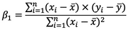
If you have a single input variable, you’re dealing with simple linear regression. It won’t be the case most of the time, but it can’t hurt to know. A simple linear regression can be expressed as:
Image 1 – Simple linear regression formula (line equation)
As you can see, there are two terms you need to calculate beforehand – betas.
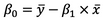
You’ll first see how to calculate Beta1, as Beta0 depends on it. Here’s the formula:
Image 2 – Beta1 equation
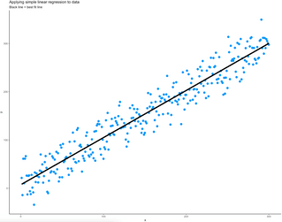
And here’s the formula for Beta0:
Image 3 – Beta0 equation
These x’s and y’s with the bar over them represent the mean (average) of the corresponding variables.
Let’s see how all of this works in action. The code snippet below generates X with 300 linearly spaced numbers between 1 and 300 and generates Y as a value from the normal distribution centered just above the corresponding X value with a bit of noise added. Both X and Y are then combined into a single data frame and visualized as a scatter plot with the ggplot2 package:
library(ggplot2)

# Generate synthetic data with a clear linear relationship
x <- seq(from = 1, to = 300)
y <- rnorm(n = 300, mean = x + 2, sd = 25)

# Convert to dataframe
simple_lr_data <- data.frame(x, y)

# Visualize as scatter plot
ggplot(data = simple_lr_data, aes(x = x, y = y)) +
  geom_point(size = 3, color = "#0099f9") +
  theme_classic() +
  labs(
    title = "Dataset for simple linear regression",
    subtitle = "A clear linear relationship is visible"
  )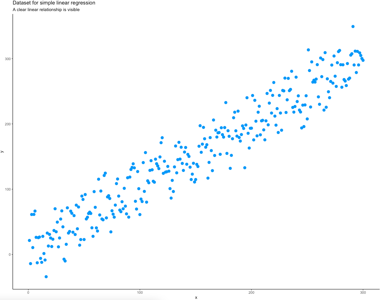
Image 4 – Input data as a scatter plot
Onto the coefficient calculation now. The coefficients for Beta0 and Beta1 are obtained first, and then wrapped into a simple_lr_predict() function that implements the line equation.
The predictions can then be obtained by applying the simple_lr_predict() function to the vector X – they should all line on a single straight line. Finally, input data and predictions are visualized with the ggplot2 package:
# Calculate coefficients
b1 <- (sum((x - mean(x)) * (y - mean(y)))) / (sum((x - mean(x))^2))
b0 <- mean(y) - b1 * mean(x)

# Define function for generating predictions
simple_lr_predict <- function(x) {
  return(b0 + b1 * x)
}

# Apply simple_lr_predict() to input data
simple_lr_predictions <- sapply(x, simple_lr_predict)
simple_lr_data$yhat <- simple_lr_predictions

# Visualize input data and the best fit line
ggplot(data = simple_lr_data, aes(x = x, y = y)) +
  geom_point(size = 3, color = "#0099f9") +
  geom_line(aes(x = x, y = yhat), size = 2) +
  theme_classic() +
  labs(
    title = "Applying simple linear regression to data",
    subtitle = "Black line = best fit line"
  )
Image 5 – Input data as a scatter plot with predictions (best-fit line)
And that’s how you can implement simple linear regression in R from scratch! Next, you’ll learn how to handle situations when there are multiple input variables.
Multiple Linear Regression with R
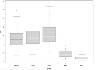
You’ll use the Fish Market dataset to build your model. To start, the goal is to load the dataset and check if some of the assumptions hold. Normal distribution and outlier assumptions can be checked with boxplots.
Want to create better data visualizations? Learn how to make stunning boxplots with ggplot2.
The code snippet below loads in the dataset and visualizes box plots for every feature (not the target):
library(reshape)

# Load in th dataset
df <- read.csv("Fish.csv")

# Remove target variable
temp_df <- subset(df, select = -c(Weight))
melt_df <- melt(temp_df)

# Draw boxplot
boxplot(data = melt_df, value ~ variable)
Image 6 – Boxplots of the input features
Do you find Box Plots confusing? Here’s our complete guide to get you started.
A degree of skew seems to be present in all input variables, and the first three contain a couple of outliers. We’ll keep this article strictly machine learning-based, so we won’t do any data preparation and cleaning.
Train/test split is the obvious next step once you’re done with preparation. The caTools package is the perfect candidate for the job.
You can train the model on the training set after the split. R has the lm function built-in, and it is used to train linear models. Inside the lm function, you’ll need to write the target variable on the left and input features on the right, separated by the ~ sign. If you put a dot instead of feature names, it means you want to train the model on all features.
After the model is trained, you can call the summary() function to see how well it performed on the training set. Here’s a code snippet for everything discussed so far:
library(caTools)
set.seed(42)

# Train/Test split in 70:30 ratio
sample_split <- sample.split(Y = df$Weight, SplitRatio = 0.7)
train_set <- subset(x = df, sample_split == TRUE)
test_set <- subset(x = df, sample_split == FALSE)

# Fit the model and obtain summary
model <- lm(Weight ~ ., data = train_set)
summary(model)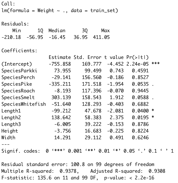
Image 7 – Summary statistics of a multiple linear regression model
The most interesting thing here is the P-values, displayed in the Pr(>|t|) column. Those values indicate the probability of a variable not being important for prediction. It’s common to use a 5% significance threshold, so if a P-value is 0.05 or below, we can say that there’s a low chance it is not significant for the analysis.
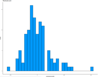
Let’s make a residual plot next. As a general rule, if a histogram of residuals looks normally distributed, the linear model is as good as it can be. If not, it means you can improve it somehow. Here’s the code for visualizing residuals:
# Get residuals
lm_residuals <- as.data.frame(residuals(model))

# Visualize residuals
ggplot(lm_residuals, aes(residuals(model))) +
  geom_histogram(fill = "#0099f9", color = "black") +
  theme_classic() +
  labs(title = "Residuals plot")
Image 8 – Residuals plot of a multiple linear regression model
As you can see, there’s a bit of skew present due to a large error on the far right.
And now it’s time to make predictions on the test set. You can use the predict() function to apply the model to the test set. As an additional step, you can combine actual values and predictions into a single data frame, just so the evaluation becomes easier. Here’s how:
# Make predictions on the test set
predictions <- predict(model, test_set)

# Convert to dataframe
eval <- cbind(test_set$Weight, predictions)
colnames(eval) <- c("Y", "Yhat")
eval <- as.data.frame(eval)
head(eval)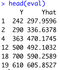
Image 9 – Dataset comparing actual values and predictions for the test set
If you want a more concrete way of evaluating your regression models, look no further than RMSE (Root Mean Squared Error). This metric will inform you how wrong your model is on average. In this case, it reports back the average number of weight units the model is wrong:
# Evaluate model
mse <- mean((eval$Y - eval$Yhat)^2)
rmse <- sqrt(mse)
The rmse variable holds the value of 83.60, indicating the model is on average wrong by 83.60 units of weight.
R Linear Regression Feature Importance
Most of the time, not all features are relevant for predictive modeling and making predictions. If you were to exclude some of them, you’re likely to get a better-performing model or at least an identical model that’s simple to understand and interpret.
That’s where feature importance comes in. Now, linear regression models are highly interpretable out of the box, but you can take them to the next level.
That’s where the Boruta package comes in. It’s a feature ranking and selection algorithm based on the Random Forests algorithm. It clearly shows you if a variable is important or not. You can tweak the “strictness” by adjusting the P-value and other parameters, but that’s a topic for another time. The most simple function call will do for today.
To get started, first install the package:
install.packages("Boruta")The boruta() function takes in the same parameters as lm(). It’s a formula with the target variable on the left side and the predictors on the right side. The additional doTrace parameter is there to limit the amount of output printed to the console – setting it to 0 will remove it altogether:
library(Boruta)

boruta_output <- Boruta(Weight ~ ., data = train_set, doTrace = 0)
boruta_output
Here are the contents of boruta_output:
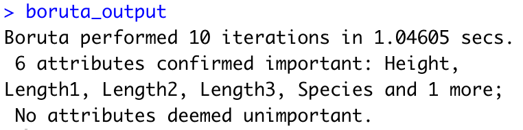
Image 10 – Results of a Boruta algorithm
Not too useful immediately, but we can extract the importance with a bit more manual labor. First, let’s extract all the attributes that are significant:
rough_fix_mod <- TentativeRoughFix(boruta_output)
boruta_signif <- getSelectedAttributes(rough_fix_mod)
boruta_signif
Image 11 – Important features
Now we can get to the importance scores and sort them in descending order:
importances <- attStats(rough_fix_mod)
importances <- importances[importances$decision != "Rejected", c("meanImp", "decision")]
importances[order(-importances$meanImp), ]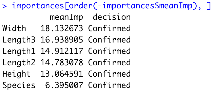
Image 12 – Importance scores
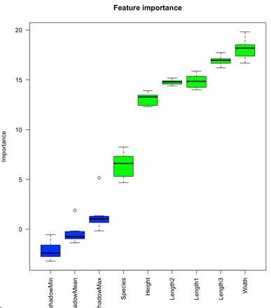
Those are all the highly-significant features of our Fish market dataset. If you want, you can also show these importance scores graphically. The bortua_output can be passed in directly to the plot function, resulting in the following chart:
plot(boruta_output, ces.axis = 0.7, las = 2, xlab = "", main = "Feature importance")Image 13 – Feature importance plot
To read this chart, remember only one thing – The green columns are confirmed to be important and the others aren’t. We don’t see any red features, but those wouldn’t be important if you were to see them. Blue box plots represent variables used by Boruta to determine importance, and you can ignore them.
Summary of R Linear Regression
Today you’ve learned how to train linear regression models in R. You’ve implemented a simple linear regression model entirely from scratch, and a multiple linear regression model with a built-in function on the real dataset.
You’ve also learned how to evaluate the model through summary functions, residual plots, and various metrics such as MSE and RMSE.
If you want to implement machine learning in your organization, you can always reach out to Appsilon for help.
Learn More
Contact Us
Project Manager

Get Updates
Subscribe to Shiny Weekly Newsletter
Join 4000+ Shiny enthusiasts to see the latest Shiny news from the R community.