Share
Share Tweet
Tweet Share
Share


SAS is losing its footing across industries due to the rise of Shiny, an R package giving users bespoke interactivity on top of their R routines. In this article, we’ll discuss SAS vs R Programming in the context of the pharmaceutical industry, but the topic of conversation applies to any data science user looking to switch data analytics tooling.
Data science teams are searching for SAS alternatives that can better handle their technical needs while satisfying non-technical personnel with interactive data storytelling. The result of this search boils down to Python vs R Programming. And although there are drag-n-drop BI tools, these solutions do not satisfy custom development, machine learning, and big data handling needs.
Appsilon is an RStudio (Posit) Full Service Certified Partner. Find out how we can help you with R and Python development services and RStudio discounts.
If your team uses Python and is comfortable with this language, we won’t try to evangelize you. But if you find value in R for data analytics and statistical analysis, we highly recommend exploring the innovations R can provide in your organization.
Breaking down statistical analysis to understand R vs SAS
A statistical analysis has several steps: problem statement, data collection, data wrangling, data analysis, and results-based communication.
The data analysis step usually involves summarizing data using descriptive statistics and applying inferential statistics through hypothesis testing and modeling.
Sharing results is usually done by writing reports. These reports commonly contain different visualizations that help contextualize the analysis; especially for those not involved throughout the analysis process.
To perform this kind of analysis, a data analyst can choose from a variety of tools. But as we mentioned, there are some solutions that work better for your unique case. In this post, we will compare two of them: R and SAS.
TOC:
- Defining SAS and R programming
- Exploring SAS
- Exploring R
- Access to New Developments in R vs SAS
- Collaboration in R
- Cost of SAS vs R for data science teams
- Should you learn R or SAS?
- Functionality of SAS compared to R
- Hiring SAS developers vs R developers
- R programming packages vs SAS tools
- Creating visualizations in R and SAS
- Support in SAS vs R
- Should you use SAS or R for Clinical Data Science?
- Working with SAS vs R
What are SAS and R programming?
SAS and R programming are both statistical software used by researchers and data scientists to create statistical data analyses and visualizations.
Let’s begin by introducing the tools:
What is SAS?
SAS is commercial software that can be used to perform advanced analytics, business intelligence, data management, and predictive analytics. You can use SAS software through both a graphical interface and the SAS programming language.
What is SAS programming?
A SAS program is a sequence of steps that you submit to SAS for execution. Each step in the program performs a specific task. Only two kinds of steps make up SAS programs:
- DATA steps: in this step data is created, imported, modified, merged, or calculated.
- PROC steps: a group of SAS statements that call and execute a procedure, usually with a SAS data set as input. SAS procedures analyze data in SAS data sets to produce statistics, tables, reports, charts, and plots.
A SAS program can contain a DATA step, a PROC step, or any combination of DATA steps and PROC steps. The number and kind of steps depend on what tasks you need to perform.
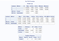
SAS program example
The following example uses SAS to Compare Group Means. The idea is to showcase how the code and output look; not to perform a real analysis. The example data set created consists of only 6 observations.
* create example dataset;
data patients;
input patient_id treatment $ age;
cards;
1 a 24
2 a 23
3 a 25
4 b 30
5 b 36
6 b 34
;
run;

* compare group means;
ods graphics on;

proc ttest cochran ci=equal umpu;
   class treatment;
   var age;
run;

ods graphics off;
You can see how we created the data in the DATA step and then called the PROC step to perform our analysis. Here you can explore the options used in the PROC step.
The output of the analysis looks like this:
As we can see, SAS provides a lot of information when you run a PROC. You can draw conclusions from both the tables and charts. It’s standard styling and output with no custom branding.
What is the SAS suite?
The SAS software suite is made of components for data management, advanced analytics, multivariate analysis, and more. Here are just a few of some important components of the SAS suite:
- Base SAS: Designed for data access, transformation, and reporting.
- SAS/STAT: Designed to perform statistical analysis.
- SAS/GRAPH: Data visualization tool to produce graphs.
- SAS/IML: Interactive Matrix Language. Includes functions for implementing algorithms.
What is R programming compared to SAS?
R is an open-source language and environment for statistical computing and graphics. It provides a wide variety of statistical techniques such as linear and nonlinear modeling, classical statistical tests, time-series analysis, classification, and clustering. Its most popular IDE (Integrated Development Environment) by far is RStudio by RStudio PBC (Posit).
In R, data is stored in objects. These objects can store strings, numeric values, data sets, or anything that can be referenced. To work with these objects we create functions. R has a style of problem-solving centered on functions.
Thinking about switching to R and Shiny? See why you might want to switch to R Shiny for enterprise application development.
R packages
In R, code can be shared through packages. A package is a shareable collection of code that is used to perform a desired function or specific task. Examples of packages used for data science include readr, dplyr, tidyr, ggplot2.
Anyone can make a package. They can be made publicly available via CRAN (Comprehensive R Archive Network), but you can also create private packages that you can use within your organization. As of writing these lines, there are over 18.000 packages available on CRAN!
Appsilon contributes to open source as well through our Shiny tools. We create packages to help us, and other R/Shiny developers build scalable, reproducible, and better-looking Shiny applications.
R Program Example
Let’s reproduce the SAS example using R code. Again, the idea is to showcase how code and output look, and not to focus on the interpretation of results.
Code:
# create example dataset
patients <- data.frame(
patient_id = 1:6,
treatment = rep(c("a", "b"), each = 3),
age = c(24, 23, 25, 30, 36, 34)
)
# compare group means
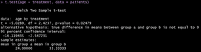
t.test(age ~ treatment, data = patients)
Console output:
R output is not styled by default. Nevertheless, there are tools you can use to make the output something you can share in a report, for example, RMarkdown.
The only limitation to output styling is your imagination. You can explore some of our Shiny demos from a variety of use cases.
Should you use SAS or R?
In general, you should at least begin incorporating R programming into your data science toolset whether you work in an enterprise or as a private individual.
Obviously, the real answer depends on your use case. But as mentioned above, SAS is proprietary, commercial software which can be expensive to the average user. R programming is free with plenty of open source tools and frankly outpaces SAS in a lot of aspects.
Curious what R Shiny applications you can build? Explore some of our R Shiny demos to see what you could create.
And in this Section, we’ll compare both software on different topics that will affect your choice of SAS or R within an enterprise.
Access to New Developments in R vs SAS
Open-source software acceptance has increased in recent years. People working together in the community allows for quicker “to market” solutions. It also creates open access to see what lies underneath the hood. There’s no guesswork in how algorithms work or if it’s the best for your case.
These new algorithms are developed and shared with the community. Implementation of them in SAS takes longer than in R. This means that more advanced data science techniques might be available right now in R but not yet available in SAS.
Collaboration in R
File sharing and collaboration are easier with R. If you want to share with a friend or colleague something you developed using SAS, that person requires access to the software – which is licensed. Even though there are some free versions, they require setting up an account which might be something you want to avoid. R is easily downloaded and installed so you can quickly set it up and run code. You can also quickly publish a dashboard on the web using Shiny.
Get your data story into the hands of colleagues quickly using these top 3 methods for sharing R Shiny apps.
Cost of SAS vs R for data science teams
SAS is commercial software. Meaning, that you must pay to play, so to speak. SAS licenses are known to be expensive so it makes it difficult for individuals and small businesses to use or scale.
On the other hand, R is open source. In other words, it’s free to use. Anyone can download it and start using it.
Join the Shiny movement and develop your own R Shiny dashboard in less than 10 minutes!
Should you learn R or SAS?
Whether or not you have experience with programming, we recommend learning R first. It’s easy to get started, free, and there are lots of freely accessible learning materials.
If you have experience using programming languages, switching to a different language is a matter of learning how to do the things you know, in another place. It usually depends on the resources available for learning.
Need a Shiny dashboard now? Download our free Shiny templates and get started today!
R educational resources
R has a lot of free, online resources to get started (e.g., Hands-on Programming with R and R for Data Science. You can also find books for different topics you want to learn (e.g., reporting, and creating web applications). Books are not the only resources available. Join RStudio’s webinars, learn and connect with R users in industry!
SAS educational resources
SAS offers courses to learn its software. They also have extensive documentation. Another thing worth mentioning about SAS is that it offers some products that don’t require knowing how to code (e.g., SAS Enterprise Guide). These tools Access the functionality of SAS from a point-and-click Windows interface.
Functionality of SAS compared to R
The following table compares how SAS and R work.
| SAS | R |
| Data steps | Expressions with functions |
| Procedures | Expressions with functions |
| Macros | Expressed in R functions |
| SAS Functions | R functions |
| SAS ODS (Output Delivery System) | R Markdown, R Quarto |
Hiring SAS developers vs R developers
Over the last decade, universities have begun to shift from teaching SAS to R. Even domain-specific stats courses tend to use R and train on the RStudio IDE. This means that the R talent pool has increased and will continue to do so in the future.
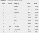
With that being said, R is not as popular as Python for developers. The TIOBE Index for 2022 indicates Python is King of the hill at #1 (R is #16, and SAS is a lowly #26). So if stacking your team is a priority and you’re already using Python routines for your analytics, stick with Python.
Data from PYPL Index
If you don’t know already, you can now use Python on RStudio. If you need help setting up your environment with your preferred language on RStudio platforms, contact Appsilon. We’re RStudio Certified Partners and can help you with
R programming outsourcing and R Shiny consulting
There’s a growing number of R-based consultancies popping up as companies begin to expand their data science teams and the need for R Shiny developers to handle more complex data handling and visualization requirements.
At Appsilon, we’ve been creating, maintaining, and developing Shiny applications for enterprise customers all over the world for many years now. Appsilon provides scalability, security, and modern UI/UX with custom R packages that native Shiny apps do not provide. Our team is among the world’s foremost experts in R Shiny and has made a variety of Shiny innovations (including scaling to 700 users!) over the years.
Appsilon is also a proud RStudio (Posit) Full Service Certified Partner. Meaning we can help you throughout the entire process of implementing and scaling RStudio (Posit) products and simplify your data-driven decision-making.
Some of the services we, as Shiny consultants provide include:
- Rapid dashboard development
- Support of full-stack engineers (from setting up a shiny server to UX optimization)
- DevOps support & advisory for all RStudio products
- Machine learning solutions
- Advanced statistical models
We deliver world-class Shiny applications faster than other vendors. Ultimately, lowering the overall cost of development and improving time to deployment. We use continuous collaboration with clients, end-to-end testing, and automated processes to streamline the development process. Our team can step in at every phase of a Shiny project, starting from business analysis and data science consulting to code refactoring.
R programming packages vs SAS tools
As mentioned, R packages can be developed by anyone. Even though there is no guarantee that they will work as expected, a package that is used by a lot of people is usually something safe to use. The reason is the following: suppose that a package has a bug the creator wasn’t aware of. People start using that package and someone identifies that problem. That person shares that with the creator (and the community) so that it can be fixed. Even someone other than the creator of the package can help code a solution!
In R, there is something called the tidyverse, a collection of R packages designed for data science. All packages share an underlying design philosophy, grammar, and data structures.
On the other hand, if you detect a problem in SAS you have to communicate with them and wait for a new release with a solution. This might be another reason why things take longer to implement in SAS.
Creating visualizations in R and SAS
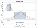
R provides a variety of packages to create custom charts, both static (ggplot2) and dynamic (plotly, highcharter). Here you can see lots of different visualizations you can make with R and the code used to produce them!
SAS data visualization features are more limited than R and don’t provide as much customization.
SAS Example
In this example, we will create another example dataset. We will create a histogram to understand age distribution by treatment group. SAS’ PROC UNIVARIATE also provides more information which we will not show here because the goal is to see the chart.
* create example dataset;
data patients;
input treatment $ age sex $;
cards;
a 24 m
a 23 m
a 25 m
a 21 m
a 22 f
a 22 f
a 23 f
a 28 f
a 21 f
a 20 f
a 29 f
a 18 f
a 30 f
a 23 f
a 25 f
a 24 f
a 23 f
a 25 f
b 30 f
b 36 f
b 34 f
b 31 f
b 32 m
b 32 m
b 34 m
b 33 m
b 34 m
b 30 m
b 28 m
b 33 m
b 40 m
b 22 m
b 29 m
;
run;

/*create histogram for age variable by treatment*/
proc univariate data=patients;
    class treatment;
    var age;
    histogram age / overlay;
run;
Output:
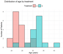
R
We will produce the same chart with R code.
# load libraries
library(tibble)
library(ggplot2)

# create example dataset
patients <- tibble::tribble(
  ~treatment, ~age, ~sex,
  "a", 24, "m",
  "a", 23, "m",
  "a", 25, "m",
  "a", 21, "m",
  "a", 22, "f",
  "a", 22, "f",
  "a", 23, "f",
  "a", 28, "f",
  "a", 21, "f",
  "a", 20, "f",
  "a", 29, "f",
  "a", 18, "f",
  "a", 30, "f",
  "a", 23, "f",
  "a", 25, "f",
  "a", 24, "f",
  "a", 23, "f",
  "a", 25, "f",
  "b", 30, "f",
  "b", 36, "f",
  "b", 34, "f",
  "b", 31, "f",
  "b", 32, "m",
  "b", 32, "m",
  "b", 34, "m",
  "b", 33, "m",
  "b", 34, "m",
  "b", 30, "m",
  "b", 28, "m",
  "b", 33, "m",
  "b", 40, "m",
  "b", 22, "m",
  "b", 29, "m"
)

# create chart
ggplot(data = patients, aes(x = age, fill = treatment)) +
  geom_histogram(position = "identity",
                 alpha = 0.5,
                 bins = 9,
                 color = "black") +
  labs(
    title = "Distribution of age by treatment",
    x = "Age (years)",
    y = "Number of Patients",
    fill = "Treatment"
  ) +
  theme_minimal() +
  theme(
    legend.position = "top"
  )
We see how with just a few lines of code we are able to create a beautiful chart using R. And we’re able to provide more customization to better suit our needs.
Support in SAS vs R
SAS provides Technical Support and has Documentation with information about everything you can do and how things are implemented in the software.
R doesn’t have Technical Support (it is open source) but it has a large community you can reach out to for help. Packages are usually well documented and come with excellent tutorials (called Vignettes) with examples. If you’re used to Python, you’ll be pleasantly surprised by the quality of documentation that is standard for the R ecosystem (e.g., dplyr vignette, tidyr vignette).
Should you use SAS or R for Clinical Data Science?
SAS is great when you need minimal output or sequential processing. But R offers greater flexibility. And with the recent successes by the R Consortium and enhanced collaboration with the FDA, R is trending toward’s higher standardization to satisfy regulatory needs.
In this section, we will explore how to solve a particular problem using each software. We will use R through RStudio IDE and SAS using SAS On Demand (which is a free version).
Problem Statement
We want to analyze the effect of different variables on mortality due to a particular disease. In particular, we want to understand the differences between treatment application times (no treatment, fast treatment, slow treatment). To do so, we will create a logistic regression model.
Data
The example dataset was created to showcase how to perform the different steps that are usually part of an analysis. It is based on real data, but it has been anonymized and some information was removed from the file (such as disease and treatment names). The focus here is on the how not the what.
Data is in .csv format and contains the following information about patients:
- ID: Patient identifier.
- AGE: Age of the patient measured in years.
- SEX: Sex of the patient (F = Female, M = Male).
- CHARLSON: Charlson score of the patient.
- PITT: Pitt bacteremia score of the patient.
- SURVIVED: Indicator variable. 1 means the patient was cured.
- DIED_OF_DISEASE: Indicator variable. 1 means the patient died due to the disease.
- DIED_OTHER: Indicator variable. 1 means the patient died due to another cause.
- UNKNOWN: Indicator variable. 1 means status was lost for the patient.
- TREATMENT: Indicator variable. 1 means the patient received treatment.
- TREATMENT_FAST: Indicator variable. 1 means treatment was applied within 48hs.
In the following Sections we will see how to perform different tasks with SAS and R:
- Read data
- Wrangle data (apply filters, add and remove columns)
- Create a logistic regression model
- Explore outputs
Working with SAS vs R
Reading data in SAS vs R programming
To start working with data, first, we need to have access to it.
SAS:
* READ DATA;
FILENAME REFFILE '/home/u4729884/data.csv';
PROC IMPORT DATAFILE=REFFILE
	DBMS=CSV
	OUT=WORK.RAW_DATA;
	GETNAMES=YES;
RUN;
R programming:
# Read data
raw_data <- read.csv("data.csv")
Data Wrangling in SAS vs R programming
Now that we have data available, we will prepare it for the model. In this Section we will show how to:
- Remove rows corresponding to patients with unknown status
- Remove rows corresponding to patients that died due to another cause
- Create a new treatment variable using values found in other columns
- Create new indicator variables for age, Charlson and Pitt using specific cutpoints
- Select columns
This is not the only way one could process the data. We choose to do it this way for simplicity. Feel free to try something different and share your results!
SAS:
* DATA WRANGLING;
DATA WORK.DATA_TO_MODEL (KEEP = AGE_60
				      SEX
					CHARLSON_4
					PITT_3
					TREATMENT_CATEGORY
					DIED_OF_DISEASE); * KEEP VARS OF INTEREST;
	SET WORK.RAW_DATA;

	* REMOVE PATIENTS WITH UNKNOWN STATUS;
	IF UNKNOWN = 1 THEN DELETE;
	* REMOVE PATIENTS THAT DIED DUE TO OTHER CAUSE;
	IF DIED_OTHER_CAUSE = 1 THEN DELETE;

	* CREATE TREATMENT FACTOR VARIABLE;
	LENGTH TREATMENT_CATEGORY $14;
	IF TREATMENT = 0 THEN TREATMENT_CATEGORY = "NO TREATMENT";
	ELSE IF TREATMENT_FAST = 1 THEN TREATMENT_CATEGORY = "FAST TREATMENT";
	ELSE TREATMENT_CATEGORY = "SLOW TREATMENT";
	* NEW AGE VARIABLE;
	IF AGE >= 60 THEN AGE_60 = 1;
	ELSE AGE_60 = 0;
	* NEW CHARLSON VARIABLE;
	IF CHARLSON > 4 THEN CHARLSON_4 = 1;
	ELSE CHARLSON_4 = 0;
	* NEW PITT VARIABLE;
	IF PITT > 3 THEN PITT_3 = 1;
	ELSE PITT_3 = 0;
RUN;
R programming:
# Load required library
library(dplyr)
# Data wrangling
data_to_model <- raw_data |>
  # Filter rows
  filter(
    UNKNOWN != 1,
    DIED_OTHER_CAUSE != 1
  ) |>
  # Create new columns
  mutate(
    TREATMENT_CATEGORY = case_when(
      TREATMENT == 0 ~ "NO TREATMENT",
      TREATMENT_FAST == 1 ~ "FAST TREATMENT",
      TRUE ~ "SLOW TREATMENT"
    ),
    AGE_60 = ifelse(AGE >= 60, 1, 0),
    CHARLSON_4 = ifelse(CHARLSON > 4, 1, 0),
    PITT_3 = ifelse(PITT > 3, 1, 0)
  ) |>
  # Select columns
  select(
    AGE_60,
    CHARLSON_4,
    PITT_3,
    TREATMENT_CATEGORY,
    DIED_OF_DISEASE
  )
Modeling data in SAS vs R programming
Once data is processed, we are ready to model. We will create a logistic regression model where we will model the probability of dying due to the disease. As explanatory variables we will include:
- Dichotomized age (cutpoint: 60 years, reference: age > 60)
- Dichotomized Charlson score (cutpoint: score of 4, reference: score > 4)
- Dichotomized Pitt score (cutpoint: score of 3, reference: score > 3)
- Treatment (Factor with three levels: no treatment, fast treatment, slow treatment). We will use fast treatment as a reference.
SAS:
* MODELING;
PROC LOGISTIC DATA = WORK.DATA_TO_MODEL DESCENDING;
CLASS TREATMENT_CATEGORY (REF = "FAST TREATMENT") SEX (REF = "F") / PARAM = REFERENCE;
MODEL DIED_OF_DISEASE = AGE_60 CHARLSON_4 PITT_3 TREATMENT_CATEGORY / LINK = LOGIT SCALE = NONE;
RUN;
R programming:
# Create model
model <- glm(formula = DIED_OF_DISEASE ~ .,
data = data_to_model,
family = binomial)
# Explore results
summary(model)
# Get odds ratio
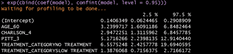
exp(cbind(coef(model), confint(model, level = 0.95)))
Exploring model results in SAS vs R programming
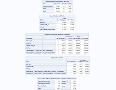
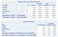
SAS:
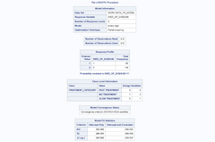
Let’s focus on these two tables:
Here we can see the coefficients of the model, its significance level, and the translation to odds ratio estimates (which are more interpretable when doing logistic regression.
We will not dive into details for explaining model assessment or results interpretation. The idea here is to show where this information is available and how to get it using code.
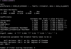
R programming:
In R, we have to compute the odds ratio using the model coefficients. It can be done with:
Final comparison of SAS vs R programming
General remarks:
- With both SAS and R we arrived at the same results.
- SAS code requires the use of a semicolon ( ; ) to end statements as well as an explicit RUN to run code. This makes SAS more prone to distraction errors.
- By default, SAS shows more information in its output and has some styling.
Detailed comparison:
- Reading data. Importing data with SAS involves more lines of code, with somewhat cryptic parameters. In R, it was straightforwardly done with a function available by default when installing R.
- Data wrangling. SAS syntax seems more complicated than R. In R, thanks to the use of the pipe operator, code is easier to read. Also, we can follow what is going on in each step. In SAS, some parts are defined at the beginning (for example, the columns to keep). Also, when creating the new treatment variable, in SAS we had to define its type before being able to create it, which might seem counter-intuitive.
- Modeling. Again, SAS code seems more verbose than R in order to accomplish this task. One thing to mention here is that in both software there are multiple ways to get to the same result, so maybe another person can write code in a more succinct way.
- Exploring results. Even though SAS output looks nicer, maybe you want to write a report using part of those results. Right now, it would imply copying and pasting tables in a document and sharing it. Regarding R, we have shown what the output looks like in the console. With R you can create reports with code in the same file using R Markdown. One more thing to mention is that SAS by default computed the odds ratio. If you want to access those values in R you need to apply computations using the model results.
Should You Choose SAS or R? (Conclusion)
If you’re looking to keep pace within your industry or create faster tooling and PoCs for your team, you should consider switching to R programming. SAS still holds value for a lot of users, but R and its open source packages are becoming the standard for the new workforce. Don’t get left behind!
In this post, we introduced SAS and R, talked about some differences between them, and showcased an example written in both languages. If you’re interested in getting started with R or Shiny for your data science needs, let’s talk.
The following list summarizes the advantages of R over SAS:
- R is free to use. SAS is expensive.
- R code is more easily shared.
- State-of-the-art implementations are usually available in R before SAS.
- More and more people are being taught R.
- R code has fewer syntax rules.
- R charts are more customizable than SAS charts
Contact Us

R/Shiny Developer

Get Updates
Subscribe to Shiny Weekly Newsletter
Join 4000+ Shiny enthusiasts to see the latest Shiny news from the R community.