Share
Share Tweet
Tweet Share
Share


UX Design of Shiny Apps: 7 Steps to Design Dashboards that People Love

23 September 2021
Do you know that feeling of excitement when you open your favorite Shiny app? You have an important job to do, possibly with a tight deadline, but that Shiny dashboard has all the tools you need. They are organized, intuitive to use, and help you accomplish your goals fast and accurately. What about the opposite? Have you ever felt fed up when using an app just because there’s no other option? Somehow everything feels wrong. Instead of getting actionable insights, you’re stuck trying to make sense of the interface, and completing a single task seems to take ages. These two very different scenarios actually boil down to one thing: the design of your Shiny UX.
If you’re in the business of developing decision-support tools that make an impact and empower your customers or data science teams, UX design can become your biggest ally.
Follow the 7 steps below to make sure your Shiny apps is not only user-friendly but also delivers a memorable experience the users will love.
- Start with the reason
- Try pen and paper
- Use ready solutions
- Get inspired
- Focus on data storytelling
- Test, test, and then test some more
- Look beyond UI
Getting ready for a Shiny UX design adventure
The first steps in the UX design sprint can be daunting. With so many options at your disposal, finding the right strategy for your Shiny app is no small feat. If you find yourself at a crossroad – take a moment to map the land.
Step 1: Start with the reason
Even if you believe your Shiny app idea is rock-solid, challenge yourself to fine-tune your vision and map key user flows long before you jump to development. When thinking about the right UX design for your Shiny app, start with these questions:
- What is the main reason for building the app?
- Who are the users?
- What will the users accomplish with your app? What are their business goals?
- How have they done it so far? Are they already used to any particular tools or workflows?
It’s important to have those answers first so that you build the Shiny app around the main functionality and make sure the interface supports it. Knowing who the users are will allow you to highlight the key information and hide or even skip all the rest. If you know exactly what the users need to accomplish, you will have no doubts about how to deliver the results: in a table, as a downloadable file, or in a graph.
Seeing how the users accomplish that task now will give you a better understanding of the whole process or even point to a competitive advantage. Maybe the existing tools have some inefficiencies that your app can address? Or maybe some parts of the current solution can be reused to speed up user adoption and onboarding?
Step 2: Try pen and paper
Once you have the answers, you can move to the next step, but it’s not coding yet. It’s time for design. Even if you aren’t a professional UX/UI designer, it’s still a great idea to first sketch your vision before you start app development. The reason is simple: it’s much easier to redesign the wireframes than change the UI code.
There are plenty of tools you can use to create wireframes and mockups (e.g. Figma), but it’s really ok to start with just pen and paper. This old-school design method has many advantages: it’s quick, you don’t need to “learn the tool” and you can simply cut out the UI elements and move them around the page to see how they fit together.
Don’t settle for the first design: experiment with it, ask the future users for feedback, and improve the design.
Step 3: Use ready solutions
You don’t need to be a front-end developer to create a compelling UI. There are plenty of tried & tested packages that will give your Shiny app a professional look. If you are building a business application, especially for the heavily Microsoft-oriented environment, you can use Appsilon’s shiny.fluent. Looking for something less formal, but still neat and professional? Try our shiny semantic package.
No time time to lose? This live coding tutorial can help you use shiny.fluent to fast-track UI design.
Step 4: Get inspired
If you struggle with the page layout, look for inspiration. Visit the websites you like and find easy ways to navigate to check how similar functionalities are resolved there. If you’re hungry for more use cases, you can browse our Shiny demos. Then you can also visit websites that you find annoying, or you just never seem to find the information you are looking for, and try to understand the underlying problem affecting user experience.
There are plenty of examples of beautiful apps on Pinterest. Just remember that the interface design should support the goal of the app: what works for one app, doesn’t necessarily have to be the best solution for a different one.
If you need a more “formal” approach, there are some principles in UX design that a good user experience design should follow. It may be difficult at the beginning to follow all of them or even see the places in the app that break the rules, but don’t give up: try, test, and adjust.
Shiny UX checkpoints to keep you on track
By now, you should know your users inside out and have a clear vision of how to best address their needs. On the second stage of your UX design journey, you enter the domain of implementation and testing.
Step 5: Focus on data storytelling
R is great for data processing and analysis, with most Shiny apps including data visualization. Data visualization design is a broad topic, but there are a few key areas to consider to get you started. For each graph that you want to present in your Shiny app, answer those questions:
- What do you want to tell with the data?
- What is the context?
- Who is your audience?
When you’re confident about your answers, you can move on to decide on the details. Choose the right type of graph, color, axis, and labels to make sure users can draw insights with minimal effort.
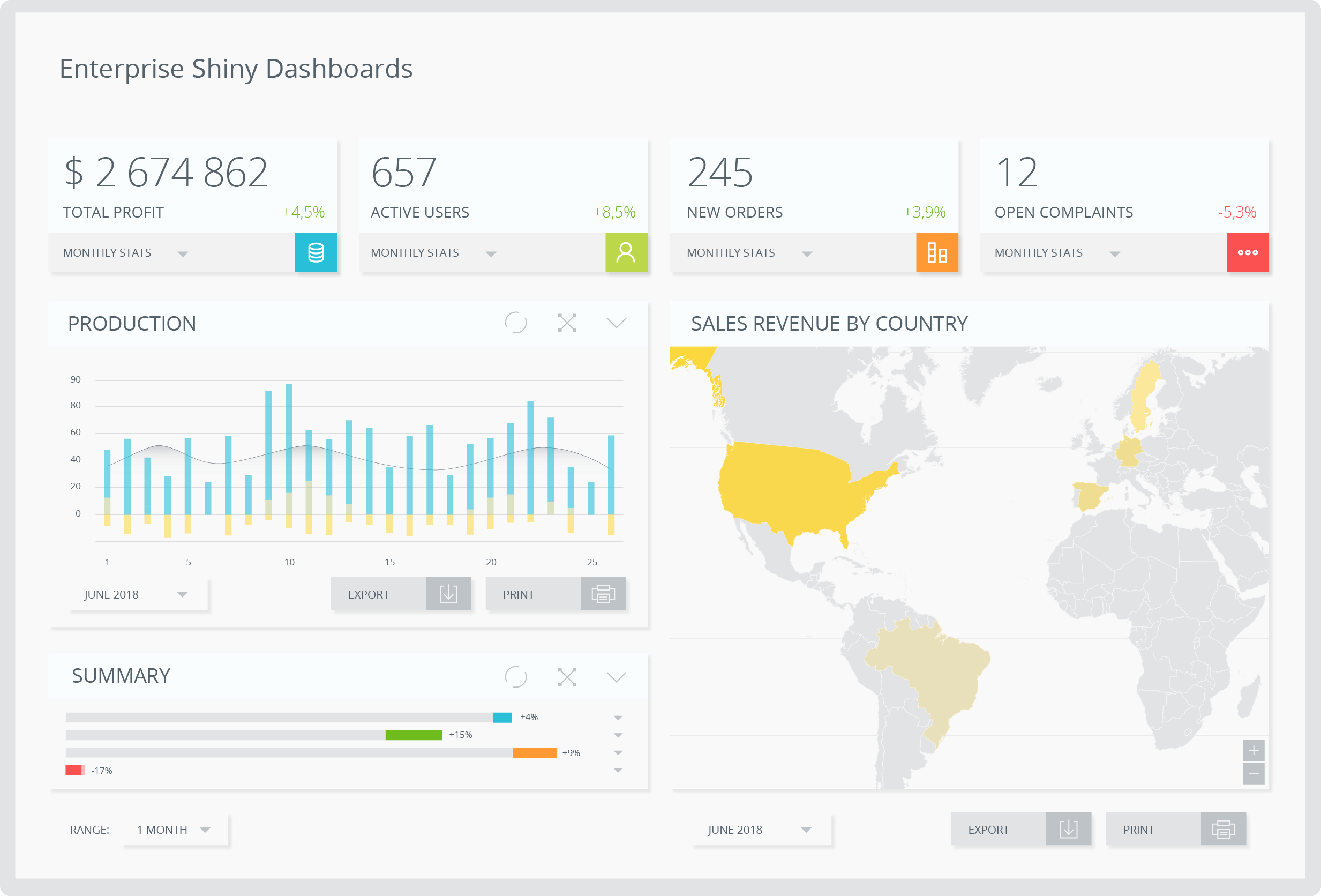
Sample Shiny dashboard. Notice how simple color coding can improve readability.
4 quick tips for data display
- Graph type
If the data is focused on changes in time – use a line graph. When the goal is to show the difference in levels for some categories – use a bar chart (and always remember to start the bar chart at 0!). - Colors
Pick the colors wisely: too many colors can make your graph heavy on the eye and difficult to read. - Axes
Adjust the axis to match the data: if the range is too wide, the variance in data will be difficult to spot. - Labels
When thinking about the labels, see if the exact value is important. If so, it’s good to have the label visible on the graph. But if the relation between the series is more important, you can hide the labels and improve the readability of the graph.
Step 6: Test, test, and then test some more
You probably know the concept of testing apps with unit tests. You may have also heard about performance testing and other types of technical tests, but did you know you can test your design as well?
In-depth user interviews are the best way to check if your Shiny app meets user expectations. They are longer sessions with the user where you ask the person to perform several tasks within the tool. This way you can see if there are any recurring problems with navigation or the general ease of use. Don’t worry if you’re short on time or resources: hallway tests are a fine alternative. Just ask your colleagues to use the app for 5-10 minutes and note their impressions.
The good news is that testing the app design can come at any stage of the development process, even before it starts. You can use the wireframes or mockups and manually change the “screens” as the user “performs an action” in the app. Just remember not to leave testing for the last moment. When the app development is finished, rebuilding the UI will be costly.
Step 7: Look beyond UI
It’s easy to forget that user experience is not only about how the app looks, but also how it feels to interact with it. Go through the checklist below to give your Shiny app a head start:
- Is the app design responsive?
- Does the user know what’s wrong when receiving an error message?
- Is the user well informed about the state of the app, e.g. when waiting for the calculation, is it clear when it will be finished?
Mind you, this list is just a point of departure. The more complex the app and the user flow – the more UX touch-points to consider apart from the visual layer of the user interface.
The UX design journey of your Shiny app is just about to begin…
There is no one easy path to great UX. User experience design of a Shiny app is a complex process with many factors contributing to the final result. Brace yourself for a bumpy ride through layouts, formats, configurations, and color schemes. There is, however, one guiding principle that can help you stay on track. If you always keep the users and their needs in mind, each design decision will come more naturally. Don’t stop there: ask for feedback on each stage and implement changes accordingly. After all, you have a common destination: a lovable Shiny app.
Professional Shiny UX for Enterprise Applications
If you’re searching for expert advice or need a PoC ASAP, reach out to Appsilon: the global leader in Shiny development. The Appsilon team has developed workflows and frameworks to rapidly deliver industry-leading R Shiny applications with enterprise designs.
Our developers have created many open source Shiny packages. You can find solutions to your design questions using our open-source design tools from shiny.semantic (with 6000+ downloads) to our latest shiny.react and shiny.fluent. Be sure to star your preferred packages and stay updated with versions.
Contact Us
Project Manager

Get Updates
Subscribe to Shiny Weekly Newsletter
Join 4000+ Shiny enthusiasts to see the latest Shiny news from the R community.