Share
Share Tweet
Tweet Share
Share


How to Improve Design of R Shiny Dashboard with the semantic.dashboard Package

11 June 2018
Updated: April 26, 2022.
semantic.dashboard is an R package used to improve the design of R Shiny dashboards. It’s an alternative to shinydashboard and makes use of Semantic UI. The package allows developers to easily introduce Semantic UI components into R Shiny apps.
The package is available on the Comprehensive R Archive Network (CRAN). You can make use of it simply by running install.packages("semantic.dashboard"). You might also be interested in this 2020 tutorial on how to build a high-quality Shiny dashboard with the semantic.dashboard package.
Table of contents:
- Improve Design of R Shiny Dashboards with semantic.dashboard
- How to Get Started with semantic.dashboard?
- How to Add Content to semantic.dashboard Dashboards
- Add Interactive Items to R Shiny Dashboards
- Source Code
- Conclusion
Improve Design of R Shiny Dashboards with semantic.dashboard
R Shiny is an excellent package for interactive data visualizations. However, fitting a large number of graphs onto just one Shiny page may prove to be a challenge. In our experience, virtually all projects with new KPIs being introduced along the way result in inadequate and not readable final reports.
Dashboards provide a solution. They allow the developer to intuitively structure their reports by breaking them down into sections, panels, and tabs. This makes it much easier for the final user to navigate through the data.
shinydashboard is one available solution and provides decent features. The only problem is – all shinydashboard apps look virtually identical. In this article, we will show you how to take advantage of the semantic.dashboard package. It is an alternative to shinydashboard which makes use of Semantic UI. The package allows developers to introduce attractive Semantic components into the app and select from many available themes.
If you don’t have semantic.dashboard installed yet, visit this GitHub page for detailed instructions. As mentioned earlier, the package is available on CRAN, so you can install it directly in RStudio.
How to Get Started with semantic.dashboard?
Let’s keep things simple and start by creating an empty dashboard:
For comparison, you can check what happens if you change library(semantic.dashboard) to library(shinydashboard).
The dashboard should look similar to this:
Image 1 – Empty dashboard
With almost no effort we have created the skeleton for our first semantic.dashboard app.
Now it is time to discuss the basic components of a dashboard. Each dashboardPage consists of three elements:
- header
- sidebar
- body
Currently, our header is quite boring, so let’s add a title and change its color:
We don’t need a sidebar to be this wide. We also would like to make it more functional, so let’s add two menu elements:
This is the result we should get:
Image 2 – Basic dashboard styling
Not bad! We can do even better by adding some icons to our menuItems. Can you do it yourself? (Hint: Use semantic.dashboard documentation, eg. by typing ?menuItem in RStudio console).
How to Add Content to semantic.dashboard Dashboards
In this section, we will start filling our app with some content. We will use a popular dataset “mtcars”, extracted from the 1974 Motor Trend US magazine, which comprises a range of parameters for 32 old-school automobiles.
First, we’ll need to change the content of the dashboard body using tabs. Look at the following code snippet:
We created two tabItems with tabNames exactly the same as menuItems. The selected parameters of tabItems tell us which tabItem should be selected and displayed after running the app.
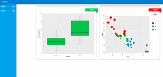
Equipped with this knowledge, we can implement something functional. We’ll start by creating a simple plot describing the relationship between the car’s gearbox type and their miles per gallon parameter.
In the shinyServer function, we call:
Since we are using ggplot2 do not forget to import it at the beginning of the script.
We are going to make another plot from this dataset, so let’s divide the main page into two sections. We can exchange content of fluidRow function of our first tabItem by:
This is a good moment to make sure that your app is running. If the answer is yes, proceed to the next section. In case it’s not, verify if you followed all the previous steps.
Add Interactive Items to R Shiny Dashboards
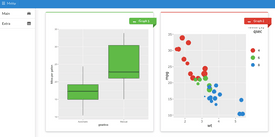
To add a more interactive plot to our dashboards we can use “plotly” R package. In this example, we will use it to present the relation between the weight of a car and miles per gallon. We decided on a scatter plot since it can provide additional information. We marked the number of cylinders by color and the quarter-mile time by the size of the points:
Note that we used semantic_palette here for graph colors in order to stay consistent with the SemanticUI layout of the app:
Here’s what the dashboard looks like after the change:
Image 3 – Sample interactive plots
We can now move on to the next tab to provide the user with additional information.
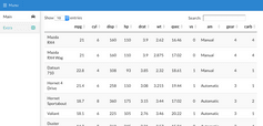
For instance, we can add a complete list of cars properties in the “Extra” tab for the curious automobile enthusiast. To do so, we’ll use the DT package to render the table on the server-side:
And now display it on the second tab:
Image 4 – Sample table view
The dashboard looks pretty good by this point. But let’s change the visuals by altering the dashboard theme. You can find a list of available themes on the Semantic Forest website – the cerulean theme will do the trick. It is simple to change the theme now, as it requires changing just one parameter in the dashboardPage function.
Here’s what the dashboard looks like after the change.
Image 5 – Sample Shiny dashboard demo
S0urce code
If you missed a step or two, you can review the complete code for the dashboard below:
Summary of semantic.dashboard for Improving Design of R Shiny Dashboards
Today you’ve learned how to improve the design of R Shiny dashboards with the semantic.dashboard package. It’s really easy to use, as you had the chance to see, and it will enable you to produce great-looking visuals in less time. For the homework, we encourage you to customize the dashboard by adding more tabs with new interactive plots.
If you’re looking to build your first R Shiny dashboard, you can use Appsilon Shiny Dashboard Templates to simplify the process. The bundle contains a ton of beautiful and easy-to-use templates. The best part – is it’s entirely free.
In case you need something more advanced, we’re also here to help. Appsilon is an RStudio Full Service Certified Partner. We develop advanced R Shiny applications for Fortune 500 companies across the globe. We’d be happy to help you choose the right options for your use case.
Resources:
Contact Us
Project Manager

Get Updates
Subscribe to Shiny Weekly Newsletter
Join 4000+ Shiny enthusiasts to see the latest Shiny news from the R community.