Share
Share Tweet
Tweet Share
Share


How to Make Stunning Bar Charts in R: A Complete Guide with ggplot2

07 December 2020
Bar Charts with R
Updated: May 6, 2022.
The language of data visualization is universal. Not everyone will recognize a great visualization, but everyone will remember a terrible one. As it turns out, the R programming language is amazing for visualizing data. Today you’ll learn how to make stunning ggplot 2 bar charts with ease. If you use the tools and techniques discussed in this article, the chances for your visualization to be classified as “terrible” will be close to zero.
Want to make your workflow more productive? Here’s our curated list of RStudio shortcuts and tips.
This article shows you how to make all sorts of bar charts with R and ggplot2. You’ll also learn how to make them aesthetically pleasing with colors, themes, titles, and labels.
Today you’ll learn how to:
- Make your first bar chart
- Change colors and themes
- Add titles, subtitles, and captions
- Edit axis labels
- Make stacked, grouped, and horizontal bar charts
- Add labels
- Add lines
Make Your First ggplot2 Bar Chart
There are plenty of datasets built into R and thousands of others available online. Still, you’ll declare your own. The reasoning is simple – you’re here to learn how to make bar charts, not how to aggregate data.
Here’s the dataset you’ll use today:
R’s standard library for data visualization is ggplot2. It’s based on the layering principle. For example, you first declare a data layer and then a visualization layer. These two are mandatory for any visualization. You’ll see later how additional layers can make charts more informative and appealing.
To start, you’ll make a bar chart that has the column quarter on the x-axis and profit on the y-axis. That’s declared in the first layer (data), and the second layer (visualization) specifies which type of visualization you want. The geom_bar and geom_col layers are used to create bar charts. With the first option, you need to specify stat = "identity" for it to work, so the ladder is used throughout the article.
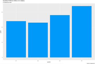
You can create a simple bar chart with this code:
Here’s the corresponding visualization:
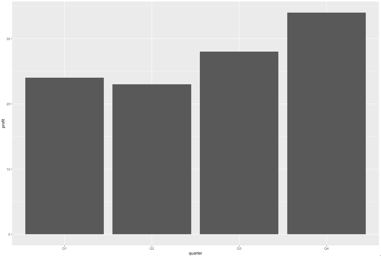
Image 1 – Simple bar chart
This one gets the job done but doesn’t look like something you’d want to show to your boss. You’ll fix it in the following sections.
Add Colors and Themes to ggplot2 Bar Charts
Tweaking colors and themes is the simplest thing you can do to make visualization look better. The geom_bar() has two useful parameters:
color– outline color of the barsfill– fill color of the bars
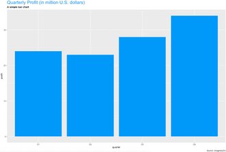
Here’s how to use fill to make your chart Appsilon-approved:
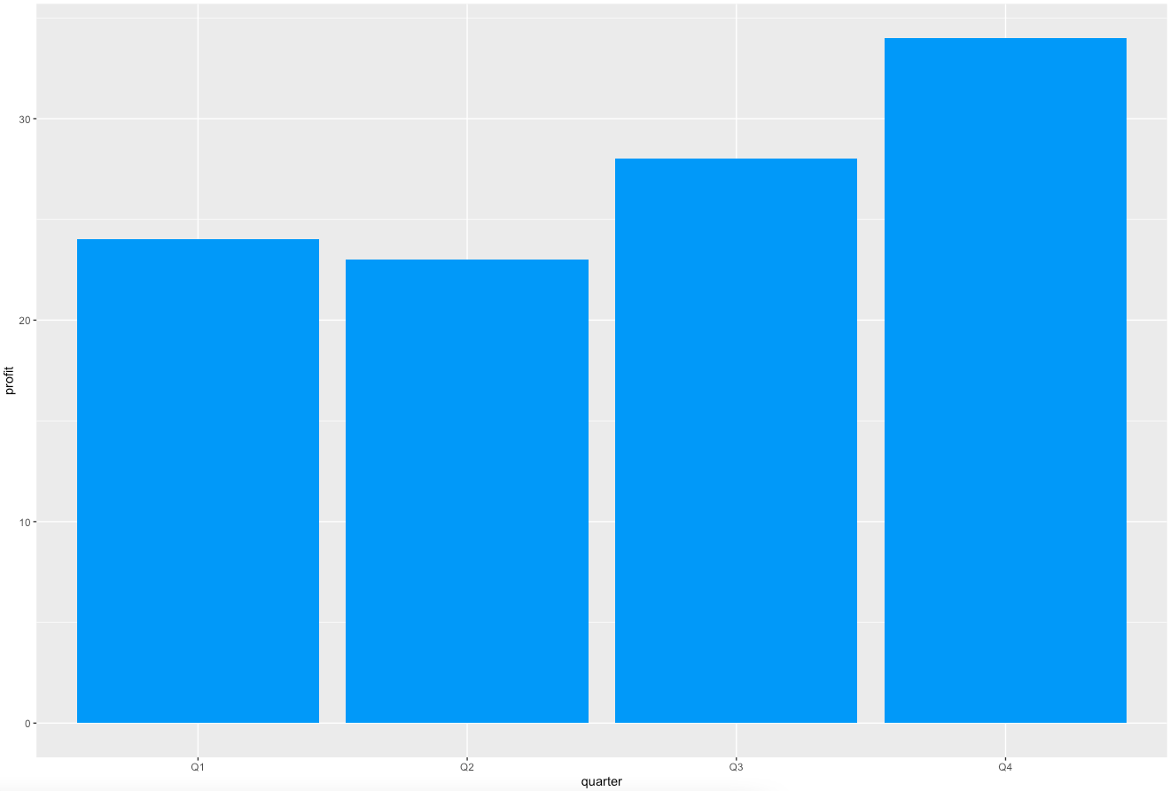
Image 2 – Using fill to change the bar color
The color parameter changes only the outline. The dataset you’re using has two distinct products. R draws a fill line between products’ values, as stacked bar charts are used by default. You’ll learn more about the stacked charts later.
Here’s what this means in practice. The code snippet below sets the fill color to white and the outline color to blue:
Image 3 – Changing the outline color
In case coloring doesn’t do the trick, you can completely change the theme. That’s yet another layer to add after the initial visualization layer. Here’s how to do it:
Image 4 – Changing the visualization theme
If this theme isn’t your thing, there’s plenty more to pick from. You can find the entire list here.
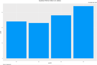
Include Titles, Subtitles, and Captions in Your ggplot2 Bar Charts
A visualization without a title is useless. There’s no way to know if you’re looking at Election votes or 2020 USA election votes in California. You can use subtitles to put additional information, but it’s not mandatory. Captions are useful for placing visualization credits and sources.
The most convenient way to add these is through a labs() layer. It takes in values for title, subtitle, and caption.
Let’s see how to add all three:
Image 5 – Title, subtitle, and caption with default styles
It’s a good start, but what if you want to add styles? Let’s see how to color the title, bold the subtitle, and italicize the caption:
Image 6 – Styling title, subtitle, and caption
Let’s take this a step further. Here’s how to align the title to the middle, subtitle to the right, and caption to the left:
Image 7 – Aligning title, subtitle, and caption
You’ve learned how to add a nicely-formatted title, but the default axis labels still holds your visualization back. You’ll learn how to change them next.
Don’t ForAxis Labels
Long story short – it works identically as with titles and subtitles. The labs() layer takes in values for both X and Y-axis labels.
Here’s how to change the text:

Image 8 – Changing X and Y axis labels
You can change the styles the same way you did with titles, subtitles, and captions. The following code snippet will make your x-axis label blue and bold, and y-axis label italic:
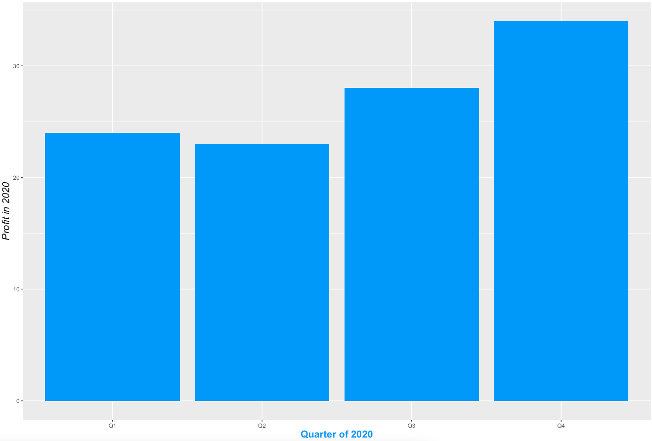
Image 9 – Changing stylings of X and Y axis labels
And that does it for changing the basic visuals. You’ll learn how to work with different bar charts next – stacked, grouped, and horizontal.
Stacked, Grouped, and Horizontal Bar Charts
The ggplot2 package uses stacked bar charts by default. Stacked bar charts are best used when all portions are colored differently.
To change the coloring, you only need to change the fill value in the data layer. Here’s an example:
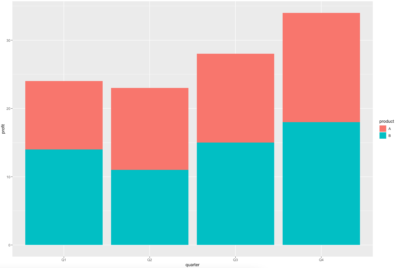
Image 10 – Default stacked bar chart
There’s a visible distinction between products, and you can now see how much profit each product made quarterly.
There are two ways to change each portion’s color:
- Manually – by specifying a vector of color names or color hex codes
- With palettes – by using built-in color palettes
Let’s cover the manual approach first. You have to add a layer with scale_fill_manual:
Image 11 – Stacked bar chart with custom colors
Palettes are a bit easier because you don’t need to know exact color values. For the same reason, it can also be considered as a limitation. Here’s a list of built-in palettes. The scale_fill_brewer layer is used to work with palettes:
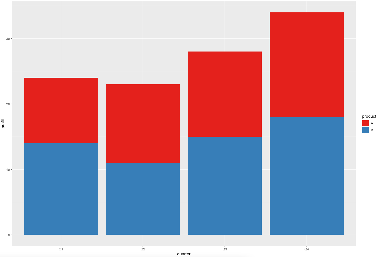
Image 12 – Stacked bar chart colored with a built-in palette
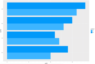
Onto the grouped bar charts now. They display bars corresponding to a group next to each other instead of on top of each other. To use grouped bar charts, you need to put position = position_dodge() into a geom_bar layer:
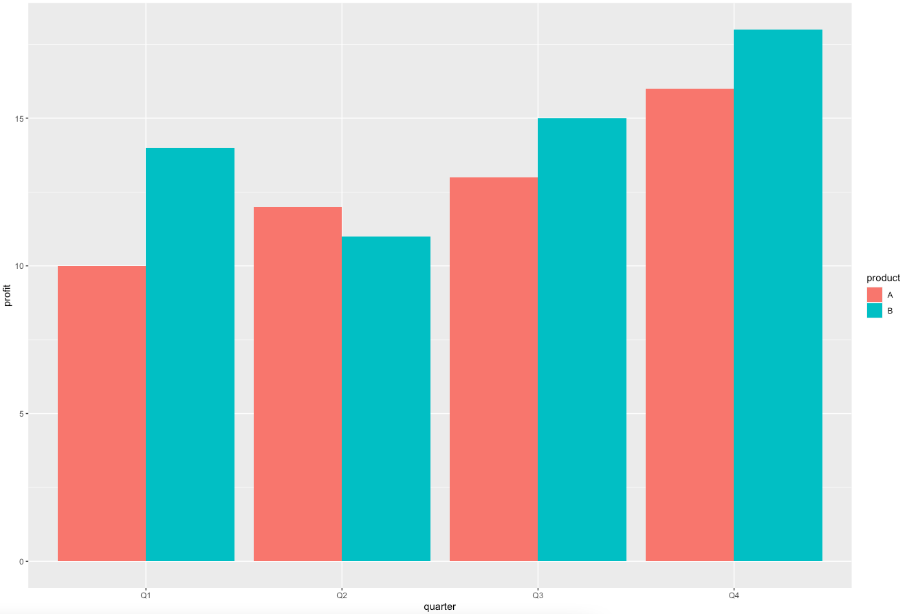
Image 13 – Grouped bar chart (default)
You can change the coloring the same way you did with stacked bar charts – through the scale_fill_manual or scale_fill_brewer layers. Here’s an example:
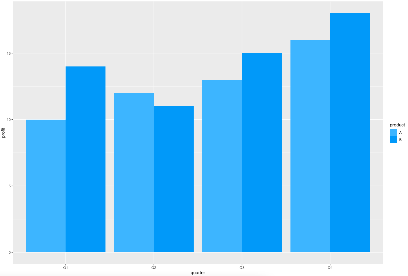
Image 14 – Grouped bar chart with custom colors
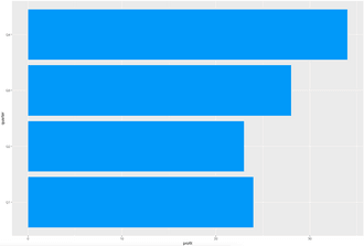
Finally, let’s cover horizontal bar charts. They are useful when there are many categories on the x-axis or when their names are long. The coord_flip() is used to turn any vertical bar chart into a horizontal one:
Image 15 – Horizontal bar chart (default)
You can use the scale_fill_manual or scale_fill_brewer layers to change the color. Here’s an example:
Image 16 – Horizontal bar chart with custom colors
Now you know how to make every type of bar chart – but there’s still one thing you can improve. Let’s see what that is in the next section.
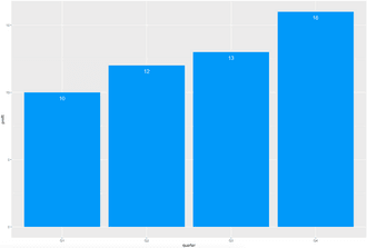
Add Labels to Individual Bars
Bar charts can be hard to look at. Knowing the exact value is often a requirement. If the y-axis is on a scale of millions, reading values from a chart becomes an approximation (at best). That’s where labels come in.
You can put text somewhere near the top of each bar to show the exact value. That solves the problem of reading values from the chart. It also makes it more user-friendly, as you don’t have to divert your view to the y-axis constantly.
You’ll learn how to put labels on top of bars. For the first example, you’ll need to filter the dataset so only product A is shown. The reason is simple – ggplot2 uses stacked bar charts by default, and there are two products in the stack for each quarter. You’ll learn how to add labels for multiple stacks later, but let’s start with the basics.
Here’s the code:

Image 17 – Labels on top of bars
But what if you want to put the labels inside? Just play with vjust a bit. Setting it to 2 does the trick:
Image 18 – Labels inside the bars
Things get a bit trickier if you need labels for multiple stacks. You have to specify position = position_stack() inside the geom_text layer. Setting the vjust to 0.5 makes them centered:
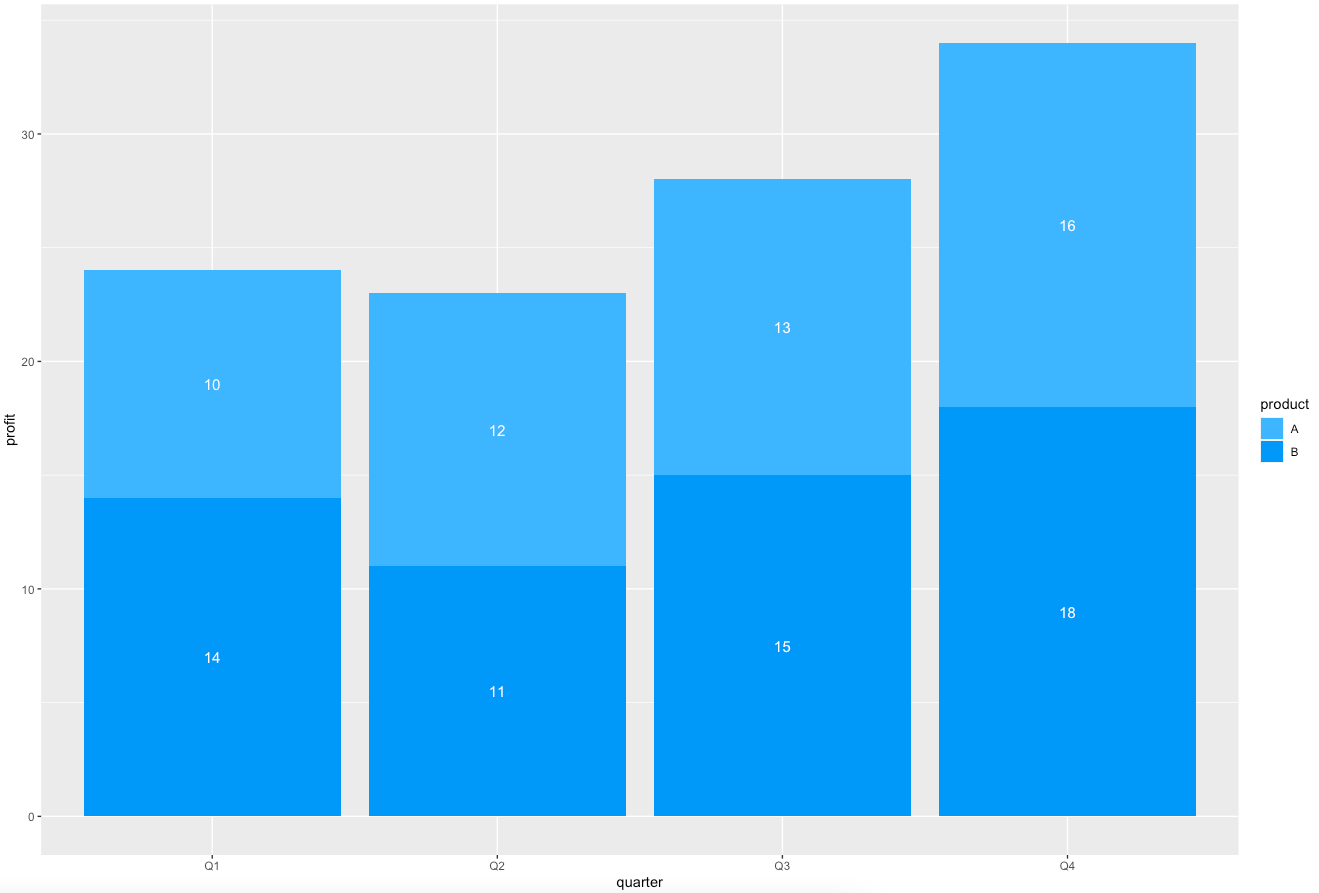
Image 19 – Labels inside the stacked bar chart
There’s an alternative for a grouped bar chart. You’ll have to specify position = position_dodge() for it to work. This code centers the labels inside every group:
Image 20 – Labels centered inside the grouped bar chart
And that’s all there is about labels and bar charts. There’s still one section to cover, and that’s adding lines to bar charts.
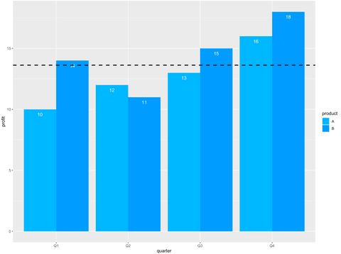
Add Lines to ggplot2 Bar Charts
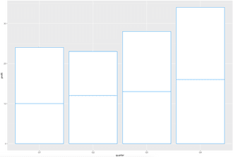
Sometimes you want to add an extra touch to your bar charts. What you could do is add a line representing an average of all the bars. In our example, this would give you an insight into which products over which quarters performed better than average, and vice versa. It’s a nice little touch-up and a bonus point when visualizing data, because the end-user has less thinking to do.
You can add horizontal lines to ggoplot2 bar charts with the geom_hline() function. The example below adds a thick dashed black line representing the mean value of all profits:
Image 21 – Adding horizontal lines to bar charts
Much easier to visually distinguish. Our imaginary company seems to have done better in the last two quarters.
Summary of ggplot2 Bar Charts
Today you’ve learned how to make every type of bar chart in R and how to customize it with colors, titles, subtitles, and labels. You’re now able to use ggplot2 bar charts for basic visualizations, reports, and dashboards. Expect to see more basic R tutorials weekly (probably Sunday) and more advanced tutorials throughout the week. Fill out the subscribe form below so you never miss an update.
Are you completely new to R? Check out our detailed R guide for programmers.
Learn how to include bar charts in interactive dashboards:
Contact Us
Project Manager

Get Updates
Subscribe to Shiny Weekly Newsletter
Join 4000+ Shiny enthusiasts to see the latest Shiny news from the R community.