Share
Share Tweet
Tweet Share
Share


How to Make Stunning Boxplots in R: A Complete Guide to ggplot Boxplot

09 November 2021
Updated: July 14, 2022.
Boxplots with R and ggplot2
Are your data visualizations an eyesore? It’s a common problem in the data science world. The solution is easier than you think, as R provides many ways to make stunning visuals. Today you’ll learn how to create impressive boxplots with R and the ggplot2 package.
Need more than boxplots? Explore more of the ggplot2 series:
This article demonstrates how to make stunning boxplots with ggplot based on any dataset. We’ll start simple with a brief introduction and interpretation of boxplots and then dive deep into visualizing and styling ggplot boxplots.
Table of contents:
- What Is a Boxplot?
- ggplot, ggplot2, and ggplot()?
- Make Your First ggplot Boxplot
- Style ggplot Boxplots — Change Layout, Outline, and Fill Color
- Add Text, Titles, Subtitles, Captions, and Axis Labels to ggplot Boxplots
- Advanced ggplot Boxplot Examples
- Conclusion
What Is a ggplot Boxplot?
A boxplot is one of the simplest ways of representing a distribution of a continuous variable. It consists of two parts:
- Box — Extends from the first to the third quartile (Q1 to Q3) with a line in the middle that represents the median. The range of values between Q1 and Q3 is also known as an Interquartile range (IQR).
- Whiskers — Lines extending from both ends of the box indicate variability outside Q1 and Q3. The minimum/maximum whisker values are calculated as Q1/Q3 -/+ 1.5 * IQR. Everything outside is represented as an outlier.
Take a look at the following visual representation of a horizontal box plot:
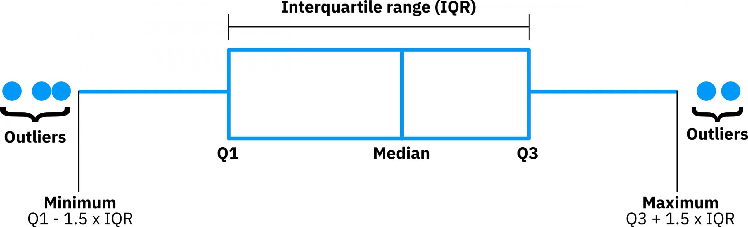
Image 1 – Boxplot representation
In short, boxplots provide a ton of information for a single chart. They’re excellent for summary statistics. Boxplots tell you whether the variable is normally distributed, or if the distribution is skewed in either direction. You can also easily spot the outliers, which always helps.
It’s an excellent data visualization for statisticians and researchers looking to visualize data distributions, compare several distributions, and of course – identify outlier points.
They also come in many shapes and styles, with options including horizontal box plots, vertical box plots, notched box plots, violin plots, and more. So be sure to choose the appropriate box plot based on your needs.
ggplot, ggplot2, and ggplot()?
Let’s clarify something before we begin.
- ggplot() is the main function
- ggplot is the name of the archived package
- ggplot2 is the name of the current package
Often, you’ll hear or see people referencing the ggplot2 package as ‘ggplot’. That’s because the previous package version was titled – you guessed it – ‘ggplot’, and old habits die hard. If you call the ggplot function, it’s simply ‘ggplot’, but the current package is ‘ggplot2’. So if you’re trying to install ggplot (the package), you’ll run into a wall. Instead, search for ggplot2.
Let’s see how you can use R and ggplot to visualize boxplots.
Make Your First ggplot Boxplot
Data frame for Your Boxplot
R has many datasets built-in, one of them being mtcars. It’s a small and easy-to-explore dataset we’ll use today to draw boxplots. You’ll need only ggplot2 installed to follow along.
We’ll visualize boxplots for the mpg (Miles per gallon) variable among different cyl (Number of cylinders) options in most of the charts. You’ll have to convert the cyl variable to a factor beforehand. Here’s how:
library(ggplot2)

df <- mtcars
df$cyl <- as.factor(df$cyl)

head(df)
The head() function prints the first six rows of the dataset:
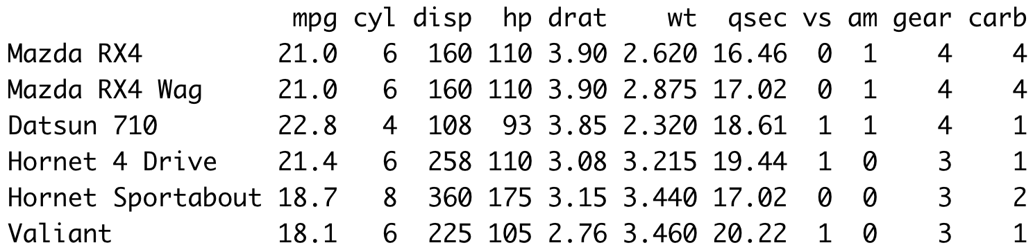
Image 2 – Head of MTCars dataset
From the image alone, you can see that mpg is continuous, and cyl is categorical. It’s a variable-type combination you’re looking for when working with boxplots.
Visualization
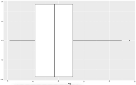
You can make ggplot boxplots look stunning with a bit of work, but starting out they’ll look pretty plain. Think of this as a blank canvas to paint your beautiful boxplot story. The geom_boxplot() function is used in ggplot2 to draw boxplots. Here’s how to use it to make a default-looking boxplot of the miles per gallon variable:
ggplot(df, aes(x = mpg)) +
  geom_boxplot()
Image 3 – Simple boxplot with ggplot2
And boy is it ugly. We’ll deal with the stylings later after we go over the basics.
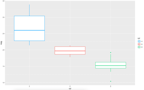
Every so often, you’ll want to visualize multiple boxplots on a single chart — each representing a distribution of the variable with some filter condition applied. For example, we can visualize the distribution of miles per gallon for every possible cylinder value. The latter is already converted to a factor, so you’re ready to go.
Here’s the code:
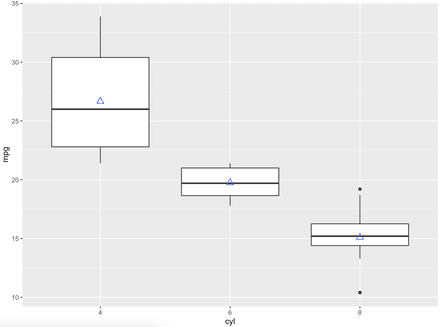
ggplot(df, aes(x = cyl, y = mpg)) +
  geom_boxplot()
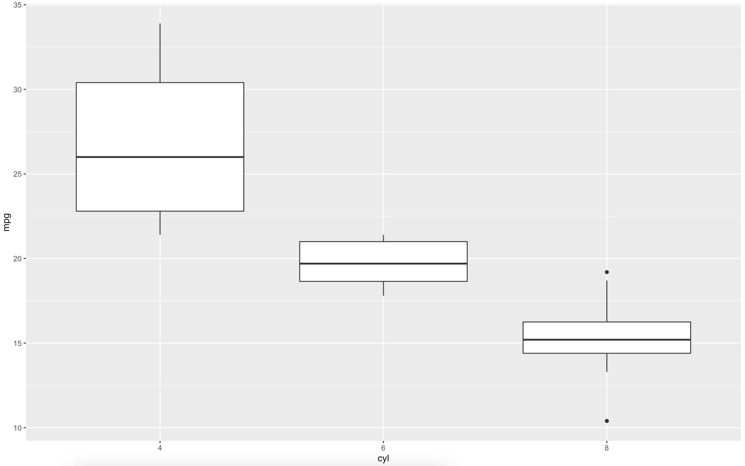
Image 4 – Miles per gallon among different cylinder numbers
It makes sense — a car makes fewer miles per gallon the more cylinders it has. There are outliers for cars with eight cylinders, represented with dots above and whiskers below.
You can change the orientation of the chart if you find this one hard to look at. Just call the coord_flip() function when coding the chart:
ggplot(df, aes(x = cyl, y = mpg)) +
  geom_boxplot() +
  coord_flip()
Image 5 – Changing the orientation
We’ll stick with the default orientation moving forward. Let’s say you want to display every data point on the boxplot. The mtcars dataset is relatively small, so it might actually be a good idea. You’ll have to call the geom_dotplot() function to do so:
ggplot(df, aes(x = cyl, y = mpg)) +
  geom_boxplot() +
  geom_dotplot(binaxis = "y", stackdir = "center", dotsize = 0.5)
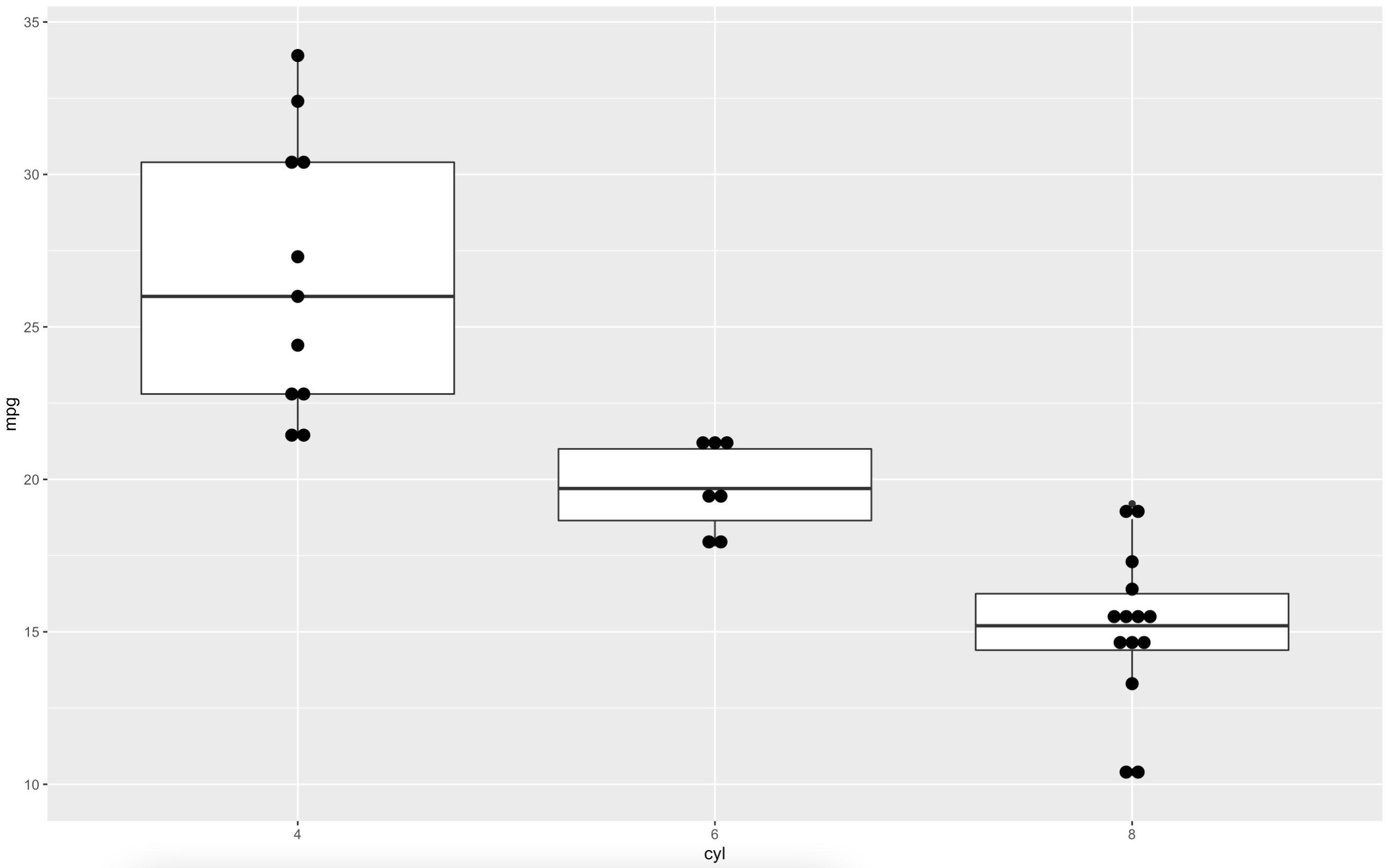
Image 6 – Displaying all data points on the boxplot
Be extra careful if you’re doing this for a larger dataset. Outliers are a bit harder to spot and it’s easy to get overwhelmed.
Let’s explore how you can make boxplots more appealing to the eye.
Style a ggplot Boxplot — Change Theme, Outline, and Fill Color
Boxplot Outline
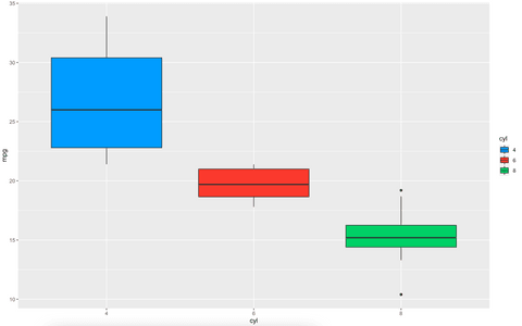
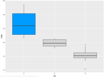
Let’s start with the outline color. It might just be enough to give your visualization an extra punch. You can specify an attribute that decides which color is applied in the call to aes(), and then use the scale_color_manual() function to provide a list of colors:
ggplot(df, aes(x = cyl, y = mpg, color = cyl)) +
  geom_boxplot() +
  scale_color_manual(values = c("#0099f8", "#e74c3c", "#2ecc71"))
Image 7 – Changing the outline color
There are other ways to specify the color palette or use custom color palettes. However, we find the option above to be the most customizable.
Fill Boxplot
If you want to change the fill color instead, you have options. You can specify a color to the fill parameter inside geom_boxplot() if you want all boxplots to have the same color:
ggplot(df, aes(x = cyl, y = mpg)) +
  geom_boxplot(fill = "#0099f8")
Image 8 – Changing the fill color
The alternative is to apply the same logic we used in the outline color — a variable controls which color is applied where, and you can use the scale_color_manual() function to change the colors:
ggplot(df, aes(x = cyl, y = mpg, fill = cyl)) +
  geom_boxplot() +
  scale_fill_manual(values = c("#0099f8", "#e74c3c", "#2ecc71"))
Image 9 – Changing the fill color (2)
Changing Your Boxplot Theme
Now we’re getting somewhere. The only thing we haven’t addressed is that horrendous background color. You can get rid of it by changing the theme. For example, adding theme_classic() will make your chart a bit more modern and minimalistic:
ggplot(df, aes(x = cyl, y = mpg, fill = cyl)) +
  geom_boxplot() +
  scale_fill_manual(values = c("#0099f8", "#e74c3c", "#2ecc71")) +
  theme_classic()
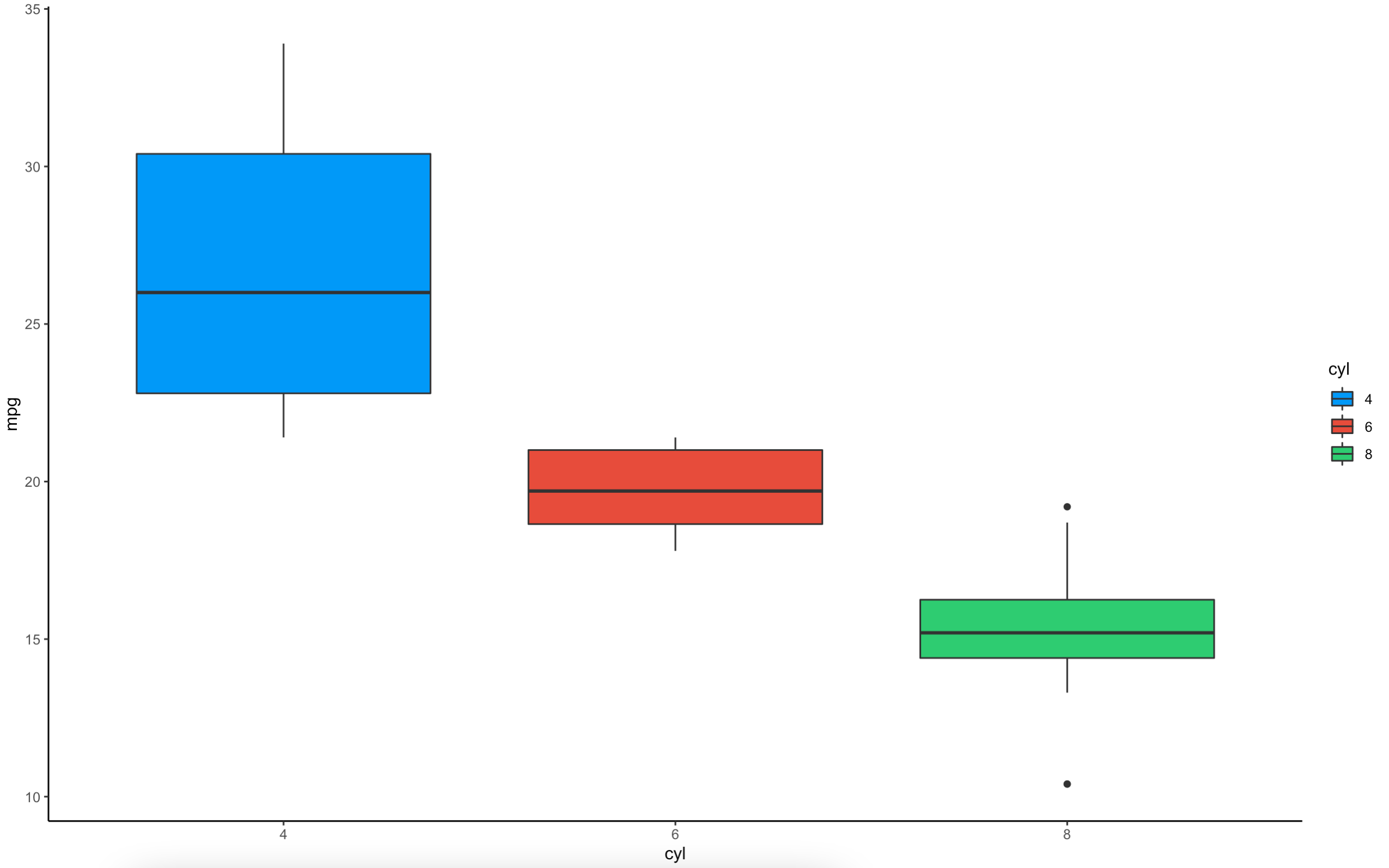
Image 10 – Changing the theme
Style boils down to personal preference, but this one is much easier to look at in our opinion.
There’s still one gigantic elephant in the room left to discuss — titles and labels. No one knows what your ggplot boxplot represents without them.
Add Text, Titles, Subtitles, Captions, and Axis Labels to a ggplot Boxplot
Labeling ggplot Boxplots
Let’s start with text labels. It’s somewhat unusual to add them to boxplots, as they’re usually used on charts where exact values are displayed (bar, line, etc.). Nevertheless, you can display any text you want with ggplot boxplots, you’ll just have to get a bit more creative.
For example, if you want to display the number of observations, mean, and median above every boxplot, you’ll first have to declare a function that fetches that information. We decided to name ours get_box_stats():
get_box_stats <- function(y, upper_limit = max(df$mpg) * 1.15) {
  return(data.frame(
    y = 0.95 * upper_limit,
    label = paste(
      "Count =", length(y), "\n",
      "Mean =", round(mean(y), 2), "\n",
      "Median =", round(median(y), 2), "\n"
    )
  ))
}
Discover more Boxplot arguments in the ggplot2 boxplot documentation.
You can now pass it to stat_summary() function when drawing boxplots:
ggplot(df, aes(x = cyl, y = mpg, fill = cyl)) +
  geom_boxplot() +
  scale_fill_manual(values = c("#0099f8", "#e74c3c", "#2ecc71")) +
  stat_summary(fun.data = get_box_stats, geom = "text", hjust = 0.5, vjust = 0.9) +
  theme_classic()
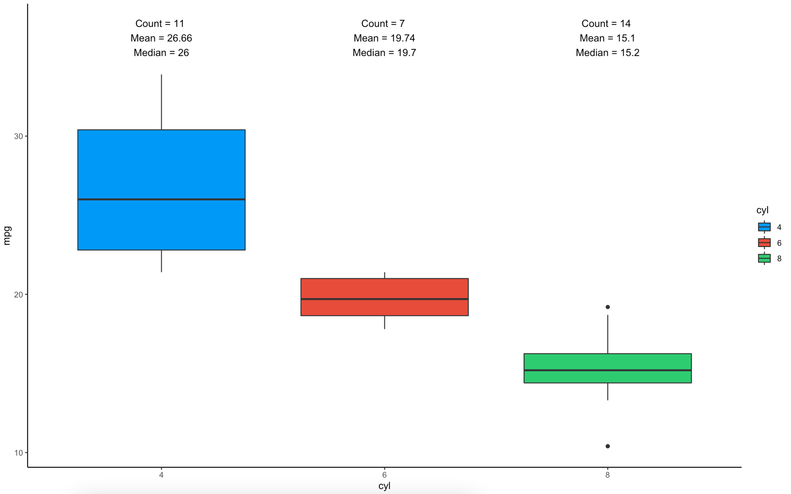
Image 11 – Adding text
Neat, right? Much better than displaying values directly on the chart.
Titling Boxplots
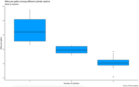
Let’s cover titles and axes labels next. These are mandatory for production-ready charts, as without them, the users don’t know what they’re looking at. You can use the following code snippet to add title, subtitle, caption, x-axis label, and y-axis label:
ggplot(df, aes(x = cyl, y = mpg)) +
  geom_boxplot(fill = "#0099f8") +
  labs(
    title = "Miles per gallon among different cylinder options",
    subtitle = "Made by Appsilon",
    caption = "Source: MTCars dataset",
    x = "Number of cylinders",
    y = "Miles per gallon"
  ) +
  theme_classic()
Image 12 – Adding title, subtitle, caption, and axis labels
If you think these look a bit plain, you’re not alone. You can use the theme() function to style them. Be aware that your custom styles will be ignored if you call theme_classic() after declaring custom styles:
ggplot(df, aes(x = cyl, y = mpg)) +
  geom_boxplot(fill = "#0099f8") +
  labs(
    title = "Miles per gallon among different cylinder options",
    subtitle = "Made by Appsilon",
    caption = "Source: MTCars dataset",
    x = "Number of cylinders",
    y = "Miles per gallon"
  ) +
  theme_classic() +
  theme(
    plot.title = element_text(color = "#0099f8", size = 16, face = "bold", hjust = 0.5),
    plot.subtitle = element_text(face = "bold.italic", hjust = 0.5),
    plot.caption = element_text(face = "italic")
  )
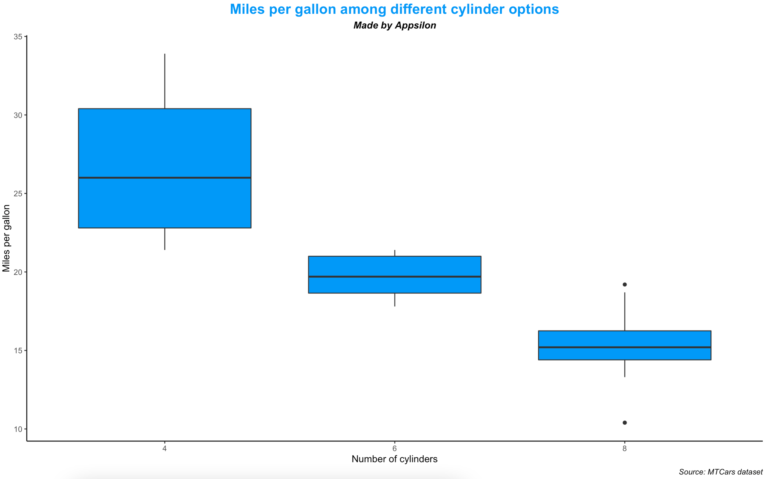
Image 13 – Styling title, subtitle, and caption
Much better — assuming you like the blue color.
Advanced ggplot Boxplot Examples
We’ll now cover a couple of advanced things you can do with R ggplot boxplots. These might not be super handy for everyday tasks, but you’ll know when you need them. Let’s start with something on a simple side – adding mean value.
Adding mean value to boxplots
As you already know, boxplots show the median as a thick line somewhere in the box. But what if you also want to show the mean value? That’s what this subsection will teach you. The stat_summary() function does the trick. You can use it to specify any function and shape, but we’ll stick with the mean:
ggplot(df, aes(x = cyl, y = mpg)) +
  geom_boxplot() +
  stat_summary(fun = "mean", geom = "point", shape = 2, size = 3, color = "blue")
Image 14 – Adding mean values to a boxplot
Again, not something you’ll use daily, but you’ll know exactly when you need this functionality.
Highlight individual boxplots
Sometimes you want to shift the user’s focus to a certain area of the chart. Doing so is a bit tricky, as it involves adding a new variable to your dataset specifying which row should be highlighted. To do so, we can use the dplyr package and chain a call to ggplot. Take a look for yourself:
library(dplyr)

df %>%
  mutate(hlt = ifelse(cyl == 4, "Highlighted", "Normal")) %>%
  ggplot(aes(x = cyl, y = mpg, fill = hlt, alpha = hlt)) +
    geom_boxplot() +
    scale_fill_manual(values = c("#0099f8", "grey")) +
    scale_alpha_manual(values = c(1, 0.5)) +
    theme(legend.position = "none")
Image 15 – Highlighting individual boxplot
We’ve modified both the color and transparency of individual boxplots, but you’re free to stick with coloring only.
Add boxplots as marginal distributions to scatter plots
In statistics, this is actually done all the time. It saves both time and space, as you can show relationships between variables as a scatter plot, and on the margins, you can also show the distribution of each variable. Now, ggplot doesn’t ship by default with this functionality, so you’ll have to install an additional package – ggExtra. Once installed, create a scatter plot as you normally would, and then wrap it in a call to ggMarginal which can show a marginal distribution as a histogram, density plot, or a boxplot:
library(ggExtra)

p <- ggplot(df, aes(x = wt, y = mpg, color = cyl, size = cyl)) +
  geom_point(alpha = 0.7) +
  theme_minimal() +
  theme(legend.position = "none")
ggMarginal(p, type = "boxplot") 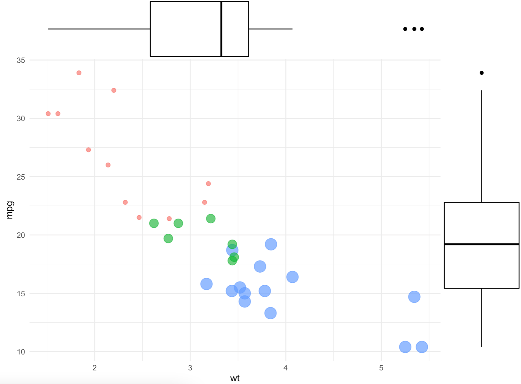
Image 16 – Adding marginal distributions
Neat, right? You can further change boxplot for histogram or desnsity to change the charts on the margins.
Everything covered so far is just enough to get you on the right track when making ggplot boxplots, so we’ll stop here.
Looking for more examples of Boxplots? Check out the r-bloggers boxplot feed to see what the R community has to say.
Conclusion to ggplot Boxplot in R
Today you’ve learned what boxplots are, and how to draw them with R and the ggplot2 library. You’ve also learned how to make them aesthetically pleasing by changing colors, and adding text, titles, and axis labels. You now have the knowledge to style boxplots however you’d like.
You know what to tweak, and now it’s up to you to pick fonts and colors. When creating data visualizations with R, you’re only limited by your creativity (and R knowledge). If you need help finding inspiration or tools be sure to check out what can be achieved with advanced R programming.
At Appsilon, we’ve used ggplot2 package frequently when developing enterprise R Shiny dashboards for Fortune 500 companies. If you have a keen eye for design and know a thing or two about R and Shiny, reach out. We have several R Shiny developer positions available.
Contact Us
Project Manager

Get Updates
Subscribe to Shiny Weekly Newsletter
Join 4000+ Shiny enthusiasts to see the latest Shiny news from the R community.