Share
Share Tweet
Tweet Share
Share


How to Make Stunning Scatter Plots in R: A Complete Guide with ggplot2

22 December 2020
Scatter Plots with R
Do you want to make stunning visualizations, but they always end up looking like a potato? It’s a tough place to be. Luckily, R makes it easy to produce great-looking visuals. Today you’ll learn how to create impressive scatter plots with R and the ggplot2 package.
Read the series from the beginning:
This article demonstrates how to make a scatter plot for any occasion and how to make it look extraordinary at the same time. After reading, visualizing relationships between any continuous variables shouldn’t be a problem. Today you’ll learn how to:
- Make your first scatter plot
- Change size, color, shapes, and themes
- Add text and labels
- Add titles, subtitles, captions, and axis labels
- Add other useful things
Make Your First Scatter Plot
R has many datasets built-in, and one of them is mtcars. It’s one of the most popular datasets, and today you’ll use it to make a lot of scatter plots. Package-wise, you’ll only need ggplot2.
Here’s how to import the packages and take a look at the first couple of rows:
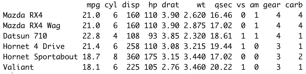
Image 1 – Head of MTCars dataset
The most widely used R package for data visualization is ggplot2. It’s a straightforward package based on the layering principle. The first layer is used to specify the data, and the layers after are used to make and tweak the visualization.
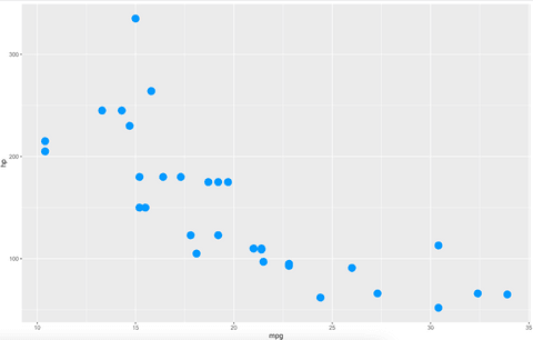
The geom_point() layer is used to draw scatter plots. Your first chart will show the relationship between the mpg attribute on the x-axis, and the hp column on the y-axis:
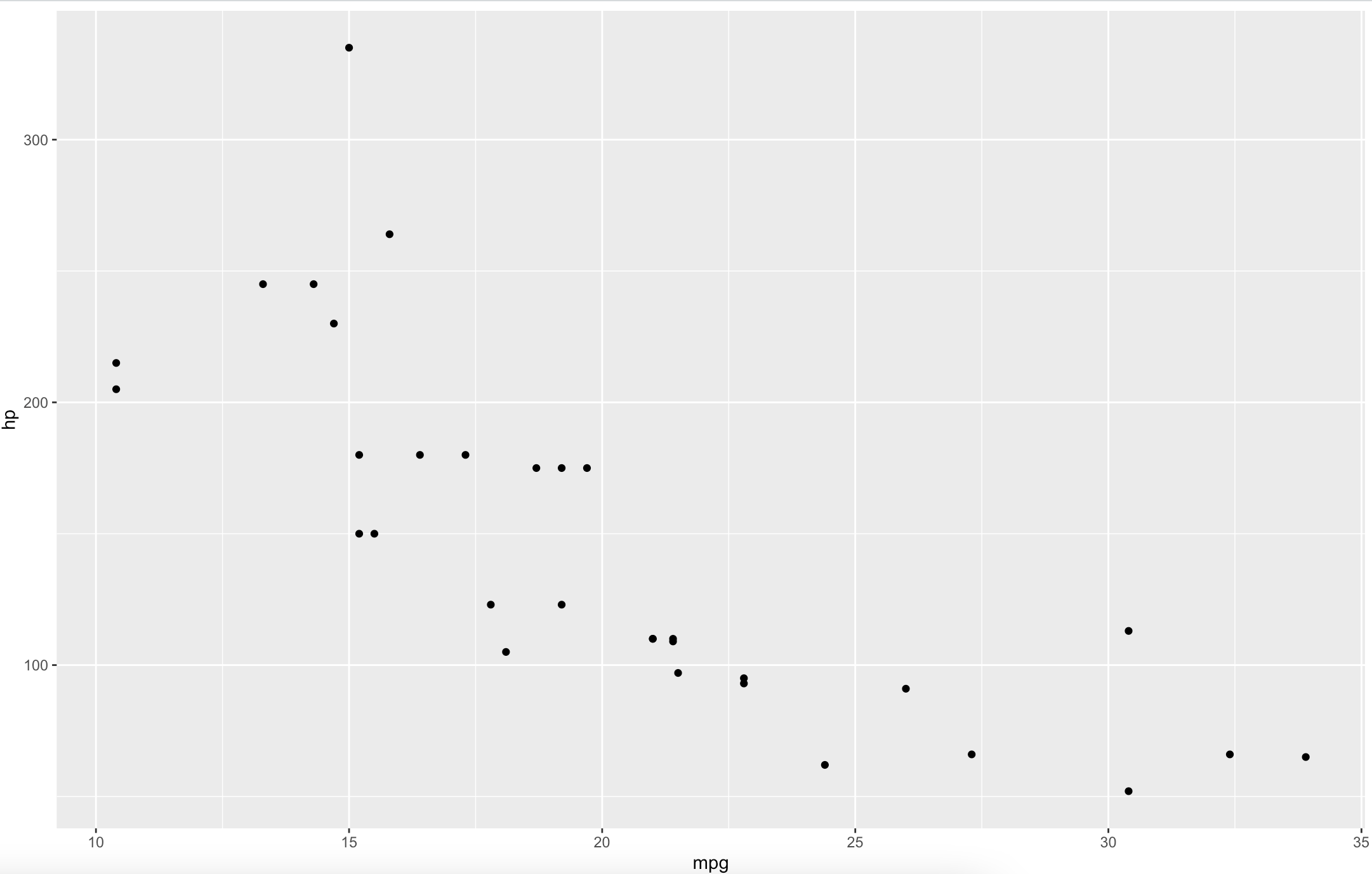
Image 2 – Relationship between MPG and HP variables
We agree with you – it’s not the prettiest visualization. You’ll learn how to deal with that in the following sections.
Change Size, Color, Shape, and Theme
You can’t make stunning visuals with default stylings. You can change a couple of things in the geom_point() layer, such as shape, color, size, and so on.
Here’s how to make the points blue and a bit larger:
Image 3 – Changing size and color
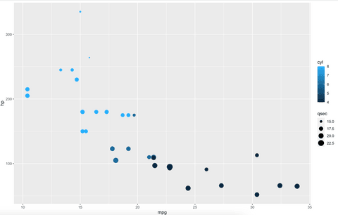
Better, but what if you don’t want to hardcode color and size values? You can put variable names instead. Here’s how to change the color based on the cyl variable and size by qsec:
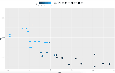
Image 4 – Changing size and color by variables
Changing shapes is also straightforward. Dots aren’t appropriate for every use case, and you’re free to change the shape with the shape attribute. You can find the list of all available shapes here.
The following code snippet replaces dots with triangles:
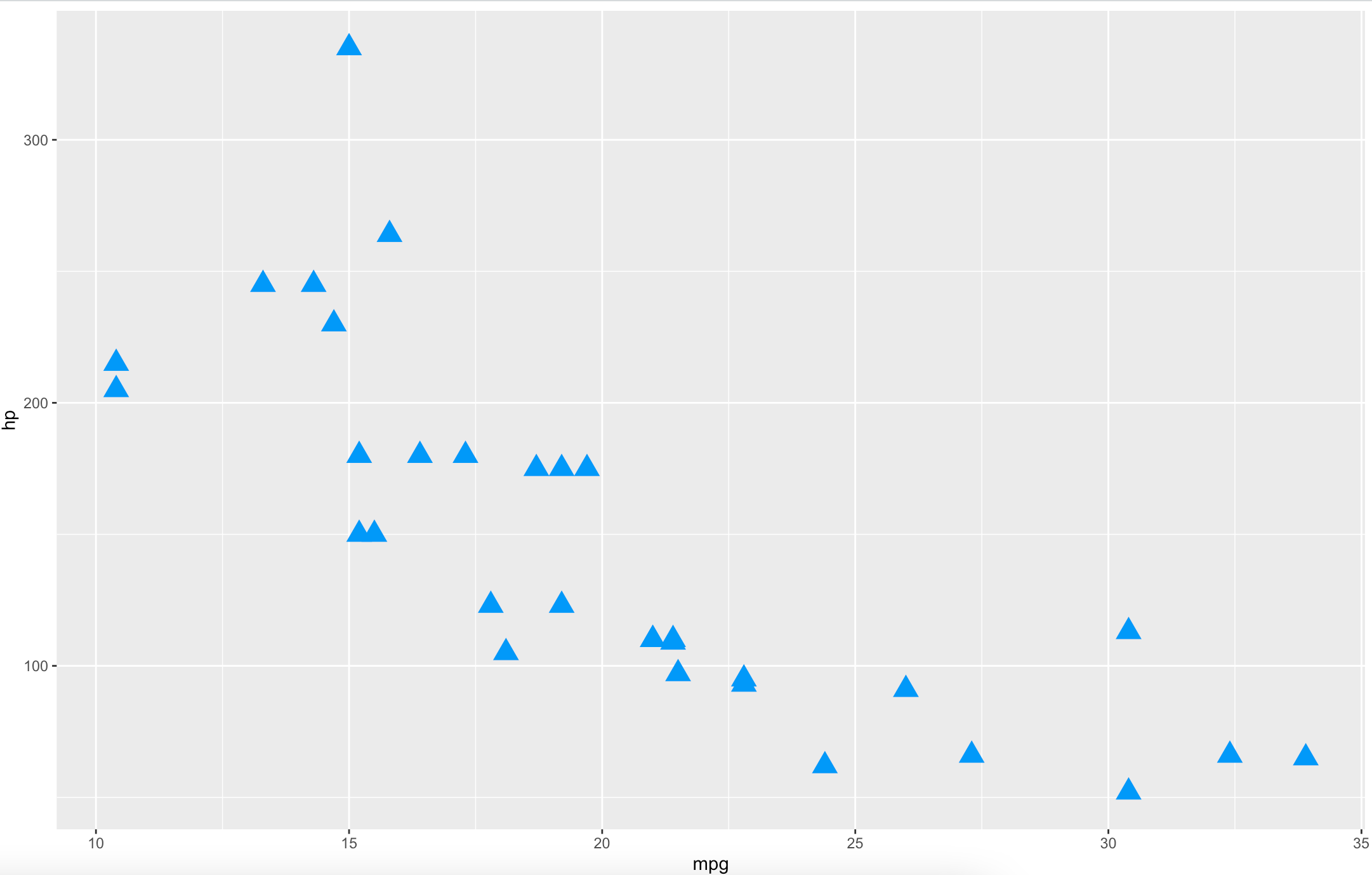
Image 5 – Replacing dots with triangles
And finally, let’s talk about themes. The default one isn’t for everyone because it’s a bit too harsh with the background. With R, you can change the theme with a single line of code:
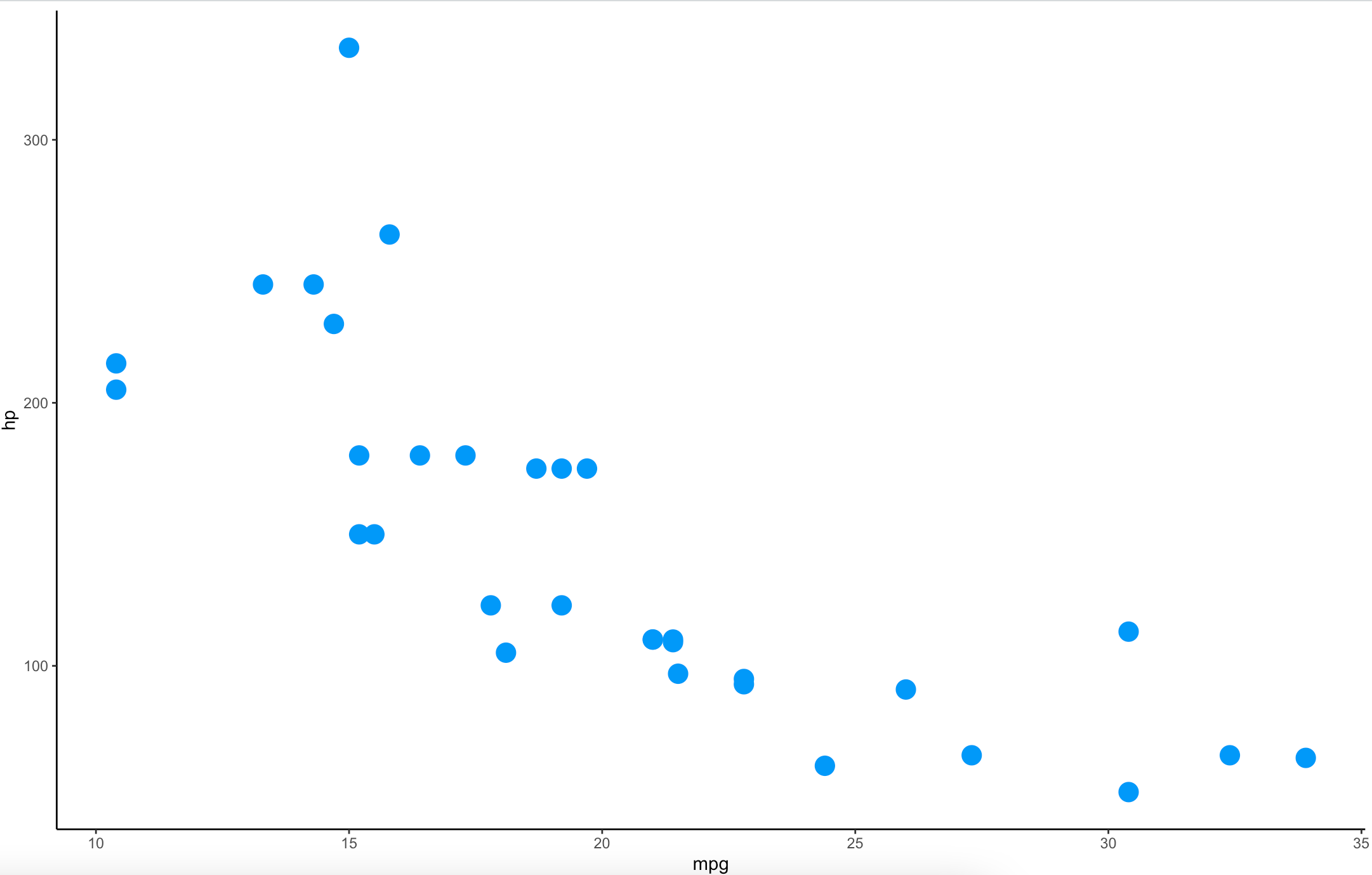
Image 6 – Changing chart theme
Now that’s progress. But it’s still not quite there yet. Let’s see how to add text and labels next.
Add Text and Labels
You can use text and labels to add additional information to your visualizations. The only difference between these two is that there’s a box around labels, making it easier to read.
Here’s how to add text to represent car names:
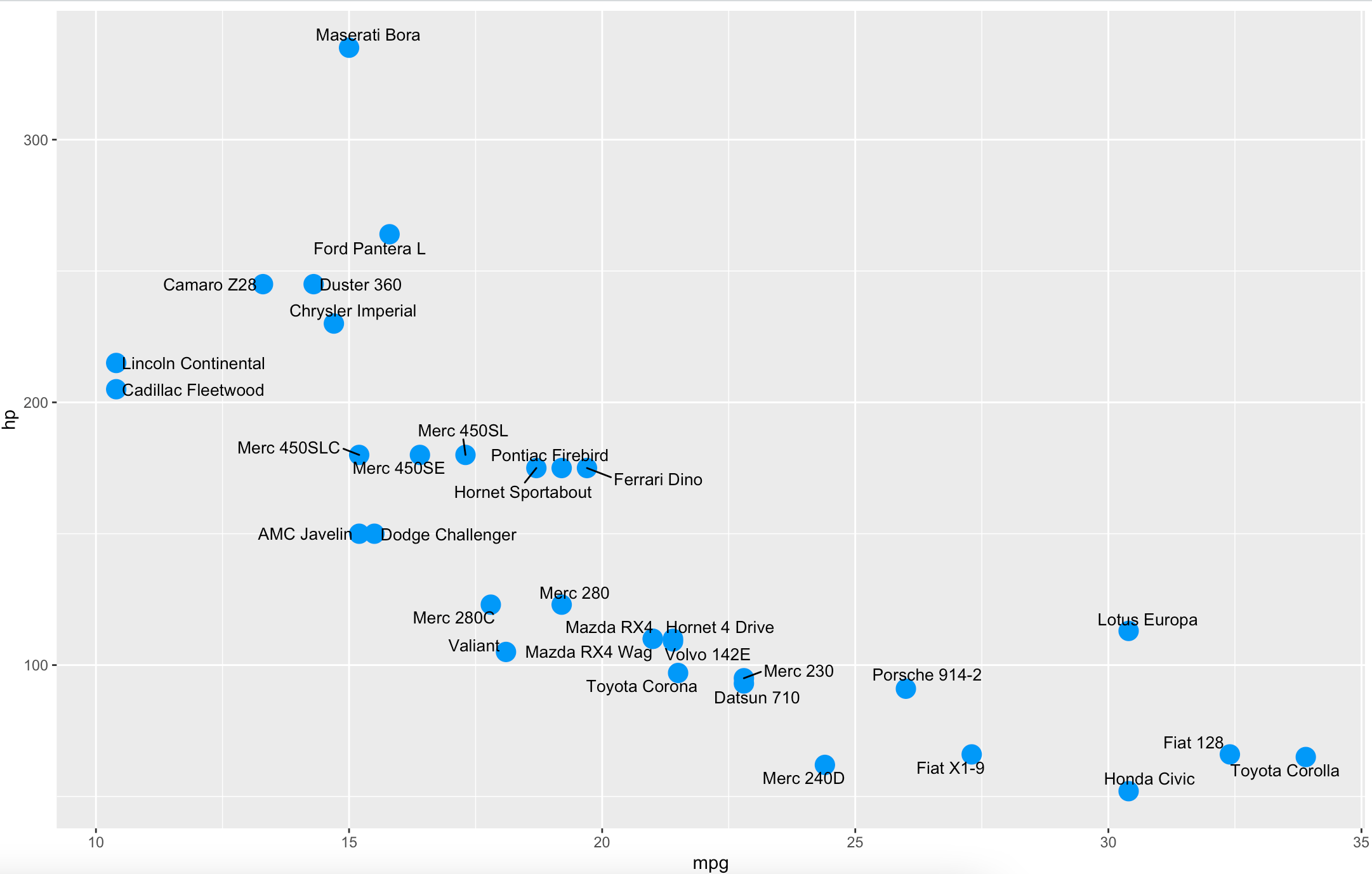
Image 7 – Adding text to the visualization
The ggrepel package is here to prevent the overlap between text. You can add text with the plain geom_text layer, but it would be impossible to read the text for the points that are close.
If this still isn’t as readable as you would want, use labels instead of text. Here’s how:
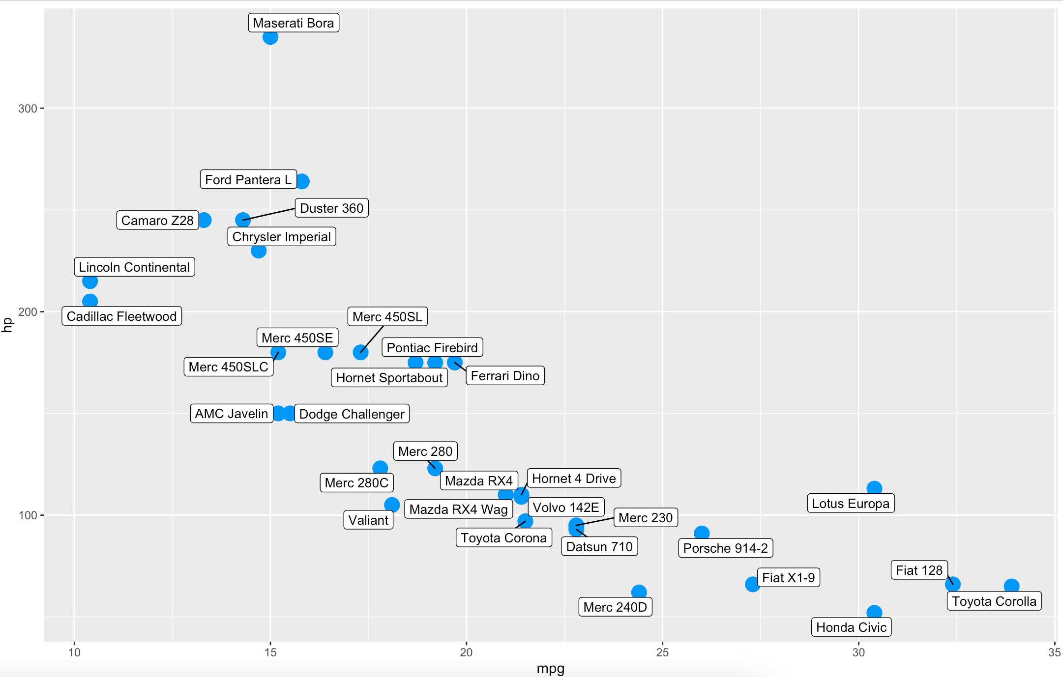
Image 8 – Adding labels to the visualization
Visualization isn’t complete without title and axis labels. Let’s see how to add and style these next.
Add Titles, Subtitles, Captions, and Axis Labels
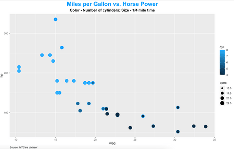
First, you’ll learn how to add titles, subtitles, and captions to the chart. The title is mandatory for any decent visualization, and the other two can help further clarify things and for citing sources, respectively.
The most convenient way to add these is through a labs() layer. It takes in values for title, subtitle, and caption:
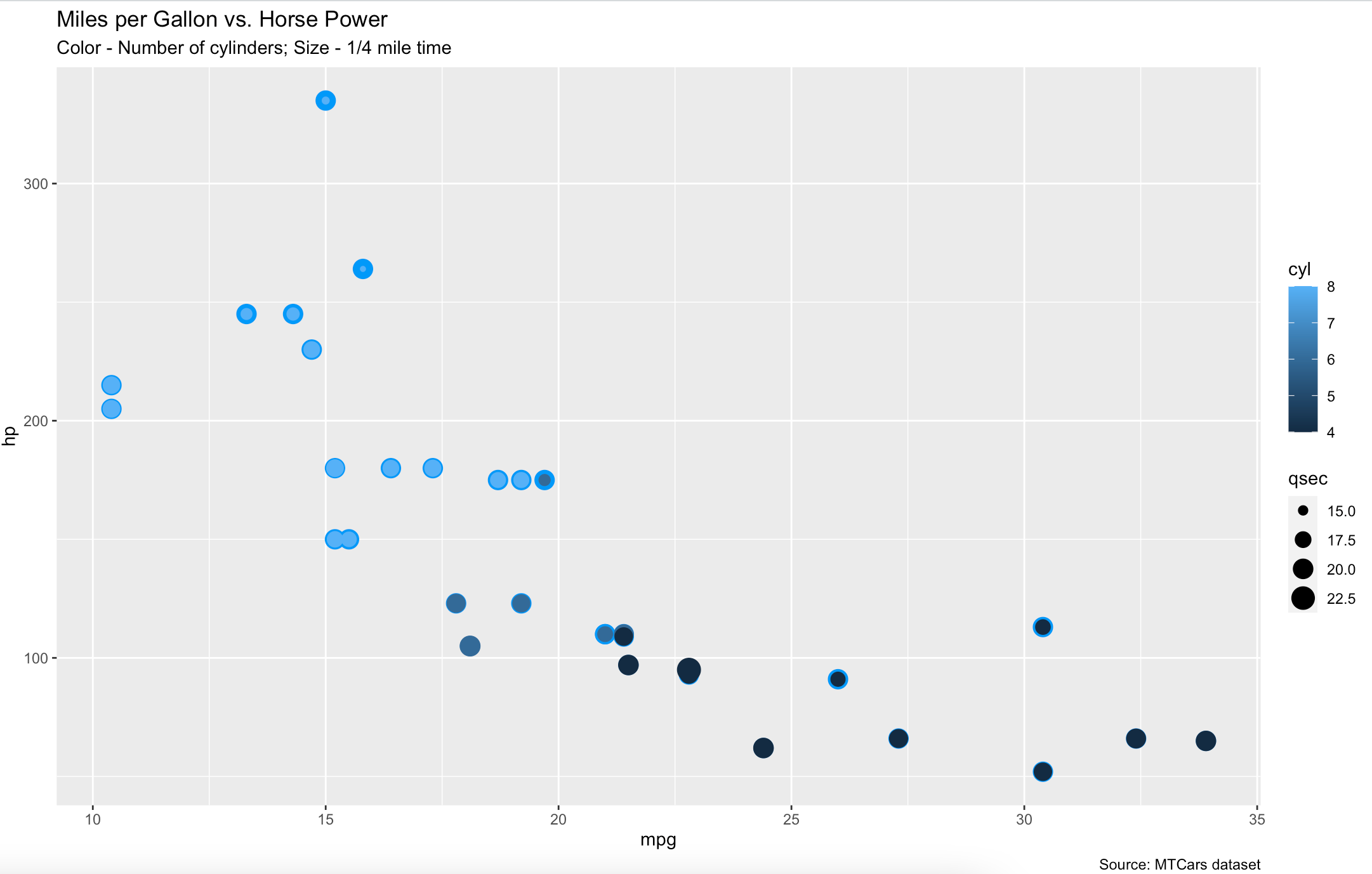
Image 9 – Adding title, subtitle, and caption
By default, these don’t look so great. You can change color, size, alignment, and emphasize/italicize the text in the theme() layer. Here’s how:
Image 10 – Styling title, subtitle, and caption
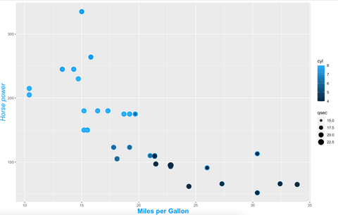
Let’s talk about axis labels next. You can change and style them the same you did with titles, subtitles, and captions – in labs() and theme() layers.
The code snippet below adds labels for both X and Y axes and styles them a bit:
Image 11 – Adding and styling axis labels
To wrap things up, let’s take a look at a couple of useful tweaks you can do to scatter plots that don’t fall into any of the discussed sections.
Add Other Useful Things
Let’s start by changing the legend position. The default position on the right might not be the best for some use cases. You can put the legend on the top by adding the legend.position argument to the theme() layer and specifying the position.
Here’s an example:
Image 12 – Changing the legend position
The other potentially useful layer you can use is geom_rug(). It shows the variable distribution on the edges of both X and Y axes for the specified variables.
Here’s how to use it:
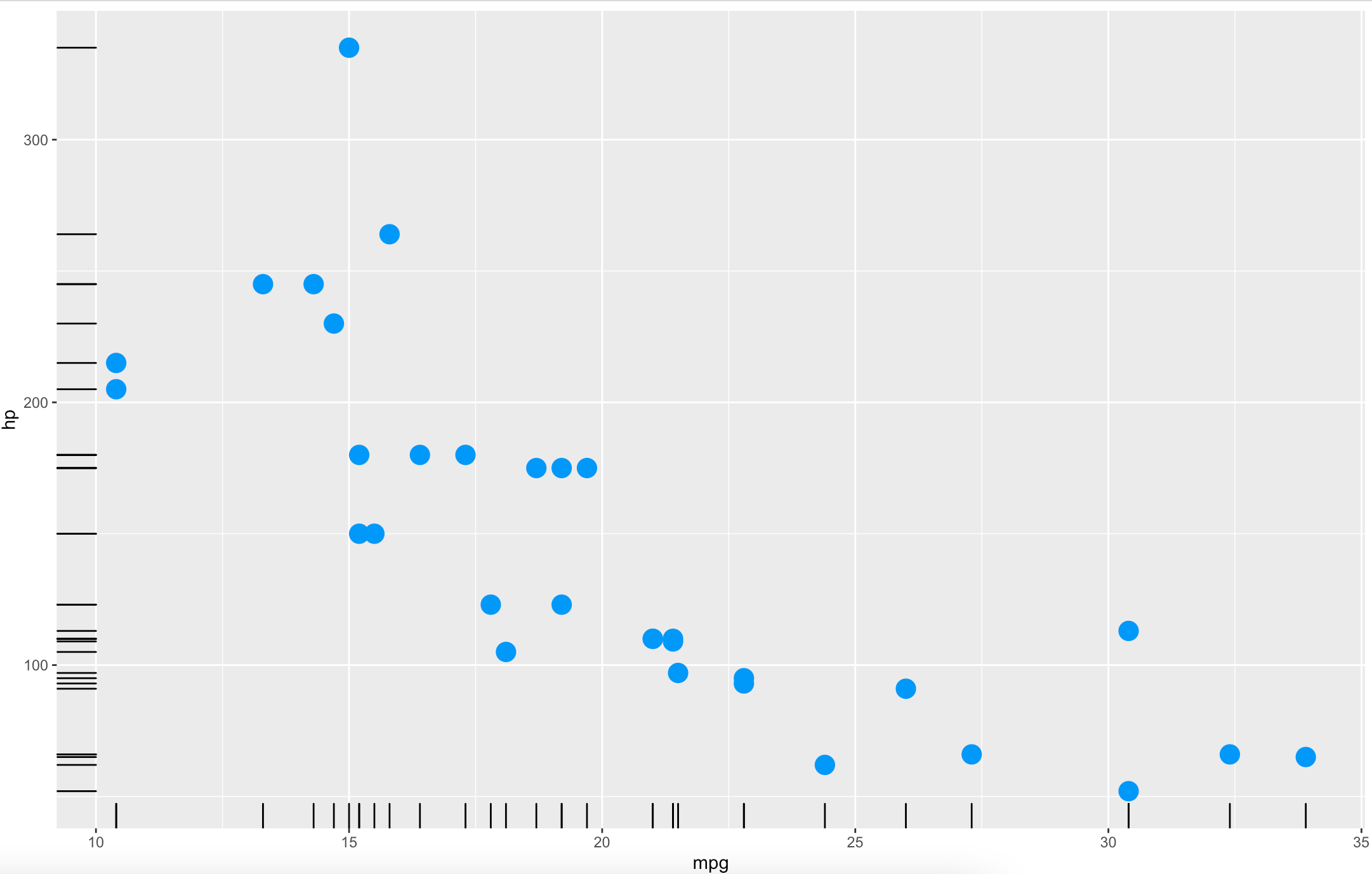
With this layer, you can get a rough idea of how your variables are distributed and on which point(s) most of the observations are located.
Conclusion
Today you’ve learned how to make scatter plots with R and ggplot2 and how to make them aesthetically pleasing. You’ve learned how to change colors, marker types, size, titles, subtitles, captions, axis labels, and a couple of other useful things.
This alone will be enough to make almost any data visualization you can imagine. It’s up to you now to choose an appropriate theme, color, and title.
You can expect more basic R tutorials weekly. Fill out the subscribe form below, so you never miss an update.
BQ: Are you completely new to R but have some programming experience? Check out our detailed R guide for programmers.
Learn More:
- How Our Project Leader Built Her First Shiny Dashboard with No R Experience
- A crash course in R Shiny UI
- How to translate R Shiny dashboards
- How to make R Shiny faster
- How to scale R Shiny dashboards

Appsilon is hiring for remote roles! See our Careers page for all open positions, including R Shiny Developers, Fullstack Engineers, Frontend Engineers, a Senior Infrastructure Engineer, and a Community Manager. Join Appsilon and work on groundbreaking projects with the world’s most influential Fortune 500 companies.
Contact Us
Project Manager

Get Updates
Subscribe to Shiny Weekly Newsletter
Join 4000+ Shiny enthusiasts to see the latest Shiny news from the R community.