Share
Share Tweet
Tweet Share
Share


How to Make Stunning Line Charts in R: A Complete Guide with ggplot2

15 December 2020
ggplot2 Line Charts
Updated: June 2, 2022.
Are your visualizations an eyesore? The 1990s are over, pal. Today you’ll learn how to make impressive ggplot2 line charts with R. Terrible-looking visualizations are no longer acceptable, no matter how useful they might otherwise be. Luckily, there’s a lot you can do to quickly and easily enhance the aesthetics of your visualizations.
Read more on our ggplot series:
This article demonstrates how to make an aesthetically-pleasing line chart for any occasion. After reading, visualizing time series and similar data should become second nature. Today you’ll learn how to:
- Make your first line chart
- Change color, line type, and add markers
- Add titles, subtitles, and captions
- Edit and style axis labels
- Draw multiple lines on a single chart
- Add labels
- Add conditional area fill
Make Your First ggplot2 Line Chart
R has a gapminder package you can download. It contains data on life expectancy, population, and GDP between 1952 and 2007. It’s a time-series dataset, which is excellent for line-based visualizations.
Here’s how to load it (and other libraries):
library(dplyr)
library(ggplot2)
library(gapminder)

head(gapminder)
Calling the head() function outputs the first six rows of the dataset. Here’s how they look:
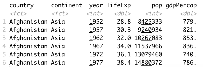
Image 1 – Head of Gapminder dataset
R’s widely used package for data visualization is ggplot2. It’s based on the layering principle. The first layer represents the data, and after that comes a visualization layer (or layers). These two are mandatory for any chart type, and line charts are no exception. You’ll learn how to add additional layers later.
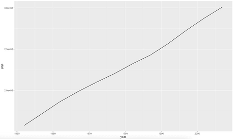
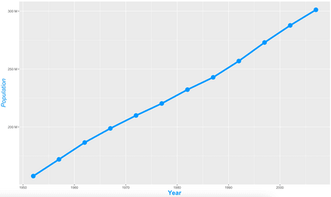
Your first chart will show the population over time for the United States. Columns year and pop are placed on X-axis and Y-axis, respectively:
usa <- gapminder %>%
  filter(continent == "Americas", country == "United States")

ggplot(usa, aes(x = year, y = pop)) +
  geom_line()
Here’s the corresponding visualization:
Image 2 – Population growth over time in the United States
The visualization is informative but as ugly as they come. The following sections will show you how to tweak the visuals.
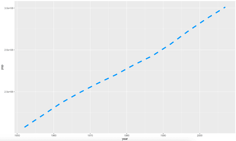
Change Color, Line Type, and Add Markers to ggplot2 Line Charts
Keeping the default styling is the worst thing you can do. With the geom_line() layer, you can change the following properties:
color– line colorsize– line widthlinetype– maybe you want dashed lines?
Here’s how to make a thicker dashed blue line:
ggplot(usa, aes(x = year, y = pop)) +
  geom_line(linetype = "dashed", color = "#0099f9", size = 2)
Image 3 – Changing line style, width, and color
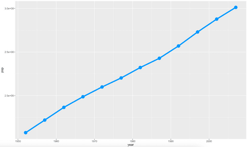
Better, but not quite there yet. Most line charts combine lines and points to make the result more appealing. Here’s how to add points (markers) to yours:
ggplot(usa, aes(x = year, y = pop)) +
  geom_line(color = "#0099f9", size = 2) +
  geom_point(color = "#0099f9", size = 5)
Image 4 – Line chart with markers
Now the charts are getting somewhere – but there’s still a lot to do.
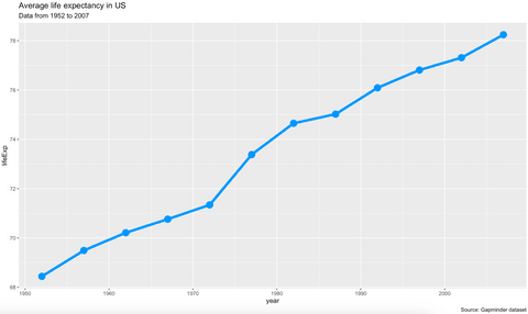
Add Titles, Subtitles, and Captions to ggplot2 Line Charts
You can’t have a complete chart without at least a title. A good subtitle can come in handy for extra information, and a caption is a good place to cite your sources. The most convenient way to add these is through a labs() layer. It takes in values for title, subtitle, and caption.
Here’s how to add all three, without styles:
ggplot(usa, aes(x = year, y = lifeExp)) +
  geom_line(color = "#0099f9", size = 2) +
  geom_point(color = "#0099f9", size = 5) +
  labs(
    title = "Average life expectancy in US",
    subtitle = "Data from 1952 to 2007",
    caption = "Source: Gapminder dataset"
  )
Image 5 – Title, subtitle, and caption with default styles
But there’s more to this story. You can customize all three in the same way – by putting styles to the theme() layer. Here’s how to center title and caption, left align and italicize the caption, and make the title blue:
ggplot(usa, aes(x = year, y = lifeExp)) +
  geom_line(color = "#0099f9", size = 2) +
  geom_point(color = "#0099f9", size = 5) +
  labs(
    title = "Average life expectancy in US",
    subtitle = "Data from 1952 to 2007",
    caption = "Source: Gapminder dataset"
  ) +
  theme(
    plot.title = element_text(color = "#0099f9", size = 20, face = "bold", hjust = 0.5),
    plot.subtitle = element_text(size = 13, face = "bold", hjust = 0.5),
    plot.caption = element_text(face = "italic", hjust = 0)
  )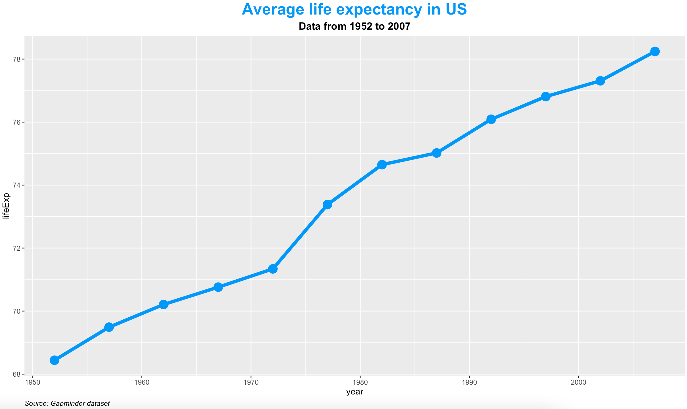
Image 6 – Styling title, subtitle, and caption
That’s all great, but what about the axis labels? Let’s see how to tweak them next.
Edit Axis Labels
Just take a look at the Y-axis for the previous year vs. population charts. The ticks look horrible. Scientific notation doesn’t help make things easier to read. The following snippet puts “M” next to the number – indicates “Millions”:
library(scales)

ggplot(usa, aes(x = year, y = pop)) +
  geom_line(color = "#0099f9", size = 2) +
  geom_point(color = "#0099f9", size = 5) +
  scale_y_continuous(
    labels = unit_format(unit = "M", scale = 1e-6)
  )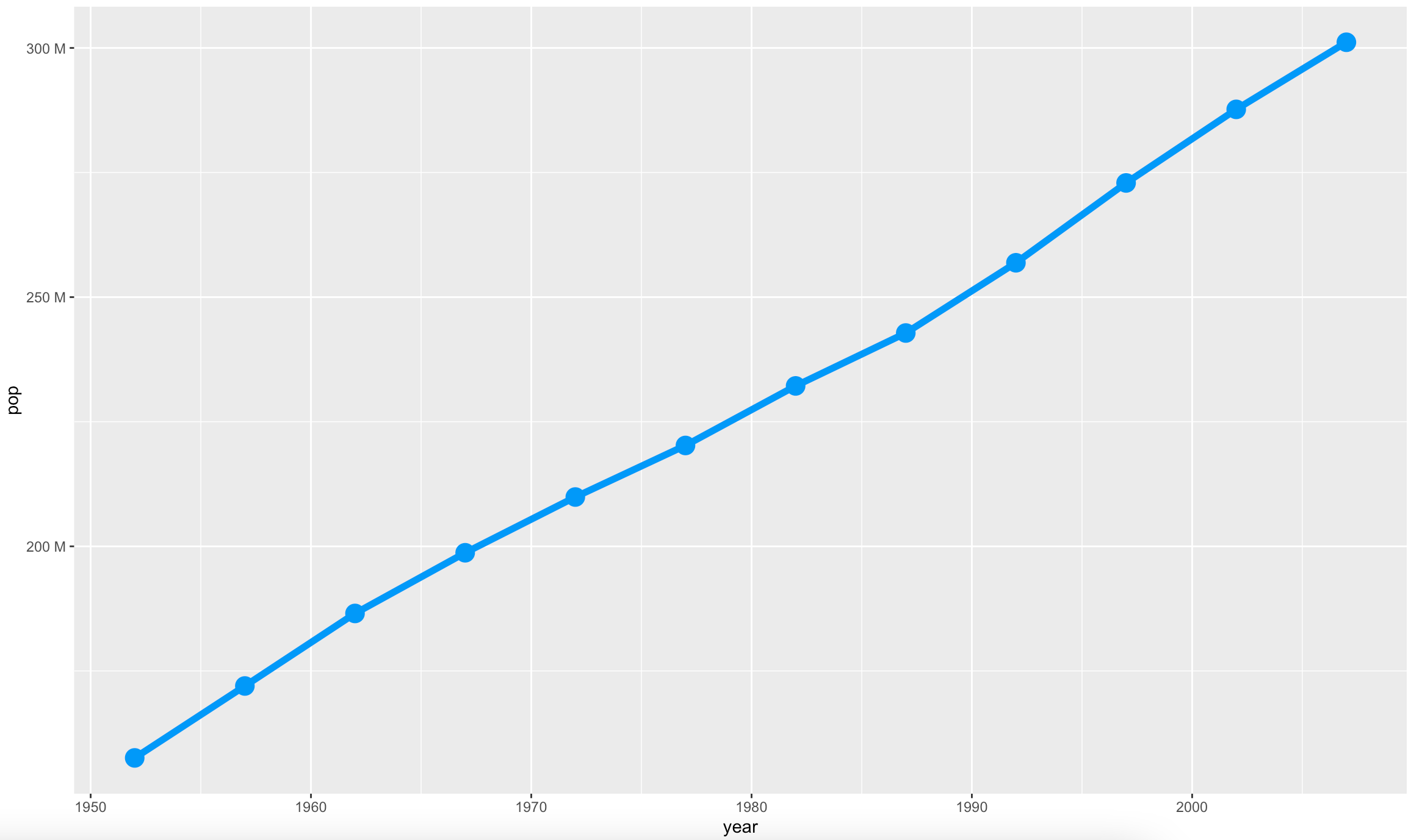
Image 7 – Changing axis ticks
But what if you want a bit more space on top and bottom? You can specify where the axis starts and ends. Here’s how:
ggplot(usa, aes(x = year, y = pop)) +
  geom_line(color = "#0099f9", size = 2) +
  geom_point(color = "#0099f9", size = 5) +
  expand_limits(y = c(125000000, 325000000)) +
  scale_y_continuous(
    labels = unit_format(unit = "M", scale = 1e-6)
  )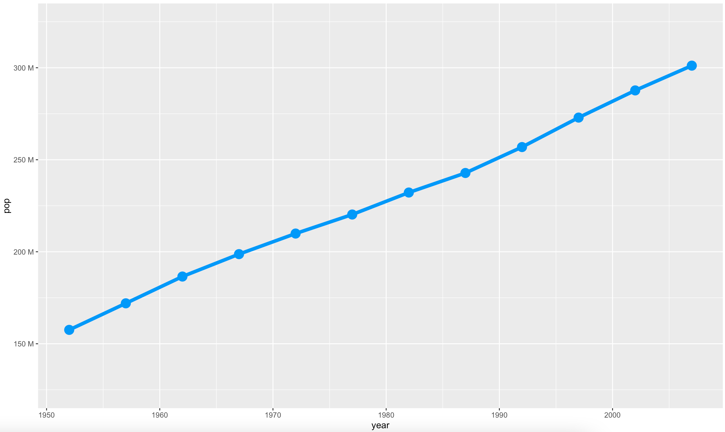
Image 8 – Changing limits of the axis
The labs() layer takes in values for x and y – these determine the text shown on the X and Y axes, respectively. You can tweak the styles for axis labels the same way you did with the title, subtitle, and caption. The snippet below shows how:
ggplot(usa, aes(x = year, y = pop)) +
  geom_line(color = "#0099f9", size = 2) +
  geom_point(color = "#0099f9", size = 5) +
  scale_y_continuous(
    labels = unit_format(unit = "M", scale = 1e-6)
  ) +
  labs(
    x = "Year",
    y = "Population"
  ) +
  theme(
    axis.title.x = element_text(color = "#0099f9", size = 16, face = "bold"),
    axis.title.y = element_text(color = "#0099f9", size = 16, face = "italic")
  )
Image 9 – Changing X and Y axis labels
And that’s it for styling axes! Let’s see how to show multiple lines on the same chart next.
Draw Multiple Lines on the Same Chart
Showing multiple lines on a single chart can be useful. We’ll use it to compare average life expectancy between major North American countries – the United States, Canada, and Mexico.
To display multiple lines, you can use the group attribute in the data aesthetics layer. Here’s an example:
north_big <- gapminder %>%
  filter(continent == "Americas", country %in% c("United States", "Canada", "Mexico"))

ggplot(north_big, aes(x = year, y = lifeExp, group = country)) +
  geom_line(aes(color = country), size = 2)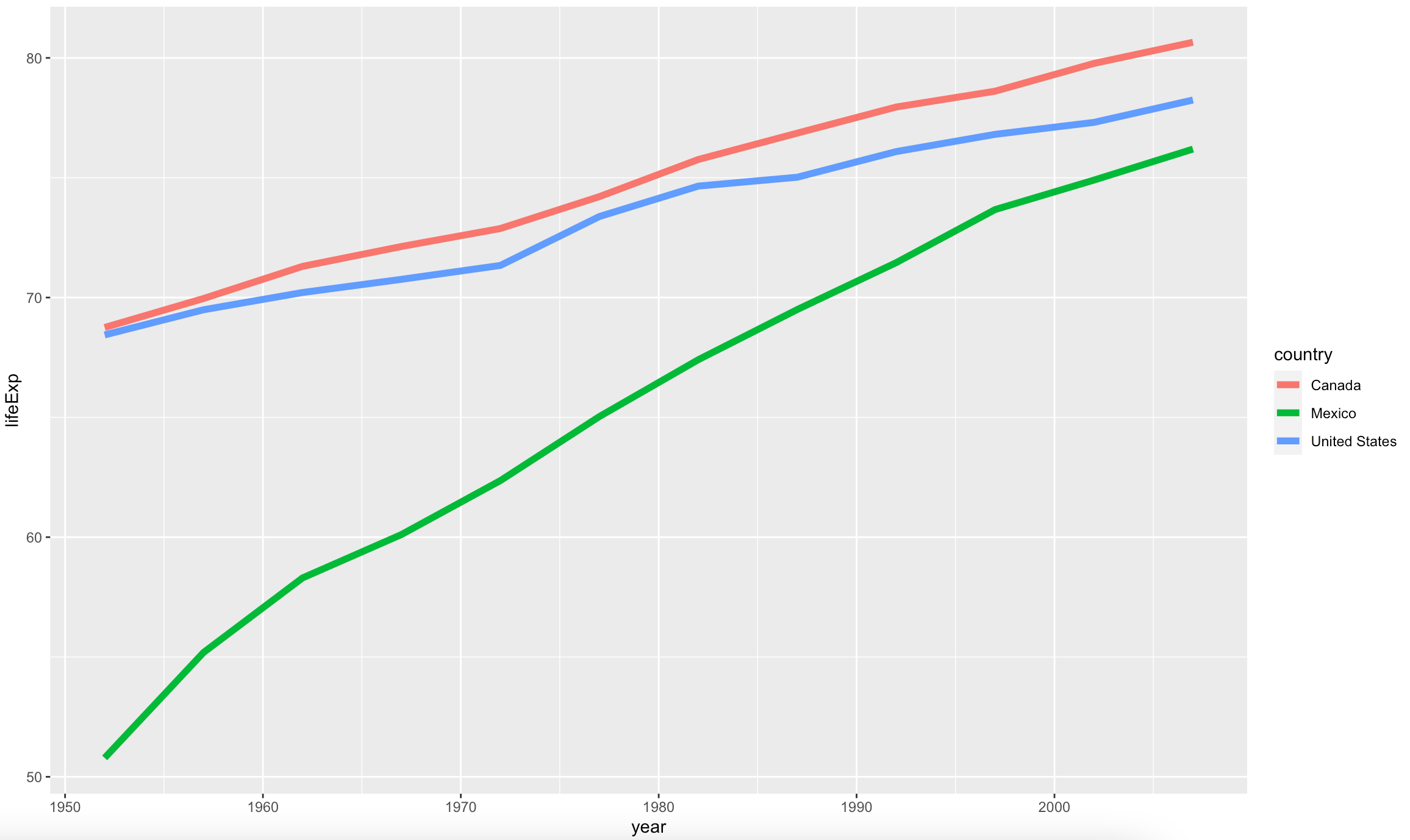
Image 10 – Average life expectancy among major North American countries
In case you’re wondering how to add markers to multiple lines – the procedure is identical as it was for a single one. Take a look at the code snippet and image below:
ggplot(north_big, aes(x = year, y = lifeExp, group = country)) +
  geom_line(aes(color = country), size = 2) +
  geom_point(aes(color = country), size = 5)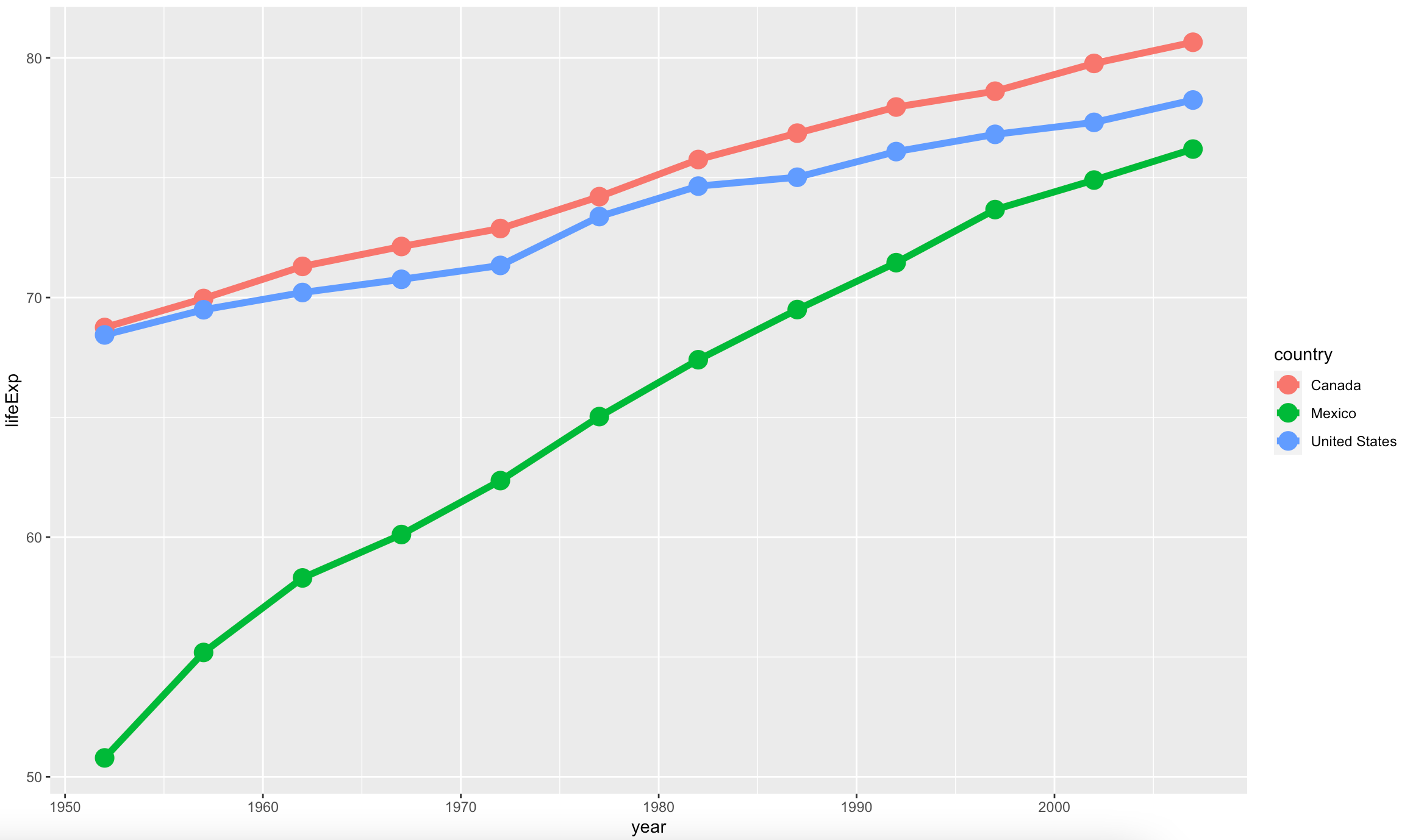
Image 11 – Adding markers to multiple lines
There’s a legend right next to the plot because of multiple lines on a single chart. You wouldn’t know which line represents what without it. Still, it’s position on the right might be irritating for some use cases. Here’s how to put it on the top:
ggplot(north_big, aes(x = year, y = lifeExp, group = country)) +
  geom_line(aes(color = country), size = 2) +
  geom_point(aes(color = country), size = 5) +
  theme(legend.position = "top")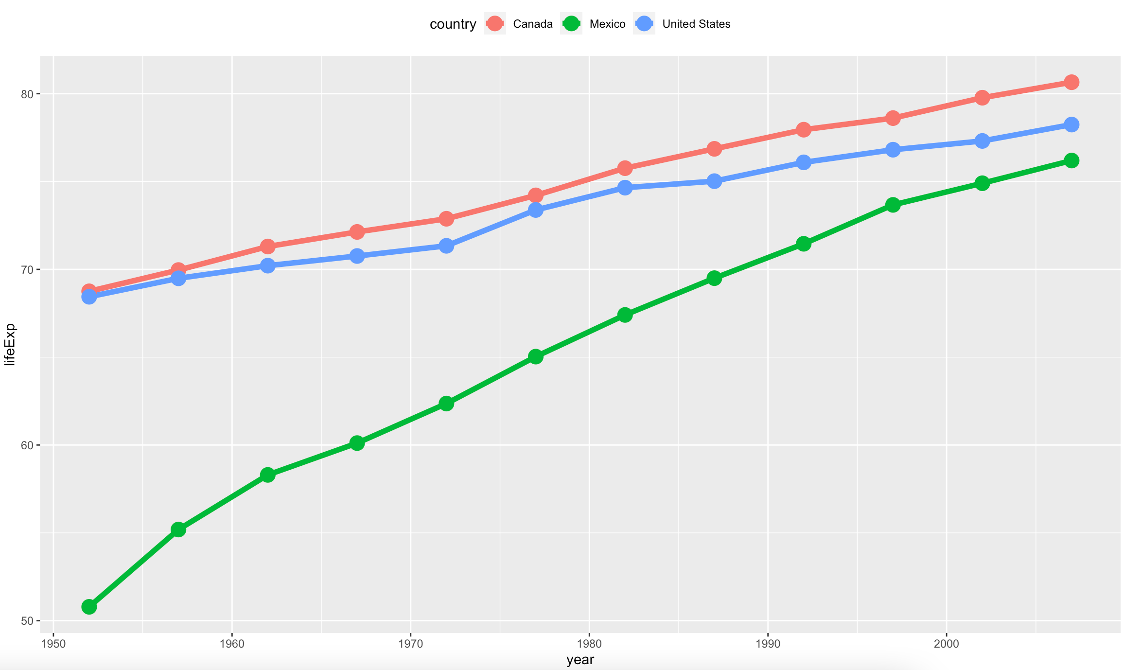
Image 12 – Changing the legend position
You’ve learned a lot until now, but there’s still one important topic to cover – labels.
Adding Labels to ggplot2 Line Charts
If there aren’t too many data points on a line chart, it can be useful to add labels showing the exact values. Be careful with them – they can make your visualization messy fast.
Here’s how to plot average life expectancy in the United States and show text on top of the line:
ggplot(usa, aes(x = year, y = lifeExp)) +
  geom_line(color = "#0099f9", size = 2) +
  geom_point(color = "#0099f9", size = 5) +
  geom_text(aes(label = lifeExp))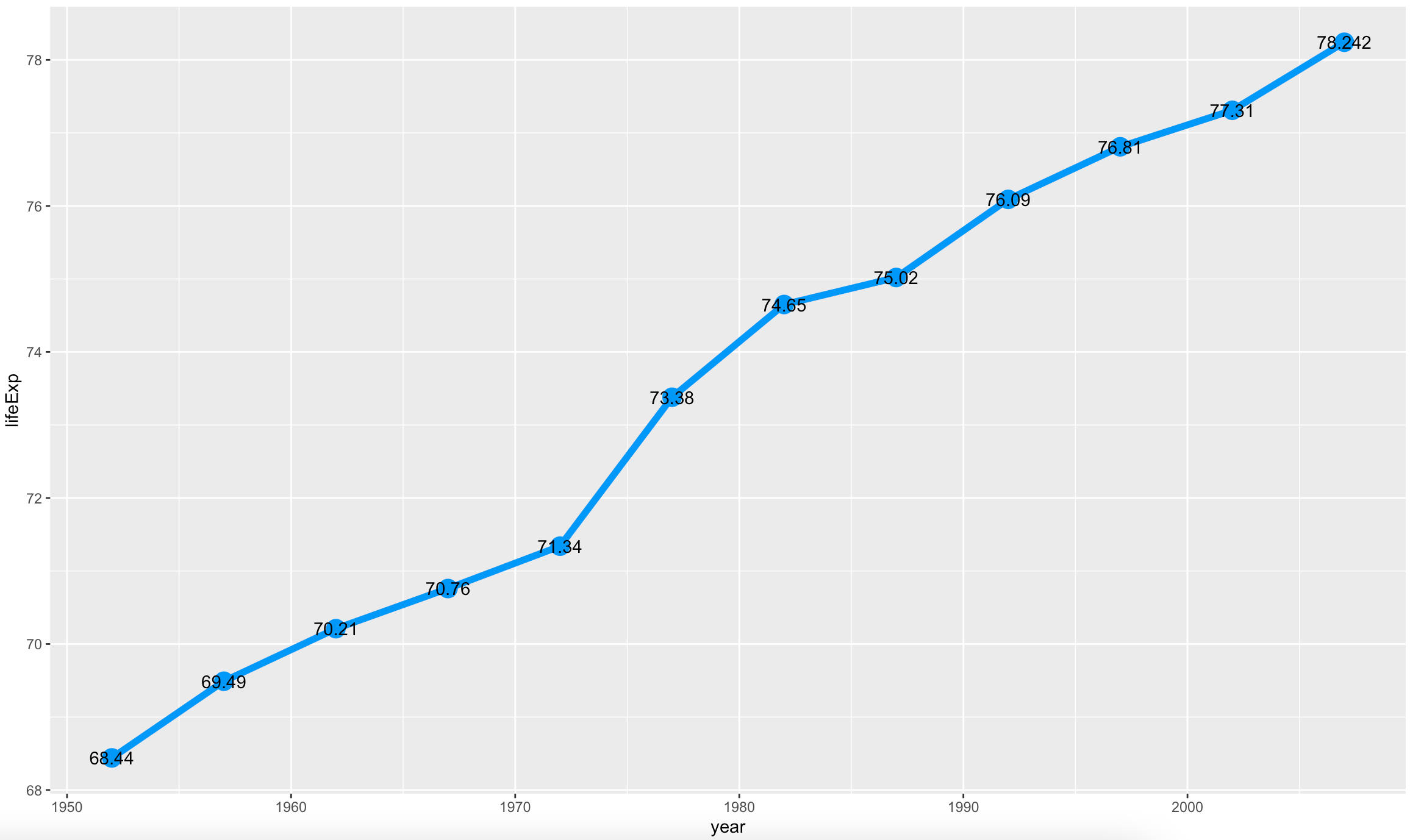
Image 13 – Adding text
A couple of problems, though. The labels are a bit small, and they are positioned right on top of the markers. The code snippet below makes the text larger and pushes them a bit higher:
ggplot(usa, aes(x = year, y = lifeExp)) +
  geom_line(color = "#0099f9", size = 2) +
  geom_point(color = "#0099f9", size = 5) +
  geom_text(
    aes(label = lifeExp),
    nudge_x = 0.25,
    nudge_y = 0.25,
    check_overlap = TRUE,
    size = 5
  )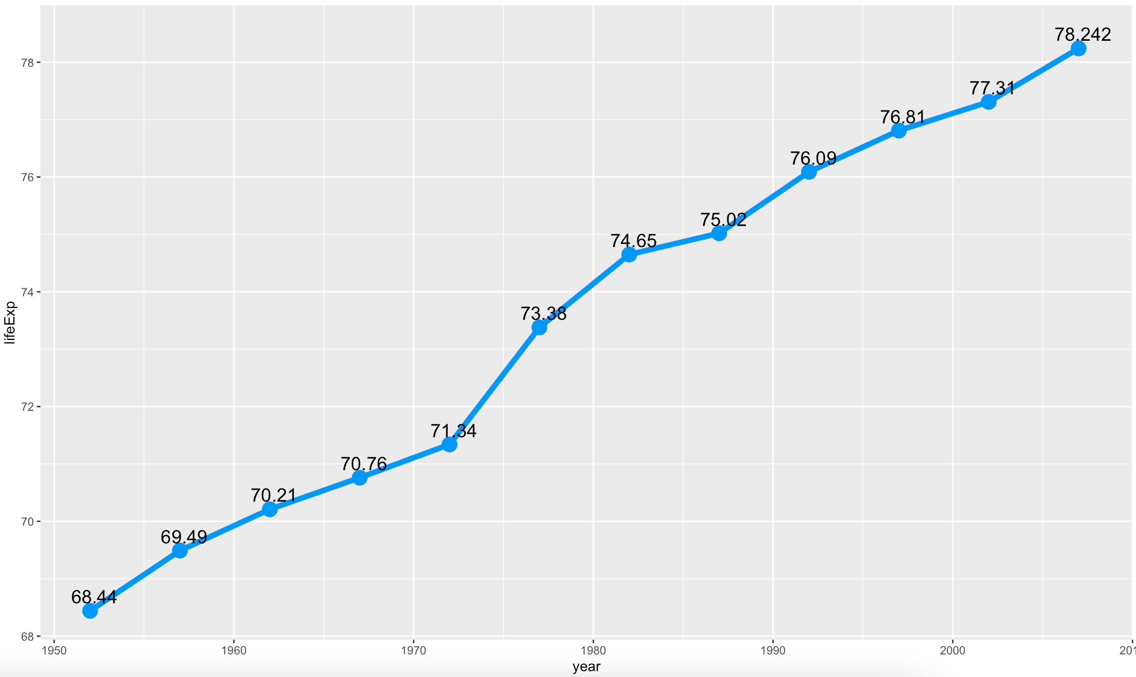
Image 14 – Styling text
Showing text might not be the cleanest solution every time. Maybe you want text wrapped inside a box to give your visualization a touch more style. You can do that by replacing geom_text() with geom_label(). That’s the only change you need to make:
ggplot(usa, aes(x = year, y = lifeExp)) +
  geom_line(color = "#0099f9", size = 2) +
  geom_point(color = "#0099f9", size = 5) +
  geom_label(
    aes(label = lifeExp),
    nudge_x = 0.25,
    nudge_y = 0.25,
    check_overlap = TRUE
  )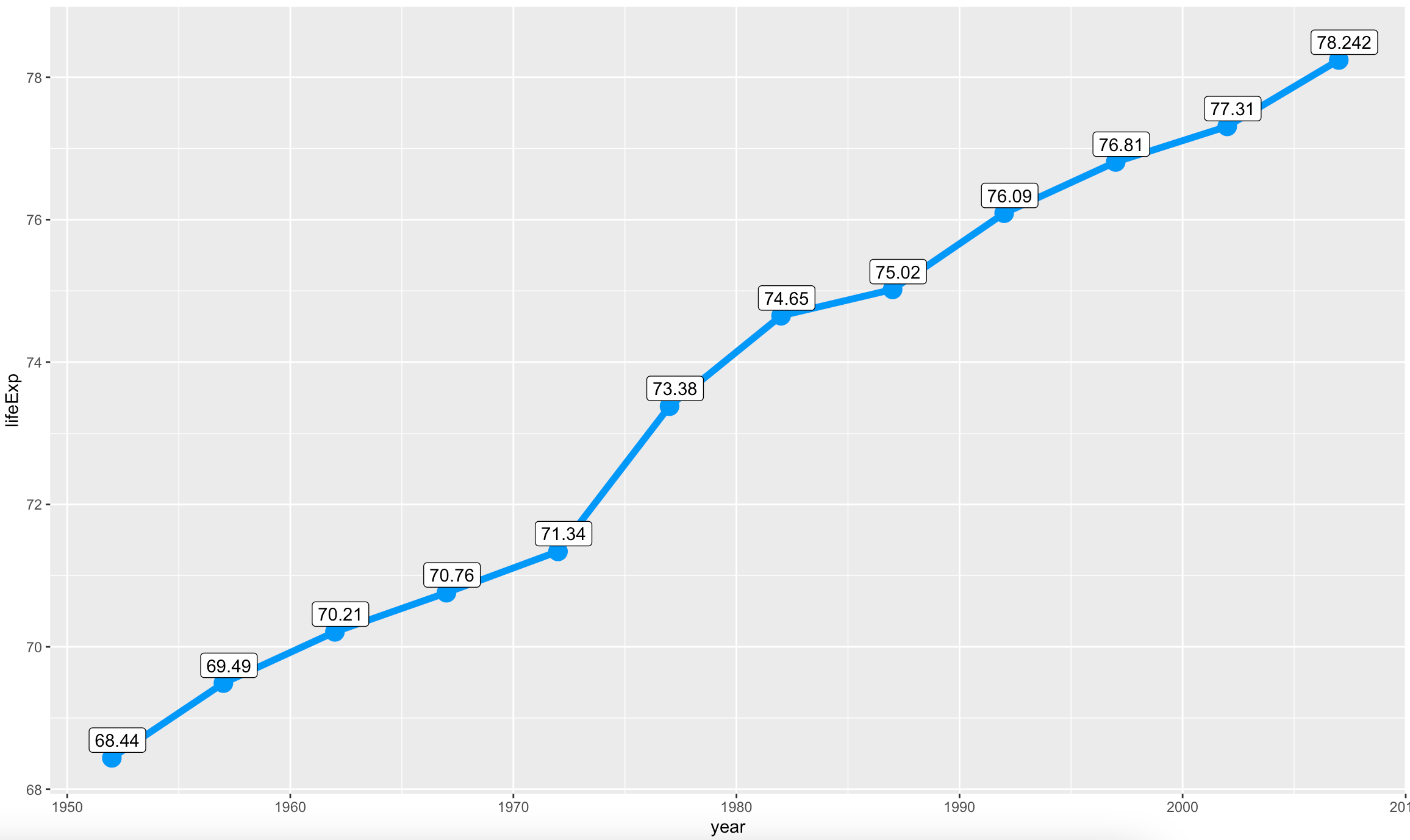
Image 15 – Replacing text with labels
Add Conditional Area Fill to ggplot2 Line Charts
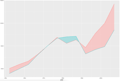
When dealing with multiple lines on a single chart, sometimes you’ll want the area between the individual lines filled. The good news is – it’s quite an easy thing to do with R and ggplot2. We’ll show you a comparison of GDP per capita between Poland and Romania over time as individual lines, and we’ll fill the area between the lines. Why? Well, it improves the overall aesthetics of the data visualization, and also makes differences easier to spot.
First things first, you’ll have to install an additional R package. It extends the capabilities of ggplot2 by adding additional functions – one of them being stat_difference():
install.packages("ggh4x")Now we’ll have to do some magic with data formatting. It’s a best practice to have a common feature in the dataset (year), and to represent data for each line as an individual column. In a nutshell, we’ll have 3 columns – year, GDP for Poland, and GDP for Romania:
pol_rom <- gapminder %>%
  filter(country %in% c("Poland", "Romania")) %>%
  select(year, country, gdpPercap) %>%
  pivot_wider(names_from = country, values_from = gdpPercap)

head(pol_rom)
Here’s what the dataset looks like:
Image 16 – Reformatted GDP dataset
Adding a conditional area fill is a child’s play from this point:
ggplot(pol_rom, aes(x = year)) +
  geom_line(aes(y = Poland, color = "Poland")) +
  geom_line(aes(y = Romania, color = "Romania")) +
  stat_difference(aes(ymin = Romania, ymax = Poland), alpha = 0.3)
Image 17 – ggplot2 line chart with a filled area
And that’s all you really need to know about labels and line charts for today. Let’s wrap things up next.
Conclusion
Today you’ve learned how to make line charts and how to make them aesthetically pleasing. You’ve learned how to change colors, line width and type, titles, subtitles, captions, axis labels, and much more. You are now ready to include line charts in your reports and dashboards. You can expect more basic R tutorials weekly (usually on Sundays) and more advanced tutorials throughout the week. Fill out the subscribe form below so you never miss an update.
Are you completely new to R but have some programming experience? Check out our detailed R guide for programmers.
Learn More:
Contact Us
Project Manager

Get Updates
Subscribe to Shiny Weekly Newsletter
Join 4000+ Shiny enthusiasts to see the latest Shiny news from the R community.